harmony 鸿蒙Content Modifier
Content Modifier
You can apply a content modifier to a component to customize its content area using a style builder.
NOTE
This feature is supported since API version 12. Updates will be marked with a superscript to indicate their earliest API version.
contentModifier
contentModifier(modifier:ContentModifier<T>)
Creates a content modifier.
System capability: SystemCapability.ArkUI.ArkUI.Full
Parameters
| Name | Type | Mandatory | Description |
|---|---|---|---|
| modifier | ContentModifier<T> | Yes | Content modifier to apply to the current component. modifier: content modifier. You need a custom class to implement the ContentModifier API. |
ContentModifier<T>
You need a custom class to implement the ContentModifier API.
applyContent
applyContent() : WrappedBuilder<[T]>
Builder of the custom content area.
Atomic service API: This API can be used in atomic services since API version 12.
System capability: SystemCapability.ArkUI.ArkUI.Full
Parameters
| Name | Description |
|---|---|
| T | Component attribute class, which is used to distinguish different information required by different components after content areas are customized, for example, ButtonConfiguration for the Button component and CheckBoxConfiguration of the Checkbox component. |
Value range of the T parameter:
ButtonConfiguration, CheckBoxConfiguration, DataPanelConfiguration, TextClockConfiguration, ToggleConfiguration, GaugeConfiguration, LoadingProgressConfiguration, RadioConfiguration, ProgressConfiguration, RatingConfiguration, SliderConfiguration
Supported attributes
The universal attribute enabled and contentModifier are supported.
CommonConfiguration<T>12+
You need a custom class to implement the ContentModifier API.
Atomic service API: This API can be used in atomic services since API version 12.
System capability: SystemCapability.ArkUI.ArkUI.Full
| Name | Type | Description |
|---|---|---|
| enabled | boolean | Whether to enable the content modifier and respond to operations such as triggerChange. The value true means to enable the content modifier and respond to operations such as triggerChange, and false means the opposite. |
| contentModifier | ContentModifier<T> | Content modifier that sends the component information required by users to the custom content area. |
Example
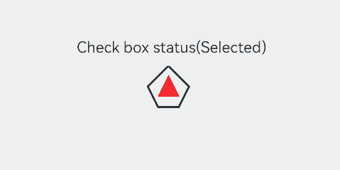
This example demonstrates how to create a custom check box using ContentModifier. This check box comes in the custom pentagon style instead of the original check box style. When selected, the check box shows a red triangle pattern inside, and the title displays the word “Selected;” when deselected, the check box hides the red triangle pattern inside, and the title displays the word “Unselected.”
// xxx.ets
class MyCheckboxStyle implements ContentModifier<CheckBoxConfiguration> {
  selectedColor: Color = Color.White

  constructor(selectedColor: Color) {
    this.selectedColor = selectedColor;
  }

  applyContent(): WrappedBuilder<[CheckBoxConfiguration]> {
    return wrapBuilder(buildCheckbox)
  }
}

@Builder
function buildCheckbox(config: CheckBoxConfiguration) {
  Column({ space: 10 }) {
    Text(config.name + (config.selected ? "(Selected)" : "(Not selected)"))
    Shape() {
      // Pentagon check box style
      Path()
        .width(200)
        .height(60)
        .commands('M100 0 L0 100 L50 200 L150 200 L200 100 Z')
        .fillOpacity(0)
        .strokeWidth(3)
      // Red triangle pattern style
      Path()
        .width(10)
        .height(10)
        .commands('M50 0 L100 100 L0 100 Z')
        .visibility(config.selected ? Visibility.Visible : Visibility.Hidden)
        .fill(config.selected ? (config.contentModifier as MyCheckboxStyle).selectedColor : Color.Black)
        .stroke((config.contentModifier as MyCheckboxStyle).selectedColor)
        .margin({ left: 11, top: 10 })
    }
    .width(300)
    .height(200)
    .viewPort({
      x: 0,
      y: 0,
      width: 310,
      height: 310
    })
    .strokeLineJoin(LineJoinStyle.Miter)
    .strokeMiterLimit(5)
    .onClick(() => {
      // Trigger the check box state change upon click.
      if (config.selected) {
        config.triggerChange(false)
      } else {
        config.triggerChange(true)
      }
    })
    .margin({ left: 150 })
  }
}

@Entry
@Component
struct Index {
  build() {
    Row() {
      Column() {
        Checkbox({ name: 'Check box status', group: 'checkboxGroup' })
          .select(true)
          .contentModifier(new MyCheckboxStyle(Color.Red))
          .onChange((value: boolean) => {
            console.info('Checkbox change is' + value)
          })
      }
      .width('100%')
    }
    .height('100%')
  }
}
你可能感兴趣的鸿蒙文章
- 所属分类: 后端技术
- 本文标签:
热门推荐
-
2、 优质文章
-
3、 gt
-
7、 openharmony
-
9、 golang
-
10、 Vue中input框自动聚焦