harmony 鸿蒙Tabs
Tabs
通过页签进行内容视图切换的容器组件,每个页签对应一个内容视图。
说明:
该组件从API version 7开始支持。后续版本如有新增内容,则采用上角标单独标记该内容的起始版本。
该组件从API version 11开始默认支持安全区避让特性(默认值为:expandSafeArea([SafeAreaType.SYSTEM], [SafeAreaEdge.BOTTOM])),开发者可以重写该属性覆盖默认行为,API version 11之前的版本需配合expandSafeArea属性实现安全区避让。
子组件
不支持自定义组件作为子组件,仅可包含子组件TabContent,以及渲染控制类型if/else和ForEach,并且if/else和ForEach下也仅支持TabContent,不支持自定义组件。
说明:
Tabs子组件的visibility属性设置为None,或者visibility属性设置为Hidden时,对应子组件不显示,但依然会在视窗内占位。
Tabs子组件TabContent显示之后不会销毁,若需要页面懒加载和释放,可以参考示例13。
接口
Tabs(options?: TabsOptions)
创建Tabs容器。
原子化服务API: 从API version 11开始,该接口支持在原子化服务中使用。
系统能力: SystemCapability.ArkUI.ArkUI.Full
参数:
| 参数名 | 类型 | 必填 | 说明 |
|---|---|---|---|
| options | TabsOptions | 否 | Tabs组件参数。 |
TabsOptions15+
Tabs组件参数,设置Tabs的页签位置,当前显示页签的索引,Tabs控制器和TabBar的通用属性。
系统能力: SystemCapability.ArkUI.ArkUI.Full
| 名称 | 类型 | 必填 | 说明 |
|---|---|---|---|
| barPosition7+ | BarPosition | 否 | 设置Tabs的页签位置。 默认值:BarPosition.Start。 原子化服务API: 从API version 11开始,该接口支持在原子化服务中使用。 |
| index7+ | number | 否 | 设置当前显示页签的索引。 默认值:0 说明: 设置为小于0的值时按默认值显示。 可选值为[0, TabContent子节点数量-1]。 直接修改index跳页时,切换动效不生效。 使用TabController的changeIndex时,默认生效切换动效,可以设置animationDuration为0关闭动画。 从API version 10开始,该参数支持$$双向绑定变量。 Tabs重建、系统资源切换(如系统字体切换、系统深浅色切换)或者组件属性变化时,会跳转到index对应的页面。若需要在上述情况下不跳转,建议使用双向绑定。 原子化服务API: 从API version 11开始,该接口支持在原子化服务中使用。 |
| controller7+ | TabsController | 否 | 设置Tabs控制器。 原子化服务API: 从API version 11开始,该接口支持在原子化服务中使用。 |
| barModifier15+ | CommonModifier | 否 | 设置TabBar的通用属性。 说明: 动态置为undefined时会保持当前状态不变,不会重置各通用属性。 由一个CommonModifier切换为另一个CommonModifier时,重复属性会进行覆盖,非重复属性会同时生效,不会重置前一个CommonModifier的通用属性。 Tabs的barWidth、barHeight、barBackgroundColor、barBackgroundBlurStyle、barBackgroundEffect属性会覆盖CommonModifier的width、height、backgroundColor、backgroundBlurStyle、backgroundEffect属性。 align属性仅在BarMode.Scrollable模式下生效,且Tabs为横向时还需nonScrollableLayoutStyle未设置或设置为异常值时才能生效。 TabContent组件的tabBar属性为底部页签样式时不支持拖拽功能。 原子化服务API: 从API version 15开始,该接口支持在原子化服务中使用。 |
BarPosition枚举说明
Tabs页签位置枚举。
原子化服务API: 从API version 11开始,该接口支持在原子化服务中使用。
系统能力: SystemCapability.ArkUI.ArkUI.Full
| 名称 | 说明 |
|---|---|
| Start | vertical属性方法设置为true时,页签位于容器左侧;vertical属性方法设置为false时,页签位于容器顶部。 |
| End | vertical属性方法设置为true时,页签位于容器右侧;vertical属性方法设置为false时,页签位于容器底部。 |
属性
除支持通用属性外,还支持以下属性:
vertical
vertical(value: boolean)
设置是否为纵向Tab。
原子化服务API: 从API version 11开始,该接口支持在原子化服务中使用。
系统能力: SystemCapability.ArkUI.ArkUI.Full
参数:
| 参数名 | 类型 | 必填 | 说明 |
|---|---|---|---|
| value | boolean | 是 | 是否为纵向Tab。 默认值:false,横向Tabs,为true时纵向Tabs。 当横向Tabs设置height为auto时,Tabs组件高度自适应子组件高度,即为tabBar高度+divider线宽+TabContent高度+上下padding值+上下border宽度。 当纵向Tabs设置width为auto时,Tabs组件宽度自适应子组件宽度,即为tabBar宽度+divider线宽+TabContent宽度+左右padding值+左右border宽度。 尽量保持每一个页面中的子组件尺寸大小一致,避免滑动页面时出现页面切换动画跳动现象。 |
scrollable
scrollable(value: boolean)
设置是否可以通过滑动页面进行页面切换。
原子化服务API: 从API version 11开始,该接口支持在原子化服务中使用。
系统能力: SystemCapability.ArkUI.ArkUI.Full
参数:
| 参数名 | 类型 | 必填 | 说明 |
|---|---|---|---|
| value | boolean | 是 | 是否可以通过滑动页面进行页面切换。 默认值:true,可以通过滑动页面进行页面切换。为false时不可滑动切换页面。 |
barMode
barMode(value: BarMode, options?: ScrollableBarModeOptions)
设置TabBar布局模式。
原子化服务API: 从API version 11开始,该接口支持在原子化服务中使用。
系统能力: SystemCapability.ArkUI.ArkUI.Full
参数:
| 参数名 | 类型 | 必填 | 说明 |
|---|---|---|---|
| value | BarMode | 是 | 布局模式。 默认值:BarMode.Fixed |
| options10+ | ScrollableBarModeOptions | 否 | Scrollable模式下的TabBar的布局样式。 说明: 仅Scrollable且水平模式下有效。 |
barMode10+
barMode(value: BarMode.Fixed)
设置TabBar布局模式为BarMode.Fixed。
原子化服务API: 从API version 11开始,该接口支持在原子化服务中使用。
系统能力: SystemCapability.ArkUI.ArkUI.Full
参数:
| 参数名 | 类型 | 必填 | 说明 |
|---|---|---|---|
| value | BarMode.Fixed | 是 | 所有TabBar会平均分配barWidth宽度(纵向时平均分配barHeight高度)。 |
barMode10+
barMode(value: BarMode.Scrollable, options: ScrollableBarModeOptions)
设置TabBar布局模式为BarMode.Scrollable。
原子化服务API: 从API version 11开始,该接口支持在原子化服务中使用。
系统能力: SystemCapability.ArkUI.ArkUI.Full
参数:
| 参数名 | 类型 | 必填 | 说明 |
|---|---|---|---|
| value | BarMode.Scrollable | 是 | 所有TabBar都使用实际布局宽度,超过总宽度(横向Tabs的barWidth,纵向Tabs的barHeight)后可滑动。 |
| options | ScrollableBarModeOptions | 是 | Scrollable模式下的TabBar的布局样式。 说明: 仅水平模式下有效。 |
barWidth
barWidth(value: Length)
设置TabBar的宽度值。设置为小于0或大于Tabs宽度值时,按默认值显示。
原子化服务API: 从API version 11开始,该接口支持在原子化服务中使用。
系统能力: SystemCapability.ArkUI.ArkUI.Full
参数:
| 参数名 | 类型 | 必填 | 说明 |
|---|---|---|---|
| value | Length8+ | 是 | TabBar的宽度值。 默认值: 未设置SubTabBarStyle和BottomTabBarStyle的TabBar且vertical属性为false时,默认值为Tabs的宽度。 未设置SubTabBarStyle和BottomTabBarStyle的TabBar且vertical属性为true时,默认值为56vp。 设置SubTabBarStyle样式且vertical属性为false时,默认值为Tabs的宽度。 设置SubTabBarStyle样式且vertical属性为true时,默认值为56vp。 设置BottomTabBarStyle样式且vertical属性为true时,默认值为96vp。 设置BottomTabBarStyle样式且vertical属性为false时,默认值为Tabs的宽度。 |
barHeight
barHeight(value: Length)
设置TabBar的高度值。横向Tabs可以设置height为’auto’,让TabBar自适应子组件高度。height设置为小于0或大于Tabs高度值时,按默认值显示。
API version 14之前的版本,若设置barHeight为固定值后,TabBar无法扩展底部安全区。从API version 14开始支持配合safeAreaPadding属性,当safeAreaPadding不设置bottom或者bottom设置为0时,可以实现扩展安全区。
原子化服务API: 从API version 11开始,该接口支持在原子化服务中使用。
系统能力: SystemCapability.ArkUI.ArkUI.Full
参数:
| 参数名 | 类型 | 必填 | 说明 |
|---|---|---|---|
| value | Length8+ | 是 | TabBar的高度值。 默认值: 未设置带样式的TabBar且vertical属性为false时,默认值为56vp。 未设置带样式的TabBar且vertical属性为true时,默认值为Tabs的高度。 设置SubTabBarStyle样式且vertical属性为false时,默认值为56vp。 设置SubTabBarStyle样式且vertical属性为true时,默认值为Tabs的高度。 设置BottomTabBarStyle样式且vertical属性为true时,默认值为Tabs的高度。 设置BottomTabBarStyle样式且vertical属性为false时,默认值为56vp,从API version 12开始,默认值变更为48vp。 |
barHeight20+
barHeight(height: Length, noMinHeightLimit: boolean)
设置TabBar的高度值。横向Tabs可以设置height为’auto’,让TabBar自适应子组件高度,并通过设置noMinHeightLimit为true让自适应高度可以小于TabBar默认高度。height设置为小于0或大于Tabs高度值时,按默认值显示。
原子化服务API: 从API version 20开始,该接口支持在原子化服务中使用。
系统能力: SystemCapability.ArkUI.ArkUI.Full
参数:
| 参数名 | 类型 | 必填 | 说明 |
|---|---|---|---|
| height | Length | 是 | TabBar的高度值。 默认值: 未设置带样式的TabBar且vertical属性为false时,默认值为56vp。 未设置带样式的TabBar且vertical属性为true时,默认值为Tabs的高度。 设置SubTabBarStyle样式且vertical属性为false时,默认值为56vp。 设置SubTabBarStyle样式且vertical属性为true时,默认值为Tabs的高度。 设置BottomTabBarStyle样式且vertical属性为true时,默认值为Tabs的高度。 设置BottomTabBarStyle样式且vertical属性为false时,默认值为48vp。 |
| noMinHeightLimit | boolean | 是 | height设置为’auto’时,设置是否取消TabBar的最小高度限制。默认值为false。 说明: 值为true表示取消TabBar的最小高度限制,即TabBar的高度值可以小于默认值。 值为false表示限制TabBar的最小高度,即TabBar的最小高度值等于默认值。 |
animationCurve20+
animationCurve(curve: Curve|ICurve)
设置Tabs翻页动画曲线。常用曲线参考Curve枚举说明,也可以通过插值计算模块提供的接口创建自定义的插值曲线对象。
原子化服务API: 从API version 20开始,该接口支持在原子化服务中使用。
系统能力: SystemCapability.ArkUI.ArkUI.Full
参数:
| 参数名 | 类型 | 必填 | 说明 |
|---|---|---|---|
| curve | Curve | ICurve | 是 | Tabs翻页的动画曲线。 默认值: 滑动TabContent翻页时,默认值为interpolatingSpring(-1, 1, 228, 30)。 点击TabBar页签和调用TabsController的changeIndex接口翻页时,默认值为cubicBezierCurve(0.2, 0.0, 0.1, 1.0)。 设置自定义动画曲线时,滑动翻页和点击页签、调用changeIndex翻页都使用设置的动画曲线。 |
animationDuration
animationDuration(value: number)
设置Tabs翻页动画时长。
animationCurve不设置时,由于滑动TabContent翻页动画曲线interpolatingSpring(-1, 1, 228, 30)时长只受曲线自身参数影响,animationDuration只能控制点击TabBar页签和调用TabsController的changeIndex接口切换TabContent的动画时长。
不受animationDuration控制的曲线可以查阅插值计算模块,比如springMotion、responsiveSpringMotion和interpolatingSpring类型的曲线。
原子化服务API: 从API version 11开始,该接口支持在原子化服务中使用。
系统能力: SystemCapability.ArkUI.ArkUI.Full
参数:
| 参数名 | 类型 | 必填 | 说明 |
|---|---|---|---|
| value | number | 是 | Tabs翻页的动画时长。 默认值: API version 10及以前,不设置该属性或设置为null时,默认值为0,即Tabs翻页无动画。设置为小于0或undefined时,默认值为300。 API version 11及以后,不设置该属性或设置为异常值,且设置TabBar为BottomTabBarStyle样式时,默认值为0。设置TabBar为其他样式时,默认值为300。 单位:ms 取值范围:[0, +∞) |
animationMode12+
animationMode(mode: Optional<AnimationMode>)
设置点击TabBar页签或调用TabsController的changeIndex接口时切换TabContent的动画形式。
原子化服务API: 从API version 12开始,该接口支持在原子化服务中使用。
系统能力: SystemCapability.ArkUI.ArkUI.Full
参数:
| 参数名 | 类型 | 必填 | 说明 |
|---|---|---|---|
| mode | Optional<AnimationMode> | 是 | 点击TabBar页签或调用TabsController的changeIndex接口时切换TabContent的动画形式。 默认值:AnimationMode.CONTENT_FIRST,表示在点击TabBar页签或调用TabsController的changeIndex接口切换TabContent时,先加载目标页内容,再开始切换动画。 |
barPosition9+
barPosition(value: BarPosition)
设置Tabs的页签位置。
原子化服务API: 从API version 11开始,该接口支持在原子化服务中使用。
系统能力: SystemCapability.ArkUI.ArkUI.Full
参数:
| 参数名 | 类型 | 必填 | 说明 |
|---|---|---|---|
| value | BarPosition | 是 | 设置Tabs的页签位置。 默认值:BarPosition.Start |
divider10+
divider(value: DividerStyle|null)
设置区分TabBar和TabContent的分割线样式。
原子化服务API: 从API version 11开始,该接口支持在原子化服务中使用。
系统能力: SystemCapability.ArkUI.ArkUI.Full
参数:
| 参数名 | 类型 | 必填 | 说明 |
|---|---|---|---|
| value | DividerStyle | null | 是 | 分割线样式,默认不显示分割线。 DividerStyle:分割线的样式; null:不显示分割线。 |
fadingEdge10+
fadingEdge(value: boolean)
设置页签超过容器宽度时是否渐隐消失。建议配合barBackgroundColor属性一起使用,如果barBackgroundColor属性没有定义,会默认显示页签末端为白色的渐隐效果。
原子化服务API: 从API version 11开始,该接口支持在原子化服务中使用。
系统能力: SystemCapability.ArkUI.ArkUI.Full
参数:
| 参数名 | 类型 | 必填 | 说明 |
|---|---|---|---|
| value | boolean | 是 | 页签超过容器宽度时是否渐隐消失。 默认值:true,页签超过容器宽度时会渐隐消失。设置为false时,页签超过容器宽度直接截断显示,不产生任何渐变效果。 |
barOverlap10+
barOverlap(value: boolean)
设置TabBar是否背后变模糊并叠加在TabContent之上。
原子化服务API: 从API version 11开始,该接口支持在原子化服务中使用。
系统能力: SystemCapability.ArkUI.ArkUI.Full
参数:
| 参数名 | 类型 | 必填 | 说明 |
|---|---|---|---|
| value | boolean | 是 | TabBar是否背后变模糊并叠加在TabContent之上。当barOverlap设置为true时,TabBar背后变模糊并叠加在TabContent之上,并且TabBar默认模糊材质的BlurStyle值修改为’BlurStyle.COMPONENT_THICK’。当barOverlap设置为false时,无模糊和叠加效果。 默认值:false |
barBackgroundColor10+
barBackgroundColor(value: ResourceColor)
设置TabBar的背景颜色。
原子化服务API: 从API version 11开始,该接口支持在原子化服务中使用。
系统能力: SystemCapability.ArkUI.ArkUI.Full
参数:
| 参数名 | 类型 | 必填 | 说明 |
|---|---|---|---|
| value | ResourceColor | 是 | TabBar的背景颜色。 默认值:Color.Transparent,透明 |
barBackgroundBlurStyle11+
barBackgroundBlurStyle(value: BlurStyle)
设置TabBar的背景模糊材质。
原子化服务API: 从API version 11开始,该接口支持在原子化服务中使用。
系统能力: SystemCapability.ArkUI.ArkUI.Full
参数:
| 参数名 | 类型 | 必填 | 说明 |
|---|---|---|---|
| value | BlurStyle | 是 | TabBar的背景模糊材质。 默认值:BlurStyle.NONE |
barBackgroundBlurStyle18+
barBackgroundBlurStyle(style: BlurStyle, options: BackgroundBlurStyleOptions)
为TabBar提供一种在背景和内容之间的模糊能力,通过枚举值的方式封装了不同的模糊半径、蒙版颜色、蒙版透明度、饱和度、亮度。
原子化服务API: 从API version 18开始,该接口支持在原子化服务中使用。
系统能力: SystemCapability.ArkUI.ArkUI.Full
参数:
| 参数名 | 类型 | 必填 | 说明 |
|---|---|---|---|
| style | BlurStyle | 是 | 背景模糊样式。模糊样式中封装了模糊半径、蒙版颜色、蒙版透明度、饱和度、亮度五个参数。 |
| options | BackgroundBlurStyleOptions | 是 | 背景模糊选项。 |
barGridAlign10+
barGridAlign(value: BarGridColumnOptions)
以栅格化方式设置TabBar的可见区域。具体参见BarGridColumnOptions对象。仅水平模式下有效,不适用于XS、XL和XXL设备。
原子化服务API: 从API version 11开始,该接口支持在原子化服务中使用。
系统能力: SystemCapability.ArkUI.ArkUI.Full
参数:
| 参数名 | 类型 | 必填 | 说明 |
|---|---|---|---|
| value | BarGridColumnOptions | 是 | 以栅格化方式设置TabBar的可见区域。 |
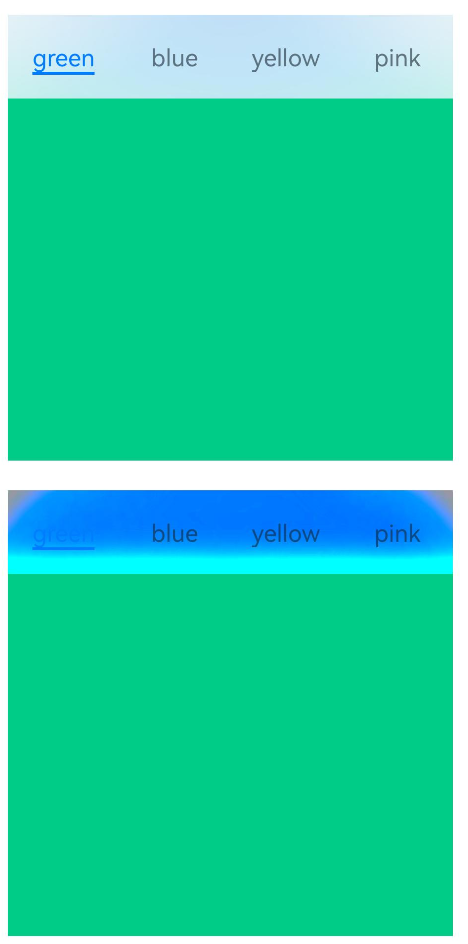
edgeEffect12+
edgeEffect(edgeEffect: Optional<EdgeEffect>)
设置边缘回弹效果。
原子化服务API: 从API version 12开始,该接口支持在原子化服务中使用。
系统能力: SystemCapability.ArkUI.ArkUI.Full
参数:
| 参数名 | 类型 | 必填 | 说明 |
|---|---|---|---|
| edgeEffect | Optional<EdgeEffect> | 是 | 边缘滑动效果。 默认值:EdgeEffect.Spring |
barBackgroundEffect18+
barBackgroundEffect(options: BackgroundEffectOptions)
设置TabBar背景属性,包含背景模糊半径,亮度,饱和度,颜色等参数。
原子化服务API: 从API version 18开始,该接口支持在原子化服务中使用。
系统能力: SystemCapability.ArkUI.ArkUI.Full
参数:
| 参数名 | 类型 | 必填 | 说明 |
|---|---|---|---|
| options | BackgroundEffectOptions | 是 | 设置TabBar背景属性包括:模糊半径,亮度,饱和度,颜色等。 |
pageFlipMode15+
pageFlipMode(mode: Optional<PageFlipMode>)
设置鼠标滚轮翻页模式。
原子化服务API: 从API version 15开始,该接口支持在原子化服务中使用。
系统能力: SystemCapability.ArkUI.ArkUI.Full
参数:
| 参数名 | 类型 | 必填 | 说明 |
|---|---|---|---|
| mode | Optional<PageFlipMode> | 是 | 鼠标滚轮翻页模式。 默认值:PageFlipMode.CONTINUOUS |
cachedMaxCount19+
cachedMaxCount(count: number, mode: TabsCacheMode)
设置子组件的最大缓存个数和缓存模式。设置该属性后,不会对缓存范围内的子组件进行预加载,仅对缓存范围外的子组件进行释放。
原子化服务API: 从API version 19开始,该接口支持在原子化服务中使用。
系统能力: SystemCapability.ArkUI.ArkUI.Full
参数:
| 参数名 | 类型 | 必填 | 说明 |
|---|---|---|---|
| count | number | 是 | 子组件的最大缓存个数。默认所有子组件加载后都不再释放。 取值范围:[0, +∞)。 |
| mode | TabsCacheMode | 是 | 子组件的缓存模式。 默认值:TabsCacheMode.CACHE_BOTH_SIDE |
DividerStyle10+对象说明
分割线样式对象。
原子化服务API: 从API version 11开始,该接口支持在原子化服务中使用。
系统能力: SystemCapability.ArkUI.ArkUI.Full
| 名称 | 类型 | 必填 | 说明 |
|---|---|---|---|
| strokeWidth | Length | 是 | 分割线的线宽(不支持百分比设置)。 默认值:0.0 单位:vp 取值范围:[0, +∞)。 |
| color | ResourceColor | 否 | 分割线的颜色。 默认值:#33182431 |
| startMargin | Length | 否 | 分割线与侧边栏顶端的距离(不支持百分比设置)。 默认值:0.0 单位:vp 取值范围:[0, +∞)。 |
| endMargin | Length | 否 | 分割线与侧边栏底端的距离(不支持百分比设置)。 默认值:0.0 单位:vp 取值范围:[0, +∞)。 |
BarGridColumnOptions10+对象说明
TabBar栅格化方式设置的对象,包括栅格模式下的column边距和间隔,以及小、中、大屏下,页签占用的columns数量。
原子化服务API: 从API version 11开始,该接口支持在原子化服务中使用。
系统能力: SystemCapability.ArkUI.ArkUI.Full
| 名称 | 类型 | 必填 | 说明 |
|---|---|---|---|
| margin | Dimension | 否 | 栅格模式下的column边距(不支持百分比设置)。 默认值:24.0 单位:vp |
| gutter | Dimension | 否 | 栅格模式下的column间隔(不支持百分比设置)。 默认值:24.0 单位:vp |
| sm | number | 否 | 小屏下,页签占用的columns数量,必须是非负偶数。小屏为大于等于320vp但小于600vp。 默认值为-1,代表页签占用TabBar全部宽度。 |
| md | number | 否 | 中屏下,页签占用的columns数量,必须是非负偶数。中屏为大于等于600vp但小于800vp。 默认值为-1,代表页签占用TabBar全部宽度。 |
| lg | number | 否 | 大屏下,页签占用的columns数量,必须是非负偶数。大屏为大于等于840vp但小于1024vp。 默认值为-1,代表页签占用TabBar全部宽度。 |
ScrollableBarModeOptions10+对象说明
Scrollable模式下的TabBar的布局样式对象。
原子化服务API: 从API version 11开始,该接口支持在原子化服务中使用。
系统能力: SystemCapability.ArkUI.ArkUI.Full
| 名称 | 类型 | 必填 | 说明 |
|---|---|---|---|
| margin | Dimension | 否 | Scrollable模式下的TabBar的左右边距(不支持百分比设置)。 默认值:0.0 单位:vp 取值范围:[0, +∞)。 |
| nonScrollableLayoutStyle | LayoutStyle | 否 | Scrollable模式下不滚动时的页签排布方式。 默认值:LayoutStyle.ALWAYS_CENTER |
BarMode枚举说明
TabBar布局模式枚举。
原子化服务API: 从API version 11开始,该接口支持在原子化服务中使用。
系统能力: SystemCapability.ArkUI.ArkUI.Full
|名称 |值|说明 | |———-|–|—————————————-| |Scrollable|0|每一个TabBar均使用实际布局宽度,超过总长度(横向Tabs的barWidth,纵向Tabs的barHeight)后可滑动。| |Fixed |1|所有TabBar平均分配barWidth宽度(纵向时平均分配barHeight高度)。|
AnimationMode12+枚举说明
点击TabBar页签时切换TabContent的动画形式枚举。
系统能力: SystemCapability.ArkUI.ArkUI.Full
| 名称 | 值 | 说明 |
|---|---|---|
| CONTENT_FIRST | 0 | 先加载目标页内容,再开始切换动画。 原子化服务API: 从API version 12开始,该接口支持在原子化服务中使用。 |
| ACTION_FIRST | 1 | 先开始切换动画,再加载目标页内容;生效需要同时需要满足:Tabs的height、width没有设置成auto。 原子化服务API: 从API version 12开始,该接口支持在原子化服务中使用。 |
| NO_ANIMATION | 2 | 关闭默认动画。调用TabsController的changeIndex接口切换TabContent时该枚举值不生效。 可以通过设置animationDuration为0实现调用TabsController的changeIndex接口时不带动画。 原子化服务API: 从API version 12开始,该接口支持在原子化服务中使用。 |
| CONTENT_FIRST_WITH_JUMP15+ | 3 | 先加载目标页内容,再无动画跳转到目标页附近,最后有动画跳转到目标页。 原子化服务API: 从API version 15开始,该接口支持在原子化服务中使用。 |
| ACTION_FIRST_WITH_JUMP15+ | 4 | 先无动画跳转到目标页附近,再有动画跳转到目标页,最后加载目标页内容。此项生效需要同时需要满足:Tabs的height、width没有设置成auto。 原子化服务API: 从API version 15开始,该接口支持在原子化服务中使用。 |
LayoutStyle10+枚举说明
Scrollable模式下不滚动时的页签排布方式枚举。
原子化服务API: 从API version 11开始,该接口支持在原子化服务中使用。
系统能力: SystemCapability.ArkUI.ArkUI.Full
|名称 |值|说明 |
|———-|–|—————————————-|
|ALWAYS_CENTER|0|当页签内容超过TabBar宽度时,TabBar可滚动。
当页签内容不超过TabBar宽度时,TabBar不可滚动,页签紧凑居中。|
|ALWAYS_AVERAGE_SPLIT|1|当页签内容超过TabBar宽度时,TabBar可滚动。
当页签内容不超过TabBar宽度时,TabBar不可滚动,且所有页签平均分配TabBar宽度。|
|SPACE_BETWEEN_OR_CENTER |2|当页签内容超过TabBar宽度时,TabBar可滚动。
当页签内容不超过TabBar宽度但超过TabBar宽度一半时,TabBar不可滚动,页签紧凑居中。
当页签内容不超过TabBar宽度一半时,TabBar不可滚动,保证页签居中排列在TabBar宽度一半,且间距相同。|
CommonModifier15+
type CommonModifier = CommonModifier
作为Tabs组件的参数对象。
原子化服务API: 从API version 15开始,该接口支持在原子化服务中使用。
系统能力: SystemCapability.ArkUI.ArkUI.Full
| 类型 | 说明 |
|---|---|
| CommonModifier | 设置TabBar的通用属性。 |
TabsCacheMode19+枚举说明
子组件的缓存模式。
原子化服务API: 从API version 19开始,该接口支持在原子化服务中使用。
系统能力: SystemCapability.ArkUI.ArkUI.Full
|名称 |值|说明 | |———————|–|—————————————-| |CACHE_BOTH_SIDE |0|缓存当前显示的子组件和其两侧的子组件。即当设置cachedMaxCount属性的count值为n时,最多缓存2n+1个子组件。| |CACHE_LATEST_SWITCHED|1|缓存当前显示的子组件和最近切换过的子组件。即当设置cachedMaxCount属性的count值为n时,最多缓存n+1个子组件。|
事件
除支持通用事件外,还支持以下事件:
onChange
onChange(event: Callback<number>)
Tab页签切换后触发的事件。
满足以下任一条件,即可触发该事件:
1、滑动页面进行页面切换时,组件滑动动画结束后触发。
2、通过控制器调用changeIndex接口,Tab页签切换后触发。
3、动态修改状态变量构造的index属性值,Tab页签切换后触发。
4、点击TabBar页签,Tab页签切换后触发。
说明:
使用自定义页签时,在onChange事件中联动可能会导致滑动页面切换后才执行页签联动,引起自定义页签切换效果延迟。建议在onAnimationStart中监听并刷新当前索引,以确保动效能够及时触发。具体实现可参考示例3。
原子化服务API: 从API version 11开始,该接口支持在原子化服务中使用。
系统能力: SystemCapability.ArkUI.ArkUI.Full
参数:
| 参数名 | 类型 | 必填 | 说明 |
|---|---|---|---|
| event | Callback<number> | 是 | 当前显示的index索引,索引从0开始计算。 |
onTabBarClick10+
onTabBarClick(event: Callback<number>)
Tab页签点击后触发的事件。
原子化服务API: 从API version 11开始,该接口支持在原子化服务中使用。
系统能力: SystemCapability.ArkUI.ArkUI.Full
参数:
| 参数名 | 类型 | 必填 | 说明 |
|---|---|---|---|
| event | Callback<number> | 是 | 被点击的index索引,索引从0开始计算。 |
onAnimationStart11+
onAnimationStart(handler: OnTabsAnimationStartCallback)
切换动画开始时触发该回调。当animationDuration为0时动画关闭,不触发该回调。
原子化服务API: 从API version 12开始,该接口支持在原子化服务中使用。
系统能力: SystemCapability.ArkUI.ArkUI.Full
参数:
| 参数名 | 类型 | 必填 | 说明 |
|---|---|---|---|
| handler | OnTabsAnimationStartCallback | 是 | 切换动画开始时触发的回调。 |
onAnimationEnd11+
onAnimationEnd(handler: OnTabsAnimationEndCallback)
切换动画结束时触发该回调,包括动画过程中手势中断。当animationDuration为0时动画关闭,不触发该回调。
原子化服务API: 从API version 12开始,该接口支持在原子化服务中使用。
系统能力: SystemCapability.ArkUI.ArkUI.Full
参数:
| 参数名 | 类型 | 必填 | 说明 |
|---|---|---|---|
| handler | OnTabsAnimationEndCallback | 是 | 切换动画结束时触发的回调。 |
onGestureSwipe11+
onGestureSwipe(handler: OnTabsGestureSwipeCallback)
在页面跟手滑动过程中,逐帧触发该回调。
原子化服务API: 从API version 12开始,该接口支持在原子化服务中使用。
系统能力: SystemCapability.ArkUI.ArkUI.Full
参数:
| 参数名 | 类型 | 必填 | 说明 |
|---|---|---|---|
| handler | OnTabsGestureSwipeCallback | 是 | 在页面跟手滑动过程中,逐帧触发的回调。 |
customContentTransition11+
customContentTransition(delegate: TabsCustomContentTransitionCallback)
自定义Tabs页面切换动画。
使用说明:
1、当使用自定义切换动画时,Tabs组件自带的默认切换动画会被禁用,同时,页面也无法跟手滑动。
2、当设置为undefined时,表示不使用自定义切换动画,仍然使用组件自带的默认切换动画。
3、当前自定义切换动画不支持打断。
4、目前自定义切换动画只支持两种场景触发:点击页签和调用TabsController.changeIndex()接口。
5、当使用自定义切换动画时,Tabs组件支持的事件中,除了onGestureSwipe,其他事件均支持。
6、onChange和onAnimationEnd事件的触发时机需要特殊说明:如果在第一次自定义动画执行过程中,触发了第二次自定义动画,那么在开始第二次自定义动画时,就会触发第一次自定义动画的onChange和onAnimationEnd事件。
7、当使用自定义动画时,参与动画的页面布局方式会改为Stack布局。如果开发者未主动设置相关页面的zIndex属性,那么所有页面的zIndex值是一样的,页面的渲染层级会按照在组件树上的顺序(即页面的index值顺序)确定。因此,开发者需要主动修改页面的zIndex属性,来控制页面的渲染层级。
原子化服务API: 从API version 12开始,该接口支持在原子化服务中使用。
系统能力: SystemCapability.ArkUI.ArkUI.Full
参数:
| 参数名 | 类型 | 必填 | 说明 |
|---|---|---|---|
| delegate | TabsCustomContentTransitionCallback | 是 | 自定义Tabs页面切换动画开始时触发的回调。 |
onContentWillChange12+
onContentWillChange(handler: OnTabsContentWillChangeCallback)
自定义Tabs页面切换拦截事件能力,新页面即将显示时触发该回调。
满足以下任一条件,即可触发该事件:
1、滑动TabContent切换新页面时触发。
2、通过TabsController.changeIndex接口切换新页面时触发。
3、通过动态修改index属性值切换新页面时触发。
4、通过点击TabBar页签切换新页面时触发。
5、TabBar页签获焦后,通过键盘左右方向键等切换新页面时触发。
原子化服务API: 从API version 12开始,该接口支持在原子化服务中使用。
系统能力: SystemCapability.ArkUI.ArkUI.Full
参数:
| 参数名 | 类型 | 必填 | 说明 |
|---|---|---|---|
| handler | OnTabsContentWillChangeCallback | 是 | 自定义Tabs页面切换拦截事件能力,新页面即将显示时触发的回调。 |
onSelected18+
onSelected(event: Callback<number>)
当选中元素改变时触发该回调,返回值为当前选中的元素的索引值。
满足以下任一条件,即可触发该事件:
滑动离手时满足翻页阈值,开始切换动画时触发。
通过TabsController控制器调用changeIndex接口,开始切换动画时触发。
动态修改状态变量构造的index属性值后触发。
通过页签处点击触发。
原子化服务API: 从API version 18开始,该接口支持在原子化服务中使用。
系统能力: SystemCapability.ArkUI.ArkUI.Full
参数:
| 参数名 | 类型 | 必填 | 说明 |
|---|---|---|---|
| event | Callback<number> | 是 | 当前选中元素的索引。 |
说明:
onSelected回调中不可通过TabsOptions的index设置当前显示页的索引,不可调用TabsController.changeIndex()方法。
onUnselected18+
onUnselected(event: Callback<number>)
当选中元素改变时触发该回调,返回值为将要隐藏的元素的索引值。
满足以下任一条件,即可触发该事件:
滑动离手时满足翻页阈值,开始切换动画时触发。
通过TabsController控制器调用changeIndex接口,开始切换动画时触发。
动态修改状态变量构造的index属性值后触发。
通过页签处点击触发。
原子化服务API: 从API version 18开始,该接口支持在原子化服务中使用。
系统能力: SystemCapability.ArkUI.ArkUI.Full
参数:
| 参数名 | 类型 | 必填 | 说明 |
|---|---|---|---|
| event | Callback<number> | 是 | 将要隐藏元素的索引。 |
说明:
onUnselected回调中不可通过TabsOptions的index设置当前显示页的索引,不可调用TabsController.changeIndex()方法。
OnTabsAnimationStartCallback18+
type OnTabsAnimationStartCallback = (index: number, targetIndex: number, extraInfo: TabsAnimationEvent) => void
切换动画开始时触发的回调。
原子化服务API: 从API version 18开始,该接口支持在原子化服务中使用。
系统能力: SystemCapability.ArkUI.ArkUI.Full
参数:
| 参数名 | 类型 | 必填 | 说明 |
|---|---|---|---|
| index | number | 是 | 当前显示元素的索引,索引从0开始。 |
| targetIndex | number | 是 | 切换动画目标元素的索引,索引从0开始。 |
| extraInfo | TabsAnimationEvent | 是 | 动画相关信息,包括主轴方向上当前显示元素和目标元素相对Tabs起始位置的位移,以及离手速度。 |
OnTabsAnimationEndCallback18+
type OnTabsAnimationEndCallback = (index: number, extraInfo: TabsAnimationEvent) => void
切换动画结束时触发的回调。
原子化服务API: 从API version 18开始,该接口支持在原子化服务中使用。
系统能力: SystemCapability.ArkUI.ArkUI.Full
参数:
| 参数名 | 类型 | 必填 | 说明 |
|---|---|---|---|
| index | number | 是 | 当前显示元素的索引,索引从0开始。 |
| extraInfo | TabsAnimationEvent | 是 | 动画相关信息,只返回主轴方向上当前显示元素相对于Tabs起始位置的位移。 |
OnTabsGestureSwipeCallback18+
type OnTabsGestureSwipeCallback = (index: number, extraInfo: TabsAnimationEvent) => void
在页面跟手滑动过程中,逐帧触发的回调。
原子化服务API: 从API version 18开始,该接口支持在原子化服务中使用。
系统能力: SystemCapability.ArkUI.ArkUI.Full
参数:
| 参数名 | 类型 | 必填 | 说明 |
|---|---|---|---|
| index | number | 是 | 当前显示元素的索引,索引从0开始。 |
| extraInfo | TabsAnimationEvent | 是 | 动画相关信息,只返回主轴方向上当前显示元素相对于Tabs起始位置的位移。 |
TabsCustomContentTransitionCallback18+
type TabsCustomContentTransitionCallback = (from: number, to: number) => TabContentAnimatedTransition|undefined
自定义Tabs页面切换动画开始时触发的回调。
原子化服务API: 从API version 18开始,该接口支持在原子化服务中使用。
系统能力: SystemCapability.ArkUI.ArkUI.Full
参数:
| 参数名 | 类型 | 必填 | 说明 |
|---|---|---|---|
| from | number | 是 | 动画开始时,当前页面的index值,索引从0开始。 |
| to | number | 是 | 动画开始时,目标页面的index值,索引从0开始。 |
返回值:
| 类型 | 说明 |
|---|---|
| TabContentAnimatedTransition | undefined | 自定义切换动画相关信息。 |
OnTabsContentWillChangeCallback18+
type OnTabsContentWillChangeCallback = (currentIndex: number, comingIndex: number) => boolean
自定义Tabs页面切换拦截事件能力,新页面即将显示时触发的回调。
原子化服务API: 从API version 18开始,该接口支持在原子化服务中使用。
系统能力: SystemCapability.ArkUI.ArkUI.Full
参数:
| 参数名 | 类型 | 必填 | 说明 |
|---|---|---|---|
| currentIndex | number | 是 | 当前显示页面的index索引,索引从0开始计算。 |
| comingIndex | number | 是 | 将要显示的新页面的index索引。 |
返回值:
| 类型 | 说明 |
|---|---|
| boolean | 当回调函数handler的返回值为true时,Tabs可以切换到新页面。 当回调函数handler的返回值为false时,Tabs无法切换到新页面,仍然显示原来页面内容。 |
TabsAnimationEvent11+对象说明
Tabs组件动画相关信息集合。
原子化服务API: 从API version 12开始,该接口支持在原子化服务中使用。
系统能力: SystemCapability.ArkUI.ArkUI.Full
| 名称 | 类型 | 只读 | 可选 | 说明 |
|---|---|---|---|---|
| currentOffset | number | 否 | 否 | Tabs当前显示元素在主轴方向上,相对于Tabs起始位置的位移。单位vp,默认值为0。 |
| targetOffset | number | 否 | 否 | Tabs动画目标元素在主轴方向上,相对于Tabs起始位置的位移。单位vp,默认值为0。 |
| velocity | number | 否 | 否 | Tabs离手动画开始时的离手速度。单位vp/s,默认值为0。 |
TabContentAnimatedTransition11+
Tabs自定义切换动画相关信息。
卡片能力: 从API version 11开始,该接口支持在ArkTS卡片中使用。
原子化服务API: 从API version 12开始,该接口支持在原子化服务中使用。
系统能力: SystemCapability.ArkUI.ArkUI.Full
| 名称 | 类型 | 必填 | 说明 |
|---|---|---|---|
| timeout | number | 否 | Tabs自定义切换动画超时时间。从自定义动画开始切换计时,如果到达该时间后,开发者仍未调用TabContentTransitionProxy的finishTransition接口通知Tabs组件自定义动画结束,那么组件就会认为此次自定义动画已结束,直接执行后续操作。 默认值:1000 单位:ms 取值范围:[0, +∞)。 |
| transition | Callback<TabContentTransitionProxy> | 是 | 自定义切换动画具体内容。 |
TabContentTransitionProxy11+
Tabs自定义切换动画执行过程中,返回给开发者的proxy对象。开发者可通过该对象获取自定义动画的起始和目标页面信息,同时,也可以通过调用该对象的finishTransition接口通知Tabs组件自定义动画已结束。
卡片能力: 从API version 11开始,该接口支持在ArkTS卡片中使用。
原子化服务API: 从API version 12开始,该接口支持在原子化服务中使用。
系统能力: SystemCapability.ArkUI.ArkUI.Full
属性
| 名称 | 类型 | 只读 | 可选 | 说明 |
|---|---|---|---|---|
| from | number | 否 | 否 | 自定义动画起始页面对应的index值,索引从0开始。 |
| to | number | 否 | 否 | 自定义动画目标页面对应的index值,索引从0开始。 |
finishTransition
finishTransition(): void
通知Tabs组件,此页面的自定义动画已结束。
卡片能力: 从API version 11开始,该接口支持在ArkTS卡片中使用。
原子化服务API: 从API version 12开始,该接口支持在原子化服务中使用。
系统能力: SystemCapability.ArkUI.ArkUI.Full
TabsController
Tabs组件的控制器,用于控制Tabs组件进行页签切换。不支持一个TabsController控制多个Tabs组件。
原子化服务API: 从API version 11开始,该接口支持在原子化服务中使用。
系统能力: SystemCapability.ArkUI.ArkUI.Full
constructor
constructor()
TabsController的构造函数。
原子化服务API: 从API version 11开始,该接口支持在原子化服务中使用。
系统能力: SystemCapability.ArkUI.ArkUI.Full
changeIndex
changeIndex(value: number): void
控制Tabs切换到指定页签。
原子化服务API: 从API version 11开始,该接口支持在原子化服务中使用。
系统能力: SystemCapability.ArkUI.ArkUI.Full
参数:
| 参数名 | 类型 | 必填 | 说明 |
|---|---|---|---|
| value | number | 是 | 页签在Tabs里的索引值,索引值从0开始。 说明: 设置小于0或大于最大数量的值时,取默认值0。 |
preloadItems12+
preloadItems(indices: Optional<Array<number>>): Promise<void>
控制Tabs预加载指定子节点。调用该接口后会一次性加载所有指定的子节点,因此为了性能考虑,建议分批加载子节点。
原子化服务API: 从API version 12开始,该接口支持在原子化服务中使用。
系统能力: SystemCapability.ArkUI.ArkUI.Full
参数:
| 参数名 | 类型 | 必填 | 说明 |
|---|---|---|---|
| indices | Optional<Array<number>> | 是 | 需预加载的子节点的下标数组。 默认值:空数组。 |
返回值:
| 类型 | 说明 |
|---|---|
| Promise<void> | 预加载完成后触发的回调。 |
错误码:
以下错误码的详细介绍请参见通用错误码。
| 错误码ID | 错误信息 |
|---|---|
| 401 | Parameter invalid. Possible causes: 1. The parameter type is not Array<number>; 2. The parameter is an empty array; 3. The parameter contains an invalid index. |
setTabBarTranslate13+
setTabBarTranslate(translate: TranslateOptions): void
设置TabBar的平移距离。
说明:
当使用bindTabsToScrollable或bindTabsToNestedScrollable等接口绑定了Tabs组件和可滚动容器组件后,在滑动可滚动容器组件时,会触发所有与其绑定的Tabs组件的TabBar的显示和隐藏动效,调用setTabBarTranslate接口设置的TabBar平移距离会失效。因此不建议同时使用bindTabsToScrollable、bindTabsToNestedScrollable和setTabBarTranslate接口。
原子化服务API: 从API version 13开始,该接口支持在原子化服务中使用。
系统能力: SystemCapability.ArkUI.ArkUI.Full
参数:
| 参数名 | 类型 | 必填 | 说明 |
|---|---|---|---|
| translate | TranslateOptions | 是 | 设置TabBar的平移距离。 |
setTabBarOpacity13+
setTabBarOpacity(opacity: number): void
设置TabBar的不透明度。
说明:
当使用bindTabsToScrollable或bindTabsToNestedScrollable等接口绑定了Tabs组件和可滚动容器组件后,在滑动可滚动容器组件时,会触发所有与其绑定的Tabs组件的TabBar的显示和隐藏动效,调用setTabBarOpacity接口设置的TabBar不透明度会失效。因此不建议同时使用bindTabsToScrollable、bindTabsToNestedScrollable和setTabBarOpacity接口。
原子化服务API: 从API version 13开始,该接口支持在原子化服务中使用。
系统能力: SystemCapability.ArkUI.ArkUI.Full
参数:
| 参数名 | 类型 | 必填 | 说明 |
|---|---|---|---|
| opacity | number | 是 | 设置TabBar的不透明度,取值范围为[0.0, 1.0]。 |
示例
示例1(设置TabBar的布局模式)
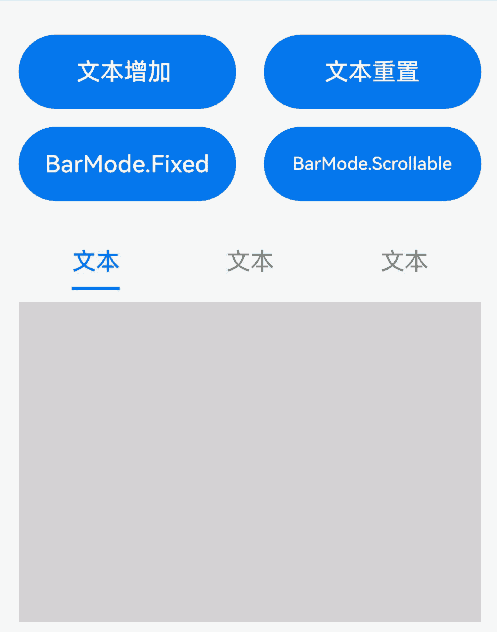
本示例通过barMode分别实现了页签均分布局和以实际长度布局,且展示了当页签布局长度之和超过了TabBar总长度后可滑动的效果。
// xxx.ets
@Entry
@Component
struct TabsExample {
  @State text: string = '文本';
  @State barMode: BarMode = BarMode.Fixed;

  build() {
    Column() {
      Row() {
        Button('文本增加 ')
          .width('47%')
          .height(50)
          .onClick((event?: ClickEvent) => {
            this.text += '文本增加';
          })
          .margin({ right: '6%', bottom: '12vp' })

        Button('文本重置')
          .width('47%')
          .height(50)
          .onClick((event?: ClickEvent) => {
            this.text = '文本';
          })
          .margin({ bottom: '12vp' })
      }

      Row() {
        Button('BarMode.Fixed')
          .width('47%')
          .height(50)
          .onClick((event?: ClickEvent) => {
            this.barMode = BarMode.Fixed;
          })
          .margin({ right: '6%', bottom: '12vp' })

        Button('BarMode.Scrollable')
          .width('47%')
          .height(50)
          .onClick((event?: ClickEvent) => {
            this.barMode = BarMode.Scrollable;
          })
          .margin({ bottom: '12vp' })
      }

      Tabs() {
        TabContent() {
          Column().width('100%').height('100%').backgroundColor(Color.Pink)
        }.tabBar(SubTabBarStyle.of(this.text))

        TabContent() {
          Column().width('100%').height('100%').backgroundColor(Color.Green)
        }.tabBar(SubTabBarStyle.of(this.text))

        TabContent() {
          Column().width('100%').height('100%').backgroundColor(Color.Blue)
        }.tabBar(SubTabBarStyle.of(this.text))
      }
      .height('60%')
      .backgroundColor(0xf1f3f5)
      .barMode(this.barMode)
    }
    .width('100%')
    .height(500)
    .padding('24vp')
  }
}
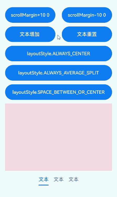
示例2(设置Scrollable模式下的TabBar的布局样式)
本示例实现了barMode的ScrollableBarModeOptions参数,该参数仅在Scrollable模式下有效。
// xxx.ets
@Entry
@Component
struct TabsExample6 {
  private controller: TabsController = new TabsController();
  @State scrollMargin: number = 0;
  @State layoutStyle: LayoutStyle = LayoutStyle.ALWAYS_CENTER;
  @State text: string = '文本';

  build() {
    Column() {
      Row() {
        Button('scrollMargin+10 ' + this.scrollMargin)
          .width('47%')
          .height(50)
          .margin({ top: 5 })
          .onClick((event?: ClickEvent) => {
            this.scrollMargin += 10;
          })
          .margin({ right: '6%', bottom: '12vp' })
        Button('scrollMargin-10 ' + this.scrollMargin)
          .width('47%')
          .height(50)
          .margin({ top: 5 })
          .onClick((event?: ClickEvent) => {
            this.scrollMargin -= 10;
          })
          .margin({ bottom: '12vp' })
      }

      Row() {
        Button('文本增加 ')
          .width('47%')
          .height(50)
          .margin({ top: 5 })
          .onClick((event?: ClickEvent) => {
            this.text += '文本增加';
          })
          .margin({ right: '6%', bottom: '12vp' })
        Button('文本重置')
          .width('47%')
          .height(50)
          .margin({ top: 5 })
          .onClick((event?: ClickEvent) => {
            this.text = '文本';
          })
          .margin({ bottom: '12vp' })
      }

      Row() {
        Button('layoutStyle.ALWAYS_CENTER')
          .width('100%')
          .height(50)
          .margin({ top: 5 })
          .fontSize(15)
          .onClick((event?: ClickEvent) => {
            this.layoutStyle = LayoutStyle.ALWAYS_CENTER;
          })
          .margin({ bottom: '12vp' })
      }

      Row() {
        Button('layoutStyle.ALWAYS_AVERAGE_SPLIT')
          .width('100%')
          .height(50)
          .margin({ top: 5 })
          .fontSize(15)
          .onClick((event?: ClickEvent) => {
            this.layoutStyle = LayoutStyle.ALWAYS_AVERAGE_SPLIT;
          })
          .margin({ bottom: '12vp' })
      }

      Row() {
        Button('layoutStyle.SPACE_BETWEEN_OR_CENTER')
          .width('100%')
          .height(50)
          .margin({ top: 5 })
          .fontSize(15)
          .onClick((event?: ClickEvent) => {
            this.layoutStyle = LayoutStyle.SPACE_BETWEEN_OR_CENTER;
          })
          .margin({ bottom: '12vp' })
      }

      Tabs({ barPosition: BarPosition.End, controller: this.controller }) {
        TabContent() {
          Column().width('100%').height('100%').backgroundColor(Color.Pink)
        }.tabBar(SubTabBarStyle.of(this.text))

        TabContent() {
          Column().width('100%').height('100%').backgroundColor(Color.Green)
        }.tabBar(SubTabBarStyle.of(this.text))

        TabContent() {
          Column().width('100%').height('100%').backgroundColor(Color.Blue)
        }.tabBar(SubTabBarStyle.of(this.text))
      }
      .animationDuration(300)
      .height('60%')
      .backgroundColor(0xf1f3f5)
      .barMode(BarMode.Scrollable, { margin: this.scrollMargin, nonScrollableLayoutStyle: this.layoutStyle })
    }
    .width('100%')
    .height(500)
    .margin({ top: 5 })
    .padding('24vp')
  }
}
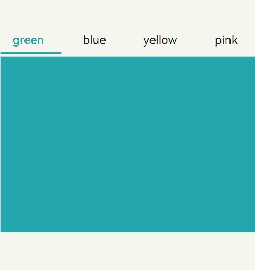
示例3(自定义页签切换联动)
本示例通过onAnimationStart、onChange实现切换时自定义tabBar和TabContent的联动。
// xxx.ets
@Entry
@Component
struct TabsExample {
  @State fontColor: string = '#182431';
  @State selectedFontColor: string = '#007DFF';
  @State currentIndex: number = 0;
  @State selectedIndex: number = 0;
  private controller: TabsController = new TabsController();

  @Builder tabBuilder(index: number, name: string) {
    Column() {
      Text(name)
        .fontColor(this.selectedIndex === index ? this.selectedFontColor : this.fontColor)
        .fontSize(16)
        .fontWeight(this.selectedIndex === index ? 500 : 400)
        .lineHeight(22)
        .margin({ top: 17, bottom: 7 })
      Divider()
        .strokeWidth(2)
        .color('#007DFF')
        .opacity(this.selectedIndex === index ? 1 : 0)
    }.width('100%')
  }

  build() {
    Column() {
      Tabs({ barPosition: BarPosition.Start, index: this.currentIndex, controller: this.controller }) {
        TabContent() {
          Column().width('100%').height('100%').backgroundColor('#00CB87')
        }.tabBar(this.tabBuilder(0, 'green'))

        TabContent() {
          Column().width('100%').height('100%').backgroundColor('#007DFF')
        }.tabBar(this.tabBuilder(1, 'blue'))

        TabContent() {
          Column().width('100%').height('100%').backgroundColor('#FFBF00')
        }.tabBar(this.tabBuilder(2, 'yellow'))

        TabContent() {
          Column().width('100%').height('100%').backgroundColor('#E67C92')
        }.tabBar(this.tabBuilder(3, 'pink'))
      }
      .vertical(false)
      .barMode(BarMode.Fixed)
      .barWidth(360)
      .barHeight(56)
      .animationDuration(400)
      .onChange((index: number) => {
        // currentIndex控制TabContent显示页签
        this.currentIndex = index;
        this.selectedIndex = index;
      })
      .onAnimationStart((index: number, targetIndex: number, event: TabsAnimationEvent) => {
        if (index === targetIndex) {
          return;
        }
        // selectedIndex控制自定义TabBar内Image和Text颜色切换
        this.selectedIndex = targetIndex;
      })
      .width(360)
      .height(296)
      .margin({ top: 52 })
      .backgroundColor('#F1F3F5')
    }.width('100%')
  }
}
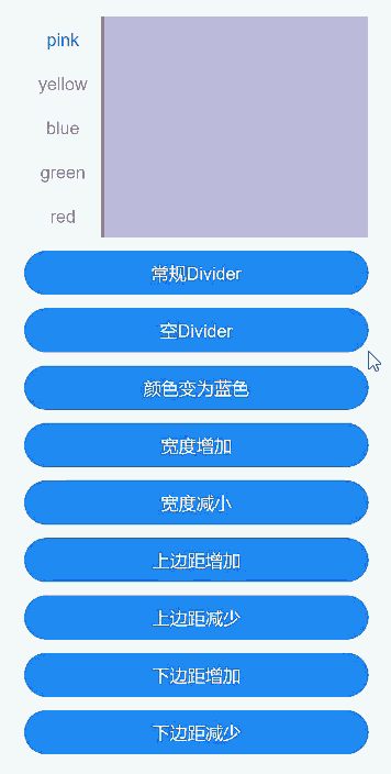
示例4(分割线基本属性)
本示例通过divider实现了分割线各种属性的展示。
// xxx.ets
@Entry
@Component
struct TabsDivider1 {
  private controller1: TabsController = new TabsController();
  @State dividerColor: string = 'red';
  @State strokeWidth: number = 2;
  @State startMargin: number = 0;
  @State endMargin: number = 0;
  @State nullFlag: boolean = false;

  build() {
    Column() {
      Tabs({ controller: this.controller1 }) {
        TabContent() {
          Column().width('100%').height('100%').backgroundColor(Color.Pink)
        }.tabBar('pink')

        TabContent() {
          Column().width('100%').height('100%').backgroundColor(Color.Yellow)
        }.tabBar('yellow')

        TabContent() {
          Column().width('100%').height('100%').backgroundColor(Color.Blue)
        }.tabBar('blue')

        TabContent() {
          Column().width('100%').height('100%').backgroundColor(Color.Green)
        }.tabBar('green')

        TabContent() {
          Column().width('100%').height('100%').backgroundColor(Color.Red)
        }.tabBar('red')
      }
      .vertical(true)
      .scrollable(true)
      .barMode(BarMode.Fixed)
      .barWidth(70)
      .barHeight(200)
      .animationDuration(400)
      .onChange((index: number) => {
        console.info(index.toString());
      })
      .height('200vp')
      .margin({ bottom: '12vp' })
      .divider(this.nullFlag ? null : {
        strokeWidth: this.strokeWidth,
        color: this.dividerColor,
        startMargin: this.startMargin,
        endMargin: this.endMargin
      })

      Button('常规Divider').width('100%').margin({ bottom: '12vp' })
        .onClick(() => {
          this.nullFlag = false;
          this.strokeWidth = 2;
          this.dividerColor = 'red';
          this.startMargin = 0;
          this.endMargin = 0;
        })
      Button('空Divider').width('100%').margin({ bottom: '12vp' })
        .onClick(() => {
          this.nullFlag = true;
        })
      Button('颜色变为蓝色').width('100%').margin({ bottom: '12vp' })
        .onClick(() => {
          this.dividerColor = 'blue';
        })
      Button('宽度增加').width('100%').margin({ bottom: '12vp' })
        .onClick(() => {
          this.strokeWidth += 2;
        })
      Button('宽度减小').width('100%').margin({ bottom: '12vp' })
        .onClick(() => {
          if (this.strokeWidth > 2) {
            this.strokeWidth -= 2;
          }
        })
      Button('上边距增加').width('100%').margin({ bottom: '12vp' })
        .onClick(() => {
          this.startMargin += 2;
        })
      Button('上边距减少').width('100%').margin({ bottom: '12vp' })
        .onClick(() => {
          if (this.startMargin > 2) {
            this.startMargin -= 2;
          }
        })
      Button('下边距增加').width('100%').margin({ bottom: '12vp' })
        .onClick(() => {
          this.endMargin += 2;
        })
      Button('下边距减少').width('100%').margin({ bottom: '12vp' })
        .onClick(() => {
          if (this.endMargin > 2) {
            this.endMargin -= 2;
          }
        })
    }.padding({ top: '24vp', left: '24vp', right: '24vp' })
  }
}
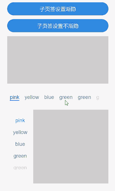
示例5(设置TabBar渐隐)
本示例通过fadingEdge实现了切换子页签渐隐和不渐隐。
// xxx.ets
@Entry
@Component
struct TabsOpaque {
  @State message: string = 'Hello World';
  private controller: TabsController = new TabsController();
  private controller1: TabsController = new TabsController();
  @State selfFadingFade: boolean = true;

  build() {
    Column() {
      Button('子页签设置渐隐').width('100%').margin({ bottom: '12vp' })
        .onClick((event?: ClickEvent) => {
          this.selfFadingFade = true;
        })
      Button('子页签设置不渐隐').width('100%').margin({ bottom: '12vp' })
        .onClick((event?: ClickEvent) => {
          this.selfFadingFade = false;
        })
      Tabs({ barPosition: BarPosition.End, controller: this.controller }) {
        TabContent() {
          Column().width('100%').height('100%').backgroundColor(Color.Pink)
        }.tabBar('pink')

        TabContent() {
          Column().width('100%').height('100%').backgroundColor(Color.Yellow)
        }.tabBar('yellow')

        TabContent() {
          Column().width('100%').height('100%').backgroundColor(Color.Blue)
        }.tabBar('blue')

        TabContent() {
          Column().width('100%').height('100%').backgroundColor(Color.Green)
        }.tabBar('green')

        TabContent() {
          Column().width('100%').height('100%').backgroundColor(Color.Green)
        }.tabBar('green')

        TabContent() {
          Column().width('100%').height('100%').backgroundColor(Color.Green)
        }.tabBar('green')

        TabContent() {
          Column().width('100%').height('100%').backgroundColor(Color.Green)
        }.tabBar('green')

        TabContent() {
          Column().width('100%').height('100%').backgroundColor(Color.Green)
        }.tabBar('green')
      }
      .vertical(false)
      .scrollable(true)
      .barMode(BarMode.Scrollable)
      .barHeight(80)
      .animationDuration(400)
      .onChange((index: number) => {
        console.info(index.toString());
      })
      .fadingEdge(this.selfFadingFade)
      .height('30%')
      .width('100%')

      Tabs({ barPosition: BarPosition.Start, controller: this.controller1 }) {
        TabContent() {
          Column().width('100%').height('100%').backgroundColor(Color.Pink)
        }.tabBar('pink')

        TabContent() {
          Column().width('100%').height('100%').backgroundColor(Color.Yellow)
        }.tabBar('yellow')

        TabContent() {
          Column().width('100%').height('100%').backgroundColor(Color.Blue)
        }.tabBar('blue')

        TabContent() {
          Column().width('100%').height('100%').backgroundColor(Color.Green)
        }.tabBar('green')

        TabContent() {
          Column().width('100%').height('100%').backgroundColor(Color.Green)
        }.tabBar('green')

        TabContent() {
          Column().width('100%').height('100%').backgroundColor(Color.Green)
        }.tabBar('green')
      }
      .vertical(true)
      .scrollable(true)
      .barMode(BarMode.Scrollable)
      .barHeight(200)
      .barWidth(80)
      .animationDuration(400)
      .onChange((index: number) => {
        console.info(index.toString());
      })
      .fadingEdge(this.selfFadingFade)
      .height('30%')
      .width('100%')
    }
    .padding({ top: '24vp', left: '24vp', right: '24vp' })
  }
}
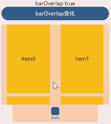
示例6(设置TabBar叠加在TabContent内容上)
本示例通过barOverlap实现了TabBar是否背后变模糊并叠加在TabContent之上。
// xxx.ets
@Entry
@Component
struct barHeightTest {
  @State arr: number[] = [0, 1, 2, 3];
  @State barOverlap: boolean = true;

  build() {
    Column() {
      Text(`barOverlap ${this.barOverlap}`).fontSize(16)
      Button('barOverlap变化').width('100%').margin({ bottom: '12vp' })
        .onClick((event?: ClickEvent) => {
          if (this.barOverlap) {
            this.barOverlap = false;
          } else {
            this.barOverlap = true;
          }
        })

      Tabs({ barPosition: BarPosition.End }) {
        TabContent() {
          Column() {
            List({ space: 10 }) {
              ForEach(this.arr, (item: number) => {
                ListItem() {
                  Text('item' + item).width('80%').height(200).fontSize(16).textAlign(TextAlign.Center).backgroundColor('#fff8b81e')
                }
              }, (item: string) => item)
            }.width('100%').height('100%')
            .lanes(2).alignListItem(ListItemAlign.Center)
          }.width('100%').height('100%')
          .backgroundColor(Color.Pink)
        }
        .tabBar(new BottomTabBarStyle($r('sys.media.ohos_icon_mask_svg'), '测试0'))
      }
      .scrollable(false)
      .height('60%')
      .barOverlap(this.barOverlap)
    }
    .height(500)
    .padding({ top: '24vp', left: '24vp', right: '24vp' })
  }
}
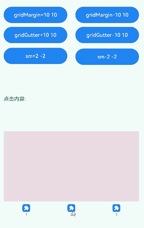
示例7(设置TabBar栅格化可见区域)
本示例通过barGridAlign实现了以栅格化方式设置TabBar的可见区域。
// xxx.ets
@Entry
@Component
struct TabsExample5 {
  private controller: TabsController = new TabsController();
  @State gridMargin: number = 10;
  @State gridGutter: number = 10;
  @State sm: number = -2;
  @State clickedContent: string = '';

  build() {
    Column() {
      Row() {
        Button('gridMargin+10 ' + this.gridMargin)
          .width('47%')
          .height(50)
          .margin({ top: 5 })
          .onClick((event?: ClickEvent) => {
            this.gridMargin += 10;
          })
          .margin({ right: '6%', bottom: '12vp' })
        Button('gridMargin-10 ' + this.gridMargin)
          .width('47%')
          .height(50)
          .margin({ top: 5 })
          .onClick((event?: ClickEvent) => {
            this.gridMargin -= 10;
          })
          .margin({ bottom: '12vp' })
      }

      Row() {
        Button('gridGutter+10 ' + this.gridGutter)
          .width('47%')
          .height(50)
          .margin({ top: 5 })
          .onClick((event?: ClickEvent) => {
            this.gridGutter += 10;
          })
          .margin({ right: '6%', bottom: '12vp' })
        Button('gridGutter-10 ' + this.gridGutter)
          .width('47%')
          .height(50)
          .margin({ top: 5 })
          .onClick((event?: ClickEvent) => {
            this.gridGutter -= 10;
          })
          .margin({ bottom: '12vp' })
      }

      Row() {
        Button('sm+2 ' + this.sm)
          .width('47%')
          .height(50)
          .margin({ top: 5 })
          .onClick((event?: ClickEvent) => {
            this.sm += 2;
          })
          .margin({ right: '6%' })
        Button('sm-2 ' + this.sm).width('47%').height(50).margin({ top: 5 })
          .onClick((event?: ClickEvent) => {
            this.sm -= 2;
          })
      }

      Text('点击内容:' + this.clickedContent).width('100%').height(200).margin({ top: 5 })


      Tabs({ barPosition: BarPosition.End, controller: this.controller }) {
        TabContent() {
          Column().width('100%').height('100%').backgroundColor(Color.Pink)
        }.tabBar(BottomTabBarStyle.of($r('sys.media.ohos_app_icon'), '1'))

        TabContent() {
          Column().width('100%').height('100%').backgroundColor(Color.Green)
        }.tabBar(BottomTabBarStyle.of($r('sys.media.ohos_app_icon'), '2'))

        TabContent() {
          Column().width('100%').height('100%').backgroundColor(Color.Blue)
        }.tabBar(BottomTabBarStyle.of($r('sys.media.ohos_app_icon'), '3'))
      }
      .width('350vp')
      .animationDuration(300)
      .height('60%')
      .barGridAlign({ sm: this.sm, margin: this.gridMargin, gutter: this.gridGutter })
      .backgroundColor(0xf1f3f5)
      .onTabBarClick((index: number) => {
        this.clickedContent += 'now index ' + index + ' is clicked\n';
      })
    }
    .width('100%')
    .height(500)
    .margin({ top: 5 })
    .padding('10vp')
  }
}
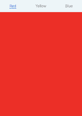
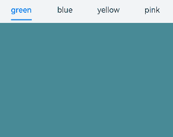
示例8(自定义Tabs页面切换动画)
本示例通过customContentTransition实现了自定义Tabs页面的切换动画。
// xxx.ets
interface itemType {
  text: string,
  backgroundColor: Color
}

@Entry
@Component
struct TabsCustomAnimationExample {
  @State data: itemType[] = [
    {
      text: 'Red',
      backgroundColor: Color.Red
    },
    {
      text: 'Yellow',
      backgroundColor: Color.Yellow
    },
    {
      text: 'Blue',
      backgroundColor: Color.Blue
    }];
  @State opacityList: number[] = [];
  @State scaleList: number[] = [];

  private durationList: number[] = [];
  private timeoutList: number[] = [];
  private customContentTransition: (from: number, to: number) => TabContentAnimatedTransition = (from: number, to: number) => {
    let tabContentAnimatedTransition = {
      timeout: this.timeoutList[from],
      transition: (proxy: TabContentTransitionProxy) => {
        this.scaleList[from] = 1.0;
        this.scaleList[to] = 0.5;
        this.opacityList[from] = 1.0;
        this.opacityList[to] = 0.5;
        this.getUIContext()?.animateTo({
          duration: this.durationList[from],
          onFinish: () => {
            proxy.finishTransition();
          }
        }, () => {
          this.scaleList[from] = 0.5;
          this.scaleList[to] = 1.0;
          this.opacityList[from] = 0.5;
          this.opacityList[to] = 1.0;
        });
      }
    } as TabContentAnimatedTransition;
    return tabContentAnimatedTransition;
  };

  aboutToAppear(): void {
    let duration = 1000;
    let timeout = 1000;
    for (let i = 1; i <= this.data.length; i++) {
      this.opacityList.push(1.0);
      this.scaleList.push(1.0);
      this.durationList.push(duration * i);
      this.timeoutList.push(timeout * i);
    }
  }

  build() {
    Column() {
      Tabs() {
        ForEach(this.data, (item: itemType, index: number) => {
          TabContent() {}
          .tabBar(item.text)
          .backgroundColor(item.backgroundColor)
          // 自定义动画变化透明度、缩放页面等
          .opacity(this.opacityList[index])
          .scale({ x: this.scaleList[index], y: this.scaleList[index] })
        })
      }
      .backgroundColor(0xf1f3f5)
      .width('100%')
      .height(500)
      .customContentTransition(this.customContentTransition)
    }
  }
}
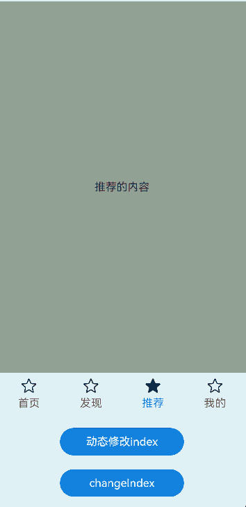
示例9(页面切换拦截)
本示例通过onContentWillChange实现了自定义页面手势滑动切换拦截。
//xxx.ets
@Entry
@Component
struct TabsExample {
  @State selectedIndex: number = 2;
  @State currentIndex: number = 2;
  private controller: TabsController = new TabsController();

  @Builder tabBuilder(title: string,targetIndex: number) {
    Column(){
      Image(this.selectedIndex === targetIndex ? $r('app.media.star_fill') : $r('app.media.star'))
        .width(24)
        .height(24)
        .margin({ bottom: 4 })
        .objectFit(ImageFit.Contain)
      Text(title).fontColor(this.selectedIndex === targetIndex ? '#1698CE' : '#6B6B6B')
    }.width('100%')
    .height(50)
    .justifyContent(FlexAlign.Center)
  }

  build() {
    Column() {
      Tabs({ barPosition: BarPosition.End, index: this.currentIndex, controller: this.controller }) {
        TabContent() {
          Column(){
            Text('首页的内容')
          }.width('100%').height('100%').backgroundColor('#00CB87').justifyContent(FlexAlign.Center)
        }.tabBar(this.tabBuilder('首页',0))

        TabContent() {
          Column(){
            Text('发现的内容')
          }.width('100%').height('100%').backgroundColor('#007DFF').justifyContent(FlexAlign.Center)
        }.tabBar(this.tabBuilder('发现',1))

        TabContent() {
          Column(){
            Text('推荐的内容')
          }.width('100%').height('100%').backgroundColor('#FFBF00').justifyContent(FlexAlign.Center)
        }.tabBar(this.tabBuilder('推荐',2))

        TabContent() {
          Column(){
            Text('我的内容')
          }.width('100%').height('100%').backgroundColor('#E67C92').justifyContent(FlexAlign.Center)
        }.tabBar(this.tabBuilder('我的',3))
      }
      .vertical(false)
      .barMode(BarMode.Fixed)
      .barWidth(360)
      .barHeight(60)
      .animationDuration(0)
      .onChange((index: number) => {
        this.currentIndex = index;
        this.selectedIndex = index;
      })
      .width(360)
      .height(600)
      .backgroundColor('#F1F3F5')
      .scrollable(true)
      .onContentWillChange((currentIndex, comingIndex) => {
        if (comingIndex == 2) {
          return false;
        }
        return true;
      })

      Button('动态修改index').width('50%').margin({ top: 20 })
        .onClick(()=>{
          this.currentIndex = (this.currentIndex + 1) % 4;
        })

      Button('changeIndex').width('50%').margin({ top: 20 })
        .onClick(()=>{
          this.currentIndex = (this.currentIndex + 1) % 4;
          this.controller.changeIndex(this.currentIndex);
        })
    }.width('100%')
  }
}
示例10(自定义TabBar切换动画)
本示例通过onChange、onAnimationStart、onAnimationEnd、onGestureSwipe等接口实现了自定义TabBar的切换动画。
// EntryAbility.ets
import { Configuration, UIAbility } from '@kit.AbilityKit';
import { i18n } from '@kit.LocalizationKit';
import { CommonUtil } from '../common/CommonUtil';

export default class EntryAbility extends UIAbility {
  onConfigurationUpdate(newConfig: Configuration): void {
    // 监听系统配置变化
    if (newConfig.language) {
      CommonUtil.setIsRTL(i18n.isRTL(newConfig.language));
    }
  }
}
// CommonUtil.ets
import { i18n, intl } from '@kit.LocalizationKit';

export class CommonUtil {
  private static isRTL: boolean = i18n.isRTL((new intl.Locale()).language);

  public static setIsRTL(isRTL: boolean): void {
    CommonUtil.isRTL = isRTL;
  }

  public static getIsRTL(): boolean {
    return CommonUtil.isRTL;
  }
}
// xxx.ets
import { LengthMetrics } from '@kit.ArkUI';
import { CommonUtil } from '../common/CommonUtil';
@Entry
@Component
struct TabsExample {
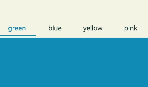
@State colorArray: [string, string][] =
[['green', '#00CB87'], ['blue', '#007DFF'], ['yellow', '#FFBF00'], ['pink', '#E67C92']];
@State currentIndex: number = 0;
@State animationDuration: number = 300;
@State indicatorLeftMargin: number = 0;
@State indicatorWidth: number = 0;
private tabsWidth: number = 0;
private textInfos: [number, number][] = [];
private isStartAnimateTo: boolean = false;
aboutToAppear():void {
for (let i = 0; i < this.colorArray.length; i++) {
this.textInfos.push([0, 0]);
}
}
@Builder
tabBuilder(index: number, name: string) {
Column() {
Text(name)
.fontSize(16)
.fontColor(this.currentIndex === index ? '#007DFF' : '#182431')
.fontWeight(this.currentIndex === index ? 500 : 400)
.id(index.toString())
.onAreaChange((oldValue: Area, newValue: Area) => {
this.textInfos[index] = [newValue.globalPosition.x as number, newValue.width as number];
if (!this.isStartAnimateTo && this.currentIndex === index && this.tabsWidth > 0) {
this.setIndicatorAttr(this.textInfos[this.currentIndex][0], this.textInfos[this.currentIndex][1]);
}
})
}.width('100%')
}
build() {
Stack({ alignContent: Alignment.TopStart }) {
Tabs({ barPosition: BarPosition.Start }) {
ForEach(this.colorArray, (item: [string, string], index:number) => {
TabContent() {
Column().width('100%').height('100%').backgroundColor(item[1])
}.tabBar(this.tabBuilder(index, item[0]))
})
}
.onAreaChange((oldValue: Area, newValue: Area)=> {
this.tabsWidth = newValue.width as number;
if (!this.isStartAnimateTo) {
this.setIndicatorAttr(this.textInfos[this.currentIndex][0], this.textInfos[this.currentIndex][1]);
}
})
.barWidth('100%')
.barHeight(56)
.width('100%')
.height(296)
.backgroundColor('#F1F3F5')
.animationDuration(this.animationDuration)
.onChange((index: number) => {
this.currentIndex = index; // 监听索引index的变化,实现页签内容的切换。
})
.onAnimationStart((index: number, targetIndex: number, event: TabsAnimationEvent) => {
// 切换动画开始时触发该回调。下划线跟着页面一起滑动,同时宽度渐变。
this.currentIndex = targetIndex;
this.startAnimateTo(this.animationDuration, this.textInfos[targetIndex][0], this.textInfos[targetIndex][1]);
})
.onAnimationEnd((index: number, event: TabsAnimationEvent) => {
// 切换动画结束时触发该回调。下划线动画停止。
let currentIndicatorInfo = this.getCurrentIndicatorInfo(index, event);
this.startAnimateTo(0, currentIndicatorInfo.left, currentIndicatorInfo.width);
})
.onGestureSwipe((index: number, event: TabsAnimationEvent) => {
// 在页面跟手滑动过程中,逐帧触发该回调。
let currentIndicatorInfo = this.getCurrentIndicatorInfo(index, event);
this.currentIndex = currentIndicatorInfo.index;
this.setIndicatorAttr(currentIndicatorInfo.left, currentIndicatorInfo.width);
})
Column()
.height(2)
.width(this.indicatorWidth)
.margin({ start: LengthMetrics.vp(this.indicatorLeftMargin), top: LengthMetrics.vp(48) })
.backgroundColor('#007DFF')
}.width('100%')
}
private getCurrentIndicatorInfo(index: number, event: TabsAnimationEvent): Record<string, number> {
let nextIndex = index;
if (index > 0 && (CommonUtil.getIsRTL() ? event.currentOffset < 0 : event.currentOffset > 0)) {
nextIndex--;
} else if (index < this.textInfos.length - 1 &&
(CommonUtil.getIsRTL() ? event.currentOffset > 0 : event.currentOffset < 0)) {
nextIndex++;
}
let indexInfo = this.textInfos[index];
let nextIndexInfo = this.textInfos[nextIndex];
let swipeRatio = Math.abs(event.currentOffset / this.tabsWidth);
let currentIndex = swipeRatio > 0.5 ? nextIndex : index; // 页面滑动超过一半,tabBar切换到下一页。
let currentLeft = indexInfo[0] + (nextIndexInfo[0] - indexInfo[0]) * swipeRatio;
let currentWidth = indexInfo[1] + (nextIndexInfo[1] - indexInfo[1]) * swipeRatio;
return { 'index': currentIndex, 'left': currentLeft, 'width': currentWidth };
}
private startAnimateTo(duration: number, leftMargin: number, width: number) {
this.isStartAnimateTo = true;
this.getUIContext()?.animateTo({
duration: duration, // 动画时长
curve: Curve.Linear, // 动画曲线
iterations: 1, // 播放次数
playMode: PlayMode.Normal, // 动画模式
onFinish: () => {
this.isStartAnimateTo = false;
console.info('play end');
}
}, () => {
this.setIndicatorAttr(leftMargin, width);
});
}
private setIndicatorAttr(leftMargin: number, width: number) {
this.indicatorWidth = width;
if (CommonUtil.getIsRTL()) {
this.indicatorLeftMargin = this.tabsWidth - leftMargin - width;
} else {
this.indicatorLeftMargin = leftMargin;
}
}
}
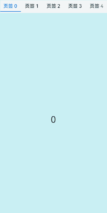
示例11(预加载子节点)
本示例通过preloadItems接口实现了预加载指定子节点。
// xxx.ets
import { BusinessError } from '@kit.BasicServicesKit';

@Entry
@Component
struct TabsPreloadItems {
  @State currentIndex: number = 1;
  private tabsController: TabsController = new TabsController();

  build() {
    Column() {
      Tabs({ index: this.currentIndex, controller: this.tabsController }) {
        TabContent() {
          MyComponent({ color: '#00CB87' })
        }.tabBar(SubTabBarStyle.of('green'))

        TabContent() {
          MyComponent({ color: '#007DFF' })
        }.tabBar(SubTabBarStyle.of('blue'))

        TabContent() {
          MyComponent({ color: '#FFBF00' })
        }.tabBar(SubTabBarStyle.of('yellow'))

        TabContent() {
          MyComponent({ color: '#E67C92' })
        }.tabBar(SubTabBarStyle.of('pink'))
      }
      .width(360)
      .height(296)
      .backgroundColor('#F1F3F5')
      .onChange((index: number) => {
        this.currentIndex = index;
      })

      Button('preload items: [0, 2, 3]')
        .margin(5)
        .onClick(() => {
          // 预加载第0、2、3个子节点,提高滑动或点击切换至这些节点时的性能
          this.tabsController.preloadItems([0, 2, 3])
            .then(() => {
              console.info('preloadItems success.');
            })
            .catch((error: BusinessError) => {
              console.error('preloadItems failed, error code: ' + error.code + ', error message: ' + error.message);
            })
        })
    }
  }
}

@Component
struct MyComponent {
  private color: string = '';

  aboutToAppear(): void {
    console.info('aboutToAppear backgroundColor:' + this.color);
  }

  aboutToDisappear(): void {
    console.info('aboutToDisappear backgroundColor:' + this.color);
  }

  build() {
    Column()
      .width('100%')
      .height('100%')
      .backgroundColor(this.color)
  }
}
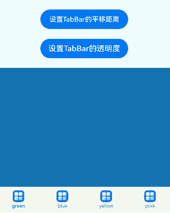
示例12(设置TabBar平移距离和不透明度)
本示例通过setTabBarTranslate、setTabBarOpacity等接口设置了TabBar的平移距离和不透明度。
// xxx.ets
@Entry
@Component
struct TabsExample {
  private controller: TabsController = new TabsController();

  build() {
    Column() {
      Button('设置TabBar的平移距离').margin({ top: 20 })
        .onClick(() => {
          this.controller.setTabBarTranslate({ x: -20, y: -20 });
        })

      Button('设置TabBar的透明度').margin({ top: 20 })
        .onClick(() => {
          this.controller.setTabBarOpacity(0.5);
        })

      Tabs({ barPosition: BarPosition.End, controller: this.controller }) {
        TabContent() {
          Column().width('100%').height('100%').backgroundColor('#00CB87')
        }.tabBar(BottomTabBarStyle.of($r('app.media.startIcon'), 'green'))

        TabContent() {
          Column().width('100%').height('100%').backgroundColor('#007DFF')
        }.tabBar(BottomTabBarStyle.of($r('app.media.startIcon'), 'blue'))

        TabContent() {
          Column().width('100%').height('100%').backgroundColor('#FFBF00')
        }.tabBar(BottomTabBarStyle.of($r('app.media.startIcon'), 'yellow'))

        TabContent() {
          Column().width('100%').height('100%').backgroundColor('#E67C92')
        }.tabBar(BottomTabBarStyle.of($r('app.media.startIcon'), 'pink'))
      }
      .width(360)
      .height(296)
      .margin({ top: 20 })
      .barBackgroundColor('#F1F3F5')
    }
    .width('100%')
  }
}
示例13(页面懒加载和释放)
本示例通过使用自定义TabBar与Swiper配合LazyForEach实现页面懒加载和释放。
// xxx.ets
class MyDataSource implements IDataSource {
  private list: number[] = [];

  constructor(list: number[]) {
    this.list = list;
  }

  totalCount(): number {
    return this.list.length;
  }

  getData(index: number): number {
    return this.list[index];
  }

  registerDataChangeListener(listener: DataChangeListener): void {
  }

  unregisterDataChangeListener() {
  }
}

@Entry
@Component
struct TabsSwiperExample {
  @State fontColor: string = '#182431';
  @State selectedFontColor: string = '#007DFF';
  @State currentIndex: number = 0;
  private list: number[] = [];
  private tabsController: TabsController = new TabsController();
  private swiperController: SwiperController = new SwiperController();
  private swiperData: MyDataSource = new MyDataSource([]);

  aboutToAppear(): void {
    for (let i = 0; i <= 9; i++) {
      this.list.push(i);
    }
    this.swiperData = new MyDataSource(this.list);
  }

  @Builder tabBuilder(index: number, name: string) {
    Column() {
      Text(name)
        .fontColor(this.currentIndex === index ? this.selectedFontColor : this.fontColor)
        .fontSize(16)
        .fontWeight(this.currentIndex === index ? 500 : 400)
        .lineHeight(22)
        .margin({ top: 17, bottom: 7 })
      Divider()
        .strokeWidth(2)
        .color('#007DFF')
        .opacity(this.currentIndex === index ? 1 : 0)
    }.width('20%')
  }

  build() {
    Column() {
      Tabs({ barPosition: BarPosition.Start, controller: this.tabsController }) {
        ForEach(this.list, (item: number) => {
          TabContent().tabBar(this.tabBuilder(item, '页签 ' + this.list[item]))
        })
      }
      .onTabBarClick((index: number) => {
        this.currentIndex = index;
        this.swiperController.changeIndex(index, true);
      })
      .barMode(BarMode.Scrollable)
      .backgroundColor('#F1F3F5')
      .height(56)
      .width('100%')

      Swiper(this.swiperController) {
        LazyForEach(this.swiperData, (item: string) => {
          Text(item.toString())
            .onAppear(()=>{
              console.info('onAppear ' + item.toString());
            })
            .onDisAppear(()=>{
              console.info('onDisAppear ' + item.toString());
            })
            .width('100%')
            .height('100%')
            .backgroundColor(0xAFEEEE)
            .textAlign(TextAlign.Center)
            .fontSize(30)
        }, (item: string) => item)
      }
      .loop(false)
      .onChange((index: number) => {
        this.currentIndex = index;
      })
      .onAnimationStart((index: number, targetIndex: number, extraInfo: SwiperAnimationEvent) => {
        this.currentIndex = targetIndex;
        this.tabsController.changeIndex(targetIndex);
      })
    }
  }
}
示例14(设置翻页动效)
本示例通过设置animationMode属性,实现了翻页的动效。
// xxx.ets
@Entry
@Component
struct TabsExample {
@State currentIndex: number = 0;
@State currentAnimationMode: AnimationMode = AnimationMode.CONTENT_FIRST;
private controller: TabsController = new TabsController();
private data: number[] = [];
aboutToAppear(): void {
for (let i = 0; i < 10; i++) {
this.data.push(i);
}
}
@Builder
tabBuilder(title: string,targetIndex: number) {
Column(){
Text(title).fontColor(this.currentIndex === targetIndex ? '#FF0000' : '#6B6B6B')
}.width('100%')
.height(50)
.justifyContent(FlexAlign.Center)
}
build() {
Column() {
Tabs({ barPosition: BarPosition.End, controller: this.controller, index: this.currentIndex }) {
ForEach(this.data, (item: string) => {
TabContent() {
Column(){
Text('' + item)
}.width('100%').height('100%').backgroundColor('#00CB87').justifyContent(FlexAlign.Center)
}.tabBar(this.tabBuilder('P' + item, parseInt(item)))
}, (item: string) => item)
}
.barWidth(360)
.barHeight(60)
.animationMode(this.currentAnimationMode)
.animationDuration(4000)
.onChange((index: number) => {
this.currentIndex = index;
})
.width(360)
.height(120)
.backgroundColor('#F1F3F5')
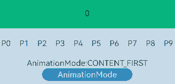
Text('AnimationMode:' + AnimationMode[this.currentAnimationMode])
Button('AnimationMode').width('50%').margin({ top: 1 }).height(25)
.onClick(()=>{
if (this.currentAnimationMode === AnimationMode.CONTENT_FIRST) {
this.currentAnimationMode = AnimationMode.ACTION_FIRST;
} else if (this.currentAnimationMode === AnimationMode.ACTION_FIRST) {
this.currentAnimationMode = AnimationMode.NO_ANIMATION;
} else if (this.currentAnimationMode === AnimationMode.NO_ANIMATION) {
this.currentAnimationMode = AnimationMode.CONTENT_FIRST_WITH_JUMP;
} else if (this.currentAnimationMode === AnimationMode.CONTENT_FIRST_WITH_JUMP) {
this.currentAnimationMode = AnimationMode.ACTION_FIRST_WITH_JUMP;
} else if (this.currentAnimationMode === AnimationMode.ACTION_FIRST_WITH_JUMP) {
this.currentAnimationMode = AnimationMode.CONTENT_FIRST;
}
})
}.width('100%')
}
}
示例15(页签超出TabBar区域显示)
本示例通过使用barModifier设置tabBar的clip属性实现页签超出tabBar区域显示效果。
// xxx.ets
import { CommonModifier } from '@kit.ArkUI';
@Entry
@Component
struct TabsBarModifierExample {
@State selectedIndex: number = 2;
@State currentIndex: number = 2;
@State isClip: boolean = false;
@State tabBarModifier: CommonModifier = new CommonModifier();
private controller: TabsController = new TabsController();
aboutToAppear(): void {
this.tabBarModifier.clip(this.isClip);
}
@Builder
tabBuilder(title: string, targetIndex: number) {
Column() {
Image($r('app.media.startIcon')).width(30).height(30)
Text(title).fontColor(this.selectedIndex === targetIndex ? '#1698CE' : '#6B6B6B')
}.width('100%')
.height(50)
.justifyContent(FlexAlign.Center)
.offset({ y: this.selectedIndex === targetIndex ? -15 : 0 })
}
build() {
Column() {
Tabs({
barPosition: BarPosition.End,
index: this.currentIndex,
controller: this.controller,
barModifier: this.tabBarModifier
}) {
TabContent() {
Column() {
Text('首页的内容')
}.width('100%').height('100%').backgroundColor('#00CB87').justifyContent(FlexAlign.Center)
}.tabBar(this.tabBuilder('首页', 0))
TabContent() {
Column() {
Text('发现的内容')
}.width('100%').height('100%').backgroundColor('#007DFF').justifyContent(FlexAlign.Center)
}.tabBar(this.tabBuilder('发现', 1))
TabContent() {
Column() {
Text('推荐的内容')
}.width('100%').height('100%').backgroundColor('#FFBF00').justifyContent(FlexAlign.Center)
}.tabBar(this.tabBuilder('推荐', 2))
TabContent() {
Column() {
Text('我的内容')
}.width('100%').height('100%').backgroundColor('#E67C92').justifyContent(FlexAlign.Center)
}.tabBar(this.tabBuilder('我的', 3))
}
.vertical(false)
.barMode(BarMode.Fixed)
.barWidth(340)
.barHeight(60)
.onChange((index: number) => {
this.currentIndex = index;
this.selectedIndex = index;
})
.width(340)
.height(400)
.backgroundColor('#F1F3F5')
.scrollable(true)
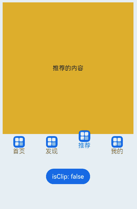
Button('isClip: ' + this.isClip)
.margin({ top: 30 })
.onClick(() => {
this.isClip = !this.isClip;
this.tabBarModifier.clip(this.isClip);
})
}.width('100%')
}
}
示例16(页签对齐布局)
本示例通过使用barModifier设置tabBar的align属性实现页签对齐布局效果。
// xxx.ets
import { CommonModifier } from '@kit.ArkUI';
@Entry
@Component
struct TabsBarModifierExample {
private controller: TabsController = new TabsController();
@State text: string = '文本';
@State isVertical: boolean = false;
@State tabBarModifier: CommonModifier = new CommonModifier();
build() {
Column() {
Row() {
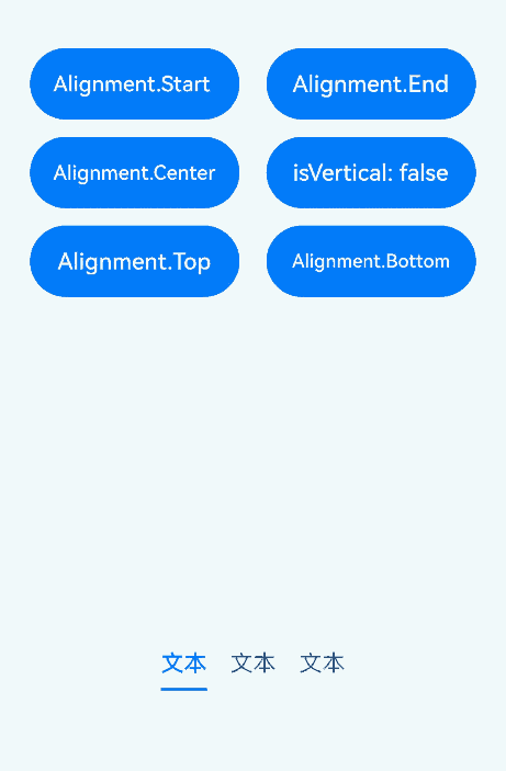
Button('Alignment.Start ')
.width('47%')
.height(50)
.margin({ top: 5 })
.onClick((event?: ClickEvent) => {
this.tabBarModifier.align(Alignment.Start);
})
.margin({ right: '6%', bottom: '12vp' })
Button('Alignment.End')
.width('47%')
.height(50)
.margin({ top: 5 })
.onClick((event?: ClickEvent) => {
this.tabBarModifier.align(Alignment.End);
})
.margin({ bottom: '12vp' })
}
Row() {
Button('Alignment.Center')
.width('47%')
.height(50)
.margin({ top: 5 })
.onClick((event?: ClickEvent) => {
this.tabBarModifier.align(Alignment.Center);
})
.margin({ right: '6%', bottom: '12vp' })
Button('isVertical: ' + this.isVertical)
.width('47%')
.height(50)
.margin({ top: 5 })
.onClick((event?: ClickEvent) => {
this.isVertical = !this.isVertical;
})
.margin({ bottom: '12vp' })
}
Row() {
Button('Alignment.Top')
.width('47%')
.height(50)
.margin({ top: 5 })
.onClick((event?: ClickEvent) => {
this.tabBarModifier.align(Alignment.Top);
})
.margin({ right: '6%', bottom: '12vp' })
Button('Alignment.Bottom')
.width('47%')
.height(50)
.margin({ top: 5 })
.onClick((event?: ClickEvent) => {
this.tabBarModifier.align(Alignment.Bottom);
})
.margin({ bottom: '12vp' })
}
Tabs({ barPosition: BarPosition.End, controller: this.controller, barModifier: this.tabBarModifier }) {
TabContent() {
Column().width('100%').height('100%').backgroundColor(Color.Pink)
}.tabBar(SubTabBarStyle.of(this.text))
TabContent() {
Column().width('100%').height('100%').backgroundColor(Color.Green)
}.tabBar(SubTabBarStyle.of(this.text))
TabContent() {
Column().width('100%').height('100%').backgroundColor(Color.Blue)
}.tabBar(SubTabBarStyle.of(this.text))
}
.vertical(this.isVertical)
.height('60%')
.backgroundColor(0xf1f3f5)
.barMode(BarMode.Scrollable)
}
.width('100%')
.height(500)
.margin({ top: 5 })
.padding('24vp')
}
}
示例17(Tabs与TabBar联动切换)
该示例通过onSelected接口,实现了Tabs与TabBar联动切换。
// xxx.ets
@Entry
@Component
struct TabsExample {
  @State fontColor: string = '#182431';
  @State selectedFontColor: string = '#007DFF';
  @State currentIndex: number = 0;
  @State selectedIndex: number = 0;
  private controller: TabsController = new TabsController();

  @Builder tabBuilder(index: number, name: string) {
    Column() {
      Text(name)
        .fontColor(this.selectedIndex === index ? this.selectedFontColor : this.fontColor)
        .fontSize(16)
        .fontWeight(this.selectedIndex === index ? 500 : 400)
        .lineHeight(22)
        .margin({ top: 17, bottom: 7 })
      Divider()
        .strokeWidth(2)
        .color('#007DFF')
        .opacity(this.selectedIndex === index ? 1 : 0)
    }.width('100%')
  }

  build() {
    Column() {
      Tabs({ barPosition: BarPosition.Start, index: this.currentIndex, controller: this.controller }) {
        TabContent() {
          Column().width('100%').height('100%').backgroundColor('#00CB87')
        }.tabBar(this.tabBuilder(0, 'green'))

        TabContent() {
          Column().width('100%').height('100%').backgroundColor('#007DFF')
        }.tabBar(this.tabBuilder(1, 'blue'))

        TabContent() {
          Column().width('100%').height('100%').backgroundColor('#FFBF00')
        }.tabBar(this.tabBuilder(2, 'yellow'))

        TabContent() {
          Column().width('100%').height('100%').backgroundColor('#E67C92')
        }.tabBar(this.tabBuilder(3, 'pink'))
      }
      .vertical(false)
      .barMode(BarMode.Fixed)
      .barWidth(360)
      .barHeight(56)
      .animationDuration(400)
      .animationMode(AnimationMode.CONTENT_FIRST)
      .onChange((index: number) => {
        console.log('onChange index:' + index);
        this.currentIndex = index;
      })
      .onSelected((index: number) => {
        console.log('onSelected index:' + index);
        this.selectedIndex = index;
      })
      .onUnselected((index: number) => {
        console.log('onUnselected index:' + index);
      })
      .width('100%')
      .height('100%')
      .backgroundColor('#F1F3F5')
    }.width('100%')
  }
}
示例18(释放Tabs子组件)
该示例通过设置cachedMaxCount属性,实现了Tabs子组件的释放。
@Entry
@Component
struct TabsExample {
  build() {
    Tabs() {
      TabContent() {
        MyComponent({ color: '#00CB87' })
      }.tabBar(SubTabBarStyle.of('green'))

      TabContent() {
        MyComponent({ color: '#007DFF' })
      }.tabBar(SubTabBarStyle.of('blue'))

      TabContent() {
        MyComponent({ color: '#FFBF00' })
      }.tabBar(SubTabBarStyle.of('yellow'))

      TabContent() {
        MyComponent({ color: '#E67C92' })
      }.tabBar(SubTabBarStyle.of('pink'))
    }
    .width(360)
    .height(296)
    .backgroundColor('#F1F3F5')
    .cachedMaxCount(1, TabsCacheMode.CACHE_BOTH_SIDE)
  }
}

@Component
struct MyComponent {
  private color: string = '';

  aboutToAppear(): void {
    console.info('aboutToAppear backgroundColor:' + this.color);
  }

  aboutToDisappear(): void {
    console.info('aboutToDisappear backgroundColor:' + this.color);
  }

  build() {
    Column()
      .width('100%')
      .height('100%')
      .backgroundColor(this.color)
  }
}
示例19(设置TabBar背景模糊效果)
该示例分别通过barBackgroundBlurStyle和barBackgroundEffect设置TabsBar页签栏的背景模糊效果。
// xxx.ets
@Entry
@Component
struct TabsExample {
  build() {
    Column() {
      // barBackgroundBlurStyle 可以通过枚举值的方式设置模糊参数
      Stack() {
        Image($r('app.media.startIcon'))
        Tabs() {
          TabContent() {
            Column().width('100%').height('100%').backgroundColor('#00CB87')
          }.tabBar('green')

          TabContent() {
            Column().width('100%').height('100%').backgroundColor('#007DFF')
          }.tabBar('blue')

          TabContent() {
            Column().width('100%').height('100%').backgroundColor('#FFBF00')
          }.tabBar('yellow')

          TabContent() {
            Column().width('100%').height('100%').backgroundColor('#E67C92')
          }.tabBar('pink')
        }
        .barBackgroundBlurStyle(BlurStyle.COMPONENT_THICK,
          { colorMode: ThemeColorMode.LIGHT, adaptiveColor: AdaptiveColor.DEFAULT, scale: 1.0 })
      }
      .width(300)
      .height(300)
      .margin(10)

      // barBackgroundEffect 可以自定义设置tabBar页签栏的模糊半径、亮度、饱和度等参数
      Stack() {
        Image($r('app.media.startIcon'))
        Tabs() {
          TabContent() {
            Column().width('100%').height('100%').backgroundColor('#00CB87')
          }.tabBar('green')

          TabContent() {
            Column().width('100%').height('100%').backgroundColor('#007DFF')
          }.tabBar('blue')

          TabContent() {
            Column().width('100%').height('100%').backgroundColor('#FFBF00')
          }.tabBar('yellow')

          TabContent() {
            Column().width('100%').height('100%').backgroundColor('#E67C92')
          }.tabBar('pink')
        }
        .barBackgroundEffect({ radius: 20, brightness: 0.6, saturation: 15 })
      }
      .width(300)
      .height(300)
      .margin(10)
    }
  }
}
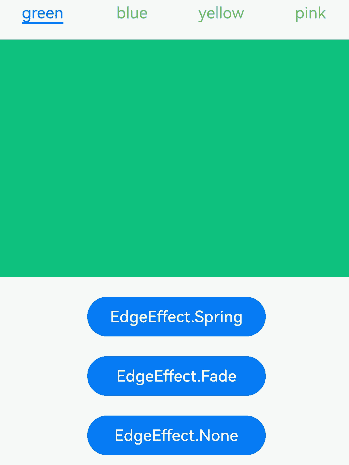
示例20(设置边缘滑动效果)
该示例通过edgeEffect实现不同边缘滑动效果。
// xxx.ets
@Entry
@Component
struct TabsExample {
  @State edgeEffect: EdgeEffect = EdgeEffect.Spring;

  build() {
    Column() {
      Tabs() {
        TabContent() {
          Column().width('100%').height('100%').backgroundColor('#00CB87')
        }.tabBar('green')

        TabContent() {
          Column().width('100%').height('100%').backgroundColor('#007DFF')
        }.tabBar('blue')

        TabContent() {
          Column().width('100%').height('100%').backgroundColor('#FFBF00')
        }.tabBar('yellow')

        TabContent() {
          Column().width('100%').height('100%').backgroundColor('#E67C92')
        }.tabBar('pink')
      }
      .width(360)
      .height(296)
      .margin({ top: 52 })
      .backgroundColor('#F1F3F5')
      .edgeEffect(this.edgeEffect)

      Button('EdgeEffect.Spring').width('50%').margin({ top: 20 })
        .onClick(() => {
          this.edgeEffect = EdgeEffect.Spring;
        })

      Button('EdgeEffect.Fade').width('50%').margin({ top: 20 })
        .onClick(() => {
          this.edgeEffect = EdgeEffect.Fade;
        })

      Button('EdgeEffect.None').width('50%').margin({ top: 20 })
        .onClick(() => {
          this.edgeEffect = EdgeEffect.None;
        })
    }.width('100%')
  }
}
示例21(Tabs设置翻页动画曲线)
该示例展示了如何通过animationCurve接口设置Tabs翻页动画曲线,并结合animationDuration设置翻页动画的时长。
import { curves } from '@kit.ArkUI';

interface TabsItemType { text: string, backgroundColor: ResourceColor }

@Entry
@Component
struct TabsExample {
  private tabsController: TabsController = new TabsController();
  private curves: (Curve|ICurve) [] = [
    curves.interpolatingSpring(-1, 1, 328, 34),
    curves.springCurve(10, 1, 228, 30),
    curves.cubicBezierCurve(0.25, 0.1, 0.25, 1.0),
  ];
  @State curveIndex: number = 0;
  private datas: TabsItemType[] = [
    { text: '1', backgroundColor: '#004AAF' },
    { text: '2', backgroundColor: '#2787D9' },
    { text: '3', backgroundColor: '#D5D5D5' },
    { text: '4', backgroundColor: '#707070' },
    { text: '5', backgroundColor: '#F7F7F7' },
  ];
  @State duration: number = 0;

  build() {
    Column({ space:2 }) {
      Tabs({ controller: this.tabsController }) {
        ForEach(this.datas, (item: TabsItemType, index: number) => {
          TabContent() {}
          .tabBar(item.text)
          .backgroundColor(item.backgroundColor)
        })
      }
      .backgroundColor(0xf1f3f5)
      .width('100%')
      .height(500)
      .animationCurve(this.curves[this.curveIndex])
      .animationDuration(this.duration)
      Row({ space:2 }) {
        Text('Curve:' + this.curveIndex)
        Button('++').onClick(() => { this.curveIndex = (this.curveIndex + 1) % this.curves.length; })
        Button('reset').onClick(() => { this.curveIndex = 0; })
      }
      .margin({ left: '10vp' })
      .width('100%')
      Row({ space:2 }) {
        Text('Duration:' + this.duration)
        Button('+100').onClick(() => { this.duration = (this.duration + 100) % 10000; })
        Button('+1000').onClick(() => { this.duration = (this.duration + 1000) % 10000; })
        Button('reset').onClick(() => { this.duration = 0; })
      }
      .margin({ left: '10vp' })
      .width('100%')
    }
    .margin('10vp')
  }
}
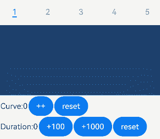
你可能感兴趣的鸿蒙文章
- 所属分类: 后端技术
- 本文标签:
热门推荐
-
2、 优质文章
-
3、 gt
-
7、 openharmony
-
9、 golang
-
10、 Vue中input框自动聚焦