harmony 鸿蒙Line
Line
The Line component is used to draw a straight line.
NOTE
This component is supported since API version 7. Updates will be marked with a superscript to indicate their earliest API version.
Child Components
Not supported
APIs
Line(options?: LineOptions)
Widget capability: This API can be used in ArkTS widgets since API version 9.
Atomic service API: This API can be used in atomic services since API version 11.
System capability: SystemCapability.ArkUI.ArkUI.Full
Parameters
| Name | Type | Mandatory | Description |
|---|---|---|---|
| options | LineOptions | No | Options for drawing a line. |
LineOptions18+
Describes the options for drawing a line.
Widget capability: This API can be used in ArkTS widgets since API version 18.
Atomic service API: This API can be used in atomic services since API version 18.
System capability: SystemCapability.ArkUI.ArkUI.Full
| Name | Type | Mandatory | Description |
|---|---|---|---|
| width | string |number | No | Width. If the value is invalid or the default value is used, the width required for the content is used. Default unit: vp |
| height | string |number | No | Height. If the value is invalid or the default value is used, the width required for the content is used. Default unit: vp |
Attributes
In addition to the universal attributes, the following attributes are supported.
startPoint
startPoint(value: Array<any>)
Sets the coordinates (relative coordinates) of the start point of the line. An invalid value is handled as the default value.
Widget capability: This API can be used in ArkTS widgets since API version 9.
Atomic service API: This API can be used in atomic services since API version 11.
System capability: SystemCapability.ArkUI.ArkUI.Full
Parameters
| Name | Type | Mandatory | Description |
|---|---|---|---|
| value | Array<Length> | Yes | Coordinates (relative coordinates) of the start point of the line, in vp. Default value: [0, 0] |
endPoint
endPoint(value: Array<any>)
Sets the coordinates (relative coordinates) of the end point of the line. An invalid value is handled as the default value.
Widget capability: This API can be used in ArkTS widgets since API version 9.
Atomic service API: This API can be used in atomic services since API version 11.
System capability: SystemCapability.ArkUI.ArkUI.Full
Parameters
| Name | Type | Mandatory | Description |
|---|---|---|---|
| value | Array<Length> | Yes | Coordinates (relative coordinates) of the end point of the line, in vp. Default value: [0, 0] |
fill
fill(value: ResourceColor)
Sets the color of the fill area. This attribute has no effect for the Line component, which cannot be used to draw a closed shape.
Widget capability: This API can be used in ArkTS widgets since API version 9.
Atomic service API: This API can be used in atomic services since API version 11.
System capability: SystemCapability.ArkUI.ArkUI.Full
Parameters
| Name | Type | Mandatory | Description |
|---|---|---|---|
| value | ResourceColor | Yes | Color of the fill area. Default value: Color.Black |
fillOpacity
fillOpacity(value: number|string|Resource)
Sets the opacity of the fill area. This attribute has no effect for the Line component, which cannot be used to draw a closed shape.
Widget capability: This API can be used in ArkTS widgets since API version 9.
Atomic service API: This API can be used in atomic services since API version 11.
System capability: SystemCapability.ArkUI.ArkUI.Full
Parameters
| Name | Type | Mandatory | Description |
|---|---|---|---|
| value | number |string |Resource | Yes | Opacity of the fill area. Default value: 1 |
stroke
stroke(value: ResourceColor)
Sets the stroke color. If this attribute is not set, the component does not have any stroke. If the value is invalid, no stroke will be drawn.
Widget capability: This API can be used in ArkTS widgets since API version 9.
Atomic service API: This API can be used in atomic services since API version 11.
System capability: SystemCapability.ArkUI.ArkUI.Full
Parameters
| Name | Type | Mandatory | Description |
|---|---|---|---|
| value | ResourceColor | Yes | Stroke color. |
strokeDashArray
strokeDashArray(value: Array<any>)
Sets stroke dashes. Line segments may overlap when they intersect. The value must be greater than or equal to 0. Invalid values are treated as the default value.
Widget capability: This API can be used in ArkTS widgets since API version 9.
Atomic service API: This API can be used in atomic services since API version 11.
System capability: SystemCapability.ArkUI.ArkUI.Full
Parameters
| Name | Type | Mandatory | Description |
|---|---|---|---|
| value | Array<Length> | Yes | Stroke dashes. Default value: [] Default unit: vp |
strokeDashOffset
strokeDashOffset(value: number|string)
Sets the offset of the start point for drawing the stroke.
Widget capability: This API can be used in ArkTS widgets since API version 9.
Atomic service API: This API can be used in atomic services since API version 11.
System capability: SystemCapability.ArkUI.ArkUI.Full
Parameters
| Name | Type | Mandatory | Description |
|---|---|---|---|
| value | number |string | Yes | Offset of the start point for drawing the stroke. Default value: 0 Default unit: vp |
strokeLineCap
strokeLineCap(value: LineCapStyle)
Sets the cap style of the stroke.
Widget capability: This API can be used in ArkTS widgets since API version 9.
Atomic service API: This API can be used in atomic services since API version 11.
System capability: SystemCapability.ArkUI.ArkUI.Full
Parameters
| Name | Type | Mandatory | Description |
|---|---|---|---|
| value | LineCapStyle | Yes | Cap style of the stroke. Default value: LineCapStyle.Butt |
strokeLineJoin
strokeLineJoin(value: LineJoinStyle)
Sets the join style of the stroke. This attribute has no effect for the Line component, which does not have corners.
Widget capability: This API can be used in ArkTS widgets since API version 9.
Atomic service API: This API can be used in atomic services since API version 11.
System capability: SystemCapability.ArkUI.ArkUI.Full
Parameters
| Name | Type | Mandatory | Description |
|---|---|---|---|
| value | LineJoinStyle | Yes | Join style of the stroke. Default value: LineJoinStyle.Miter |
strokeMiterLimit
strokeMiterLimit(value: number|string)
Sets the limit value when the sharp angle is drawn as a miter. This attribute has no effect for the Line component, which cannot be used to draw a shape with a sharp angle.
Widget capability: This API can be used in ArkTS widgets since API version 9.
Atomic service API: This API can be used in atomic services since API version 11.
System capability: SystemCapability.ArkUI.ArkUI.Full
Parameters
| Name | Type | Mandatory | Description |
|---|---|---|---|
| value | number |string | Yes | Limit value when the sharp angle is drawn as a miter. Default value: 4 |
strokeOpacity
strokeOpacity(value: number|string|Resource)
Sets the stroke opacity. The value range is [0.0, 1.0]. A value less than 0.0 is treated as 0.0. A value greater than 1.0 is treated as 1.0. Any other value is treated as 1.0.
Widget capability: This API can be used in ArkTS widgets since API version 9.
Atomic service API: This API can be used in atomic services since API version 11.
System capability: SystemCapability.ArkUI.ArkUI.Full
Parameters
| Name | Type | Mandatory | Description |
|---|---|---|---|
| value | number |string |Resource | Yes | Stroke opacity. Default value: 1 |
strokeWidth
strokeWidth(value: Length)
Sets the stroke width. If of the string type, this attribute cannot be set in percentage. A percentage is processed as 1px.
Widget capability: This API can be used in ArkTS widgets since API version 9.
Atomic service API: This API can be used in atomic services since API version 11.
System capability: SystemCapability.ArkUI.ArkUI.Full
Parameters
| Name | Type | Mandatory | Description |
|---|---|---|---|
| value | Length | Yes | Stroke width. The value must be greater than or equal to 0. Default value: 1 Default unit: vp An invalid value is handled as the default value. |
antiAlias
antiAlias(value: boolean)
Specifies whether anti-aliasing is enabled.
Widget capability: This API can be used in ArkTS widgets since API version 9.
Atomic service API: This API can be used in atomic services since API version 11.
System capability: SystemCapability.ArkUI.ArkUI.Full
Parameters
| Name | Type | Mandatory | Description |
|---|---|---|---|
| value | boolean | Yes | Whether anti-aliasing is enabled. true: Anti-aliasing is enabled. false: Anti-aliasing is disabled. Default value: true |
Example
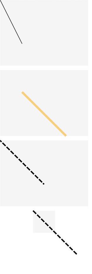
Example 1: Drawing a Line
This example demonstrates how to use startPoint, endPoint, fillOpacity, stroke, strokeDashArray, and strokeDashOffset to set the start point, end point, opacity, stroke color, stroke dashes, and stroke offset of a line.
// xxx.ets
@Entry
@Component
struct LineExample {
  build() {
    Column({ space: 10 }) {
      // The coordinates of the start and end points of the line are determined relative to the coordinates of the drawing area of the <Line> component.
      Line()
        .width(200)
        .height(150)
        .startPoint([0, 0])
        .endPoint([50, 100])
        .stroke(Color.Black)
        .backgroundColor('#F5F5F5')
      Line()
        .width(200)
        .height(150)
        .startPoint([50, 50])
        .endPoint([150, 150])
        .strokeWidth(5)
        .stroke(Color.Orange)
        .strokeOpacity(0.5)
        .backgroundColor('#F5F5F5')
      // strokeDashOffset is used to define the offset when the associated strokeDashArray array is rendered.
      Line()
        .width(200)
        .height(150)
        .startPoint([0, 0])
        .endPoint([100, 100])
        .stroke(Color.Black)
        .strokeWidth(3)
        .strokeDashArray([10, 3])
        .strokeDashOffset(5)
        .backgroundColor('#F5F5F5')
      // If the coordinates of a point are beyond the width and height range of the <Line> component, the line will exceed the drawing area.
      Line()
        .width(50)
        .height(50)
        .startPoint([0, 0])
        .endPoint([100, 100])
        .stroke(Color.Black)
        .strokeWidth(3)
        .strokeDashArray([10, 3])
        .backgroundColor('#F5F5F5')
    }
  }
}
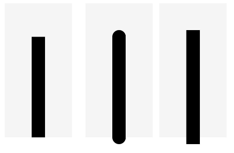
Example 2: Setting the Stroke Cap Style
This example demonstrates how to use strokeLineCap to set the stroke cap style of a line.
// xxx.ets
@Entry
@Component
struct LineExample1 {
  build() {
    Row({ space: 10 }) {
      // Set LineCapStyle to Butt.
      Line()
        .width(100)
        .height(200)
        .startPoint([50, 50])
        .endPoint([50, 200])
        .stroke(Color.Black)
        .strokeWidth(20)
        .strokeLineCap(LineCapStyle.Butt)
        .backgroundColor('#F5F5F5')
        .margin(10)
      // Set LineCapStyle to Round.
      Line()
        .width(100)
        .height(200)
        .startPoint([50, 50])
        .endPoint([50, 200])
        .stroke(Color.Black)
        .strokeWidth(20)
        .strokeLineCap(LineCapStyle.Round)
        .backgroundColor('#F5F5F5')
      // Set LineCapStyle to Square.
      Line()
        .width(100)
        .height(200)
        .startPoint([50, 50])
        .endPoint([50, 200])
        .stroke(Color.Black)
        .strokeWidth(20)
        .strokeLineCap(LineCapStyle.Square)
        .backgroundColor('#F5F5F5')
    }
  }
}
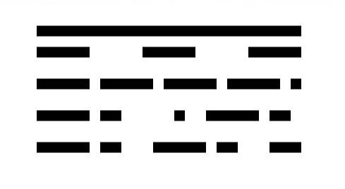
Example 3: Setting the Stroke Dashes
This example demonstrates how to use strokeDashArray to set the stroke dashes of a line.
// xxx.ets
@Entry
@Component
struct LineExample {
  build() {
    Column() {
      Line()
        .width(300)
        .height(30)
        .startPoint([50, 30])
        .endPoint([300, 30])
        .stroke(Color.Black)
        .strokeWidth(10)
      // Set the interval for strokeDashArray to 50.
      Line()
        .width(300)
        .height(30)
        .startPoint([50, 20])
        .endPoint([300, 20])
        .stroke(Color.Black)
        .strokeWidth(10)
        .strokeDashArray([50])
      // Set the interval for strokeDashArray to 50, 10.
      Line()
        .width(300)
        .height(30)
        .startPoint([50, 20])
        .endPoint([300, 20])
        .stroke(Color.Black)
        .strokeWidth(10)
        .strokeDashArray([50, 10])
      // Set the interval for strokeDashArray to 50, 10, 20.
      Line()
        .width(300)
        .height(30)
        .startPoint([50, 20])
        .endPoint([300, 20])
        .stroke(Color.Black)
        .strokeWidth(10)
        .strokeDashArray([50, 10, 20])
      // Set the interval for strokeDashArray to 50, 10, 20, 30.
      Line()
        .width(300)
        .height(30)
        .startPoint([50, 20])
        .endPoint([300, 20])
        .stroke(Color.Black)
        .strokeWidth(10)
        .strokeDashArray([50, 10, 20, 30])
    }
  }
}
你可能感兴趣的鸿蒙文章
- 所属分类: 后端技术
- 本文标签:
热门推荐
-
2、 优质文章
-
3、 gt
-
7、 openharmony
-
9、 golang
-
10、 Vue中input框自动聚焦