harmony 鸿蒙Basic Syntax Overview
Basic Syntax Overview
With a basic understanding of the ArkTS language, let’s look into the basic composition of ArkTS through an example. As shown below, when the user clicks the button, the text content changes from Hello World to Hello ArkUI.
Figure 1 Example effect drawing

In this example, the basic composition of ArkTS is as follows.
Figure 2 Basic composition of ArkTS
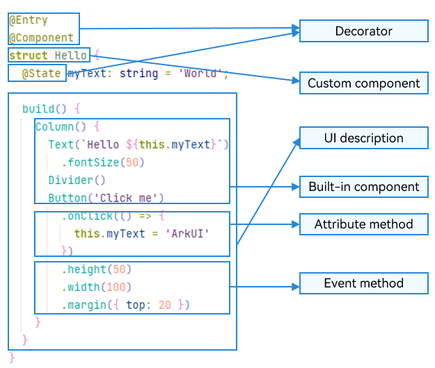
Decorator: design pattern used to decorate classes, structures, methods, and variables to assign special meanings to them. In the preceding sample code, \@Entry, \@Component, and \@State are decorators. \@Component indicates a custom component, \@Entry indicates that the custom component is an entry component, and \@State indicates a state variable in the component, whose change will trigger the UI to re-render.
UI description: declarative description of the UI structure, such as the code block of the build() method.
Custom component: reusable UI unit, which can be combined with other components, such as the struct Hello decorated by @Component.
Built-in component: default basic or container component preset in ArkTS, which can be directly invoked, such as <Column>, <Text>, <Divider>, and <Button> components in the sample code.
Attribute method: method used to configure component attributes, such as fontSize(), width(), height(), and backgroundColor(). You can configure multiple attributes of a component in method chaining mode.
Event method: method used to add the logic for a component to respond to an event. In the sample code, onClick() following Button is an event method. You can configure response logic for multiple events in method chaining mode.
ArkTS extends multiple syntax paradigms to make development a more enjoyable experience.
@Builder/@BuilderParam: special method for encapsulating UI descriptions. It enables UI descriptions to be encapsulated and reused in a fine-grained manner.
@Extend/@Style: decorator that extends built-in components and encapsulates attribute styles to combine built-in components more flexibly.
stateStyles: polymorphic style, which can be set based on the internal state of the component.
你可能感兴趣的鸿蒙文章
harmony 鸿蒙app.json5 Configuration File
harmony 鸿蒙Internal Structure of the app Tag
harmony 鸿蒙Application Configuration File Overview (FA Model)
harmony 鸿蒙Application Configuration File Overview (Stage Model)
harmony 鸿蒙Application Installation and Uninstallation Process
harmony 鸿蒙Application Package Overview
harmony 鸿蒙Application Package Structure in FA Model
- 所属分类: 后端技术
- 本文标签:
热门推荐
-
2、 优质文章
-
3、 gt
-
7、 openharmony
-
9、 golang
-
10、 Vue中input框自动聚焦