harmony 鸿蒙divider
divider
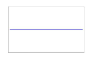
The <Divider> component is used to separate content blocks and content elements. It can be used in a list or for UI layout.
NOTE
The APIs of this module are supported since API version 8. Updates will be marked with a superscript to indicate their earliest API version.
Attributes
In addition to the universal attributes, the following attributes are supported.
| Name | Type | Default Value | Mandatory | Description |
|---|---|---|---|---|
| vertical | boolean | false | No | Whether to use the vertical divider. The default value is false, indicating that the horizontal divider is used. |
Styles
Only the following styles are supported.
| Name | Type | Default Value | Mandatory | Description |
|---|---|---|---|---|
| margin | <length> | 0 | No | Shorthand attribute to set the margin for all sides in a declaration. The attribute can have one to four values. |
| margin-[left|top|right|bottom] | <length> | 0 | No | Shorthand attribute of the length type to set left, top, right, and bottom margins attributes. Its unit is px and default value is 0. |
| color | <color> | - | No | Color of the divider. |
| stroke-width | <length> | 1 | No | Stroke width of the divider. |
| display | string | flex | No | Type of the bounding box generated by the divider. The value can be flex or none. The default value is flex. |
| visibility | string | visible | No | Whether to display the divider. Invisible dividers also occupy space. visible indicates that the divider is displayed, and hidden indicates that the divider is not displayed. |
| line-cap | string | butt | No | Cap style of the divider. The default value is “butt”. Available values are as follows: - “butt”: The ends of the divider are squared off. - “round”: A rounded cap is added to each end of the divider. - “square”: A square cap is added to each end of the divider. If the value is “round” or “square”, the divider length increases by the stroke width. |
| flex | number | - | No | How to divide available space of the parent component for each divider. This is a shorthand attribute to set the flex-grow attribute. This attribute takes effect only when the parent component is <div>, <list-item>, or <tabs>. |
| flex-grow | number | 0 | No | How much the divider will grow. The value specifies allocation of the remaining space on the main axis of the parent component. Size of available space = Container size - Total size of all child components. The value 0 indicates that the child component does not grow. This attribute takes effect only when the parent component is <div>, <list-item>, or <tabs>. |
| flex-shrink | number | 1 | No | How much the divider will shrink. The shrink occurs only when the sum of default element widths is greater than that of the parent component. The value 0 indicates that the divider does not shrink. This attribute takes effect only when the parent component is <div>, <list-item>, or <tabs>. |
| flex-basis | <length> | - | No | Initial length of the divider on the main axis. This attribute takes effect only when the parent component is <div>, <list-item>, or <tabs>. |
Events
Not supported
Example
<!-- xxx.hml -->
<div class="container">
  <div class="content">
    <divider class="divider" vertical="false"></divider>
  </div>
</div>
/* xxx.css */
.container {
  margin: 20px;
  flex-direction:column;
  width:100%;
  height:100%;
  align-items:center;
}
.content{
  width:80%;
  height:40%;
  margin-top:100px;
  border:1px solid #000000;
  align-items: center;
  justify-content: center;
  flex-direction:column;
}
.divider {
  margin: 10px;
  color: #ff0000ff;
  stroke-width: 3px;
  line-cap: round;
}
4 x 4 widget

你可能感兴趣的鸿蒙文章
0
赞
- 所属分类: 后端技术
- 本文标签:
热门推荐
-
2、 - 优质文章
-
3、 gate.io
-
8、 golang
-
9、 openharmony
-
10、 Vue中input框自动聚焦