harmony 鸿蒙ProgressButton
ProgressButton
The ProgressButton component is a download button with a progress indicator that shows the download progress.
NOTE
This component is supported since API version 10. Updates will be marked with a superscript to indicate their earliest API version.
Modules to Import
import { ProgressButton } from '@kit.ArkUI'
Attributes
The universal attributes are not supported.
ProgressButton
ProgressButton({progress: number, content: string, progressButtonWidth?: Length, clickCallback: () => void, enable: boolean, colorOptions?: ProgressButtonColorOptions, progressButtonRadius?: LengthMetrics})
Decorator: @Component
System capability: SystemCapability.ArkUI.ArkUI.Full
| Name | Type | Mandatory | Decorator | Description |
|---|---|---|---|---|
| progress | number | Yes | \@Prop | Current download progress. The value ranges from 0 to 100. Values less than 0 are adjusted to 0, and values greater than 100 are capped at 100. Default value: 0 Atomic service API: This API can be used in atomic services since API version 11. |
| content | string | Yes | \@Prop | Button text. The default value is an empty string. NOTE The text is truncated with an ellipsis (…) if it exceeds the maximum display width of the component. Atomic service API: This API can be used in atomic services since API version 11. |
| progressButtonWidth | Length | No | - | Button width, in vp. The value must be greater than or equal to 44 vp. The default value is 44vp. Values less than the default value and invalid values are adjusted to the default value. Atomic service API: This API can be used in atomic services since API version 11. |
| clickCallback | () => void | Yes | - | Callback invoked when the button is clicked. Atomic service API: This API can be used in atomic services since API version 11. |
| enable | boolean | Yes | \@Prop | Whether the button can be clicked. true: The button can be clicked. false: The button cannot be clicked. Atomic service API: This API can be used in atomic services since API version 11. |
| colorOptions18+ | ProgressButtonColorOptions | No | \@Prop | Color options of the button. Atomic service API: This API can be used in atomic services since API version 18. |
| progressButtonRadius18+ | LengthMetrics | No | \@Prop | Corner radius of the button. It cannot be set in percentage. Value range: [0, height/2] Default value: height/2 If an invalid value is set, the default value is used. Atomic service API: This API can be used in atomic services since API version 18. |
ProgressButtonColorOptions18+
Defines the color options for the download button.
Atomic service API: This API can be used in atomic services since API version 18.
System capability: SystemCapability.ArkUI.ArkUI.Full
| Name | Type | Mandatory | Description |
|---|---|---|---|
| progressColor | ResourceColor | No | Color of the progress indicator. Default value: #330A59F7 |
| borderColor | ResourceColor | No | Border color of the button. Default value: #330A59F7 |
| textColor | ResourceColor | No | Text color of the button. Default value: system default value |
| backgroundColor | ResourceColor | No | Background color of the button. Default value: \$r(‘sys.color.ohos_id_color_foreground_contrary’) |
Events
The universal events are not supported.
Example
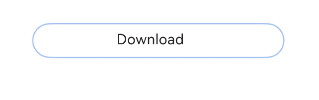
Example 1: Creating a Download Button with a Progress Indicator
This example demonstrates how to create a simple download button with a progress indicator that shows the loading status of a text file.
import { ProgressButton } from '@kit.ArkUI'

@Entry
@Component
struct Index {
  @State progressIndex: number = 0
  @State textState: string = 'Download'
  @State ButtonWidth: number = 200
  @State isRunning: boolean = false
  @State enableState: boolean = true

  build() {
    Column() {
      Scroll() {
        Column({ space: 20 }) {
          ProgressButton({
            progress: this.progressIndex,
            progressButtonWidth: this.ButtonWidth,
            content: this.textState,
            enable: this.enableState,
            clickCallback: () => {
              if (this.textState && !this.isRunning && this.progressIndex < 100) {
                this.textState = 'Continue'
              }
              this.isRunning = !this.isRunning
              let timer = setInterval(() => {
                if (this.isRunning) {
                  if (this.progressIndex === 100) {

                  } else {
                    this.progressIndex++
                    if (this.progressIndex === 100) {
                      this.textState = 'Completed'
                      this.enableState = false
                    }
                  }
                } else {
                  clearInterval(timer)
                }
              }, 20)
            }
          })
        }.alignItems(HorizontalAlign.Center).width('100%').margin({ top: 20 })
      }
    }
  }
}
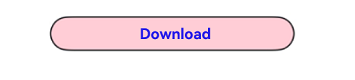
Example 2: Implementing a Download Button with Custom Colors
This example shows how to implement a download button with custom colors.
import { ProgressButton } from '@kit.ArkUI'

@Entry
@Component
struct Index {
  @State progressIndex: number = 0
  @State textState: string = 'Download'
  @State ButtonWidth: number = 200
  @State isRunning: boolean = false
  @State enableState: boolean = true

  build() {
    Column() {
      Scroll() {
        Column({ space: 20 }) {
          ProgressButton({
            // Set the color options of the download button.
            colorOptions: {
              progressColor: Color.Orange,
              borderColor: Color.Black,
              textColor: Color.Blue,
              backgroundColor: Color.Pink
            },
            progress: this.progressIndex,
            progressButtonWidth: this.ButtonWidth,
            content: this.textState,
            enable: this.enableState,
            clickCallback: () => {
              if (this.textState && !this.isRunning && this.progressIndex < 100) {
                this.textState = 'Continue'
              }
              this.isRunning = !this.isRunning
              let timer = setInterval(() => {
                if (this.isRunning) {
                  if (this.progressIndex === 100) {
                  } else {
                    this.progressIndex++
                    if (this.progressIndex === 100) {
                      this.textState = 'Completed'
                      this.enableState = false
                    }
                  }
                } else {
                  clearInterval(timer)
                }
              }, 20)
            }
          })
        }.alignItems(HorizontalAlign.Center).width('100%').margin({ top: 20 })
      }
    }
  }
}
Example 3: Implementing a Download Button with Custom Corner Radius
This example shows how to implement a download button with custom corner radius.
import { ProgressButton, LengthMetrics } from '@kit.ArkUI'

@Entry
@Component
struct Index {
  @State progressIndex: number = 0
  @State textState: string = 'Download'
  @State ButtonWidth: number = 200
  @State isRunning: boolean = false
  @State enableState: boolean = true

  build() {
    Column() {
      Scroll() {
        Column({ space: 20 }) {
          ProgressButton({
            progressButtonRadius: LengthMetrics.vp (8), // Set the custom corner radius to 8 vp.
            progress: this.progressIndex,
            progressButtonWidth: this.ButtonWidth,
            content: this.textState,
            enable: this.enableState,
            clickCallback: () => {
              if (this.textState && !this.isRunning && this.progressIndex < 100) {
                this.textState = 'Continue'
              }
              this.isRunning = !this.isRunning
              let timer = setInterval(() => {
                if (this.isRunning) {
                  if (this.progressIndex === 100) {
                  } else {
                    this.progressIndex++
                    if (this.progressIndex === 100) {
                      this.textState = 'Completed'
                      this.enableState = false
                    }
                  }
                } else {
                  clearInterval(timer)
                }
              }, 20)
            }
          })
        }.alignItems(HorizontalAlign.Center).width('100%').margin({ top: 20 })
      }
    }
  }
}

你可能感兴趣的鸿蒙文章
- 所属分类: 后端技术
- 本文标签:
热门推荐
-
2、 优质文章
-
3、 gt
-
7、 openharmony
-
9、 golang
-
10、 Vue中input框自动聚焦