harmony 鸿蒙ExceptionPrompt
ExceptionPrompt
The exception prompt component is used to show an error message when an error arises.
NOTE
This component is supported since API version 11. Updates will be marked with a superscript to indicate their earliest API version.
Modules to Import
import { ExceptionPrompt, PromptOptions, MarginType } from '@kit.ArkUI'
Child Components
Not supported
Attributes
The universal attributes are not supported.
ExceptionPrompt
ExceptionPrompt({ options: PromptOptions, onTipClick?: ()=>void, onActionTextClick?: ()=>void })
Decorator: @Component
Atomic service API: This API can be used in atomic services since API version 12.
System capability: SystemCapability.ArkUI.ArkUI.Full
Parameters
| Name | Type | Mandatory | Decorator | Description |
|---|---|---|---|---|
| options | PromptOptions | Yes | \@Prop | Exception prompt configuration. |
| onTipClick | ()=>void | No | - | Callback invoked when the prompt text on the left is clicked. |
| onActionTextClick | ()=>void | No | - | Callback invoked when the icon on the right is clicked. |
PromptOptions
Defines the exception prompt options.
Atomic service API: This API can be used in atomic services since API version 12.
System capability: SystemCapability.ArkUI.ArkUI.Full
| Name | Type | Mandatory | Description |
|---|---|---|---|
| icon | ResourceStr | No | Icon style of the exception prompt. |
| symbolStyle18+ | SymbolGlyphModifier | No | Symbol icon style of the exception prompt, which has higher priority than icon. Atomic service API: This API can be used in atomic services since API version 18. |
| tip | ResourceStr | No | Text content of the exception prompt. By default, the following text resources are provided: 1. ohos_network_not_connected: displayed when no Internet connection. 2. ohos_network_connected_unstable: displayed when the Internet connection is unstable. 3. ohos_unstable_connect_server: displayed when the server fails to be connected. 4. ohos_custom_network_tips_left: displayed when an Internet connection is available but the location fails to be obtained. |
| marginType | MarginType | Yes | Margin type of the exception prompt. |
| actionText | ResourceStr | No | Text of the icon on the right of the exception prompt. |
| marginTop | Dimension | Yes | Top margin of the exception prompt. |
| isShown | boolean | No | Whether the exception prompt is displayed. true: The exception prompt is displayed. false: The exception prompt is displayed. |
MarginType
Defines the margin type.
Atomic service API: This API can be used in atomic services since API version 12.
System capability: SystemCapability.ArkUI.ArkUI.Full
| Name | Value | Description |
|---|---|---|
| DEFAULT_MARGIN | 0 | Default margin: Margin 1: referenced from ohos_id_card_margin_start. Margin 2: referenced from ohos_id_card_margin_end. |
| FIT_MARGIN | 1 | Adaptable margin: Margin 1: referenced from ohos_id_max_padding_start. Margin 2: referenced from ohos_id_max_padding_end. |
Events
The universal events are not supported.
Example
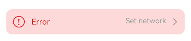
Example 1: Configuring an Exception Prompt
This example demonstrates how to configure an exception prompt, including the exception icon, text, margin, and the text content of the right-side icon button.
import { ExceptionPrompt, PromptOptions, MarginType } from '@kit.ArkUI'

@Entry
@Component
struct Index {
  @State options: PromptOptions = {
    icon: $r('sys.media.ohos_ic_public_fail'),
    tip: 'Error',
    marginType: MarginType.DEFAULT_MARGIN,
    actionText: 'Set network',
    marginTop: 80,
    isShown: true,
  }

  build() {
    Column() {
      ExceptionPrompt({
        options: this.options,
        onTipClick: () => {
          // Handle clicks on the left text to switch to a connected state.
        },
        onActionTextClick: () => {
          // Handle clicks on the Set network button to open the network settings dialog box.
        },
      })
    }
  }
}
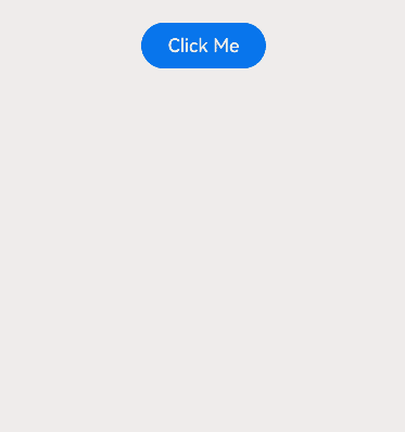
Example 2: Setting a Dialog-Type Exception Prompt
This example uses a custom dialog box to set a dialog-type exception prompt.
import { ExceptionPrompt, PromptOptions, MarginType } from '@kit.ArkUI'

@CustomDialog
struct CustomDialogExample {
  @Link textValue: string;
  @Link inputValue: string;
  @State options: PromptOptions = {
    icon: $r('sys.media.ohos_ic_public_fail'),
    tip: 'Error',
    marginType: MarginType.DEFAULT_MARGIN,
    actionText: 'Settings',
    marginTop: 5,
    isShown: true,
  };
  cancel: () => void = () => {
  };
  confirm: () => void = () => {
  };
  controller?: CustomDialogController;

  // To pass multiple other controllers into a CustomDialog to open another or several other custom dialog boxes within it,
  // place the controller pointing to itself last.
  build() {
    Column() {
      ExceptionPrompt({
        options: this.options,
      })
      TextInput({ placeholder: '', text: this.textValue }).margin({ top: 70 }).height(60).width('90%')
        .onChange((value: string) => {
          this.textValue = value;
        })
      Text('Are you sure you want to change the text?').fontSize(16).margin({ bottom: 10 })
      Flex({ justifyContent: FlexAlign.SpaceAround }) {
        Button('No')
          .onClick(() => {
            this.controller?.close();
            this.cancel();
          }).backgroundColor(0xffffff).fontColor(Color.Black)
        Button('OK')
          .onClick(() => {
            this.inputValue = this.textValue;
            this.controller?.close();
            this.confirm();
          }).backgroundColor(0xffffff).fontColor(Color.Red)
      }.margin({ bottom: 10 })
    }
  }
}

@Entry
@Component
struct Index1 {
  @State ButtonText: string = '';
  @State MAP_HEIGHT: string = '30%';
  @State duration: number = 2500;
  @State tips: string = '';
  @State actionText: string = '';
  controller: TextInputController = new TextInputController();
  cancel: () => void = () => {
  };
  confirm: () => void = () => {
  };
  @State options: PromptOptions = {
    icon: $r('sys.media.ohos_ic_public_fail'),
    tip: '',
    marginType: MarginType.DEFAULT_MARGIN,
    actionText: '',
    marginTop: 80,
    isShown: true,
  }
  @State textValue: string = '';
  @State inputValue: string = 'click me';
  dialogController: CustomDialogController|undefined = new CustomDialogController({
    builder: CustomDialogExample({
      cancel: this.onCancel,
      confirm: this.onAccept,
      textValue: $textValue,
      inputValue: $inputValue,
    }),
    cancel: this.existApp,
    autoCancel: true,
    alignment: DialogAlignment.Bottom,
    offset: { dx: 0, dy: -20 },
    gridCount: 4,
    customStyle: false,
  })

  aboutToDisappear() {
    this.dialogController = undefined; // Set dialogController to undefined.
  }

  onCancel() {
    console.info('Callback when the first button is clicked');
  }

  onAccept() {
    console.info('Callback when the second button is clicked');
  }

  existApp() {
    console.info('Click the callback in the blank area');
  }

  build() {
    Column() {
      Button('Click Me')
        .width('30%')
        .margin({ top: 420 })
        .zIndex(999)
        .onClick(() => {
          if (this.dialogController != undefined) {
            this.dialogController.open();
          }
        })
    }
    .height('100%')
    .width('100%')
  }
}
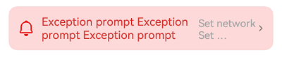
Example 3: Setting the Symbol Icon
This example demonstrates how to use symbolStyle in PromptOptions to set custom symbol icons.
import { ExceptionPrompt, MarginType, SymbolGlyphModifier } from '@kit.ArkUI'

@Entry
@Component
struct Index {
  build() {
    Column() {
      ExceptionPrompt({
        options: {
          icon: $r('sys.symbol.house'),
          tip: 'Exception prompt Exception prompt Exception prompt',
          marginType: MarginType.DEFAULT_MARGIN,
          actionText: 'Set network Set network Set network Set network',
          marginTop: 80,
          isShown: true,
        },
      })
      ExceptionPrompt({
        options: {
          icon: $r('sys.symbol.house'),
          symbolStyle: new SymbolGlyphModifier($r('sys.symbol.bell')).fontColor([Color.Red]),
          tip: 'Exception prompt Exception prompt Exception prompt',
          marginType: MarginType.DEFAULT_MARGIN,
          actionText: 'Set network Set network Set network Set network',
          marginTop: 80,
          isShown: true,
        },
      })
    }
  }
}
你可能感兴趣的鸿蒙文章
- 所属分类: 后端技术
- 本文标签:
热门推荐
-
2、 优质文章
-
3、 gt
-
7、 openharmony
-
9、 golang
-
10、 Vue中input框自动聚焦