harmony 鸿蒙Filter
Filter
The advanced filter component allows users to filter data with multiple criteria combined. It consists of a floating bar and filters therein. The floating bar can be expanded to reveal the filters, which come in a multi-line collapsible or multi-line list style. For added convenience, you can append an additional quick filter.
NOTE
This component is supported since API version 10. Updates will be marked with a superscript to indicate their earliest API version.
Modules to Import
import { Filter } from '@kit.ArkUI'
Child Components
Not supported
Attributes
The universal attributes are not supported.
Filter
Filter({ multiFilters: Array<FilterParams>, additionFilters?: FilterParams, filterType?: FilterType, onFilterChanged: (Array<FilterResult>) => void, container: ()=> void })
Decorator: @Component
Atomic service API: This API can be used in atomic services since API version 11.
System capability: SystemCapability.ArkUI.ArkUI.Full
Parameters
| Name | Type | Mandatory | Decorator | Description |
|---|---|---|---|---|
| multiFilters | Array<FilterParams> | Yes | \@Prop | List of filter criteria. |
| additionFilters | FilterParams | No | \@Prop | Additional quick filter. |
| filterType | FilterType | No | \@Prop | Filter type. |
| onFilterChanged | (filterResults: Array<FilterResult>) => void | Yes | - | Callback invoked when the filter criteria is changed. The input parameter is the list of selected filter criteria. |
| container | ()=>void | Yes | \@BuilderParam | Custom content of the filtering result display area, which is passed in a trailing closure. |
FilterParams
Atomic service API: This API can be used in atomic services since API version 11.
System capability: SystemCapability.ArkUI.ArkUI.Full
| Name | Type | Mandatory | Description |
|---|---|---|---|
| name | ResourceStr | Yes | Name of the filter criterion. The default value is an empty string. NOTE If the text is longer than the column width, it will be truncated. |
| options | Array<ResourceStr> | Yes | Options of the filter criterion. The default value is an empty string. NOTE The text is truncated with an ellipsis (…) if it is too long. |
FilterType
Atomic service API: This API can be used in atomic services since API version 11.
System capability: SystemCapability.ArkUI.ArkUI.Full
| Name | Value | Description |
|---|---|---|
| MULTI_LINE_FILTER | 0 | Multi-line collapsible. |
| LIST_FILTER | 1 | Multi-line list. |
FilterResult
Atomic service API: This API can be used in atomic services since API version 11.
System capability: SystemCapability.ArkUI.ArkUI.Full
| Name | Type | Mandatory | Description |
|---|---|---|---|
| name | ResourceStr | Yes | Name of the filter criterion. The default value is an empty string. NOTE If the text is longer than the column width, it will be truncated. |
| index | number | Yes | Index of the selected option of the filter criterion. Value range: an integer no less than -1 The default value is -1, indicating that there is no selected option. Values less than -1 are treated as no selected option. |
| value | ResourceStr | Yes | Value of the selected option of the filter criterion. The default value is an empty string. NOTE If the text is longer than the column width, it will be truncated. |
Events
The universal events are not supported.
Example
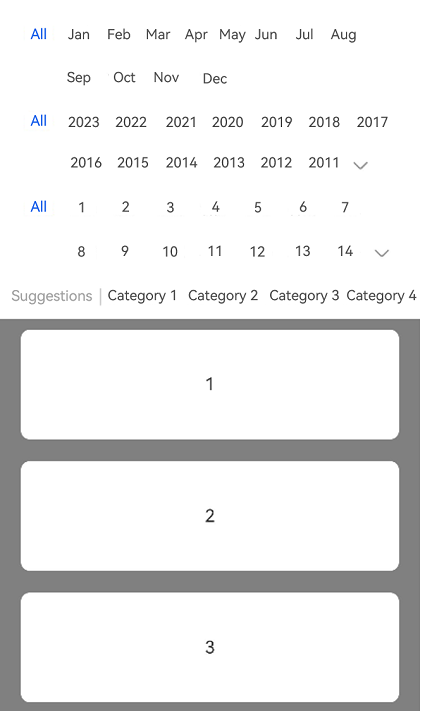
This example shows how to implement a multi-line collapsible filter by setting FilterType to MULTI_LINE_FILTER.
import { Filter, FilterParams, FilterResult, FilterType } from '@kit.ArkUI';

@Entry
@Component
struct Index {
  private filterParam: Array<FilterParams> = [{
    name: 'Month',
    options: ['All', 'Jan', 'Feb', 'Mar', 'Apr', 'May', 'Jun', 'Jul', 'Aug', 'Sep', 'Oct', 'Nov', 'Dec'],
  },
    {
      name: 'Year',
      options: ['All', '2023', '2022', '2021', '2020', '2019', '2018', '2017', '2016', '2015', '2014', '2013', '2012',
        '2011', '2010', '2009', '2008'],
    },
    {
      name: 'Day',
      options: ['All', '1', '2', '3', '4', '5',' 6', '7','8', '9','10', '11', '12',
        '13','14', '15', '16', '17', '18','19','20','21','22', '23'],
    }];
  // Addition filter parameter. The name of the filter dimension must be specified. Otherwise, the entire filter dimension is not displayed.
  private additionParam: FilterParams =
    { name: 'Suggestions', options: ['Category 1', 'Category 2', 'Category 3', 'Category 4', 'Category 5', 'Category 6'] };
  private arr: number[] = [1, 2, 3, 4, 5, 6, 7, 8, 9, 10, 1, 2, 3, 4, 5, 6, 7, 8, 9, 10];

  build() {
    Column() {
      Filter({
        multiFilters: this.filterParam,
        additionFilters: this.additionParam,
        filterType: FilterType.MULTI_LINE_FILTER,
        onFilterChanged: (select: Array<FilterResult>) => {
          console.log('rec filter change');
          for (let filter of select) {
            console.log('name:' + filter.name + ',index:' + filter.index + ',value:' + filter.value);
          }
        }
      }) {
        List({ initialIndex: 0 }) {
          ForEach(this.arr, (item: string, index: number) => {
            ListItem() {
              Text(item.toString())
                .width('100%')
                .height(100)
                .fontSize(16)
                .textAlign(TextAlign.Center)
                .borderRadius(10)
                .backgroundColor(Color.White)
                .margin({ top: 10, bottom: 10 })
            }
          })
        }.backgroundColor(Color.Gray)
        .padding({ left: 20, right: 20 })
      }
    }
    .height('100%')
    .width('100%')
  }
}
你可能感兴趣的鸿蒙文章
- 所属分类: 后端技术
- 本文标签:
热门推荐
-
2、 优质文章
-
3、 gt
-
7、 openharmony
-
9、 golang
-
10、 Vue中input框自动聚焦