harmony 鸿蒙Popup
Popup
You can bind the Popup attribute to a component to create a popup, specifying its content and interaction logic, and display state. It is mainly used for screen recording and message notification.
Popups can be defined with PopupOptions or CustomPopupOptions. In PopupOptions, you can set primaryButton and secondaryButton to include buttons in the popup. In CustomPopupOptions, you can create a custom popup through builder.
You can configure the modality of a popup through mask. Setting mask to true or a color value makes the popup a modal, and setting mask to false makes the popup a non-modal.
Creating a Text Popup
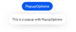
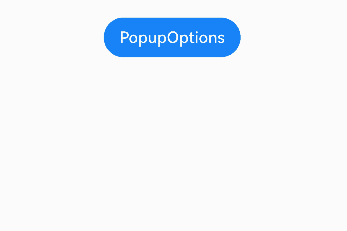
Text popups are usually used to display text only and do not allow for user interactions. Bind the Popup attribute to a component. When the show parameter in the bindPopup attribute is set to true, a popup is displayed.
If you bind the Popup attribute to a <Button> component, each time the <Button> button is clicked, the Boolean value of handlePopup changes. When it changes to true, the popup is displayed.
@Entry
@Component
struct PopupExample {
  @State handlePopup: boolean = false

  build() {
    Column() {
      Button('PopupOptions')
        .onClick(() => {
          this.handlePopup = !this.handlePopup
        })
        .bindPopup(this.handlePopup, {
          message: 'This is a popup with PopupOptions',
        })
    }.width('100%').padding({ top: 5 })
  }
}
Adding an Event Listener for Popup State Changes
You can use the onStateChange parameter to add an event callback for popup state changes, so as to determine the current state of the popup.
@Entry
@Component
struct PopupExample {
  @State handlePopup: boolean = false

  build() {
    Column() {
      Button('PopupOptions')
        .onClick(() => {
          this.handlePopup = !this.handlePopup
        })
        .bindPopup(this.handlePopup, {
          message: 'This is a popup with PopupOptions',
          onStateChange: (e)=> {// Return the current popup state.
            if (!e.isVisible) {
              this.handlePopup = false
            }
          }
        })
    }.width('100%').padding({ top: 5 })
  }
}
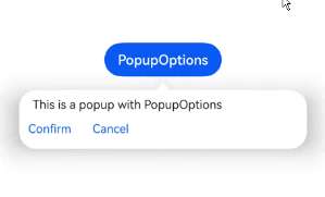
Creating a Popup with Buttons
You can add a maximum of two buttons to a popup through the primaryButton and secondaryButton attributes. For each of the buttons, you can set the action parameter to specify the operation to be triggered.
@Entry
@Component
struct PopupExample22 {
  @State handlePopup: boolean = false

  build() {
    Column() {
      Button('PopupOptions').margin({ top: 200 })
        .onClick(() => {
          this.handlePopup = !this.handlePopup
        })
        .bindPopup(this.handlePopup, {
          message: 'This is a popup with PopupOptions',
          primaryButton: {
            value: 'Confirm',
            action: () => {
              this.handlePopup = !this.handlePopup
              console.info('confirm Button click')
            }
          },
          secondaryButton: {
            value: 'Cancel',
            action: () => {
              this.handlePopup = !this.handlePopup
            }
          },
          onStateChange: (e) => {
            if (!e.isVisible) {
              this.handlePopup = false
            }
          }
        })
    }.width('100%').padding({ top: 5 })
  }
}
Implementing Popup Animation
You implement the entrance and exit animation effects of popups through transition.
// xxx.ets
@Entry
@Component
struct PopupExample {
  @State handlePopup: boolean = false
  @State customPopup: boolean = false

  // Define the popup content in the popup builder.
  @Builder popupBuilder() {
    Row() {
      Text('Custom Popup with transitionEffect').fontSize(10)
    }.height(50).padding(5)
  }

  build() {
    Flex({ direction: FlexDirection.Column }) {
      // PopupOptions for setting the popup
      Button('PopupOptions')
        .onClick(() => {
          this.handlePopup = !this.handlePopup
        })
        .bindPopup(this.handlePopup, {
          message: 'This is a popup with transitionEffect',
          placementOnTop: true,
          showInSubWindow: false,
          onStateChange: (e) => {
            if (!e.isVisible) {
              this.handlePopup = false
            }
          },
          // Set the popup animation to a combination of opacity and translation effects, with no exit animation.
          transition:TransitionEffect.asymmetric(
            TransitionEffect.OPACITY.animation({ duration: 1000, curve: Curve.Ease }).combine(
              TransitionEffect.translate({ x: 50, y: 50 })),
            TransitionEffect.IDENTITY)
        })
        .position({ x: 100, y: 150 })

      // CustomPopupOptions for setting the popup
      Button('CustomPopupOptions')
        .onClick(() => {
          this.customPopup = !this.customPopup
        })
        .bindPopup(this.customPopup, {
          builder: this.popupBuilder,
          placement: Placement.Top,
          showInSubWindow: false,
          onStateChange: (e) => {
            if (!e.isVisible) {
              this.customPopup = false
            }
          },
          // Set the popup entrance and exit animations to be a scaling effect.
          transition:TransitionEffect.scale({ x: 1, y: 0 }).animation({ duration: 500, curve: Curve.Ease })
        })
        .position({ x: 80, y: 300 })
    }.width('100%').padding({ top: 5 })
  }
}
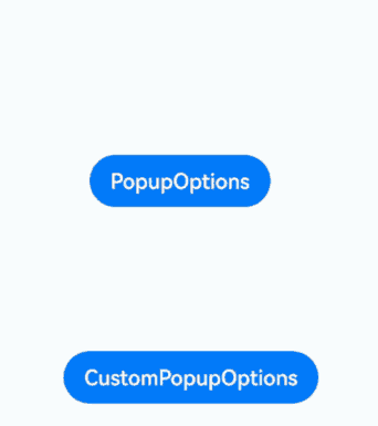
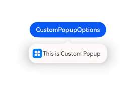
Creating a Custom Popup
You can create a custom popup with builder in CustomPopupOptions, defining custom content in \@Builder. In addition, you can use parameters such as popupColor to control the popup style.
@Entry
@Component
struct Index {
  @State customPopup: boolean = false
  // Define the popup content in the popup builder.
  @Builder popupBuilder() {
    Row({ space: 2 }) {
      Image($r("app.media.icon")).width(24).height(24).margin({ left: 5 })
      Text('This is Custom Popup').fontSize(15)
    }.width(200).height(50).padding(5)
  }
  build() {
    Column() {
      Button('CustomPopupOptions')
        .position({x:100,y:200})
        .onClick(() => {
          this.customPopup = !this.customPopup
        })
        .bindPopup(this.customPopup, {
          builder: this.popupBuilder, // Content of the popup.
          placement:Placement.Bottom, // Position of the popup.
          popupColor:Color.Pink // Background color of the popup.
          onStateChange: (e) => {
            if (!e.isVisible) {
              this.customPopup = false
            }
          }
        })
    }
    .height('100%')
  }
}
To place the popup in a specific position, set the placement parameter. The popup builder triggers a popup message to instruct the user to complete the operation.
Defining the Popup Style
You can define the popup style using both builder-based customization and through specific API configurations.
Background color: While popups initially come with a transparent background, they have a blur effect, which is COMPONENT_ULTRA_THICK on phones. Mask style: Popups come with a default mask that is transparent. Size: The size of a popup is determined by the content within the builder or the length of the message it holds. Position: Popups are located below their host component by default. You can control the display position and alignment using the Placement API. The following example demonstrates how to configure a popup’s style using popupColor, mask, width, and placement.
// xxx.ets

@Entry
@Component
struct PopupExample {
  @State handlePopup: boolean = false

  build() {
    Column({ space: 100 }) {
      Button('PopupOptions')
        .onClick(() => {
          this.handlePopup = !this.handlePopup
        })
        .bindPopup(this.handlePopup, {
          width: 200,
          message: 'This is a popup.',
          popupColor: Color.Red, // Set the background color for the popup.
          mask: {
            color: '#33d9d9d9'
          },
          placement: Placement.Top,
          backgroundBlurStyle: BlurStyle.NONE // Remove the blur effect for the popup.
        })
    }
    .width('100%')
  }
}
你可能感兴趣的鸿蒙文章
harmony 鸿蒙Atomic Service Full Screen Launch Component (FullScreenLaunchComponent)
harmony 鸿蒙Arc Button (ArcButton)
harmony 鸿蒙Frame Animation (ohos.animator)
harmony 鸿蒙Implementing Property Animation
- 所属分类: 后端技术
- 本文标签:
热门推荐
-
2、 优质文章
-
3、 gt
-
7、 openharmony
-
9、 golang
-
10、 Vue中input框自动聚焦