harmony 鸿蒙Universal Attributes
Universal Attributes
NOTE
Universal attributes are supported since API version 4. Updates will be marked with a superscript to indicate their earliest API version.
Common Attributes
Common attributes are used to set component identities and appearance.
| Name | Type | Default Value | Mandatory | Description |
|---|---|---|---|---|
| id | string | - | No | Unique ID of the component. |
| style | string | - | No | Style declaration of the component. |
| class | string | - | No | Style class of the component, which is used to refer to a style table. |
| ref | string | - | No | Reference information of child elements or child components, which is registered with the parent component on $refs. |
| disabled | boolean | false | No | Whether the component is disabled. If it is disabled, it cannot respond to user interaction. |
| data | string | - | No | Attribute set for the component to facilitate data storage and reading. In the JS file: - Use e.target.attr.data to read data in the event callback, where e is the input parameter. - Use $element or $refs to obtain a DOM element, which can then be accessed through attr.data.You are advised to use data-* instead since API version 6. |
| data-*6+ | string | - | No | Attribute set for the component to facilitate data storage and reading. The value is case insensitive. For example, data-A and data-a are the same by default. In the JS file: - Use e.target.dataSet.a to read data in the event callback, where e is the input parameter. - After a DOM element is obtained by using $element or $refs, it can be accessed through dataSet.a. |
| click-effect5+ | string | - | No | Click effect complying with spring physics. Available values are as follows: - spring-small: The component scales down to 90% of its size when it is selected. This is appropriate for small components. - spring-medium: The component scales down to 95% of its size when it is selected. This is appropriate for medium-sized components. - spring-large: The component scales down to 95% of its size when it is selected. This is appropriate for large components. |
| dir6+ | string | auto | No | Element layout mode. Available values are as follows: - rtl: right-to-left layout. - ltr: left-to-right layout. - auto: follows the system language environment. |
Rendering Attributes
Rendering attributes are used to set whether a component is rendered.
| Name | Type | Default Value | Description |
|---|---|---|---|
| for | Array | - | Expands the current element based on the configured data list. |
| if | boolean | - | Whether the element is added or removed. |
| show | boolean | - | Whether the element is displayed or hidden. |
NOTE
Do not set styles in attribute fields.
Example
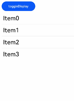
Example 1
<!-- xxx.hml -->
<div id="container">
    <button class="btn" type="capsule" value="toggleDisplay" onclick="toggleDisplay"></button>
	<list class="list">
		<list-item for="{{ array }}" class="listItem">
			<text class="text" onclick="toggleShow" show="{{ visible }}"
                  if="{{ display }}">{{ $item.value }}</text>
		</list-item>
	</list>
</div>
/* xxx.css */
#container {
    flex-direction: column;
    width: 100%;
    margin-top: 10px;
}
.text {
    font-size: 50px;
    font-weight: 500;
    margin-left: 12px;
}
.listItem {
    width: 100%;
    height: 100px;
    line-height: 60px;
    border-bottom: 1px solid #DEDEDE;
    font-size: 20px;
}
.btn{
    width: 280px;
    font-size: 26px;
    margin: 10px 0;
}
// xxx.js
export default {
	data: {
        visible: true,
        display: true,
        title: "",
        i: 4,
        array: [
            {"value": "Item 0"},
            {"value": "Item 1"},
            {"value": "Item 2"},
            {"value": "Item 3"},
        ],
    },
    toggleShow: function() {
        this.array.push ({"value": "Item" + this.i })
        this.i++
    },
    toggleDisplay: function() {
        this.display = !this.display
    },
}
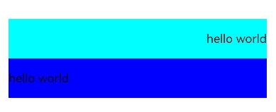
Example 2
<!-- xxx.hml -->
<div class="container">
    <div>
        <text class="text1" dir='rtl' >hello world</text>
    </div>
    <div>
        <text class="text2" dir='ltr' >hello world</text>
    </div>
</div>
/* xxx.css */
.container {
    display: flex;
    flex-direction: column;
    justify-content: center;
    align-items: center;
    width: 100%;
    height: 100%;
}
.text1{
    width: 90%;
    height: 100px;
    background-color: aqua;
}
.text2{
    width: 90%;
    height: 100px;
    background-color: blue;
}
你可能感兴趣的鸿蒙文章
harmony 鸿蒙JavaScript-compatible Web-like Development Paradigm
0
赞
- 所属分类: 后端技术
- 本文标签:
热门推荐
-
2、 优质文章
-
3、 gt
-
7、 openharmony
-
9、 golang
-
10、 Vue中input框自动聚焦