harmony 鸿蒙button
button
NOTE
This component is supported since API version 4. Updates will be marked with a superscript to indicate their earliest API version.
The <button> component includes capsule, circle, text, arc, and download buttons.
Child Components
Not supported
Attributes
In addition to the universal attributes, the following attributes are supported.
| Name | Type | Default Value | Mandatory | Description |
|---|---|---|---|---|
| type | string | - | No | Button type. The value cannot be dynamically updated. By default, a capsule-like button is displayed. Unlike the capsule button, the capsule-like button allows its corners to be configured using border-radius. The options are as follows: - capsule: capsule button with fillets, background color, and text. - circle: circle button that can accommodate icons. - text: text button, which displays only text. - arc: arc button. This value is applicable to wearables only. - download: download button, with an extra download progress bar. |
| value | string | - | No | Text value of the button. |
| icon | string | - | No | Path of the button icon. The supported icon formats are JPG, PNG, and SVG. |
| placement5+ | string | end | No | Position of the button icon in text. This attribute is valid only when type is not set. Available values are as follows: - start: The button icon is at the beginning of the text. - end: The button icon is at the end of the text. - top: The button icon is at the top of the text. - bottom: The button icon is at the bottom of the text. |
| waiting | boolean | false | No | Waiting status. When this attribute is set to true, a loading animation is displayed on the left of the text. This attribute does not work for download buttons. |
Styles
When the Button Type Is Not arc
In addition to the universal styles, the following styles are supported.
| Name | Type | Default Value | Mandatory | Description |
|---|---|---|---|---|
| text-color | <color> | #007dff | No | Text color of the button. |
| font-size | <length> | 16px | No | Font size of the button. |
| allow-scale | boolean | true | No | Whether the font size changes with the system’s font size settings. If the config-changes tag of fontSize is configured for abilities in the config.json file, the setting takes effect without application restart. |
| font-style | string | normal | No | Font style of the button. |
| font-weight | number |string | normal | No | Font weight of the button. For details, see font-weight of the <text> component. |
| font-family | <string> | sans-serif | No | Font family, in which fonts are separated by commas (,). Each font is set using a font name or font family name. The first font in the family or the specified custom font is used for the text. |
| icon-width | <length> | - | No | Width of the internal icon of a circle button. The entire circle button is filled by default. This style must be set when the icon uses the SVG image. |
| icon-height | <length> | - | No | Height of the internal icon of a circle button. The entire circle button is filled by default. This style must be set when the icon uses the SVG image. |
| radius | <length> | - | No | Corner radius of the button. For a circle button, this style takes precedence over width and height in the universal styles. |
When the Button Type Is arc
In addition to the background-color, opacity, display, visibility, position, and [left|top|right|bottom] styles in Universal Styles, the following styles are supported.
| Name | Type | Default Value | Mandatory | Description |
|---|---|---|---|---|
| text-color | <color> | #de0000 | No | Text color of the arc button. |
| font-size | <length> | 37.5px | No | Font size of the arc button. |
| allow-scale | boolean | true | No | Whether the font size changes with the system’s font size settings. |
| font-style | string | normal | No | Font style of the arc button. |
| font-weight | number |string | normal | No | Font weight of the arc button. For details, see font-weight of the <text> component. |
| font-family | <string> | sans-serif | No | Font family, in which fonts are separated by commas (,). Each font is set using a font name or font family name. The first font in the family or the specified custom font is used for the text. |
Events
The universal events are supported.
Methods
The universal methods are supported.
When the button type is download, the following methods are supported.
| Name | Parameters | Description |
|---|---|---|
| setProgress | { progress:percent } | Progress bar of the download button. The value ranges from 0 to 100. The progress bar is displayed if the value is greater than 0. If the value is greater than or equal to 100, the progress bar is not displayed. The text displayed on the progress bar is subject to the value settings. |
Example
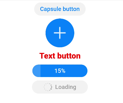
<!-- xxx.hml -->
<div class="div-button">
  <button class="first" type="capsule" value="Capsule button"></button>
  <button class="button circle" type="circle" icon="common/ic_add_default.png"></button>
  <button class="button text" type="text">Text button</button>
  <button class="button download" type="download" id="download-btn"
    onclick="progress">{{downloadText}}</button>
  <button class="last" type="capsule" waiting="true">Loading</button>
</div>
/* xxx.css */
.div-button {
  flex-direction: column;
  align-items: center;
}
.first{
  background-color: #F2F2F2;
  text-color: #0D81F2;
}
.button {
  margin-top: 15px;
}
.last{
  background-color: #F2F2F2;
  text-color: #969696;
  margin-top: 15px;
  width: 280px;
  height:72px;
}
.button:waiting {
  width: 280px;
}
.circle {
  background-color: #007dff;
  radius: 72px;
  icon-width: 72px;
  icon-height: 72px;
}
.text {
  text-color: red;
  font-size: 40px;
  font-weight: 900;
  font-family: sans-serif;
  font-style: normal;
}
.download {
  width: 280px;
  text-color: white;
  background-color: #007dff;
}
// xxx.js
export default {
  data: {
    count: 5,
    downloadText: "Download"
  },
  progress(e) {
    this.count+= 10;
    this.downloadText = this.count+ "%";
    this.$element('download-btn').setProgress({ progress: this.count});
    if (this.count>= 100) {
      this.downloadText = "Done";
    }
  }
}
你可能感兴趣的鸿蒙文章
harmony 鸿蒙JavaScript-compatible Web-like Development Paradigm
- 所属分类: 后端技术
- 本文标签:
热门推荐
-
2、 优质文章
-
3、 gt
-
7、 openharmony
-
9、 golang
-
10、 Vue中input框自动聚焦