harmony 鸿蒙text
text
NOTE
This component is supported since API version 4. Updates will be marked with a superscript to indicate their earliest API version.
The text content must be written in the content area.
The <text> component is used to display a piece of textual information.
Required Permissions
None
Child Components
The <span> child component is supported.
Attributes
The universal attributes are supported.
Styles
In addition to the universal styles, the following styles are supported.
| Name | Type | Default Value | Mandatory | Description |
|---|---|---|---|---|
| color | <color> | #e5000000 | No | Font color. |
| font-size | <length> | 30px | No | Font size. |
| allow-scale | boolean | true | No | Whether the font size changes with the system’s font size settings. For details about how to make the configuration take effect dynamically, see the config-changes attribute in the config.json file. |
| letter-spacing | <length> | 0px | No | Character spacing (px). |
| word-spacing7+ | <length> |<percentage> |string | normal | No | Spacing between texts. If the input is a string, the options are as follows: normal: default spacing. |
| font-style | string | normal | No | Font style. Available values are as follows: - normal: standard font style. - italic: italic font style. |
| font-weight | number |string | normal | No | Font weight. For the number type, the value ranges from 100 to 900. The default value is 400. A larger value indicates a heavier font weight. The value of the number type must be an integer multiple of 100. The value of the string type can be lighter, normal, bold, or bolder. |
| text-decoration | string | none | No | Text decoration. Available values are as follows: - underline: An underline is used. - line-through: A strikethrough is used. - none: The standard text is used. |
| text-decoration-color7+ | <color> | - | No | Color of the text decoration. |
| text-align | string | start |
No | Text alignment mode. Available values are as follows: - left: The text is left-aligned. - center: The text is center-aligned. - right: The text is right-aligned. - start: The text is aligned with the direction in which the text is written. - end: The text is aligned with the opposite direction in which the text is written. If the text width is not specified, the alignment effect may not be obvious when the text width is the same as the width of the parent container. |
| line-height | <length> |<percentage>7+ |string7+ | 0px1-6 normal7+ |
No | Text line height. When this parameter is set to 0px, the text line height is not limited and the font size is adaptive. The value of the string type is as follows: normal7+: default line height |
| text-overflow | string | clip | No | Display mode when the text is too long. This style takes effect when the maximum number of lines is specified. Available values are as follows: - clip: The text is clipped and displayed based on the size of the parent container. - ellipsis: The text is displayed based on the size of the parent container. The text that cannot be displayed is replaced with ellipsis. This style must be used together with max-lines. |
| font-family | string | sans-serif | No | Font family, in which fonts are separated by commas (,). Each font is set using a font name or font family name. The first font in the family or the specified custom font is used for the text. |
| max-lines | number |string7+ | - | No | Maximum number of text lines. The value of the string type is as follows: - auto7+: The number of text lines adapts to the container height. |
| min-font-size | <length> | - | No | Minimum font size in the text. This style must be used together with max-font-size. The font size can be changed dynamically. After the maximum and minimum font sizes are set, font-size does not take effect. |
| max-font-size | <length> | - | No | Maximum font size in the text. This style must be used together with min-font-size. The font size can be changed dynamically. After the maximum and minimum font sizes are set, font-size does not take effect. |
| font-size-step | <length> | 1px | No | Step for dynamically adjusting the font size in the text. The minimum and maximum font sizes must be set. |
| prefer-font-sizes | <array> | - | No | Preset preferred font sizes. For dynamic font size adjustment, the preset sizes are used to match the maximum number of lines in the text. If the preferred font sizes were not set, the font size will be adjusted based on the maximum and minimum font sizes and the step you have set. If the maximum number of lines in the text cannot be met, text-overflow is used to truncate the text. If this parameter is set, font-size, max-font-size, min-font-size, and font-size-step do not take effect. Example: prefer-font-sizes: 12px,14px,16px |
| word-break6+ | string | normal | No | Text line breaking mode. The options are as follows: - normal: Allows text line breaks between words as appropriate to the relevant language writing systems. This is the default mode. - break-all: Allows text line breaks between any characters for writing systems other than Chinese, Japanese, and Korean. - break-word: Works in the same way as break-all, except that it does not break unbreakable words. |
| text-indent7+ | <length> | - | No | Indentation of the first line. |
| white-space7+ | string | pre | No | Mode for processing blanks in the component. The options are as follows: - normal: All spaces, carriage returns, and tabs are combined into one space, and the text is automatically wrapped. - nowrap: All spaces, carriage returns, and tabs are combined into one space, and the text is not wrapped. - pre: All contents are output as-is. - pre-wrap: All contents are output as-is with line breaks. - pre-line: All spaces and tabs are combined into one space, the carriage return remains unchanged, and the text is wrapped. |
| adapt-height7+ | boolean | false | No | Whether the text size adapts to the container height. The settings take effect after font size auto-adaptation is configured. |
NOTE - In dynamic font adjustment, both the preset size set and the minimum/maximum font sizes are used to adjust the font size to display the text within the maximum number of lines. The preset size set is checked from left to right, and the minimum/maximum font sizes are checked from large to small, to find a size meeting the requirement.
Use the escape character \r\n for newline.
The following escape characters are supported: \a, \b, \f, \n, \r, \t, \v, \’, \”, and \0.
When you use <span> as a child component to form a text paragraph, note that if a <span> style is abnormal, the text paragraph cannot be displayed.
The letter-spacing, text-align, line-height, text-overflow, and max-lines styles take effect on text content held by the <text> component and its child components (<span>).
The <text> component cannot contain both the text and the child component <span>. If both of them exist, only the content in <span> is displayed.
Events
The universal events are supported.
Methods
The universal methods are supported.
Example
<!-- xxx.hml -->
<div class="container">
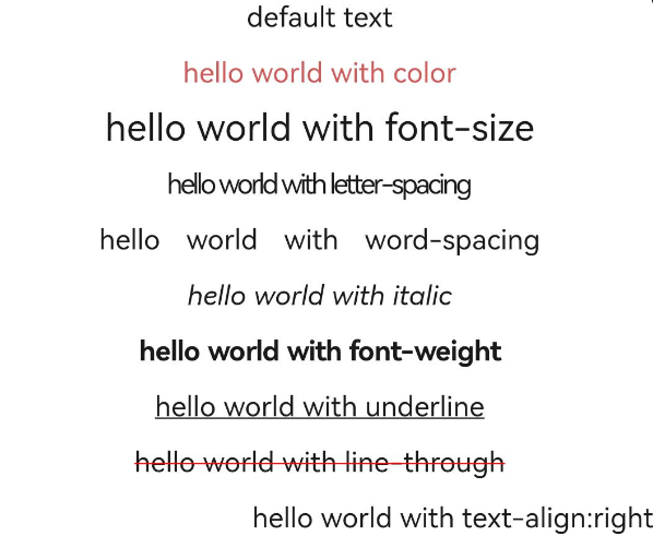
<text class="title">default text</text>
<text class="title textcolor">hello world with color</text>
<text class="title textsize">hello world with font-size</text>
<text class="title textletterspacing">hello world with letter-spacing</text>
<text class="title textwordspacing">hello world with word-spacing</text>
<text class="title textstyle">hello world with italic</text>
<text class="title textweight">hello world with font-weight</text>
<text class="title textdecoration1">hello world with underline</text>
<text class="title textdecoration2">hello world with line-through</text>
<text class="title textalign">hello world with text-align:right</text>
</div>
/* xxx.css */
.container {
    display: flex;
    justify-content: center;
    align-items: center;
    flex-direction: column;
}
.title {
    text-align: center;
    width: 800px;
    height: 60px;
}
.textcolor {
    color: indianred;
}
.textsize {
    font-size: 40px;
}
.textletterspacing {
    letter-spacing: -3px;
}
.textwordspacing {
    word-spacing: 20px;
}
.textstyle {
    font-style: italic;
}
.textweight {
    font-weight: 700;
}
.textdecoration1 {
    text-decoration: underline;
}
.textdecoration2 {
    text-decoration: line-through;
    text-decoration-color: red;
}
.textalign {
    text-align: right;
}
你可能感兴趣的鸿蒙文章
harmony 鸿蒙JavaScript-compatible Web-like Development Paradigm
- 所属分类: 后端技术
- 本文标签:
热门推荐
-
2、 优质文章
-
3、 gt
-
7、 openharmony
-
9、 golang
-
10、 Vue中input框自动聚焦