harmony 鸿蒙switch
switch
NOTE
This component is supported since API version 4. Updates will be marked with a superscript to indicate their earliest API version.
The <switch> component is used to enable or disable a function.
Required Permissions
None
Child Components
Not supported
Attributes
In addition to the universal attributes, the following attributes are supported.
| Name | Type | Default Value | Mandatory | Description |
|---|---|---|---|---|
| checked | boolean | false | No | Whether the component is checked or not. |
| showtext | boolean | false | No | Whether the component displays text. |
| texton | string | “On” | No | Text displayed when the component is checked. |
| textoff | string | “Off” | No | Text displayed when the component is not checked. |
Styles
In addition to the universal styles, the following styles are supported.
| Name | Type | Default Value | Mandatory | Description |
|---|---|---|---|---|
| texton-color | <color> | #000000 | No | Text color displayed when the component is checked. This attribute is available only when texton and textoff are set. |
| textoff-color | <color> | #000000 | No | Text color displayed when the component is not checked. This attribute is available only when texton and textoff are set. |
| text-padding | number | 0px | No | Distance between the two sides of the longest text in texton and textoff and the border of the slider. |
| font-size | <length> | - | No | Font size. This attribute is available only when texton and textoff are set. |
| allow-scale | boolean | true | No | Whether the font size changes with the system’s font size settings. If the config-changes tag of fontSize is configured for abilities in the config.json file, the setting takes effect without application restart. |
| font-style | string | normal | No | Font style. This attribute is available only when texton and textoff are set. For details, see font-style of the <text> component. |
| font-weight | number |string | normal | No | Font weight. This attribute is available only when texton and textoff are set. For details, see font-weight of the <text> component. |
| font-family | string | sans-serif | No | Font family, in which fonts are separated by commas (,). Each font is set using a font name or font family name. The first font in the family or the specified custom font is used for the text. This attribute is available only when texton and textoff are set. |
Events
In addition to the universal events, the following events are supported.
| Name | Parameter | Description |
|---|---|---|
| change | { checked: checkedValue } | Triggered when the checked state changes. |
Methods
The universal methods are supported.
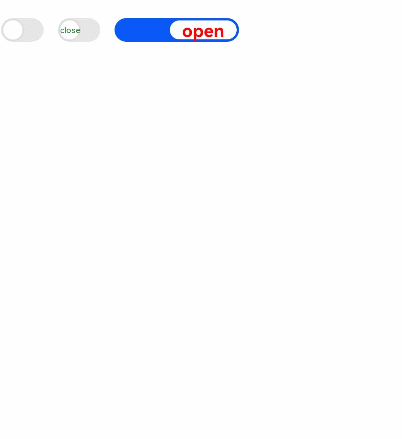
Example
<!-- xxx.hml -->
<div class="container">
    <switch @change="normalswitchChange">
    </switch>
    <switch class="switch" showtext="true" texton="On" textoff="Off" @change="switchChange">
    </switch>
    <switch class="switch text" showtext="true" texton="Switch on" textoff="Switch off" checked="true" @change="switchChange">
    </switch>
</div>
/* xxx.css */
.container {
    display: flex;
    justify-content: center;
    align-items: center;
}
.switch {
    texton-color: red;
    textoff-color: forestgreen;
}
.text {
    text-padding: 20px;
    font-size: 30px;
    font-weight: 700;
}
// xxx.js
import promptAction from '@ohos.promptAction';
export default {
    data: {
        title: 'World'
    },
    switchChange(e) {
        if (e.checked) {
            promptAction.showToast({
                message: "Switch on."
            });
        } else {
            promptAction.showToast({
                message: "Switch off."
            });
        }
    },
    normalswitchChange(e) {
        if (e.checked) {
            promptAction.showToast({
                message: "switch on"
            });
        } else {
            promptAction.showToast({
                message: "switch off"
            });
        }
    }
}
你可能感兴趣的鸿蒙文章
harmony 鸿蒙JavaScript-compatible Web-like Development Paradigm
0
赞
- 所属分类: 后端技术
- 本文标签:
热门推荐
-
2、 优质文章
-
3、 gt
-
7、 openharmony
-
9、 golang
-
10、 Vue中input框自动聚焦