harmony 鸿蒙input
input
NOTE
This component is supported since API version 4. Updates will be marked with a superscript to indicate their earliest API version.
The <input> component provides an interactive interface to receive user input. It can be a radio button, check box, button, single-line text box, and more.
Required Permissions
None
Child Components
Not supported
Attributes
In addition to the universal attributes, the following attributes are supported.
| Name | Type | Default Value | Mandatory | Description |
|---|---|---|---|---|
| type | string | text |
No | Type of the input component. Available values include text, email, date, time, number, password, button, checkbox, and radio. The text, email, date, time, number, and password types can be dynamically switched and modified. The button, checkbox, and radio types cannot be dynamically modified. - button: a button that can be clicked. - checkbox: a check box. - radio: a radio button that allows users to select one from multiple others with the same name. - text: a single-line text field. - email: a field used for an email address. - date: date component, including the year, month, and day, but excluding time. - time: time component, without the time zone. - number: field for entering digits. - password: password field, in which characters will be shielded. |
| checked | boolean | false | No | Whether the <input> component is selected. This attribute is valid only when type is set to checkbox or radio. |
| name | string | - | No | Name of the <input> component. This attribute is mandatory when type is set to radio. |
| value | string | - | No | Value of the <input> component. When type is radio, this attribute is mandatory and the value must be unique for radio buttons with the same name. |
| placeholder | string | - | No | Content of the hint text. This attribute is available only when the component type is set to text |email|date|time|number|password. |
| maxlength | number | - | No | Maximum number of characters that can be entered in the input box. The empty value indicates no limit. |
| enterkeytype | string | default | No | Type of the Enter key on the soft keyboard. The value cannot be dynamically updated. Available values include: - default - next - go - done - send - search Except for the next type, clicking the Enter key hides the soft keyboard. |
| headericon | string | - | No | Icon resource path before text input. This icon does not support click events and is unavailable for button, checkbox, and radio types. The supported icon image formats are JPG, PNG, and SVG. |
| showcounter5+ | boolean | false | No | Whether to display the character counter for an input box. This attribute takes effect only when maxlength is set. |
| menuoptions5+ | Array<MenuOption> | - | No | Menu options displayed after users click the More button. |
| autofocus6+ | boolean | false | No | Whether to automatically obtain focus. This attribute setting does not take effect on the application home page. You can enable a text box on the home page to automatically obtain focus, by delaying the focus method call (for about 100–500 ms) in onActive. |
| selectedstart6+ | number | -1 | No | Start position for text selection. |
| selectedend6+ | number | -1 | No | End position for text selection. |
| softkeyboardenabled6+ | boolean | true | No | Whether to display the soft keyboard during editing. |
| showpasswordicon6+ | boolean | true | No | Whether to display the icon at the end of the password text box. This attribute is available only when type is set to password. |
Table 1 MenuOption5+
| Name | Type | Description |
|---|---|---|
| icon | string | Path of the icon for a menu option. |
| content | string | Text content of a menu option. |
Styles
In addition to the universal styles, the following styles are supported.
| Name | Type | Default Value | Mandatory | Description |
|---|---|---|---|---|
| color | <color> | #e6000000 | No | Font color of the single-line text box or button. |
| font-size | <length> | 16px | No | Font size of the single-line text box or button. |
| allow-scale | boolean | true | No | Whether the font size changes with the system’s font size settings. If the config-changes tag of fontSize is configured for abilities in the config.json file, the setting takes effect without application restart. |
| placeholder-color | <color> | #99000000 | No | Color of the hint text in the single-line text box. This attribute is available only when the component type is set to text, email, date, time, number, or password. |
| font-weight | number |string | normal | No | Font weight of the single-line text box or button. For details, see font-weight of the <text> component. |
| caret-color6+ | <color> | - | No | Color of the caret. |
Events
In addition to the universal events, the following events are supported.
- When type is set to text, email, date, time, number, or password, the following events are supported.
| Name | Parameter | Description |
|---|---|---|
| change | { value: inputValue } |
Triggered when the content entered in the input box changes. The most recent content entered by the user is returned. If you change the value attribute directly, this event will not be triggered. |
| enterkeyclick | { value: enterKey } |
Triggered when the Enter key on the soft keyboard is clicked. The type of the Enter key is returned, which is of the number type. Available values are as follows: - 2: returned if enterkeytype is go. - 3: returned if enterkeytype is search. - 4: returned if enterkeytype is send. - 5: returned if enterkeytype is next. - 6: returned if enterkeytype is default, done, or is not set. |
| translate5+ | { value: selectedText } |
Triggered when users click the translate button in the menu displayed after they select a text segment. The selected text content is returned. |
| share5+ | { value: selectedText } |
Triggered when users click the share button in the menu displayed after they select a text segment. The selected text content is returned. |
| search5+ | { value: selectedText } |
Triggered when users click the search button in the menu displayed after they select a text segment. The selected text content is returned. |
| optionselect5+ | { index: optionIndex, value: selectedText } |
Triggered when users click a menu option in the menu displayed after they select a text segment. This event is valid only when the menuoptions attribute is set. The option index and selected text content are returned. |
| selectchange6+ | { start: number, end: number } |
Triggered when the text selection changes. |
- When type is set to checkbox or radio, the following events are supported.
| Name | Parameter | Description |
|---|---|---|
| change | { checked:true |false } |
Triggered when the checked status of the checkbox or radio button changes. |
Methods
In addition to the universal methods, the following methods are supported.
| Name | Parameter | Description |
|---|---|---|
| focus | { focus: true|false }: If focus is not passed, the default value true is used. |
Obtains or loses focus. When type is set to text, email, date, time, number, or password, the input method can be displayed or collapsed. |
| showError | { error: string } |
Displays the error message. This method is available when type is set to text, email, date, time, number, or password. |
| delete6+ | - | Deletes text based on the current caret position when type is set to text, email, date, time, number, or password; deletes the last character and displays the caret if the current input component does not have a caret. |
Example
- Single-line text box
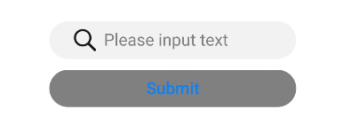
html
<!-- xxx.hml -->
<div class="content">
 <input id="input" class="input" type="text" value="" maxlength="20" enterkeytype="send"
   headericon="/common/search.svg" placeholder="Please input text" onchange="change"
   onenterkeyclick="enterkeyClick">
 </input>
 <input class="button" type="button" value="Submit" onclick="buttonClick" style="color: blue"></input>
</div>
   /* xxx.css */
   .content {
     width: 100%;
     flex-direction: column;
     align-items: center;
   }
   .input {
     width: 60%;
     placeholder-color: gray;
   }
   .button {
     width: 60%;
     background-color: gray;
     margin-top: 20px;
    }
   // xxx.js
   import promptAction from '@ohos.promptAction'
   export default {
     change(e){
       promptAction.showToast({
         message: "value: " + e.value,
         duration: 3000,
       });
     },
     enterkeyClick(e){
       promptAction.showToast({
         message: "enterkey clicked",
         duration: 3000,
       });
     },
     buttonClick(e){
       this.$element("input").showError({
         error: 'error text'
       });
     },
    }
- Common button
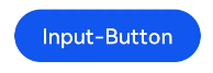
html
<!-- xxx.hml -->
<div class="div-button">
 <input class="button" type="button" value="Input-Button"></input>
</div>
   /* xxx.css */
   .div-button {
     flex-direction: column;
     align-items: center;
   }
   .button {
     margin-top: 30px;
     width: 280px;
   }
- Check box
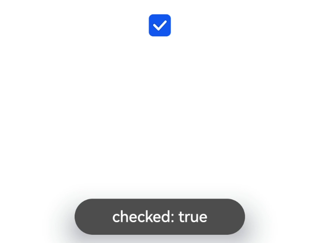
html
<!-- xxx.hml -->
<div class="content">
 <input onchange="checkboxOnChange" checked="true" type="checkbox"></input>
</div>
   /* xxx.css */
   .content{
     width: 100%;
     height: 200px;
     align-items: center;
     justify-content: center;
   }
   // xxx.js
   import promptAction from '@ohos.promptAction'
   export default {
     checkboxOnChange(e) {
       promptAction.showToast({
         message:'checked: ' + e.checked,
         duration: 3000,
       });
     }
   }
- Radio button
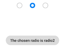
html
<!-- xxx.hml -->
<div class="content">
 <input type="radio" checked='true' name="radioSample" value="radio1" onchange="onRadioChange('radio1')"></input>
 <input type="radio" checked='false' name="radioSample" value="radio2" onchange="onRadioChange('radio2')"></input>
 <input type="radio" checked='false' name="radioSample" value="radio3" onchange="onRadioChange('radio3')"></input>
</div>
   /* xxx.css */
   .content{
     width: 100%;
     height: 200px;
     justify-content: center;
     align-items: center;
   }
   // xxx.js
   import promptAction from '@ohos.promptAction'
   export default {
     onRadioChange(inputValue, e) {
       if (inputValue === e.value) {
         promptAction.showToast({
           message: 'The chosen radio is ' + e.value,
           duration: 3000,
         });
       }
     }
   }
你可能感兴趣的鸿蒙文章
harmony 鸿蒙JavaScript-compatible Web-like Development Paradigm
0
赞
- 所属分类: 后端技术
- 本文标签:
热门推荐
-
2、 优质文章
-
3、 gt
-
7、 openharmony
-
9、 golang
-
10、 Vue中input框自动聚焦