harmony 鸿蒙image
image
NOTE
This component is supported since API version 4. Updates will be marked with a superscript to indicate their earliest API version.
The <image> component is used to render and display images.
Child Components
Not supported
Attributes
In addition to the universal attributes, the following attributes are supported.
| Name | Type | Default Value | Mandatory | Description |
|---|---|---|---|---|
| src | string | - | No | Image path, which supports local paths. The supported image formats include PNG, JPG, BMP, SVG, and GIF. - The Base64 string6+ is supported in the following format: data:image/[png |jpeg |bmp |webp];base64, [base64 data], where [base64 data] is a Base64 string. - The path prefix of dataability:// is supported, which allows access to the image path provided by the Data ability.6+ |
| alt | string | - | No | Alternative information for the image, which is displayed during image loading. |
Styles
In addition to the universal styles, the following styles are supported.
| Name | Type | Default Value | Mandatory | Description |
|---|---|---|---|---|
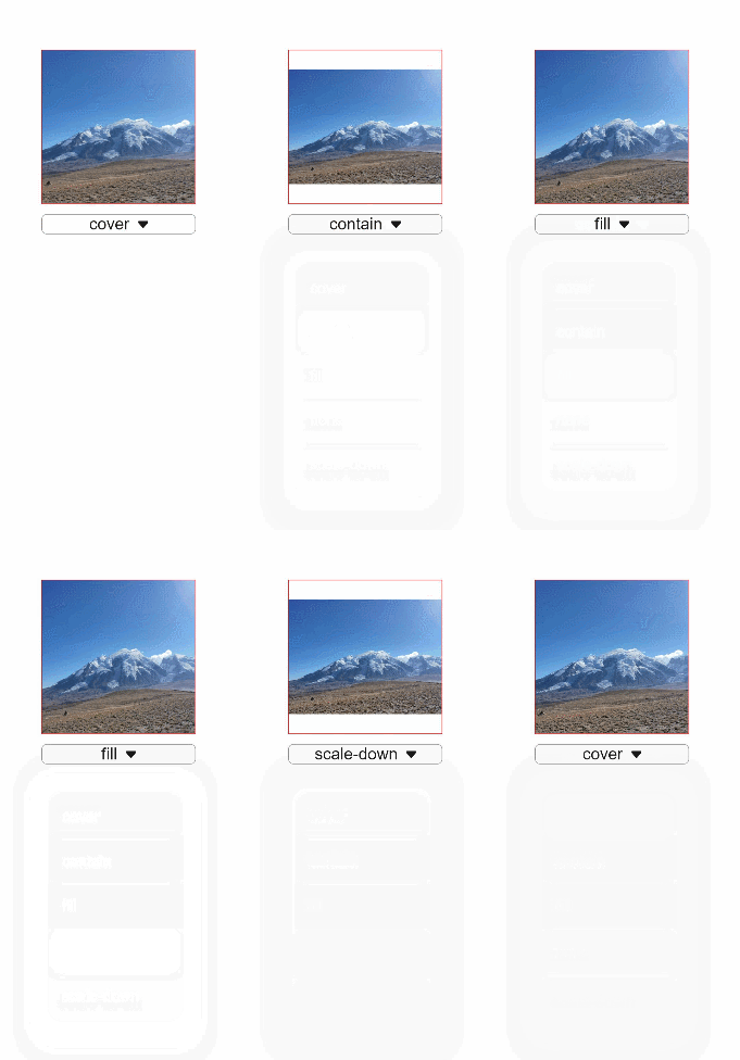
| object-fit | string | cover | No | Image scale type. This style is not supported for SVG images. For details about available values, see object-fit. |
| match-text-direction | boolean | false | No | Whether image orientation changes with the text direction. This style is not supported for SVG images. |
| fit-original-size | boolean | false | No | Whether the <image> component adapts to the image source size when its width and height are not set. If this style is set to true, object-fit will not take effect. This style is not supported for SVG images. |
| object-position7+ | string | 0px 0px | No | Position of the image in the component. The options are as follows: 1. Pixels, in px. For example, 15px 15px indicates the position to move along the x-axis or y-axis. 2. Characters. Optional values are as follows: - left: The image is displayed on the left of the component.< - top: The image is displayed on the top of the component. - right: The image is displayed on the right of the component. - bottom: The image is displayed at the bottom of the component. |
Table 1 object-fit
| Type | Description |
|---|---|
| cover | The image is scaled with its aspect ratio retained for both sides to be greater than or equal to the display boundaries and displayed in the middle. |
| contain | The image is scaled with the aspect ratio retained for the image to be completely displayed within the display boundaries and displayed in the middle. |
| fill | The image is scaled to fill the display area, and its aspect ratio is not retained. |
| none | The image is displayed in the middle with its aspect ratio and size retained. |
| scale-down | The image is displayed in the middle with its aspect ratio retained. The size is equal to or smaller than the original size. |
NOTE
When using an SVG image, note that:
The SVG image will not be drawn if the length or width of the <image> component is infinity.
If the image length and width are not specified in the SVG description, the SVG image fills the <image> component area.
If the image length and width are specified in the SVG description, the following rules are adopted to decide the final display effect:
If the <image> component is too small to afford the SVG image, the SVG image is cropped and only its upper left part is displayed in the component.
If the <image> component is big enough to afford the SVG image, this SVG image is displayed in the upper left corner of the component.
For SVG images, only the following tags are included in the supported list: svg, rect, circle, ellipse, path, line, polyline, polygon, animate, animateMotion, and animateTransform.
Events
In addition to the universal events, the following events are supported.
| Name | Parameter | Description |
|---|---|---|
| complete | { width: width, height: height } |
Triggered when an image is successfully loaded. The loaded image size is returned. |
| error | { width: width, height: height } |
Triggered when an exception occurs during image loading. In this case, the width and height are 0. |
Methods
The universal methods are supported.
Example
<!-- xxx.hml -->
<div class="container">
  <image src="common/images/example.png" style="width: 300px; height: 300px; object-fit:{{fit}}; object-position: center center; border: 1px solid red;">
  </image>
  <select class="selects" onchange="change_fit"><option for="{{fits}}" value="{{$item}}">{{$item}}</option></select>
</div>
/* xxx.css */
.container {
  justify-content: center;
  align-items: center;
  flex-direction: column;
}
.selects{
  margin-top: 20px;
  width:300px;
  border:1px solid #808080;
  border-radius: 10px;
}
// xxx.js
export default {
  data: {
    fit:"cover",
    fits: ["cover", "contain", "fill", "none", "scale-down"],
  },
  change_fit(e) {
    this.fit = e.newValue;
  },
}

你可能感兴趣的鸿蒙文章
harmony 鸿蒙JavaScript-compatible Web-like Development Paradigm
- 所属分类: 后端技术
- 本文标签: