harmony 鸿蒙AtomicServiceNavigation
AtomicServiceNavigation
AtomicServiceNavigation is a component that serves as the root container of a page. By default, it includes a title bar, content area, and toolbar. The content area switches between the home page content (child components of NavDestination) and non-home page content through routing.
NOTE
This component is supported since API version 12. Updates will be marked with a superscript to indicate their earliest API version.
Modules to Import
import { AtomicServiceNavigation } from '@kit.ArkUI';
Child Components
Supported Since API version 10, you are advised to use NavPathStack for page routing.
AtomicServiceNavigation
AtomicServiceNavigation({
    navPathStack?: NavPathStack,
    navigationContent: Callback<void>,
    title?: ResourceStr,
    titleOptions?: TitleOptions,
    gradientBackground?: GradientBackground,
    hideTitleBar?: boolean,
    navBarWidth?: Length,
    mode?: NavigationMode,
    navDestinationBuilder?: NavDestinationBuilder,
    navBarWidthRange?: [Dimension, Dimension],
    minContentWidth?: Dimension,
    sideBarOptions?: sideBarOptions,
    sideBarContent?: Callback<void>,
    menus?:	CustomBuilder|Array<NavigationMenuItem>,
    stateChangeCallback?: Callback<boolean>,
    modeChangeCallback?: Callback<NavigationMode>
})
Atomic service API: This API can be used in atomic services since API version 12.
Decorator: @Component
System capability: SystemCapability.ArkUI.ArkUI.Full
Parameters
| Name | Type | Mandatory | Decorator | Description |
|---|---|---|---|---|
| navPathStack | NavPathStack | No | @State | Information about the navigation stack. |
| navigationContent | Callback<void> | No | @BuilderParam | Content of the navigation container. |
| title | ResourceStr | No | @Prop | Page title. |
| titleOptions | TitleOptions | No | @Prop | Title bar options. |
| gradientBackground18+ | GradientBackground | No | @Prop | Background color options. |
| hideTitleBar | boolean | No | @Prop | Whether to hide the title bar. |
| navBarWidth | Length | No | @Prop | Width of the navigation bar. This attribute takes effect only when the component is split. |
| mode | NavigationMode | No | @Prop | Display mode of the navigation bar. Available options are Stack, Split, and Auto. |
| navDestinationBuilder | NavDestinationBuilder | No | @BuilderParam | Builder data required for creating the NavDestination component. |
| navBarWidthRange | [Dimension, Dimension] | No | @Prop | Minimum and maximum widths of the navigation bar (effective in dual-column mode). |
| minContentWidth | Dimension | No | @Prop | Minimum width of the navigation bar content area (effective in dual-column mode). |
| sideBarOptions18+ | SideBarOptions | No | @Prop | Sidebar options. |
| sideBarContent18+ | Callback<void> | No | @BuilderParam | Content of the sidebar. |
| menus18+ | CustomBuilder |Array<NavigationMenuItem> | No | @BuilderParam | Custom layouts for wide-screen scenarios. The default value is empty, with no styles displayed. |
| stateChangeCallback | Callback<boolean> | No | - | Callback invoked when the navigation bar visibility status changes. |
| modeChangeCallback | Callback<NavigationMode> | No | - | Callback invoked when the component is displayed for the first time or its display mode switches between single-column and dual-column. |
TitleOptions
Title bar options. Atomic service API: This API can be used in atomic services since API version 12.
System capability: SystemCapability.ArkUI.ArkUI.Full
| Name | Type | Mandatory | Description |
|---|---|---|---|
| backgroundColor | ResourceColor | No | Background color of the title bar. |
| isBlurEnabled | boolean | No | Whether the title bar is blurred. Default value: true |
| barStyle | BarStyle | No | Style options of the title bar. |
| titleBarType18+ | TitleBarType | No | Type of the title bar. Default value: TitleBarType.ROUND_ICON |
| titleIcon18+ | Resource |SymbolGlyphModifier | No | Icon of the title bar. Default value: $r(‘sys.color.ohos_id_color_titlebar_icon’) |
GradientBackground18+
Provides options for setting gradient colors for branding.
Atomic service API: This API can be used in atomic services since API version 18.
System capability: SystemCapability.ArkUI.ArkUI.Full
| Name | Type | Mandatory | Description |
|---|---|---|---|
| primaryColor | ResourceColor | Yes | Color value for single-color gradients and the first color in dual-color gradients. No default value. |
| secondaryColor | ResourceColor | No | Second color in dual-color gradients. No default value. |
| backgroundTheme | BackgroundTheme18+ | No | Background theme of the navigation bar. Default value: DEFAULT |
| mixMode | MixMode18+ | No | How the two colors blend in dual-color gradients. It is effective only when both primaryColor and secondaryColor are set. Default value: TOWARDS |
| alpha | GradientAlpha18+ | No | Transparency level for the gradient display area. Default value: OPACITY_20 |
NavDestinationBuilder
type NavDestinationBuilder = (name: string, param?: Object) => void
Atomic service API: This API can be used in atomic services since API version 12.
System capability: SystemCapability.ArkUI.ArkUI.Full
| Name | Type | Mandatory | Description |
|---|---|---|---|
| name | string | Yes | Name of the NavDestination page. |
| param | Object | Yes | Settings of the NavDestination page. |
MixMode18+
Provides options for background color blending modes.
Atomic service API: This API can be used in atomic services since API version 18.
System capability: SystemCapability.ArkUI.ArkUI.Full
| Name | Value | Description |
|---|---|---|
| AVERAGE | 1 | Both colors are evenly mixed. |
| CROSS | 2 | One color passes through the other. |
| TOWARDS | 3 | One color gradually blends into the other. |
TitleBarType18+
Enumerates the title bar types. The default type is ROUND_ICON.
Atomic service API: This API can be used in atomic services since API version 18.
System capability: SystemCapability.ArkUI.ArkUI.Full
| Name | Value | Description |
|---|---|---|
| SQUARED_ICON | 1 | Square icon style. |
| ROUND_ICON | 2 | Round icon style. |
| DRAWER | 3 | Drawer style. |
GradientAlpha18+
Enumerates the transparency levels of the navigation bar background.
Atomic service API: This API can be used in atomic services since API version 18.
System capability: SystemCapability.ArkUI.ArkUI.Full
| Name | Value | Description |
|---|---|---|
| OPACITY_20 | 1 | Transparency level of 0.2. |
| OPACITY_60 | 2 | Transparency level of 0.6. |
| OPACITY_80 | 3 | Transparency level of 0.8. |
| OPACITY_100 | 4 | Transparency level of 1.0. |
BackgroundTheme18+
Enumerates the navigation bar background themes.
Atomic service API: This API can be used in atomic services since API version 18.
System capability: SystemCapability.ArkUI.ArkUI.Full
| Name | Value | Description |
|---|---|---|
| DARK | 1 | Dark theme. |
| LIGHT | 2 | Light theme. |
| DEFAULT | 3 | Light gray theme, with the color value of #F1F3F5. |
SideBarOptions18+
Provides sidebar options.
Atomic service API: This API can be used in atomic services since API version 18.
System capability: SystemCapability.ArkUI.ArkUI.Full
| Name | Type | Mandatory | Description |
|---|---|---|---|
| sideBarBackground | ResourceColor | No | Background color of the sidebar. Default value: $r(‘sys.color.ohos_id_color_sub_background’) |
| onChange | Callback<boolean> | No | Callback triggered when the sidebar is shown or hidden. |
| sideBarIcon | Resource |SymbolGlyphModifier | No | Icon of the sidebar. Default value: $r(‘sys.symbol.open_sidebar’) |
Example
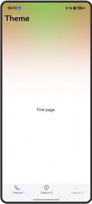
Example 1: Setting the Layout and Gradient Background
This example demonstrates how to set the basic style of the AtomicServiceNavigation component with a gradient background.
import { AtomicServiceNavigation, NavDestinationBuilder, AtomicServiceTabs, TabBarOptions, TabBarPosition } from '@kit.ArkUI';
import { MixMode, GradientAlpha, BackgroundTheme} from '@ohos.atomicservice.AtomicServiceNavigation'
@Entry
@Component
struct Index {
  @State message: string = 'Title';
  childNavStack: NavPathStack = new NavPathStack();
  @Builder
  tabContent1() {
    Text('first page')
      .onClick(() => {
        this.childNavStack.pushPath({ name: 'page one' })
      })
  }

  @Builder
  tabContent2() {
    Text('second page')
  }

  @Builder
  tabContent3() {
    Text('third page')
  }

  @Builder
  navigationContent() {
    AtomicServiceTabs({
      tabContents: [
        () => {
          this.tabContent1()
        },
        () => {
          this.tabContent2()
        },
        () => {
          this.tabContent3()
        }
      ],
      tabBarOptionsArray: [
        new TabBarOptions($r('sys.media.ohos_ic_public_phone'), 'Feature 1'),
        new TabBarOptions($r('sys.media.ohos_ic_public_location'), 'Feature 2', Color.Green, Color.Red),
        new TabBarOptions($r('sys.media.ohos_ic_public_more'), 'Feature 3')
      ],
      tabBarPosition: TabBarPosition.BOTTOM,
      barBackgroundColor: $r('sys.color.ohos_id_color_bottom_tab_bg'),
      onTabBarClick: (index: Number) => {
        if (index == 0) {
          this.message = 'Feature 1';
        } else if (index == 1) {
          this.message = 'Feature 2';
        } else {
          this.message = 'Feature 3';
        }
      }
    })
  }

  @Builder
  pageMap(name: string) {
    if (name === 'page one') {
      PageOne()
    } else if (name === 'page two') {
      PageTwo()
    }
  }

  build() {
    Row() {
      Column() {
        AtomicServiceNavigation({
          navigationContent: () => {
            this.navigationContent()
          },
          title: this.message,
          titleOptions: {
            isBlurEnabled: false
          },
          gradientBackground: {
            primaryColor: 'red',
            secondaryColor: 'green',
            backgroundTheme: BackgroundTheme.LIGHT,
            mixMode: MixMode.AVERAGE,
            alpha: GradientAlpha.OPACITY_100
          },
          navDestinationBuilder: this.pageMap,
          navPathStack: this.childNavStack,
          mode: NavigationMode.Stack
        })
      }
      .width('100%')
    }
    .height('100%')
  }
}

@Component
export struct PageOne {
  pageInfo: NavPathStack = new NavPathStack();

  build() {
    NavDestination() {
      Button('Next')
        .onClick(() => {
          this.pageInfo.pushPath({ name: 'page two'})
        })
    }
    .title('PageOne')
    .onReady((context: NavDestinationContext) => {
      this.pageInfo = context.pathStack;
    })
  }
}

@Component
export struct PageTwo {
  pageInfo: NavPathStack = new NavPathStack();

  build() {
    NavDestination() {
      Button('End')
    }
    .title('PageTwo')
    .onReady((context: NavDestinationContext) => {
      this.pageInfo = context.pathStack;
    })
  }
}
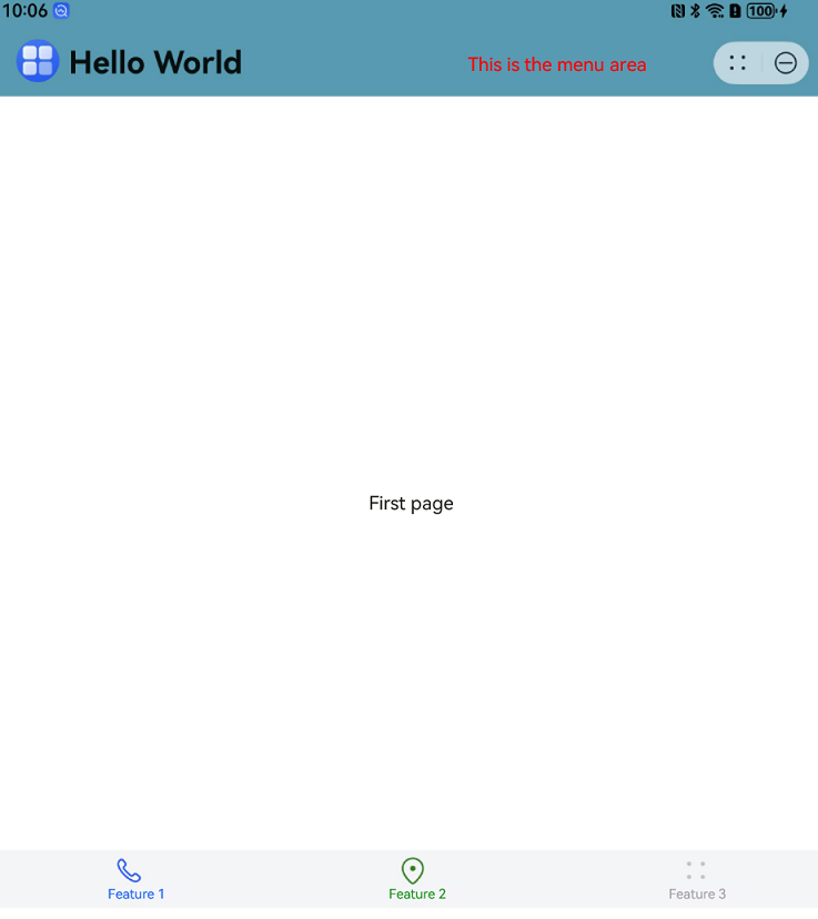
Example 2: Implementing the Drawer Style with Custom Layouts for Wide-Screen Scenarios
This example demonstrates how to implement the drawer style and insert custom layouts into the title bar in wide-screen scenarios (width > 600 vp).
import { AtomicServiceNavigation, TitleBarType } from '@kit.ArkUI';
import { AtomicServiceTabs, TabBarOptions, TabBarPosition } from '@kit.ArkUI';

@Entry
@Component
struct Index {
  @State message: string = 'Hello World';
  childNavStack: NavPathStack = new NavPathStack();

  @Builder
  tabContent1() {
    Text('First page')
      .onClick(() => {
        this.childNavStack.pushPath({ name: 'page one' })
      })
  }

  @Builder
  tabContent2() {
    Text('Second page')
  }

  @Builder
  tabContent3() {
    Text('Third page')
  }

  @Builder
  navigationContent() {
    AtomicServiceTabs({
      tabContents: [
        () => {
          this.tabContent1()
        },
        () => {
          this.tabContent2()
        },
        () => {
          this.tabContent3()
        }
      ],
      tabBarOptionsArray: [
        new TabBarOptions($r('sys.media.ohos_ic_public_phone'), 'Feature 1'),
        new TabBarOptions($r('sys.media.ohos_ic_public_location'), 'Feature 2', Color.Green, Color.Red),
        new TabBarOptions($r('sys.media.ohos_ic_public_more'), 'Feature 3')
      ],
      tabBarPosition: TabBarPosition.BOTTOM,
      barBackgroundColor: $r('sys.color.ohos_id_color_bottom_tab_bg'),
      onTabBarClick: (index: Number) => {
        if (index == 0) {
          this.message = 'Feature 1';
        } else if (index == 1) {
          this.message = 'Feature 2';
        } else {
          this.message = 'Feature 3';
        }
      }
    })
  }

  @Builder
  pageMap(name: string) {
    if (name === 'page one') {
      PageOne()
    } else if (name === 'page two') {
      PageTwo()
    }
  }

  @State showText: string = 'time: ';
  @State time: number = 0;

  @Builder
  insertComp() {
    Text('This is the menu area')
      .fontColor(Color.Red)
      .width(200)
      .height('100%')
  }

  build() {
    Column() {
      AtomicServiceNavigation({
        navigationContent: () => {
          this.navigationContent()
        },
        navDestinationBuilder: this.pageMap,
        navPathStack: this.childNavStack,
        title: this.message,
        titleOptions: {
          titleIcon: $r('app.media.startIcon'),
          backgroundColor: 'rgb(61, 157, 180)',
          titleBarType: TitleBarType.DRAWER
        },
        menus: () => { this.insertComp() },
        mode: NavigationMode.Stack
      })
    }
    .width('100%')
  }
}

@Component
export struct PageOne {
  pageInfo: NavPathStack = new NavPathStack();

  build() {
    NavDestination() {
      Button('Next')
        .onClick(() => {
          this.pageInfo.pushPath({ name: 'page two'})
        })
    }
    .title('PageOne')
    .onReady((context: NavDestinationContext) => {
      this.pageInfo = context.pathStack;
    })
  }
}

@Component
export struct PageTwo {
  pageInfo: NavPathStack = new NavPathStack();

  build() {
    NavDestination() {
      Button('End')
    }
    .title('PageTwo')
    .onReady((context: NavDestinationContext) => {
      this.pageInfo = context.pathStack;
    })
  }
}
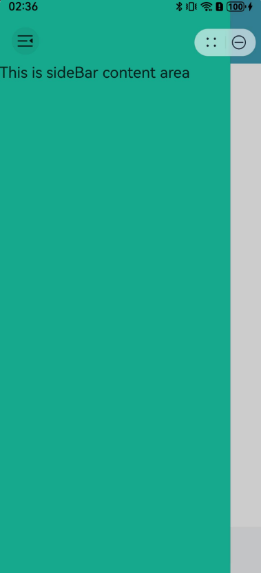
Example 3: Configuring the Sidebar
This example demonstrates how to set the sidebar background color and content style.
import { AtomicServiceNavigation, TitleBarType } from '@kit.ArkUI';
import { AtomicServiceTabs, TabBarOptions, TabBarPosition } from '@kit.ArkUI';

@Entry
@Component
struct Index {
  @State message: string = 'Hello World';
  childNavStack: NavPathStack = new NavPathStack();

  @Builder
  tabContent1() {
    Text('first page')
      .onClick(() => {
        this.childNavStack.pushPath({ name: 'page one' })
      })
  }

  @Builder
  tabContent2() {
    Text('second page')
  }

  @Builder
  tabContent3() {
    Text('third page')
  }

  @Builder
  navigationContent() {
    AtomicServiceTabs({
      tabContents: [
        () => {
          this.tabContent1()
        },
        () => {
          this.tabContent2()
        },
        () => {
          this.tabContent3()
        }
      ],
      tabBarOptionsArray: [
        new TabBarOptions($r('sys.media.ohos_ic_public_phone'), 'Feature 1'),
        new TabBarOptions($r('sys.media.ohos_ic_public_location'), 'Feature 2', Color.Green, Color.Red),
        new TabBarOptions($r('sys.media.ohos_ic_public_more'), 'Feature 3')
      ],
      tabBarPosition: TabBarPosition.BOTTOM,
      barBackgroundColor: $r('sys.color.ohos_id_color_bottom_tab_bg'),
      onTabBarClick: (index: Number) => {
        if (index == 0) {
          this.message = 'Feature 1';
        } else if (index == 1) {
          this.message = 'Feature 2';
        } else {
          this.message = 'Feature 3';
        }
      }
    })
  }

  @Builder
  pageMap(name: string) {
    if (name === 'page one') {
      PageOne()
    } else if (name === 'page two') {
      PageTwo()
    }
  }

  @State showText: string = 'time: ';
  @State time: number = 0;

  @Builder
  insertComp() {
    Text('This is menus area')
      .fontColor(Color.Red)
      .width(200)
      .height('100%')
  }

  @Builder
  sideBarContentBuilder() {
    Text('This is sideBar content area')
      .fontSize(20)
  }

  build() {
    Column() {
      AtomicServiceNavigation({
        navigationContent: () => {
          this.navigationContent()
        },
        navDestinationBuilder: this.pageMap,
        navPathStack: this.childNavStack,
        title: this.message,
        titleOptions: {
          titleIcon: $r('app.media.startIcon'),
          backgroundColor: 'rgb(61, 157, 180)',
          titleBarType: TitleBarType.DRAWER
        },
        sideBarOptions: {
          sideBarBackground: '#409EFF'
        },
        sideBarContent: () => { this.sideBarContentBuilder() },
        mode: NavigationMode.Stack
      })
    }
    .width('100%')
  }
}

@Component
export struct PageOne {
  pageInfo: NavPathStack = new NavPathStack();

  build() {
    NavDestination() {
      Button('Next')
        .onClick(() => {
          this.pageInfo.pushPath({ name: 'page two'})
        })
    }
    .title('PageOne')
    .onReady((context: NavDestinationContext) => {
      this.pageInfo = context.pathStack;
    })
  }
}

@Component
export struct PageTwo {
  pageInfo: NavPathStack = new NavPathStack();

  build() {
    NavDestination() {
      Button('End')
    }
    .title('PageTwo')
    .onReady((context: NavDestinationContext) => {
      this.pageInfo = context.pathStack;
    })
  }
}
你可能感兴趣的鸿蒙文章
- 所属分类: 后端技术
- 本文标签:
热门推荐
-
2、 优质文章
-
3、 gt
-
7、 openharmony
-
9、 golang
-
10、 Vue中input框自动聚焦