harmony 鸿蒙Using Toasts (Toast)
Using Toasts (Toast)
A toast is a temporary window provides brief feedback or status information to users. It typically appears at the bottom or top of the screen for a short duration before automatically disappearing. The main purpose of a toast is to provide concise and non-intrusive information, avoiding disruption to the user’s current workflow.
You can use the getPromptAction method in UIContext to obtain the PromptAction object associated with the current UI context, and then use the object to call showToast to create and display a toast.
How to Use
Use toasts appropriately. Instead of constantly reminding users, use toasts for specific scenarios.
For example, use toasts to indicate whether an action performed by the user is successful or fails, or to update users when the application’s status changes.
Manage text density. Because toasts are displayed for a limited time, avoid using long text.
Ensure that the text is clear and readable, with font size and color consistent with the application’s theme. In addition, toasts should not contain any interactive elements, such as buttons or links.
- Avoid overlapping and frequent pop-ups.
As a lightweight notification, toasts should not cover other screen elements or obscure important content. Frequent pop-ups without intervals can disrupt the user experience. Avoid replacing one toast with another in quick succession. Ensure that toasts display for no more than 3 seconds to prevent interference with user operations.
- Conform with the default pop-up position.
By default, toasts appear from the bottom of the screen with a safe distance. Ensure that they do not overlap with other pop-up components. In special scenarios, consider adjusting the content layout to avoid this issue.
Comparison of Toast Modes
Toasts provide two display modes: DEFAULT (displayed in the application) and TOP_MOST (displayed above the application).
Before displaying a TOP_MOST toast, a full-screen subwindow is created (the size of the subwindow on mobile devices is the same as the main window). The layout position of the toast is then calculated within this subwindow, and it is displayed accordingly. The differences between the DEFAULT and TOP_MOST modes are described as follows.
| Item | DEFAULT | TOP_MOST |
|---|---|---|
| Subwindow creation | No | Yes |
| Layer order | The toast is is displayed within the main window, with the same layer level as the main window, generally low. | The toast is displayed in a subwindow, generally higher than the main window, higher than other dialog box components, but lower than the soft keyboard and permission request dialog box. |
| Soft keyboard avoidance | The toast always moves up the soft keyboard when it is displayed. | The toast avoids the keyboard only if the toast is blocked, and after avoidance, the distance between the bottom of the toast and the soft keyboard is 80 vp. |
| UIExtension layout | The toast is aligned with UIExtension as the main window, with alignment consistent with UIExtension. | The toast is aligned with the host window as the main window, with alignment consistent with the host window. |
import {promptAction} from '@kit.ArkUI';
@Entry
@Component
struct Index {
  build() {
    Column({space: 10}) {
      TextInput()
      Button() {
        Text("Toast of the DEFAULT type")
          .fontSize(20)
          .fontWeight(FontWeight.Bold)

      }
      .width('100%')
      .onClick(()=>{
        promptAction.showToast({
          message: "OK, I am DEFAULT toast.",
          duration:2000,
          showMode: promptAction.ToastShowMode.DEFAULT,
          bottom:80
        })
      })
      Button() {
        Text("Toast of the TOPMOST type")
          .fontSize(20)
          .fontWeight(FontWeight.Bold)

      }
      .width('100%')
      .onClick(()=>{
        promptAction.showToast({
          message: "OK, I am TOP_MOST toast.",
          duration:2000,
          showMode: promptAction.ToastShowMode.TOP_MOST,
          bottom:85
        })
      })
    }
  }
}
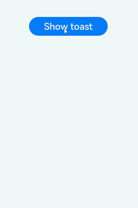
Creating a Toast
This mode is suitable for scenarios where the toast automatically disappears within a short period of time.
import { LengthMetrics, PromptAction } from '@kit.ArkUI'
import { BusinessError } from '@kit.BasicServicesKit'

@Entry
@Component
struct toastExample {
  private uiContext: UIContext = this.getUIContext()
  private promptAction: PromptAction = this.uiContext.getPromptAction()

  build() {
    Column() {
      Button('Show toast').fontSize(20)
        .onClick(() => {
          try {
            this.promptAction.showToast({
              message: 'Hello World',
              duration: 2000
            });
          } catch (error) {
            let message = (error as BusinessError).message
            let code = (error as BusinessError).code
            console.error(`showToast args error code is ${code}, message is ${message}`);
          };
        })
    }.height('100%').width('100%').justifyContent(FlexAlign.Center)
  }
}
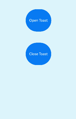
Creating a Toast with a Close Button
This mode is suitable for scenarios where the dialog box has a longer retention period and the user can close it manually.
import { LengthMetrics, PromptAction } from '@kit.ArkUI'
import { BusinessError } from '@kit.BasicServicesKit'

@Entry
@Component
struct toastExample {
  @State toastId: number = 0;
  private uiContext: UIContext = this.getUIContext()
  private promptAction: PromptAction = this.uiContext.getPromptAction()

  build() {
    Column() {
      Button('Open Toast')
        .type(ButtonType.Capsule)
        .height(100)
        .onClick(() => {
          try {
            this.promptAction.openToast({
              message: 'Toast Massage',
              duration: 10000,
            }).then((toastId: number) => {
              this.toastId = toastId;
            });
          } catch (error) {
            let message = (error as BusinessError).message;
            let code = (error as BusinessError).code;
            console.error(`OpenToast error code is ${code}, message is ${message}`);
          };
        })
      Blank().height(50);
      Button('Close Toast')
        .height(100)
        .type(ButtonType.Capsule)
        .onClick(() => {
          try {
            this.promptAction.closeToast(this.toastId);
          } catch (error) {
            let message = (error as BusinessError).message;
            let code = (error as BusinessError).code;
            console.error(`CloseToast error code is ${code}, message is ${message}`);
          };
        })
    }.height('100%').width('100%').justifyContent(FlexAlign.Center)
  }
}
你可能感兴趣的鸿蒙文章
harmony 鸿蒙Atomic Service Full Screen Launch Component (FullScreenLaunchComponent)
harmony 鸿蒙Arc Button (ArcButton)
harmony 鸿蒙Frame Animation (ohos.animator)
harmony 鸿蒙Implementing Property Animation
- 所属分类: 后端技术
- 本文标签:
热门推荐
-
2、 优质文章
-
3、 gt
-
7、 openharmony
-
9、 golang
-
10、 Vue中input框自动聚焦