harmony 鸿蒙Button Development
Button Development
The Button component can be used to set a capsule, circle, text, arc, or download button. For details, see button.
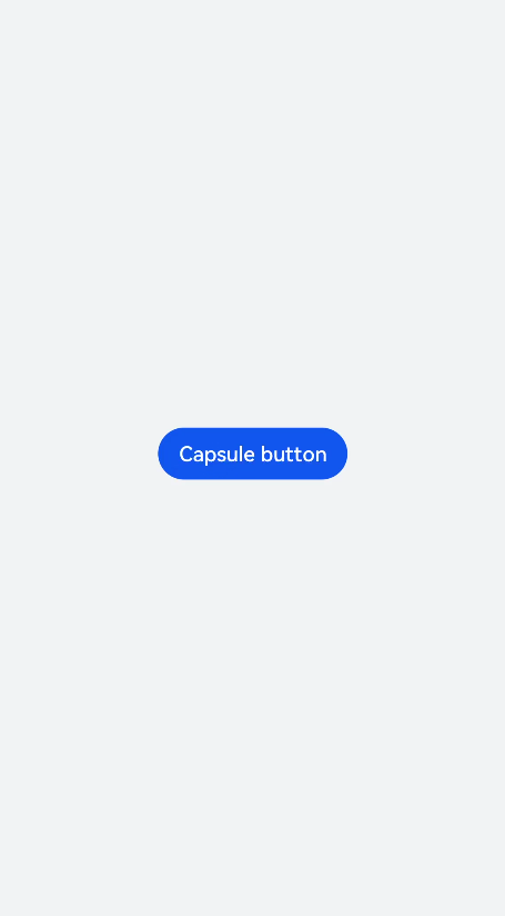
Creating a Button Component
Create a Button component in the .hml file under pages/index.
<!-- xxx.hml -->
<div class="container">
  <button  type="capsule" value="Capsule button"></button>
</div>
/* xxx.css */
.container {
  width: 100%;
  height: 100%;
  flex-direction: column;
  justify-content: center;
  align-items: center;
  background-color: #F1F3F5;
}
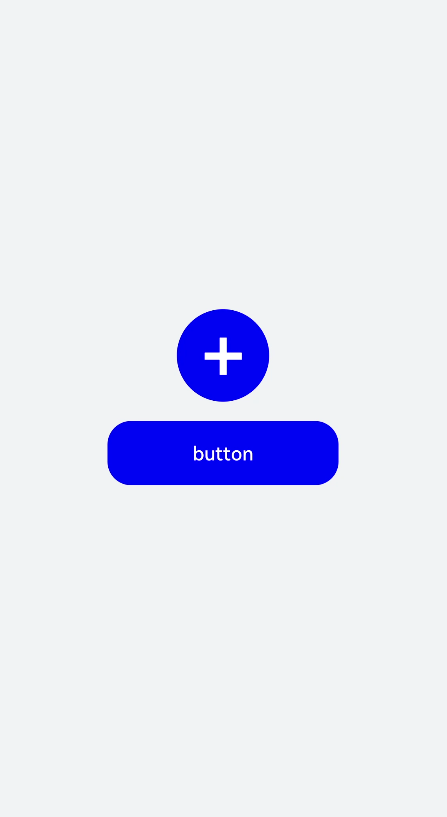
Setting the Button Type
Set the type attribute of the Button component to circle, text, or any other supported value.
<!-- xxx.hml -->
<div class="container">
  <button class="circle" type="circle" >+</button>
  <button class="text" type="text"> button</button>
</div>
/* xxx.css */
.container {
  width: 100%;
  height: 100%;
  background-color: #F1F3F5;
  flex-direction: column;
  align-items: center;
  justify-content: center;
}
.circle {
  font-size: 120px;
  background-color: blue;
  radius: 72px;
}
.text {
  margin-top: 30px;
  text-color: white;
  font-size: 30px;
  font-style: normal;
  background-color: blue;
  width: 50%;
  height: 100px;
}
NOTE
If the icon used by the Button component is from the cloud, you must declare the ohos.permission.INTERNET permission in the config.json file under the resources folder.
Sample code for declaring the ohos.permission.INTERNET permission in the config.json file under the resources folder:
<!-- config.json -->
"module": {
  "reqPermissions": [{
    "name": "ohos.permission.INTERNET"
  }],
}
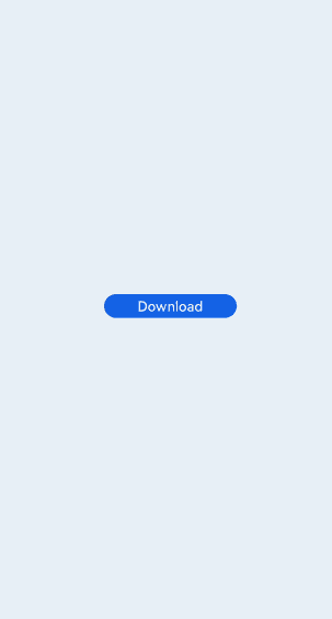
Showing the Download Progress
Add the progress method to the Button component to display the download progress in real time.
<!-- xxx.hml -->
<div class="container">
  <button class="button download" type="download" id="download-btn" onclick="setProgress">{{downloadText}}</button>
</div>
/* xxx.css */
.container {
  width: 100%;
  height: 100%;
  background-color: #F1F3F5;
  flex-direction: column;
  align-items: center;
  justify-content: center;
}
.download {
  width: 280px;
  text-color: white;
  background-color: #007dff;
}
// xxx.js
import promptAction from '@ohos.promptAction';
export default {
  data: {
    percent: 0,
    downloadText: "Download",
    isPaused: true,
    intervalId : null,
  },
  start(){
    this.intervalId = setInterval(()=>{
      if(this.percent <100){
        this.percent += 1;
        this.downloadText = this.percent+ "%";
       } else{
         promptAction.showToast({
            message: "Download succeeded."
         })
         this.paused()
         this.downloadText = "Download";
         this.percent = 0;
         this.isPaused = true;
       }
    },100)
  },
  paused(){
    clearInterval(this.intervalId);
    this.intervalId = null;
  },
 setProgress(e) {
    if(this.isPaused){
      promptAction.showToast({
        message: "Started Downloading"
      })
      this.start();
      this.isPaused = false;
    }else{
      promptAction.showToast({
        message: "Paused."
      })
      this.paused();
      this.isPaused = true;
    }
  }
}
NOTE
The setProgress method supports only buttons of the download type.
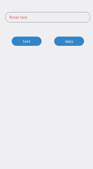
Example Scenario
Switch between the button types for different types of text.
<!-- xxx.hml -->
<div class="container">
  <div class="input-item">
    <input class="input-text" id="change" type="{{mytype}}"  placeholder="{{myholder}}"
      style="background-color:{{mystyle1}};
      placeholder-color:{{mystyle2}};flex-grow:{{myflex}};"name="{{myname}}" value="{{myvalue}}"></input>
  </div>
  <div class="input-item">
    <div class="doc-row">
      <input type="button" class="select-button color-3" value="text" onclick="changetype3"></input>
      <input type="button" class="select-button color-3" value="data" onclick="changetype4"></input>
    </div>
  </div>
</div>
/* xxx.css */
.container {
  flex-direction: column;
  align-items: center;
  background-color: #F1F3F5;
}
.input-item {
  margin-bottom: 80px;
  flex-direction: column;
}
.doc-row {
  justify-content: center;
  margin-left: 30px;
  margin-right: 30px;
  justify-content: space-around;
}
.input-text {
  height: 80px;
  line-height: 80px;
  padding-left: 30px;
  padding-right: 30px;
  margin-left: 30px;
  margin-right: 30px;
  margin-top:100px;
  border: 3px solid;
  border-color: #999999;
  font-size: 30px;
  background-color: #ffffff;
  font-weight: 400;
}
.select-button {
  width: 35%;
  text-align: center;
  height: 70px;
  padding-top: 10px;
  padding-bottom: 10px;
  margin-top: 30px;
  font-size: 30px;
  color: #ffffff;
}
.color-3 {
  background-color: #0598db;;
}
// xxx.js
export default {
  data: {
    myflex: '',
    myholder: 'Enter text.',
    myname: '',
    mystyle1: "#ffffff",
    mystyle2: "#ff0000",
    mytype: 'text',
    myvalue: '',
  },
  onInit() {
  },
  changetype3() {
    this.myflex = '';
    this.myholder = 'Enter text.';
    this.myname = '';
    this.mystyle1 = "#ffffff";
    this.mystyle2 = "#FF0000";
    this.mytype = 'text';
    this.myvalue = '';
  },
  changetype4() {
    this.myflex = '';
    this.myholder = 'Enter a date.';
    this.myname = '';
    this.mystyle1 = "#ffffff";
    this.mystyle2 = "#FF0000";
    this.mytype = 'date';
    this.myvalue = '';
  },
}
你可能感兴趣的鸿蒙文章
harmony 鸿蒙Atomic Service Full Screen Launch Component (FullScreenLaunchComponent)
harmony 鸿蒙Arc Button (ArcButton)
harmony 鸿蒙Frame Animation (ohos.animator)
harmony 鸿蒙Implementing Property Animation
- 所属分类: 后端技术
- 本文标签:
热门推荐
-
2、 优质文章
-
3、 gt
-
7、 openharmony
-
9、 golang
-
10、 Vue中input框自动聚焦