harmony 鸿蒙<canvas> Development
<canvas> Development
The <canvas> component provides a canvas for drawing customized graphics. For details, see canvas.
Creating a <canvas> Component
Create a <canvas> component in the .hml file under pages/index.
<!-- xxx.hml -->
<div class="container">
  <canvas></canvas>
</div>
/* xxx.css */
.container{
width: 100%;
height: 100%;
flex-direction: column;
justify-content: center;
align-items: center;
background-color: #F1F3F5;
}
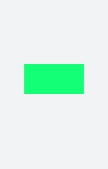
canvas{
background-color: #00ff73;
}
NOTE
The default background color of the <canvas> component is the same as that of the parent component.
The default width and height of <canvas> are 300 px and 150 px, respectively.
Adding Styles
Set width, height, background-color, and border of the <canvas> component.
<!-- xxx.hml -->
<div class="container">
  <canvas></canvas>
</div>
/* xxx.css */
.container{
  flex-direction: column;
  justify-content: center;
  align-items: center;
  background-color: #F1F3F5;
  width: 100%;
  height: 100%;
}
canvas{
  width: 500px;
  height: 500px;
  background-color: #fdfdfd;
  border: 5px solid red;
}

Adding Events
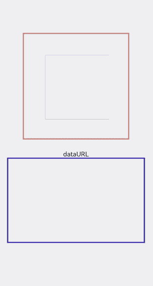
Add the long press event to the <canvas> component. When the event is triggered, the value of dataUrl (image information returned by the toDataURL method) of the <canvas> component can be obtained and printed in the text area below.
<!-- xxx.hml -->
<div class="container">
  <canvas ref="canvas1" onlongpress="getUrl"></canvas>
  <text>dataURL</text>
  <text class="content">{{dataURL}}</text>
</div>
/* xxx.css */
.container{
  width:100%;
  height:100%;
  flex-direction: column;
  justify-content: center;
  align-items: center;
  background-color: #F1F3F5;
  }
  canvas{
    width: 500px;
    height: 500px;
    background-color: #fdfdfd;
    border: 5px solid red;
    margin-bottom: 50px;
}
.content{
  border: 5px solid blue;
  padding: 10px;
  width: 90%;
  height: 400px;
  overflow: scroll;
}
// xxx.js
import promptAction from '@ohos.promptAction';
export default {
  data:{
    dataURL:null,
  },
  onShow(){
    let el = this.$refs.canvas1;
    let ctx = el.getContext("2d");
    ctx.strokeRect(100,100,300,300);
  },
  getUrl(){
    let el = this.$refs.canvas1
    let dataUrl = el.toDataURL()
    this.dataURL = dataUrl;
    promptAction.showToast({duration:2000,message:"long press,get dataURL"})
  }
}
NOTE
The <canvas> component cannot be created in onInit or onReady.
你可能感兴趣的鸿蒙文章
harmony 鸿蒙Atomic Service Full Screen Launch Component (FullScreenLaunchComponent)
harmony 鸿蒙Arc Button (ArcButton)
harmony 鸿蒙Frame Animation (ohos.animator)
harmony 鸿蒙Implementing Property Animation
热门推荐
-
2、 优质文章
-
3、 gt
-
7、 openharmony
-
9、 golang
-
10、 Vue中input框自动聚焦