harmony 鸿蒙toolbar-item
toolbar-item
NOTE
This component is supported since API version 5. Updates will be marked with a superscript to indicate their earliest API version.
As a child component of <toolbar>, the <toolbar-item> component is used to display an operation option on the toolbar.
Child Components
Not supported
Attributes
In addition to the universal attributes, the following attributes are supported.
| Name | Type | Default Value | Mandatory | Description |
|---|---|---|---|---|
| value | string | - | Yes | Text content of the operation option. |
| icon | string | - | Yes | Icon image path, which is displayed on the option text. The value can be a local path. Supported image formats are PNG, JPG, and SVG. |
Styles
Only the following styles are supported.
| Name | Type | Default Value | Mandatory | Description |
|---|---|---|---|---|
| color | <color> | #e6000000 | No | Font color. |
| font-size | <length> | 16px | No | Font size. |
| allow-scale | boolean | true | No | Whether the font size changes with the system’s font size settings. |
| font-style | string | normal | No | Font style. Available values are as follows: - normal: standard font style - italic: italic font style |
| font-weight | number|string | normal | No | Font weight. The number value must be an exact multiple of 100 ranging from 100 to 900. The default value is 400. A larger value indicates a bigger weight. Available values of the string type are lighter, normal, bold, or bolder. |
| text-decoration | string | none | No | Text decoration. Available values are as follows: - underline: An underline is used. - line-through: A strikethrough is used. - none: The standard text is used. |
| font-family | string | sans-serif | No | Font family, in which fonts are separated by commas (,). Each font is set using a font name or font family name. The first font in the family or the specified custom font is used for the text. |
| background | <linear-gradient> | - | No | Background. This attribute supports gradient styles only and is not compatible with background-color or background-image. |
| background-color | <color> | - | No | Background color. |
| background-image | string | - | No | Background image. Currently, this attribute is not compatible with background-color or background. Both online and local image resources are supported. |
| background-size | - string - <length> <length> - <percentage> <percentage> |
auto | No | Background image size. - The available values of the string type are as follows: - contain: extends the image to the maximum size so that its height and width are fully applicable to the content area. - cover: extends the background image to a large enough size so that it completely covers the background area. Some parts of the image may not be displayed in the background area. - auto: retains the original aspect ratio of the image. - Values of the <length> type: The two values are width and height of the background image. The first value indicates the width, and the second value indicates the height. If you only set one value, the other value is set to auto by default. - Values of the <percentage> type: The two values are width and height of the background image in percentage of the parent element. The first value indicates the width, and the second value indicates the height. If you only set one value, the other value is set to auto by default. |
| background-repeat | string | repeat | No | How a background image is repeatedly drawn. By default, a background image is repeated both horizontally and vertically. - repeat: The image is repeated along both the x-axis and y-axis. - repeat-x: The image is repeated along the x-axis. - repeat-y: The image is repeated along the y-axis. - no-repeat: The image is not repeated. |
| background-position | - string string - <length> <length> - <percentage> <percentage> |
0px 0px | No | Position of the background image. - Values of the string type: If you set only one value, the other value is set to center by default. The two values define the horizontal position and vertical position, respectively. - left: leftmost in the horizontal direction. - right: rightmost in the horizontal direction. - top: top in the vertical direction. - bottom: bottom in the vertical direction. - center: center in the horizontal or vertical direction. - Values of the <length> type: The first value indicates the horizontal position, and the second value indicates the vertical position. For the upper left corner, the value is 0 0 in px (0px 0px). If you only set one value, the other value is set to 50%. - Values of the <percentage> type: The first value indicates the horizontal position, and the second value indicates the vertical position. For the upper left corner, the value is 0% 0%. For the lower right corner, the value is 100% 100%. If you only set one value, the other value is set to 50%. - Values of the <percentage> type and <length> type can be used together. |
| opacity | number | 1 | No | Opacity of an element. The value ranges from 0 to 1. The value 1 means opaque, and 0 means completely transparent. |
| display | string | flex | No | Type of the box containing an element. Available values are as follows: - flex: flexible layout - none: not rendered |
| visibility | string | visible | No | Whether to display the box containing an element. A hidden box still occupies layout space. (To remove the box, set the display attribute to none.) Available values are as follows: - visible: The box is visible. - hidden: The box is hidden but still takes up space. If both visibility and display are set, only display takes effect. |
Events
The universal events are supported.
Methods
Not supported
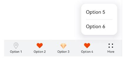
Example
<!-- xxx.hml -->
<toolbar style="position : fixed; bottom : 0px;">
    <toolbar-item icon='common/Icon/location.png' value='Option 1'></toolbar-item>
    <toolbar-item icon='common/Icon/heart.png' value='Option 2'></toolbar-item>
    <toolbar-item icon='common/Icon/diamond.png' value='Option 3'></toolbar-item>
    <toolbar-item icon='common/Icon/heart.png' value='Option 4'></toolbar-item>
    <toolbar-item icon='common/Icon/heart.png' value='Option 5'></toolbar-item>
    <toolbar-item icon='common/Icon/heart.png' value='Option 6'></toolbar-item>
</toolbar>
你可能感兴趣的鸿蒙文章
harmony 鸿蒙JavaScript-compatible Web-like Development Paradigm
0
赞
- 所属分类: 后端技术
- 本文标签:
热门推荐
-
2、 优质文章
-
3、 gt
-
7、 openharmony
-
9、 golang
-
10、 Vue中input框自动聚焦