harmony 鸿蒙Basic Usage of Custom Components
Basic Usage of Custom Components
Custom components are existing components encapsulated based on service requirements. A custom component can be invoked multiple times in a project to improve the code readability. You can import a custom component to the host page through element as shown in the following code snippet:
<element name='comp' src='../common/component/comp.hml'></element>
<div>
  <comp prop1='xxxx' @child1="bindParentVmMethod"></comp>
</div>
The following is an example of using a custom component with if-else, which displays comp1 when showComp1 is set to true and displays comp2 otherwise.
<element name='comp1' src='../common/component/comp1/comp1.hml'></element>
<element name='comp2' src='../common/component/comp2/comp2.hml'></element>
<div>
  <comp1 if="{{showComp1}}" prop1='xxxx' @child1="bindParentVmMethodOne"></comp1>
  <comp2 else prop1='xxxx' @child1="bindParentVmMethodTwo"></comp2>
</div>
The name attribute indicates the custom component name (optional), which is case-insensitive and is in lowercase by default. The src attribute indicates the .hml file path (mandatory) of the custom component. If name is not set, the .hml file name is used as the component name by default.
Custom Events
To bind an event to a custom child component, use the (on|@)event-name=“bindParentVmMethod” syntax. this.$emit(‘eventName’, { params: ‘passedParameters’ }) is used in the child component to trigger the event and pass parameters to the parent component. The parent component then calls the bindParentVmMethod API and receives parameters passed by the child component.
NOTE
For child component events that are named in camel case, convert the names to kebab case when binding the events to the parent component. For example, use \@children-event in the parent component instead of childrenEvent used in the child component.
Example 1 with parameters passed
The following example describes how to define a child component comp:
<!-- comp.hml -->
<div class="item">
   <text class="text-style" onclick="childClicked">Click here to view the hidden text.</text>
   <text class="text-style" if="{{showObj}}">hello world</text>
</div>
/* comp.css */
.item {
  width: 700px;
  flex-direction: column;
  height: 300px;
  align-items: center;
  margin-top: 100px;
}
.text-style {
  font-weight: 500;
  font-family: Courier;
  font-size: 40px;
}
// comp.js
export default {
  data: {
    showObj: false,
  },
  childClicked () {
    this.$emit('eventType1');
    this.showObj = !this.showObj;
  },
}
The following example describes how to import comp to the parent component:
<!-- xxx.hml -->
<element name='comp' src='../common/component/comp.hml'></element>
<div class="container">
  <comp @event-type1="textClicked"></comp>
</div>
/* xxx.css */
.container {
  background-color: #f8f8ff;
  flex: 1;
  flex-direction: column;
  align-content: center;
}
// xxx.js
export default {
  textClicked () {}
}
Example 2 with no parameters passed
The following example describes how to define a child component comp:
<!-- comp.hml -->
<div class="item">
   <text class="text-style" onclick="childClicked">Click here to view the hidden text.</text>
   <text class="text-style" if="{{ showObj }}">hello world</text>
</div>
// comp.js
export default {
  childClicked () {
    this.$emit('eventType1', { text: 'Receive the parameters from the child component.' });
    this.showObj = !this.showObj;
  },
}
In the following example, the child component passes the text parameter to the parent component, and the parent component obtains the parameter through e.detail:
<!-- xxx.hml -->
<element name='comp' src='../common/comp/comp.hml'></element>
<div class="container">
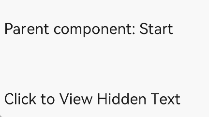
<text>Parent component: {{text}}</text>
<comp @event-type1="textClicked"></comp>
</div>
// xxx.js
export default {
  data: {
    text: 'Start'
  },
  textClicked (e) {
    this.text = e.detail.text;
  },
}
Custom Component Data
In the JS file of a custom component, you can define, pass, and process data by declaring fields such as data, props, and computed. For details about how to use props and computed, see Data Transfer and Processing.
Table 1 Custom component data
| Name | Type | Description |
|---|---|---|
| data | Object |Function | Data model of the page. If the attribute is of the function type, the return value must be of the object type. The name cannot start with a dollar sign ($) or underscore (_). Do not use reserved words (for, if, show, and tid). Do not use this attribute and private or public at the same time. |
| props | Array |Object | Used for communication between components. This attribute can be passed to components through <tag xxxx=‘value’>. A props name must be in lowercase and cannot start with a dollar sign ($) or underscore (_). Do not use reserved words (for, if, show, and tid) in the name. Currently, props does not support functions. |
| computed | Object | Used for pre-processing for reading and setting parameters. The result is cached. The name cannot start with a dollar sign ($) or underscore (_). Do not use reserved words. |
你可能感兴趣的鸿蒙文章
harmony 鸿蒙JavaScript-compatible Web-like Development Paradigm
- 所属分类: 后端技术
- 本文标签:
热门推荐
-
2、 优质文章
-
3、 gt
-
7、 openharmony
-
9、 golang
-
10、 Vue中input框自动聚焦