harmony 鸿蒙list-item-group
list-item-group
NOTE
This component is supported since API version 4. Updates will be marked with a superscript to indicate their earliest API version.
<list-item-group> is a child component of <list> and is used to group items in a list. By default, the width of <list-item-group> is equal to that of <list>.
To use this component, you must set the columns attribute of the parent component <list> to 1. Otherwise, this component is not displayed.
You can customize the width of each <list-item-group>. However, if you retain the default value stretch of align-items for the parent component <list>, the width of <list-item-group> is equal to that of <list>. To make the customized <list-item-group> width take effect, set align-items to other values rather than stretch.
Required Permissions
None
Child Components
Only the <list-item> child component is supported.
Attributes
In addition to the universal attributes, the following attributes are supported.
| Name | Type | Default Value | Mandatory | Description |
|---|---|---|---|---|
| type | string | default | No | Type of the list-item-group. A list supports multiple list-item-group types. The same type of list-item-groups must have the same view layout after being rendered. If the type is fixed, replace the if attribute with the show attribute to ensure that the view layout remains unchanged. |
NOTE
The universal attribute id is used to identify a group. The input parameters of related functions and event information in the list also use id to uniquely identify a group.
Styles
In addition to the universal styles, the following styles are supported.
| Name | Type | Default Value | Mandatory | Description |
|---|---|---|---|---|
| flex-direction | string | row | No | Main axis direction of the flex container, which defines how items are placed in the container. Available values are as follows: - column: Items are placed vertically from top to bottom. - row: Items are placed horizontally from left to right. |
| justify-content | string | flex-start | No | How items are aligned along the main axis of the flex container. Available values are as follows: - flex-start: Items are packed toward the start edge of the container along the main axis. - flex-end: Items are packed toward the end edge of the container along the main axis. - center: Items are packed toward the center of the container along the main axis. - space-between: Items are positioned with space between the rows. - space-around: Items are positioned with space before, between, and after the rows. - space-evenly5+: Items are distributed within the container along the main axis, with even space between each two. |
Events
In addition to the universal events, the following events are supported.
| Name | Parameter | Description |
|---|---|---|
| groupclick | { groupid: string } | Triggered when a group is clicked. groupid: ID of the group that is clicked. |
| groupcollapse | { groupid: string } | Triggered when a group is collapsed. groupid: ID of the group collapsed. If the parameter is not carried or groupid is left empty, all groups are collapsed. |
| groupexpand | { groupid: string } | Triggered when a group is expanded. groupid: ID of the group expanded. If the parameter is not carried or groupid is left empty, all groups are expanded. |
Methods
The universal methods are supported.
Example
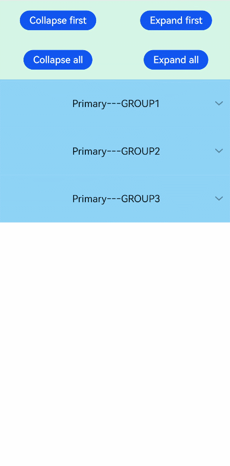
<!-- xxx.hml -->
<div class="doc-page">
  <list style="width: 100%;" id="mylist">
    <list-item class="top-list-item" clickeffect="false">
      <div class="item-div">
        <div class="item-child">
          <button type="capsule" value="Collapse first" onclick="collapseOne"></button>
          <button type="capsule" value="Expand first" onclick="expandOne"></button>
        </div>
        <div class="item-child">
          <button type="capsule" value="Collapse all" onclick="collapseAll"></button>
          <button type="capsule" value="Expand all" onclick="expandAll"></button>
        </div>
      </div>
    </list-item>
    <list-item-group for="listgroup in list" id="{{listgroup.value}}" ongroupcollapse="collapse" ongroupexpand="expand">
      <list-item type="item" style="background-color:#FFF0F5;height:95px;">
        <div class="item-group-child">
          <text>One---{{listgroup.value}}</text>
        </div>
      </list-item>
      <list-item type="item" style="background-color: #87CEFA;height:145px;" primary="true">
        <div class="item-group-child">
          <text>Primary---{{listgroup.value}}</text>
        </div>
      </list-item>
    </list-item-group>
  </list>
</div>
/* xxx.css */
.doc-page {
  flex-direction: column;
}
.top-list-item {
  width:100%;
  background-color:#D4F2E7;
}
.item-div {
  flex-direction:column;
  align-items:center;
  justify-content:space-around;
  height:240px;
}
.item-child {
  width:100%;
  height:60px;
  justify-content:space-around;
  align-items:center;
}
.item-group-child {
  justify-content: center;
  align-items: center;
  width:100%;
}
// xxx.js
import promptAction from '@ohos.promptAction';
export default {
    data: {
        direction: 'column',
        list: [],
        listAdd: []
    },
    onInit() {
        this.list = []
        this.listAdd = []
        for (var i = 1; i <= 3; i++) {
            var dataItem = {
                value: 'GROUP' + i,
            };
            this.list.push(dataItem);
        }
    },
    collapseOne(e) {
        this.$element('mylist').collapseGroup({
            groupid: 'GROUP1'
        })
    },
    expandOne(e) {
        this.$element('mylist').expandGroup({
            groupid: 'GROUP1'
        })
    },
    collapseAll(e) {
        this.$element('mylist').collapseGroup({
            groupid: ''
        })
    },
    expandAll(e) {
        this.$element('mylist').expandGroup({
            groupid: ''
        })
    },
    collapse(e) {
        promptAction.showToast({
            message: 'Close ' + e.groupid
        })
    },
    expand(e) {
        promptAction.showToast({
            message: 'Open ' + e.groupid
        })
    }
}
你可能感兴趣的鸿蒙文章
harmony 鸿蒙JavaScript-compatible Web-like Development Paradigm
- 所属分类: 后端技术
- 本文标签:
热门推荐
-
2、 优质文章
-
3、 gt
-
7、 openharmony
-
9、 golang
-
10、 Vue中input框自动聚焦