harmony 鸿蒙popup
popup
NOTE
This component is supported since API version 4. Updates will be marked with a superscript to indicate their earliest API version.
The <popup> component is used to display a pop-up to offer instructions after a user clicks a bound component or calls the specific API.
Required Permissions
None
Child Components
This component supports only one child component.5+
Attributes
In addition to the universal attributes, the following attributes are supported.
| Name | Type | Default Value | Mandatory | Description |
|---|---|---|---|---|
| target | string | - | Yes | ID of the target element. Dynamic switch is not supported. |
| placement | string | bottom | No | Position of the pop-up relative to the target element. Available values are as follows: - left: on the left of the target element. - right: on the right of the target element. - top: at the top of the target element; - bottom: at the bottom of the target element. - topLeft: in the upper left corner of the target element. - topRight: in the upper right corner of the target element. - bottomLeft: in the lower left corner of the target element. - bottomRight: in the lower right corner of the target element. |
| keepalive5+ | boolean | false | No | Whether to retain this pop-up. true: The pop-up does not disappear when users tap other areas or switch the page. To hide the pop-up, call the hide method. false: The pop-up disappears when users tap other areas or switch the page. |
| clickable5+ | boolean | true | No | Whether to display the pop-up when the user clicks the target element. If this attribute is set to false, the pop-up can be triggered only by an API call. |
| arrowoffset5+ | <length> | 0 | No | Offset of the pop-up arrow. By default, the arrow is centered. A positive value means that the arrow moves along the language direction (LTR or RTL), and a negative value means that the arrow moves along the opposite direction of the language direction. |
NOTE
The focusable attribute is not supported.
Styles
In addition to the universal styles, the following styles are supported.
| Name | Type | Default Value | Mandatory | Description |
|---|---|---|---|---|
| mask-color | <color> | - | No | Color configuration of the mask layer. By default, the mask layer is completely transparent. |
NOTE
Position-related styles are not supported.
Events
In addition to the universal events, the following events are supported.
| Name | Parameter | Description |
|---|---|---|
| visibilitychange | { visibility: boolean } | Triggered when a pop-up appears or disappears. |
Methods
The following methods are supported.
| Name | Parameter | Description |
|---|---|---|
| show5+ | - | Shows the pop-up. |
| hide5+ | - | Hides the pop-up. |
NOTE 1. Attributes and styles of a <popup> component cannot be dynamically updated.
Margins of a pop-up take effect depending on its position relative to the target element. For example, if the pop-up is below the target element, only margin-top takes effect; if the pop-up displays on the upper left of the target element, only margin-bottom and margin-right take effect.
Styles set for the four borders of a pop-up must be the same. If they are different and the border radius is 0, the first configured border style (in the sequence of left, top, right, and bottom) takes effect. Otherwise, the border attribute does not take effect.
The click event bound to the target element of a pop-up does not take effect.
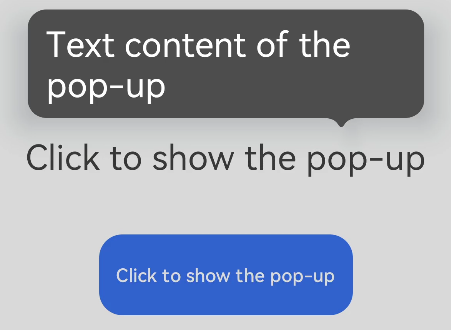
Example
<!-- xxx.hml -->
<div class="container">
  <text id="text">Click to show the pop-up</text>
  <!-- popup supports single child of any type5+ -->
  <popup id="popup" class="popup" target="text" placement="top" keepalive="true" clickable="true"
    arrowoffset="100px" onvisibilitychange="visibilitychange" onclick="hidepopup">
    <text class="text">Text content of the pop-up</text>
  </popup>
  <button class="button" onclick="showpopup">Click to show the pop-up</button>
</div>
/* xxx.css */
.container {
  flex-direction: column;
  align-items: center;
  padding-top: 200px;
}
.popup {
  mask-color: gray;
}
.text {
  color: white;
}
.button {
  width: 220px;
  height: 70px;
  margin-top: 50px;
}
// xxx.js
import promptAction from '@ohos.promptAction'
export default {
  visibilitychange(e) {
    promptAction.showToast({
      message: 'visibility change visibility: ' + e.visibility,
        duration: 3000
    });
  },
  showpopup() {
    this.$element("popup").show();
  },
  hidepopup() {
    this.$element("popup").hide();
  }
}
你可能感兴趣的鸿蒙文章
harmony 鸿蒙JavaScript-compatible Web-like Development Paradigm
- 所属分类: 后端技术
- 本文标签:
热门推荐
-
2、 优质文章
-
3、 gt
-
7、 openharmony
-
9、 golang
-
10、 Vue中input框自动聚焦