harmony 鸿蒙Page Transition (pageTransition)
Page Transition (pageTransition)
You can customize the page entrance and exit animations in the pageTransition API for transition between pages. For details, see Page Transition Animation.
NOTE
This event is supported since API version 7. Updates will be marked with a superscript to indicate their earliest API version.
To achieve a better transition effect, you are advised to use the Navigation component and modal transition.
pageTransition
pageTransition?(): void
Defines the transition animation to play when the user accesses this page or is redirected from this page to another page.
Atomic service API: This API can be used in atomic services since API version 11.
System capability: SystemCapability.ArkUI.ArkUI.Full
PageTransitionEnter
PageTransitionEnter(value: PageTransitionOptions)
Sets the page entrance animation. Inherits from CommonTransition.
Atomic service API: This API can be used in atomic services since API version 11.
System capability: SystemCapability.ArkUI.ArkUI.Full
Parameters
| Name | Type | Mandatory | Description |
|---|---|---|---|
| value | PageTransitionOptions | Yes | Page entrance animation. |
onEnter
onEnter(event: PageTransitionCallback): PageTransitionEnterInterface
Invoked on a per-frame basis until the entrance animation is complete, with the progress parameter changing from 0 to 1.
Atomic service API: This API can be used in atomic services since API version 11.
System capability: SystemCapability.ArkUI.ArkUI.Full
Parameters
| Name | Type | Mandatory | Description |
|---|---|---|---|
| event | PageTransitionCallback | Yes | Callback invoked on a per-frame basis until the entrance animation is complete, with the progress parameter changing from 0 to 1. |
Example
  pageTransition() {
    PageTransitionEnter({ duration: 1200, curve: Curve.Linear })
      // During the transition animation, the entrance animation has a type that represents the route type, and a progress that increases from 0 to 1.
      .onEnter((type: RouteType, progress: number) => {
        // Service logic
      })
  }
PageTransitionExit
PageTransitionExit(value: PageTransitionOptions)
Sets the page exit animation. Inherits from CommonTransition.
Atomic service API: This API can be used in atomic services since API version 11.
System capability: SystemCapability.ArkUI.ArkUI.Full
Parameters
| Name | Type | Mandatory | Description |
|---|---|---|---|
| value | PageTransitionOptions | Yes | Page exit animation. |
onExit
onExit(event: PageTransitionCallback): PageTransitionExitInterface
Invoked on a per-frame basis until the exit animation is complete, with the progress parameter changing from 0 to 1.
System capability: SystemCapability.ArkUI.ArkUI.Full
Atomic service API: This API can be used in atomic services since API version 11.
Parameters
| Name | Type | Mandatory | Description |
|---|---|---|---|
| event | PageTransitionCallback | Yes | Callback invoked on a per-frame basis until the exit animation is complete, with the progress parameter changing from 0 to 1. |
Example
  pageTransition() {
    PageTransitionExit({ duration: 1200, curve: Curve.Linear })
      // During the transition animation, the exit animation has a type that represents the route type, and a progress that increases from 0 to 1.
      .onExit((type: RouteType, progress: number) => {
        // Service logic
      })
  }
PageTransitionOptions
Atomic service API: This API can be used in atomic services since API version 11.
System capability: SystemCapability.ArkUI.ArkUI.Full
| Name | Type | Mandatory | Description |
|---|---|---|---|
| type | RouteType | No | Route type for the page transition effect to take effect. Default value: RouteType.None |
| duration | number | No | Animation duration. Unit: ms Default value: 1000 Value range: [0, +∞) |
| curve | Curve |string |ICurve10+ | No | Animation curve. You are advised to specify the curve using the Curve or** ICurve** type. For the string type, this parameter indicates an animation interpolation curve. For available values, see the curve parameter in AnimateParam. Default value: Curve.Linear |
| delay | number | No | Animation delay. Unit: ms Default value: 0 NOTE If no match is found, the default page transition effect is used (which may vary according to the device). To disable the default page transition effect, set duration to 0. |
CommonTransition
Defines a common transition animation for page transitions.
Atomic service API: This API can be used in atomic services since API version 11.
System capability: SystemCapability.ArkUI.ArkUI.Full
constructor
constructor()
A constructor used to create a common transition animation.
Atomic service API: This API can be used in atomic services since API version 11.
System capability: SystemCapability.ArkUI.ArkUI.Full
slide
slide(value: SlideEffect): T
Sets the slide-in and slide-out effects for page transitions.
Atomic service API: This API can be used in atomic services since API version 11.
System capability: SystemCapability.ArkUI.ArkUI.Full
Parameters
| Name | Type | Mandatory | Description |
|---|---|---|---|
| value | SlideEffect | Yes | Slide-in and slide-out effects for page transitions. |
translate
translate(value: TranslateOptions): T
Sets the translation effect for page transitions.
Atomic service API: This API can be used in atomic services since API version 11.
System capability: SystemCapability.ArkUI.ArkUI.Full
Parameters
| Name | Type | Mandatory | Description |
|---|---|---|---|
| value | TranslateOptions | Yes | Translation effect for page transitions, specifying the start value for entrance and the end value for exit. When this parameter is set together with slide, the latter takes effect by default. - x: translation distance along the x-axis. - y: translation distance along the y-axis. - z: translation distance along the y-axis. |
scale
scale(value: ScaleOptions): T
Sets the scaling effect for page transitions.
Atomic service API: This API can be used in atomic services since API version 11.
System capability: SystemCapability.ArkUI.ArkUI.Full
Parameters
| Name | Type | Mandatory | Description |
|---|---|---|---|
| value | ScaleOptions | Yes | Scaling effect for page transitions, specifying the start value for entrance and the end value for exit. - x: scale factor along the x-axis. - y: scale factor along the y-axis. - z: scale factor along the z-axis. - centerX and centerY: scaling center. The default values are both “50%”, meaning the center of the page is used as the scaling center by default. - If the center point is (0, 0), it refers to the upper left corner of the component. |
opacity
opacity(value: number): T
Sets the starting opacity value for entrance or the ending opacity value for exit.
Atomic service API: This API can be used in atomic services since API version 11.
System capability: SystemCapability.ArkUI.ArkUI.Full
Parameters
| Name | Type | Mandatory | Description |
|---|---|---|---|
| value | number | Yes | Starting opacity value for entrance or the ending opacity value for exit. Value range: [0, 1] |
PageTransitionCallback14+
type PageTransitionCallback = (type: RouteType, progress: number) => void
Represents the callback for page transition events.
Atomic service API: This API can be used in atomic services since API version 14.
System capability: SystemCapability.ArkUI.ArkUI.Full
| Name | Type | Mandatory | Description |
|---|---|---|---|
| type | RouteType | Yes | Type of page transition. |
| progress | number | Yes | Transition progress, ranging from 0 to 1. |
## RouteType
System capability: SystemCapability.ArkUI.ArkUI.Full
Atomic service API: This API can be used in atomic services since API version 11.
| Name | Description |
|---|---|
| Pop | Redirects to a specified page. To redirect the user from page B back to page A, set RouteType of PageTransitionExit to None or Pop for page B and set RouteType of PageTransitionEnter to None or Pop for page A. |
| Push | Redirects to the next page. To redirect the user from page A to page B, set RouteType of PageTransitionExit to None or Push for page A and set RouteType of PageTransitionEnter to None or Push for page B. |
| None | The page is not redirected. The animation specified by PageTransitionEnter takes effect for page entrance, and the animation specified by PageTransitionExit takes effect for page exit. |
SlideEffect
Atomic service API: This API can be used in atomic services since API version 11.
System capability: SystemCapability.ArkUI.ArkUI.Full
| Name | Description |
|---|---|
| Left | When set to Enter, slides in from the left. When set to Exit, slides out to the left. Atomic service API: This API can be used in atomic services since API version 11. |
| Right | When set to Enter, slides in from the right. When set to Exit, slides out to the right. Atomic service API: This API can be used in atomic services since API version 11. |
| Top | When set to Enter, slides in from the top. When set to Exit, slides out to the top. Atomic service API: This API can be used in atomic services since API version 11. |
| Bottom | When set to Enter, slides in from the bottom. When set to Exit, slides out to the bottom. Atomic service API: This API can be used in atomic services since API version 11. |
| START12+ | Left-to-right scripts: When set to Enter, slides in from the left; when set to Exit, slides out to the left. Right-to-left scripts: When set to Enter, slides in from the right; when set to Exit, slides out to the right. Atomic service API: This API can be used in atomic services since API version 12. |
| END12+ | Left-to-right scripts: When set to Enter, slides in from the right; when set to Exit, slides out to the right. Right-to-left scripts: When set to Enter, slides in from the left; when set to Exit, slides out to the left. Atomic service API: This API can be used in atomic services since API version 12. |
Example
Example 1: Configuring Entrance and Exit Animations
Method 1: Configure different entrance and exit animations based on different transition types.
// index.ets
import { router } from '@kit.ArkUI';

@Entry
@Component
struct Index {
  @State scale1: number = 1
  @State opacity1: number = 1

  build() {
    Column() {
      Image($r("app.media.transition_image1")).width('100%').height('100%')
    }
    .width('100%')
    .height('100%')
    .scale({ x: this.scale1 })
    .opacity(this.opacity1)
    .onClick(() => {
      router.pushUrl({ url: 'pages/Page1' })
    })
  }

  pageTransition() {
    PageTransitionEnter({ duration: 1200, curve: Curve.Linear })
      .onEnter((type: RouteType, progress: number) => {
        if (type == RouteType.Push||type == RouteType.Pop) {
          this.scale1 = progress
          this.opacity1 = progress
        }
      })
    PageTransitionExit({ duration: 1200, curve: Curve.Ease })
      .onExit((type: RouteType, progress: number) => {
        if (type == RouteType.Push) {
          this.scale1 = 1 - progress
          this.opacity1 = 1 - progress
        }
      })
  }
}
// page1.ets
import { router } from '@kit.ArkUI';

@Entry
@Component
struct Page1 {
  @State scale2: number = 1
  @State opacity2: number = 1

  build() {
    Column() {
      Image($r("app.media.transition_image2")).width('100%').height('100%') // Store the image in the media folder.
    }
    .width('100%')
    .height('100%')
    .scale({ x: this.scale2 })
    .opacity(this.opacity2)
    .onClick(() => {
      router.pushUrl({ url: 'pages/Index' })
    })
  }

  pageTransition() {
    PageTransitionEnter({ duration: 1200, curve: Curve.Linear })
      .onEnter((type: RouteType, progress: number) => {
        if (type == RouteType.Push||type == RouteType.Pop) {
          this.scale2 = progress
        }
        this.opacity2 = progress
      })
    PageTransitionExit({ duration: 1200, curve: Curve.Ease })
      .onExit((type: RouteType, progress: number) => {
        if (type == RouteType.Pop) {
          this.scale2 = 1 - progress
          this.opacity2 = 1 - progress
        }
      })
  }
}

Method 2: Configure the entrance animation of sliding in from the left and the exit animation of translating with opacity change.
// index.ets
@Entry
@Component
struct PageTransitionExample {
  build() {
    Column() {
      Navigator({ target: 'pages/page1', type: NavigationType.Push }) {
        Image($r("app.media.transition_image2")).width('100%').height('100%') // The image is stored in the media folder.
      }
    }
  }

  // Use the default effects provided by the system, such as translation, scaling, and opacity.
  pageTransition() {
    // Set the duration of the entrance animation to 1200 ms, in the purpose of matching the duration of the exit animation of the other page.
    PageTransitionEnter({ duration: 1200 })
      .slide(SlideEffect.Left)
    // Set the duration of the exit animation to 1000 ms, in the purpose of matching the duration of the entrance animation of the other page.
    PageTransitionExit({ duration: 1000 })
      .translate({ x: 100.0, y: 100.0 })
      .opacity(0)
  }
}
// page1.ets
@Entry
@Component
struct PageTransitionExample1 {
  build() {
    Column() {
      Navigator({ target: 'pages/index', type: NavigationType.Push }) {
        Image($r('app.media.bg2')).width('100%').height('100%') // The image is stored in the media folder.
      }
    }
  }

  // Use the default effects provided by the system, such as translation, scaling, and opacity.
  pageTransition() {
    // Set the duration of the entrance animation to 1000 ms, in the purpose of matching the duration of the exit animation of the other page.
    PageTransitionEnter({ duration: 1000 })
      .slide(SlideEffect.Left)
    // Set the duration of the exit animation to 1200 ms, in the purpose of matching the duration of the entrance animation of the other page.
    PageTransitionExit({ duration: 1200 })
      .translate({ x: 100.0, y: 100.0 })
      .opacity(0)
  }
}

Example 2: Setting Translation Effects for Entrance and Exit
Method 1: Configure the various translation effects provided, with the system language layout mode set to right-to-left (RTL).
// index.ets
import { router } from '@kit.ArkUI'
@Entry
@Component
struct PageTransitionExample {
@State scale1: number = 1
@State opacity1: number = 1
build() {
Column() {
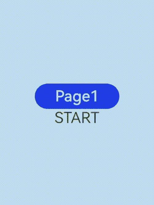
Button("Page 1").onClick(() => {
router.pushUrl({
url: "pages/page1"
})
})
.width(200)
.height(60)
.fontSize(36)
Text("START")
.fontSize(36)
.textAlign(TextAlign.Center)
}
.scale({ x: this.scale1 })
.opacity(this.opacity1)
.height("100%")
.width("100%")
.justifyContent(FlexAlign.Center)
}
// Customization method 2: Use the default effects provided by the system, such as translation, scaling, and opacity.
pageTransition() {
// Set the entrance animation.
PageTransitionEnter({ duration: 200 })
.slide(SlideEffect.START)
// Set the exit animation.
PageTransitionExit({ delay: 100 })
.slide(SlideEffect.START) //Left
}
}
// page1.ets
import { router } from '@kit.ArkUI'

@Entry
@Component
struct PageTransitionExample {
  @State scale1: number = 1
  @State opacity1: number = 1

  build() {
    Column() {
      Button("Page 2").onClick(() => {
        router.pushUrl({
          url: "pages/Index"
        })
      })
        .width(200)
        .height(60)
        .fontSize(36)
      Text("END")
        .fontSize(36)
        .textAlign(TextAlign.Center)
    }
    .scale({ x: this.scale1 })
    .opacity(this.opacity1)
    .height("100%")
    .width("100%")
    .justifyContent(FlexAlign.Center)
  }

  // Customization method 2: Use the default effects provided by the system, such as translation, scaling, and opacity.
  pageTransition() {
    PageTransitionEnter({ duration: 200 })
      .slide(SlideEffect.END) //Right
    PageTransitionExit({ delay: 100 })
      .slide(SlideEffect.END) //Right
  }
}
Method 2: Use the system’s default entrance and exit effects, with the system language layout mode set to right-to-left (RTL).
// index.ets
import { router } from '@kit.ArkUI'

@Entry
@Component
struct PageTransitionExample {
  @State scale1: number = 1
  @State opacity1: number = 1

  build() {
    Column() {
      Button("Page 1").onClick(() => {
        router.pushUrl({
          url: "pages/page1"
        })
      })
        .width(200)
        .height(60)
        .fontSize(36)
    }
    .scale({ x: this.scale1 })
    .opacity(this.opacity1)
    .height("100%")
    .width("100%")
    .justifyContent(FlexAlign.Center)
  }
}
// page1.ets
import { router } from '@kit.ArkUI'

@Entry
@Component
struct PageTransitionExample {
  @State scale1: number = 1
  @State opacity1: number = 1

  build() {
    Column() {
      Button("Page 2").onClick(() => {
        router.pushUrl({
          url: "pages/Index"
        })
      })
        .width(200)
        .height(60)
        .fontSize(36)
    }
    .scale({ x: this.scale1 })
    .opacity(this.opacity1)
    .height("100%")
    .width("100%")
    .justifyContent(FlexAlign.Center)
  }
}
你可能感兴趣的鸿蒙文章
- 所属分类: 后端技术
- 本文标签:
热门推荐
-
2、 优质文章
-
3、 gt
-
7、 openharmony
-
9、 golang
-
10、 Vue中input框自动聚焦