harmony 鸿蒙Component Navigation (Navigation) (Recommended)
Component Navigation (Navigation) (Recommended)
Component navigation, implemented using the Navigation component, is instrumental for managing transitions between pages and within components. It allows for the passing of redirection parameters across various components and offers various stack operations to simplify access to and reuse of diverse pages. This documentation delves into the display modes, routing operations, subpage management, cross-package navigation, and the effects of navigation transitions.
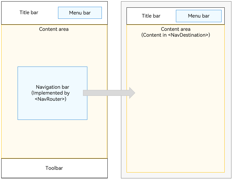
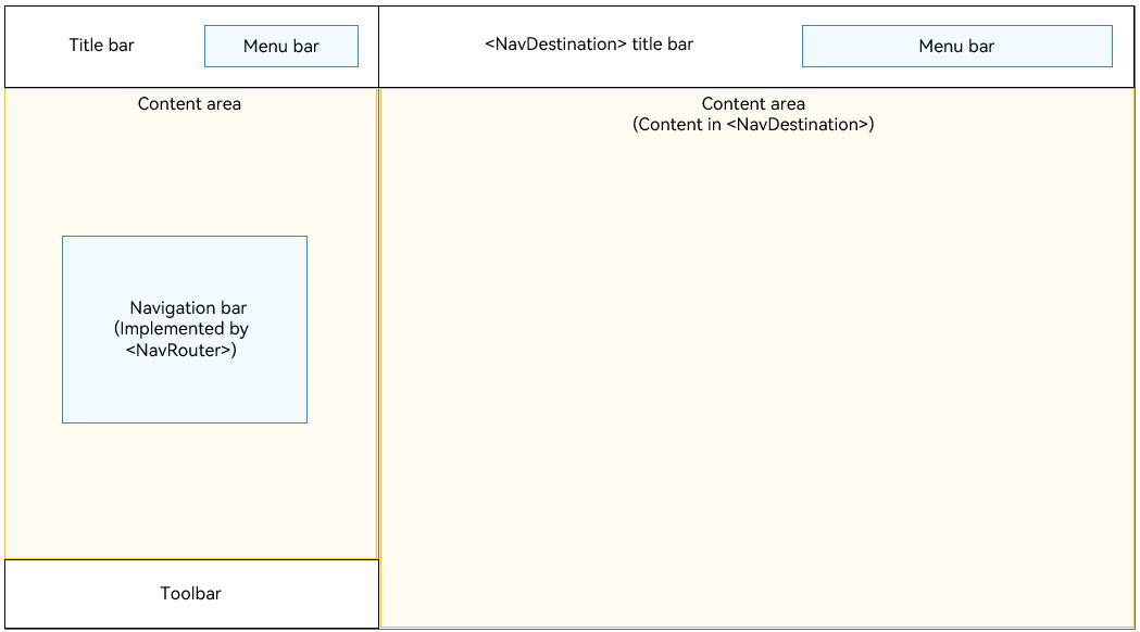
The Navigation component serves as the root view container for route navigation and is commonly used as the root container for pages decorated with @Entry. It supports three display modes: Stack, Split, and Auto. This component is designed for both intra-module and cross-module routing, leveraging component-level routing to provide a more natural and seamless transition between pages. It also offers multiple title bar styles to enhance the cascading between titles and content. In one-time development for multi-device deployment scenarios, the Navigation component can automatically adapt to the window size. When the window is large enough, it automatically displays content in columns.
The Navigation component consists of a navigation page and subpages. The navigation page consists of the title bar (with the menu bar), content area, and toolbar, and can be hidden through the hideNavBar attribute. Unlike other pages, the navigation page does not reside in the page stack. Routing is used to manage transitions between the navigation page and its subpages, as well as between subpages themselves.
In API version 9, the Navigation component must be used together with the NavRouter component for page routing. Since API version 10, whenever possible, use NavPathStack instead to implement page routing.
Setting the Page Display Mode
The Navigation component uses the mode attribute to set the page display mode.
- Adaptive Mode
By default, the Navigation component is in adaptive mode. In this case, the mode attribute is NavigationMode.Auto. In adaptive mode, when the device width is greater than or equal to the threshold (520 vp for API version 9 and earlier and 600 vp for API version 10 and later), the Navigation component uses the column mode. Otherwise, the Navigation component uses the single-page mode.
  Navigation() {
    // ...
  }
  .mode(NavigationMode.Auto)
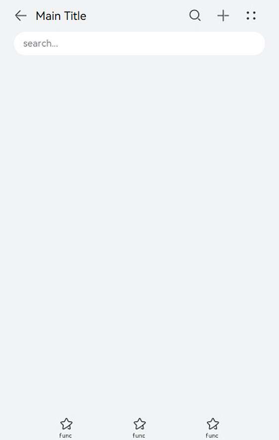
Single-page mode
Figure 1 Single-page mode
Set mode to NavigationMode.Stack so that the Navigation component is displayed on a single page.
  Navigation() {
    // ...
  }
  .mode(NavigationMode.Stack)
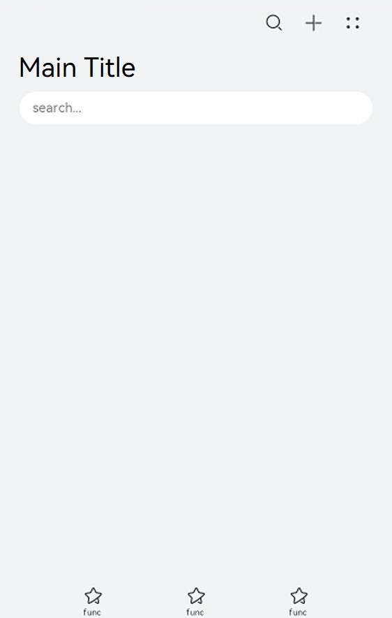
- Column mode
Figure 2 Column mode
Set mode to NavigationMode.Split so that the Navigation component is displayed in columns.
@Entry
@Component
struct NavigationExample {
@State TooTmp: ToolbarItem = {
'value': "func", 'icon': "./image/ic_public_highlights.svg", 'action': () => {
}
}
@Provide('pageInfos') pageInfos: NavPathStack = new NavPathStack()
private arr: number[] = [1, 2, 3];
@Builder
PageMap(name: string) {
if (name === "NavDestinationTitle1") {
pageOneTmp()
} else if (name === "NavDestinationTitle2") {
pageTwoTmp()
} else if (name === "NavDestinationTitle3") {
pageThreeTmp()
}
}
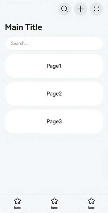
build() {
Column() {
Navigation(this.pageInfos) {
TextInput({ placeholder: 'Search...' })
.width("90%")
.height(40)
.backgroundColor('#FFFFFF')
List({ space: 12 }) {
ForEach(this.arr, (item: number) => {
ListItem() {
Text("Page" + item)
.width("100%")
.height(72)
.backgroundColor('#FFFFFF')
.borderRadius(24)
.fontSize(16)
.fontWeight(500)
.textAlign(TextAlign.Center)
.onClick(() => {
this.pageInfos.pushPath({ name: "NavDestinationTitle" + item })
})
}
}, (item: number) => item.toString())
}
.width("90%")
.margin({ top: 12 })
}
.title("Main Title")
.mode(NavigationMode.Split)
.navDestination(this.PageMap)
.menus([
{
value: "", icon: "./image/ic_public_search.svg", action: () => {
}
},
{
value: "", icon: "./image/ic_public_add.svg", action: () => {
}
},
{
value: "", icon: "./image/ic_public_add.svg", action: () => {
}
},
{
value: "", icon: "./image/ic_public_add.svg", action: () => {
}
},
{
value: "", icon: "./image/ic_public_add.svg", action: () => {
}
}
])
.toolbarConfiguration([this.TooTmp, this.TooTmp, this.TooTmp])
}
.height('100%')
.width('100%')
.backgroundColor('#F1F3F5')
}
}
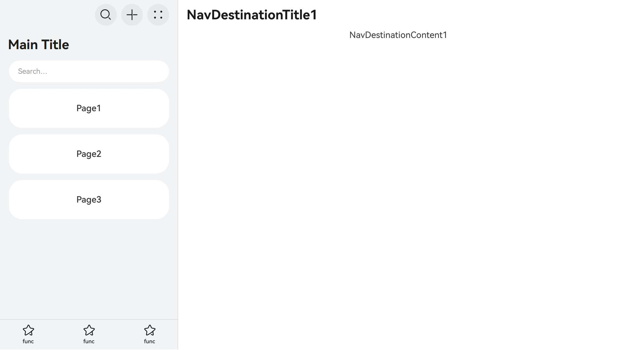
// PageOne.ets
@Component
export struct pageOneTmp {
@Consume('pageInfos') pageInfos: NavPathStack;
build() {
NavDestination() {
Column() {
Text("NavDestinationContent1")
}.width('100%').height('100%')
}.title("NavDestinationTitle1")
.onBackPressed(() => {
const popDestinationInfo = this.pageInfos.pop() // Pop the top element out of the navigation stack.
console.log('pop' + 'Return value' + JSON.stringify(popDestinationInfo))
return true
})
}
}
// PageTwo.ets
@Component
export struct pageTwoTmp {
@Consume('pageInfos') pageInfos: NavPathStack;
build() {
NavDestination() {
Column() {
Text("NavDestinationContent2")
}.width('100%').height('100%')
}.title("NavDestinationTitle2")
.onBackPressed(() => {
const popDestinationInfo = this.pageInfos.pop() // Pop the top element out of the navigation stack.
console.log('pop' + 'Return value' + JSON.stringify(popDestinationInfo))
return true
})
}
}
// PageThree.ets
@Component
export struct pageThreeTmp {
@Consume('pageInfos') pageInfos: NavPathStack;
build() {
NavDestination() {
Column() {
Text("NavDestinationContent3")
}.width('100%').height('100%')
}.title("NavDestinationTitle3")
.onBackPressed(() => {
const popDestinationInfo = this.pageInfos.pop() // Pop the top element out of the navigation stack.
console.log('pop' + 'Return value' + JSON.stringify(popDestinationInfo))
return true
})
}
}
Setting the Title Bar Mode
The title bar is on the top of the page and is used to display the page name and operation entry. The Navigation component uses the titleMode attribute to set the title bar mode.
NOTE
If no main title or subtitle is set for Navigation or NavDestination and there is no back button, the title bar is not displayed.
- Mini mode
Applicable when the title of a level-1 page does not need to be highlighted.
Figure 3 Title bar in Mini mode
  Navigation() {
    // ...
  }
  .titleMode(NavigationTitleMode.Mini)
- Full mode
Applicable when the title of a level-1 page needs to be highlighted.
**Figure 4** Title bar in Full mode
  Navigation() {
    // ...
  }
  .titleMode(NavigationTitleMode.Full)
Setting the Menu Bar
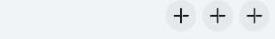
The menu bar is in the upper right corner of the Navigation component. You can set the menu bar through the menus attribute, which supports two parameter types: Array<NavigationMenuItem> and CustomBuilder. When the Array<NavigationMenuItem> type is used, a maximum of three icons can be displayed in portrait mode and a maximum of five icons can be displayed in landscape mode. Extra icons will be placed in the automatically generated More icons.
Figure 5 Menu bar with three icons
let TooTmp: NavigationMenuItem = {'value': "", 'icon': "./image/ic_public_highlights.svg", 'action': ()=> {}}
Navigation() {
  // ...
}
.menus([TooTmp,
  TooTmp,
  TooTmp])
You can also reference images in the resources folder.
let TooTmp: NavigationMenuItem = {'value': "", 'icon': "resources/base/media/ic_public_highlights.svg", 'action': ()=> {}}
Navigation() {
  // ...
}
.menus([TooTmp,
  TooTmp,
  TooTmp])
Figure 6 Menu bar with four icons

let TooTmp: NavigationMenuItem = {'value': "", 'icon': "./image/ic_public_highlights.svg", 'action': ()=> {}}
Navigation() {
  // ...
}
// In portrait mode, the toolbar shows a maximum of five icons, with any additional icons placed under an automatically generated More icon.
.menus([TooTmp,
  TooTmp,
  TooTmp,
  TooTmp])
Setting the Toolbar
Use the toolbarConfiguration attribute to customize the toolbar, which is located at the bottom of the Navigation component.
Figure 7 Toolbar

let TooTmp: ToolbarItem = {'value': "func", 'icon': "./image/ic_public_highlights.svg", 'action': ()=> {}}
let TooBar: ToolbarItem[] = [TooTmp,TooTmp,TooTmp]
Navigation() {
  // ...
}
.toolbarConfiguration(TooBar)
Routing Operations
Navigation-related routing operations are all based on the APIs provided by NavPathStack. For each Navigation component, a NavPathStack object must be created and passed in to manage pages. The router operations mainly involve page navigation, page return, page replacement, page deletion, parameter acquisition, and route interception.
NavPathStack can be inherited since API version 12. You can customize attributes and methods in derived classes or override methods of the parent class. Derived class objects can be used in place of the base class NavPathStack objects. For details about the sample code, see Example 10: Defining a Derived Class of NavPathStack.
NOTE
Avoid relying on lifecycle event listeners as a means to manage the navigation stack.
@Entry
@Component
struct Index {
  // Create a NavPathStack object and pass it to Navigation.
  pageStack: NavPathStack = new NavPathStack()

  build() {
    Navigation(this.pageStack) {
    }
    .title('Main')
  }
}
Page Navigation
NavPathStack implements the following types of page navigation through Push related APIs:
Normal navigation: Navigation is conducted by page name and allows for passing of param.
this.pageStack.pushPath({ name: "PageOne", param: "PageOne Param" })
this.pageStack.pushPathByName("PageOne", "PageOne Param")
Navigation with a return callback: An onPop callback is added during navigation to obtain return information and process it upon page popping.
this.pageStack.pushPathByName('PageOne', "PageOne Param", (popInfo) => {
  console.log('Pop page name is: ' + popInfo.info.name + ', result: ' + JSON.stringify(popInfo.result))
});
Navigation with an error code: Upon failure, an asynchronous callback is triggered to provide the error code information.
this.pageStack.pushDestination({name: "PageOne", param: "PageOne Param"})
  .catch((error: BusinessError) => {
    console.error(`Push destination failed, error code = ${error.code}, error.message = ${error.message}.`);
  }).then(() => {
    console.info('Push destination succeed.');
  });
this.pageStack.pushDestinationByName("PageOne", "PageOne Param")
  .catch((error: BusinessError) => {
    console.error(`Push destination failed, error code = ${error.code}, error.message = ${error.message}.`);
  }).then(() => {
    console.info('Push destination succeed.');
  });
Page Return
NavPathStack implements the page return feature through Pop related APIs.
// Return to the previous page.
this.pageStack.pop()
// Return to the previous PageOne page.
this.pageStack.popToName("PageOne")
// Return to the page whose index is 1.
this.pageStack.popToIndex(1)
// Return to the root home page (clear all pages in the stack).
this.pageStack.clear()
Page Replacement
NavPathStack implements the page replacement feature through Replace related APIs.
// Replace the top page of the stack with PageOne.
this.pageStack.replacePath({ name: "PageOne", param: "PageOne Param" })
this.pageStack.replacePathByName("PageOne", "PageOne Param")
// Replacement with an error code: Upon failure, an asynchronous callback is triggered to provide the error code information.
this.pageStack.replaceDestination({name: "PageOne", param: "PageOne Param"})
  .catch((error: BusinessError) => {
    console.error(`Replace destination failed, error code = ${error.code}, error.message = ${error.message}.`);
  }).then(() => {
    console.info('Replace destination succeed.');
  })
Page Deletion
NavPathStack implements the page deletion feature through Remove related APIs.
// Remove all pages whose name is PageOne from the stack.
this.pageStack.removeByName("PageOne")
// Remove the page with the specified index.
this.pageStack.removeByIndexes([1,3,5])
// Remove the page with the specified ID.
this.pageStack.removeByNavDestinationId("1");
Page Moving
NavPathStack implements the page moving feature through Move related APIs.
// Move the page named PageOne to the top of the stack.
this.pageStack.moveToTop("PageOne");
// Move the page at index 1 to the top of the stack.
this.pageStack.moveIndexToTop(1);
Parameter Acquisition
NavPathStack obtains parameters of the page through Get related APIs.
// Obtain all page names in the stack.
this.pageStack.getAllPathName()
// Obtain the parameters of the page whose index is 1.
this.pageStack.getParamByIndex(1)
// Obtain the parameters of the PageOne page.
this.pageStack.getParamByName("PageOne")
// Obtain the index set of the PageOne page.
this.pageStack.getIndexByName("PageOne")
Route Interception
NavPathStack provides the setInterception API to set callbacks for page navigation interception of Navigation. This API requires passing in a NavigationInterception object, which contains three callback functions described below.
| Name | Description |
|---|---|
| willShow | Callback invoked when the page is about to be navigated, allowing for stack operations, which are effective in the current navigation. |
| didShow | Callback invoked after the page is navigated. Stack operations in this callback are effective in the next navigation. |
| modeChange | Callback invoked when the display mode of the Navigation component switches between single-column and dual-column. |
NOTE
The navigation stack has already changed when any of the preceding callbacks is invoked.
You can implement the capability to intercept and redirect in the willShow callback by modifying the route stack.
this.pageStack.setInterception({
  willShow: (from: NavDestinationContext|"navBar", to: NavDestinationContext|"navBar",
    operation: NavigationOperation, animated: boolean) => {
    if (typeof to === "string") {
      console.log("target page is navigation home page.");
      return;
    }
    // Redirect navigation to PageTwo to PageOne.
    let target: NavDestinationContext = to as NavDestinationContext;
    if (target.pathInfo.name === 'PageTwo') {
      target.pathStack.pop();
      target.pathStack.pushPathByName('PageOne', null);
    }
  }
})
Subpage
NavDestination is the root container for Navigation subpages, used to hold some special attributes as well as lifecycles of subpages. You can set separate attributes such as the title bar and menu bar for NavDestination, in the same way you set attributes for Navigation. You can also set different display modes for NavDestination through the mode attribute to meet different page requirements.
Page Display Mode
- Standard mode
By default, subpages in the NavDestination component are in standard mode, which corresponds to the NavDestinationMode.STANDARD value of the mode attribute. The lifecycle of a standard type NavDestination follows the changes in its position in the NavPathStack.
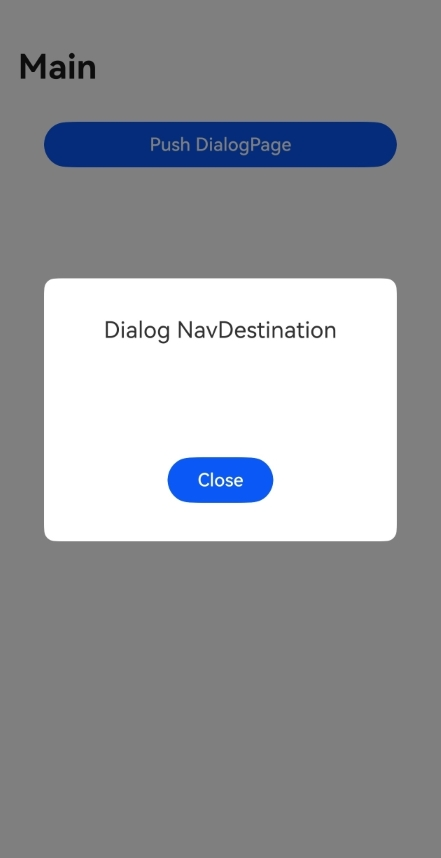
- Dialog mode
With mode set to NavDestinationMode.DIALOG, a NavDestination The appearance and disappearance of the dialog-type NavDestination will not affect the display and lifecycle of the underlying standard-type NavDestination, and the two can be displayed at the same time.
  // Dialog NavDestination
  @Entry
  @Component
   struct Index {
     @Provide('NavPathStack') pageStack: NavPathStack = new NavPathStack()

     @Builder
     PagesMap(name: string) {
       if (name == 'DialogPage') {
         DialogPage()
       }
     }

     build() {
       Navigation(this.pageStack) {
         Button('Push DialogPage')
           .margin(20)
           .width('80%')
           .onClick(() => {
             this.pageStack.pushPathByName('DialogPage', '');
           })
       }
       .mode(NavigationMode.Stack)
       .title('Main')
       .navDestination(this.PagesMap)
     }
   }

   @Component
   export struct DialogPage {
     @Consume('NavPathStack') pageStack: NavPathStack;

     build() {
       NavDestination() {
         Stack({ alignContent: Alignment.Center }) {
           Column() {
             Text("Dialog NavDestination")
               .fontSize(20)
               .margin({ bottom: 100 })
             Button("Close").onClick(() => {
               this.pageStack.pop()
             }).width('30%')
           }
           .justifyContent(FlexAlign.Center)
           .backgroundColor(Color.White)
           .borderRadius(10)
           .height('30%')
           .width('80%')
         }.height("100%").width('100%')
       }
       .backgroundColor('rgba(0,0,0,0.5)')
       .hideTitleBar(true)
       .mode(NavDestinationMode.DIALOG)
     }
   }
Page Lifecycle
Navigation, as a routing container, hosts its lifecycle within the NavDestination component and exposes lifecycle events as component events.
The lifecycle of Navigation can be divided into three categories: custom component lifecycle, universal component lifecycle, and its own exclusive lifecycle. aboutToAppear and aboutToDisappear are the lifecycle callbacks of custom components (custom components contained in the outer layer of NavDestination); OnAppear and OnDisappear are universal component lifecycle callbacks. The remaining six lifecycle events are unique to NavDestination.
The sequence of these lifecycle events is illustrated in the figure below.
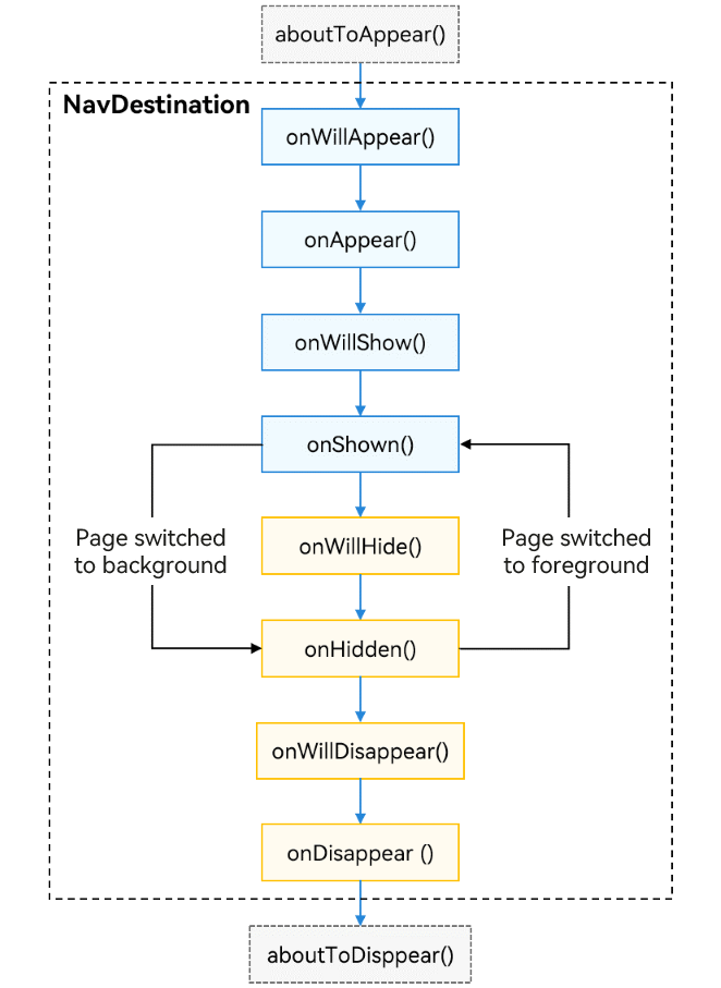
- aboutToAppear: Invoked when the custom component is about to appear. Specifically, it is invoked after a new instance of the custom component is created and before its build() function is executed (before the creation of NavDestination). You can change state variables in this callback, and the changes take effect in the subsequent execution of build().
- onWillAppear: invoked after the NavDestination component is created and before it is mounted to the component tree. Changing the state variable in this callback takes effect in the current frame.
- onAppear: invoked when the NavDestination component is mounted to the component tree. It is a universal lifecycle event.
- onWillShow: invoked before the NavDestination component layout is displayed. In this case, the page is invisible. (This callback is not invoked when the application is switched to the foreground.)
- onShown: invoked after the NavDestination component layout is displayed. At this time, the page layout is complete.
- onWillHide: invoked when the NavDestination component is about to be hidden (it is not invoked when the application is switched to the background).
- onHidden: invoked after the NavDestination component is hidden (when a non-top page is pushed into the stack, the top page pops out of the stack, or the application is switched to the background).
- onWillDisappear: invoked before the NavDestination component is about to be destroyed. If there is a transition animation, this callback is invoked before the animation (when the top page of the stack pops out of the stack).
- onDisappear: invoked when the NavDestination component is unloaded and destroyed from the component tree. It is a universal lifecycle event.
- aboutToDisappear: invoked before the custom component is destroyed. The state variable cannot be changed in this callback.
Page Listening and Query
To facilitate the decoupling of components from pages, custom components within NavDestination subpages can listen for or query some page status information through global APIs.
- Page information query
Custom components provide the queryNavDestinationInfo API, which can be used to query the information of the current page within NavDestination. The return value is NavDestinationInfo. If the query fails, the return value is undefined.
   import { uiObserver } from '@kit.ArkUI';

   // Custom components within NavDestination
   @Component
   struct MyComponent {
     navDesInfo: uiObserver.NavDestinationInfo|undefined

     aboutToAppear(): void {
       this.navDesInfo = this.queryNavDestinationInfo();
     }

     build() {
         Column() {
           Text("Page name: " + this.navDesInfo?.name)
         }.width('100%').height('100%')
     }
   }
- Page status listening
You can register a listener for NavDestination lifecycle changes using the observer.on(‘navDestinationUpdate’) API.
  uiObserver.on('navDestinationUpdate', (info) => {
       console.info('NavDestination state update', JSON.stringify(info));
   });
You can also register a callback for page transition states to obtain page information during route changes using NavDestinationSwitchInfo. This registration supports different scopes: UIAbilityContext and UIContext.
   // Used in UIAbility
   import { UIContext, uiObserver } from '@kit.ArkUI';

   // callBackFunc is a callback defined by you.
   function callBackFunc(info: uiObserver.NavDestinationSwitchInfo) {}
   uiObserver.on('navDestinationSwitch', this.context, callBackFunc);

   // The getUIContext() API of the window can be used to obtain the corresponding UIContent.
   uiContext: UIContext|null = null;
   uiObserver.on('navDestinationSwitch', this.uiContext, callBackFunc);
Page Transition
The Navigation component provides default transition animations for switching between pages. These animations are activated when operations are performed on the navigation stack, producing different transition effects. Note that for dialog box pages, the default transition animations are available only since API version 13. The Navigation component also offers advanced features such as disabling the default transitions and implementing custom transitions as well as shared element transitions.
Disabling Transitions
- On a Global Basis
To enable or disable all transition animations in the current Navigation component, you can use the disableAnimation API provided in NavPathStack.
  pageStack: NavPathStack = new NavPathStack()

  aboutToAppear(): void {
    this.pageStack.disableAnimation(true)
  }
- On a One-time Basis
To disable the transition animation for a single operation (implemented by APIs provided by NavPathStack, such as Push, Pop, and Replace), set the animated parameter in the API to false. This setting does not affect the next transition.
  pageStack: NavPathStack = new NavPathStack()

  this.pageStack.pushPath({ name: "PageOne" }, false)
  this.pageStack.pop(false)
Customizing a Transition
You can customize transition animations through the customNavContentTransition event. Specifically, you can define a custom transition animation in the following steps:
- Build a custom transition animation utility class CustomNavigationUtils, which manages custom transition animation CustomTransition objects for each page through a Map. A page registers its CustomTransition object when created and unregisters it when destroyed.
- Implement a transition protocol object NavigationAnimatedTransition. The timeout property indicates the transition timeout duration, with a default value of 1000 ms. The transition property is where you implement your custom transition animation logic; it is the method that the system calls when the transition starts. The onTransitionEnd is the callback for when the transition ends.
- Call the customNavContentTransition API to return the NavigationAnimatedTransition object. If undefined is returned, the system default transition is used.
For details about the sample code, see Example 3: Setting an Interactive Transition Animation.
Defining a Shared Element Transition
You can implement shared element transitions between navigation destination pages using geometryTransition. Ensure that the default transition animations are disabled for pages configured with shared element transitions. 1. Add the geometryTransition attribute to the components that need to implement shared element transitions, ensuring that the id parameter is consistent between the two NavDestination components.
```ts
// Set id of the source page.
NavDestination() {
  Column() {
    // ...
    Image($r('app.media.startIcon'))
    .geometryTransition('sharedId')
    .width(100)
    .height(100)
  }
}
.title('FromPage')

// Set id of the destination page.
NavDestination() {
  Column() {
    // ...
    Image($r('app.media.startIcon'))
    .geometryTransition('sharedId')
    .width(200)
    .height(200)
  }
}
.title('ToPage')
```
Place the page routing operation in the animateTo animation closure, set the corresponding animation parameters, and disable the default transition.
NavDestination() {
  Column() {
    Button('Go to Destination Page')
    .width('80%')
    .height(40)
    .margin(20)
    .onClick(() => {
        this.getUIContext()?.animateTo({ duration: 1000 }, () => {
          this.pageStack.pushPath({ name: 'ToPage' }, false)
        })
    })
  }
}
.title('FromPage')
Cross-Package Dynamic Routing
Using static imports for page routing can lead to coupling between different modules and prolonged home page loading times.
The purpose of dynamic routing is to allow multiple modules (HARs/HSPs) to reuse the same business logic, with decoupling between different modules and integration of routing functionality.
Advantages of dynamic routing
- In addition to the URL for navigation, you can configure various information, such as the default orientation (landscape or portrait) and whether authentication is required. The configuration is processed in a unified manner during routing
- You can assign a name to each routing page and navigate by name instead of file path.
- Dynamic imports (on-demand loading) can be used to load pages to prevent the first page from loading a large amount of code, which can cause stuttering.
Dynamic routing provides two modes: System Routing Table and Custom Routing Table.
The system routing table is easier to use than the custom routing table. It only requires adding the corresponding page navigation configuration items to implement page navigation.
The custom route table is more complex to use, but can be customized to meet specific service requirements.
The custom route table and system route table can be used together.
System Routing Table
Navigation supports the system routing table for dynamic routing since API version 12. Each service module (HSP or HAR) requires an individual route_map.json file. When routing is triggered, the application only needs to pass the name of the page that needs to be routed through the routing API provided by NavPathStack. The system then automatically completes the dynamic loading of the target module, page component construction, and route redirection. This way, module decoupling is achieved at the development level. Note that the system routing table does not work with DevEco Studio Previewer, cross-platform functionality, or emulators. The main steps are as follows:
- Add the route table configuration to the module.json5 file of the redirection target module.
     {
       "module" : {
         "routerMap": "$profile:route_map"
       }
     }
- Create the route_map.json file in resources/base/profile of the project directory. Add the following configuration information:
     {
       "routerMap": [
         {
           "name": "PageOne",
           "pageSourceFile": "src/main/ets/pages/PageOne.ets",
           "buildFunction": "PageOneBuilder",
           "data": {
             "description" : "this is PageOne"
           }
         }
       ]
     }
The configuration is described as follows.
|Item|Description| |—|—| |name|Name of the target page to be redirected to.| |pageSourceFile|Path of the target page in the package, relative to the src directory.| |buildFunction|Name of the entry point function for redirection to the target page, which must be decorated by @Builder.| |data|Custom data. You can obtain the value through the getConfigInRouteMap API.|
- On the target page, configure the @Builder decorated entry point function. The function name must be the same as the value of buildFunction in the route_map.json file. Otherwise, an error is reported at compile time.
     // Entry point function for redirection to the target page
     @Builder
     export function PageOneBuilder() {
       PageOne()
     }

     @Component
     struct PageOne {
       pathStack: NavPathStack = new NavPathStack()

       build() {
         NavDestination() {
         }
         .title('PageOne')
         .onReady((context: NavDestinationContext) => {
            this.pathStack = context.pathStack
         })
       }
     }
- Use routing APIs such as pushPathByName to navigate to the target page. (Note: In this case, you do not need to configure the navDestination attribute in Navigation.)
     @Entry
     @Component
     struct Index {
       pageStack : NavPathStack = new NavPathStack();

       build() {
         Navigation(this.pageStack){
         }.onAppear(() => {
           this.pageStack.pushPathByName("PageOne", null, false);
         })
         .hideNavBar(true)
       }
     }
Custom Routing Table
You can implement cross-package dynamic routing through a custom routing table.
Implementation:
- Define page navigation configuration items.
- Use resource files for definitions and use the @ohos.resourceManager module to parse the resource files at runtime.
- Configure the route loading options in the .ets file, including the route page name (that is, the alias of the page in APIs like pushPath), name of the module where the file is located (name of the HSP/HAR module), and path to the target page in the module (relative to the src directory).
- Use dynamic import to load the module containing the target page at runtime. Once the module is loaded, call a method within the module that uses import to load and display the target page, then return the Builder function defined after the page has finished loading.
- Execute the Builder function loaded in step 2 on the navDestination attribute of the Navigation component to navigate to the target page.
你可能感兴趣的鸿蒙文章
harmony 鸿蒙Atomic Service Full Screen Launch Component (FullScreenLaunchComponent)
harmony 鸿蒙Arc Button (ArcButton)
harmony 鸿蒙Frame Animation (ohos.animator)
harmony 鸿蒙Implementing Property Animation
- 所属分类: 后端技术
- 本文标签:
热门推荐
-
2、 优质文章
-
3、 gt
-
7、 openharmony
-
9、 golang
-
10、 Vue中input框自动聚焦