harmony 鸿蒙Using Tabs (Tabs)
Using Tabs (Tabs)
When there is a large amount of page information, to enable the user to focus on the currently displayed content, the page content needs to be classified to improve the page space utilization. The Tabs component can quickly switch between views on a page, improving information search efficiency and reducing the amount of information that users receive at a time.
Basic Layout
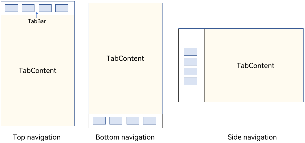
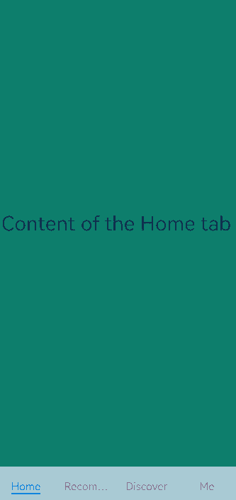
The Tabs component consists of two parts: TabContent and TabBar. TabContent is the content page, and TabBar is the navigation tab bar. The following figure shows the page structure. The layout varies according to the navigation type. In bottom navigation, top navigation, and side navigation, the navigation tab bar is located at the bottom, top, and edge, respectively.
Figure 1 Tabs component layout
NOTE
The TabContent component does not support setting of the common width attribute. By default, its width is the same as that of the parent Tabs component.
The TabContent component does not support setting of the common height attribute. Its height is determined by the height of the parent Tabs component and the TabBar component.
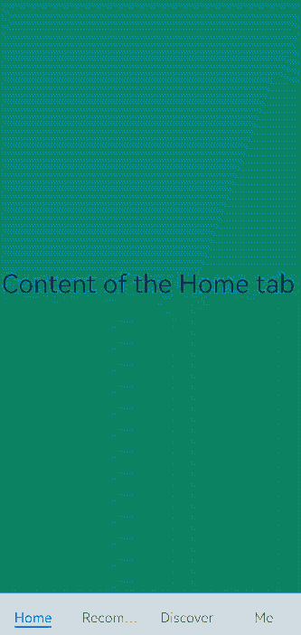
Tabs use braces to enclose the tab content, as shown in Figure 2.
Figure 2 Using Tabs and TabContent

Each TabContent component should be mapped to a tab page, which can be configured through the tabBar attribute. The following is an example.
 TabContent() {
   Text('Home tab content').fontSize(30)
 }
.tabBar('Home')
When setting multiple TabContent components, place them in sequence in the Tabs component.
Tabs() {
  TabContent() {
    Text('Home tab content').fontSize(30)
  }
  .tabBar('Home')

  TabContent() {
    Text('Recommended tab content').fontSize(30)
  }
  .tabBar('Recommended')

  TabContent() {
    Text('Discover tab content').fontSize(30)
  }
  .tabBar('Discover')

  TabContent() {
    Text('Me tab content').fontSize(30)
  }
  .tabBar("Me")
}
Bottom Navigation
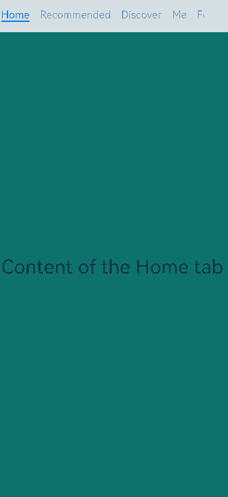
Bottom navigation is the most common navigation mode in applications. The bottom navigation bar is located at the bottom of the level-1 page of the application. It enables the user to quickly have a picture of the feature categories the moment they open the application. In addition, it facilitates one-hand operations of the user. Bottom navigation generally exists as a main navigation form of an application, in that it provides convenient access to primary destinations anywhere in the application.
Figure 3 Bottom navigation bar
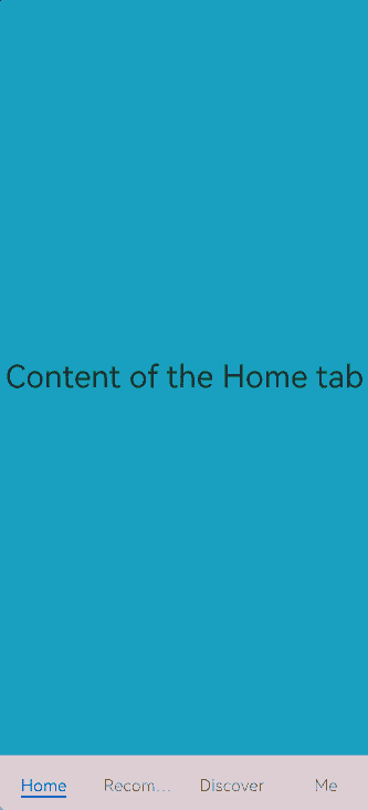
You set the position of the navigation bar through the barPosition parameter of the Tabs component. By default, barPosition is set to BarPosition.Start, which means that the navigation bar is located on the top. To display the navigation bar at the bottom, set barPosition to BarPosition.End.
Tabs({ barPosition: BarPosition.End }) {
  // TabContent: Home, Discover, Recommended, and Me
  // ...
}
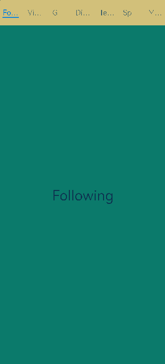
Top Navigation
Top navigation comes in handy when there are many content categories and users need to frequently switch between them. It is usually a further subdivision of the categories in the bottom navigation bar. For example, a theme application may provide a top navigation bar that classifies themes into image, video, and font.
Figure 4 Top navigation bar
Tabs({ barPosition: BarPosition.Start }) {
  // TabContent: Following, Video, Game, Digital, Technology, Sports, Movie
  // ...
}
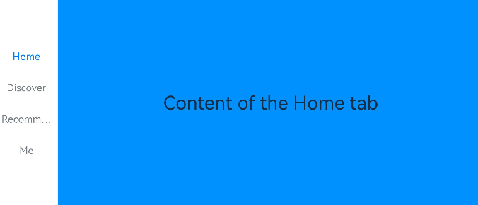
Side Navigation
Side navigation is seldom used in applications. It is more applicable to landscape screens. Because the natural eye movement pattern is from left to right, the side navigation bar is located on the left side by default.
Figure 5 Side navigation bar
To implement the side navigation bar, set the vertical attribute of the Tabs component to true. By default, vertical is set to false, indicating that the content page and navigation bar are aligned vertically.
Tabs({ barPosition: BarPosition.Start }) {
  // TabContent: Home, Discover, Recommended, and Me
  // ...
}
.vertical(true)
.barWidth(100)
.barHeight(200)
NOTE
When the vertical attribute is set to false, the tab bar takes up the whole screen width by default. Set barWidth to a proper value.
When the vertical attribute is set to true, the tab bar takes up the actual content height by default. Set barWidth to a proper value.
Restricting the Scrolling of the Navigation Bar
By default, the navigation bar is scrollable. On some pages that require multi-level classification of content, for example, when both bottom navigation and top navigation are used, the scroll effect of the bottom navigation bar may conflict with that of the top navigation bar. In this case, the scrolling of the bottom navigation bar needs to be restricted to improve user experience.
Figure 6 Restricting the scrolling of the bottom navigation bar
The attribute that enables or disables the scrolling is scrollable. Its default value is true, indicating that scrolling is enabled. To disable the scrolling, set the attribute to false.
Tabs({ barPosition: BarPosition.End }) {
  TabContent(){
    Column(){
      Tabs(){
        // Content on the top navigation bar
        // ...
      }
    }
    .backgroundColor('#ff08a8f1')
    .width('100%')
  }
  .tabBar('Home')

  // Other TabContent content: Discover, Recommended, and Me
  // ...
}
.scrollable(false)
Fixed Navigation Bar
When the content categories are relatively fixed and not scalable, a fixed navigation bar can be used. For example, it can be used for the bottom navigation bar, which generally contains 3 to 5 categories. The fixed navigation bar cannot be scrolled or dragged. The tab bar width is evenly distributed among the categories.
Figure 7 Fixed navigation bar
To use a fixed navigation bar, set the barMode attribute of the Tabs component to barMode.Fixed (default).
Tabs({ barPosition: BarPosition.End }) {
  // TabContent: Home, Discover, Recommended, and Me
  // ...
}
.barMode(BarMode.Fixed)
Scrollable Navigation Bar
The top navigation bar or side navigation bar can be set to be scrollable if the screen width cannot fully accommodate all the tabs. With a scrollable navigation bar, users can reveal tabs beyond the visible area by touching or swiping on the navigation bar.
Figure 8 Scrollable navigation bar
To use a scrollable navigation bar, set the barMode attribute of the Tabs component to BarMode.Scrollable.
Tabs({ barPosition: BarPosition.Start }) {
  // TabContent: follow, video, game, digital, technology, sports, movie, humanities, art, nature, and military
  // ...
}
.barMode(BarMode.Scrollable)
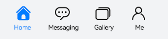
Customizing the Navigation Bar
The bottom navigation bar is generally used on the home page of an application. To deliver a more vibrant experience, you can customize the style of the navigation bar, combining use of text and icons to signify the tab content.
Figure 9 Custom navigation bar
By default, the system uses an underscore (_) to indicate the active tab. For a custom navigation bar, you need to implement the corresponding style to distinguish active tabs from inactive tabs.
To customize the navigation bar, use the tabBar parameter and pass in to it custom function component styles in CustomBuilder mode. In this example, a custom function component tabBuilder is declared, and the input parameters include title (tab title), targetIndex (target index of the tab), selectedImg (image for the selected state), and normalImg (image for the unselected state). The UI display style is determined based on whether the value of currentIndex (index of the active tab) matches that of targetIndex (target index of the tab).
@State currentIndex: number = 0;

@Builder tabBuilder(title: string, targetIndex: number, selectedImg: Resource, normalImg: Resource) {
  Column() {
    Image(this.currentIndex === targetIndex ? selectedImg : normalImg)
      .size({ width: 25, height: 25 })
    Text(title)
      .fontColor(this.currentIndex === targetIndex ? '#1698CE' : '#6B6B6B')
  }
  .width('100%')
  .height(50)
  .justifyContent(FlexAlign.Center)
}
Pass the custom function component to the tabBar attribute corresponding to the tab content and transfer the corresponding parameters.
TabContent() {
  Column(){
    Text('Me tab content')
  }
  .width('100%')
  .height('100%')
  .backgroundColor('#007DFF')
}
.tabBar(this.tabBuilder('Me', 0, $r('app.media.mine_selected'), $r('app.media.mine_normal')))
Switching to a Specified Tab
Non-custom navigation bars follow the default switching logic. If you are using a custom navigation bar, you must manually implement the logic for switching tabs so that when the user switches to a tab, the application displays the corresponding tab page.
Figure 10 Content page and tab bar not synced
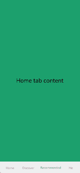
To sync the content page with the tab bar, use the onChange event provided by Tabs to listen for changes in the index. Pass the currently active index value to currentIndex to enable tab switching.
@Entry
@Component
struct TabsExample1 {
  @State currentIndex: number = 2

  @Builder tabBuilder(title: string, targetIndex: number) {
    Column() {
      Text(title)
        .fontColor(this.currentIndex === targetIndex ? '#1698CE' : '#6B6B6B')
    }
  }

  build() {
    Column() {
      Tabs({ barPosition: BarPosition.End }) {
        TabContent() {
          // ...
        }.tabBar(this.tabBuilder('Home', 0))

        TabContent() {
          // ...
        }.tabBar(this.tabBuilder('Discover', 1))

        TabContent() {
          // ...
        }.tabBar(this.tabBuilder('Recommended', 2))

        TabContent() {
          // ...
        }.tabBar(this.tabBuilder('Me',3))
      }
      .animationDuration(0)
      .backgroundColor('#F1F3F5')
      .onChange((index: number) => {
        this.currentIndex = index
      })
    }.width('100%')
  }
}
Figure 11 Content page and tab bar synced
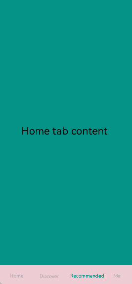
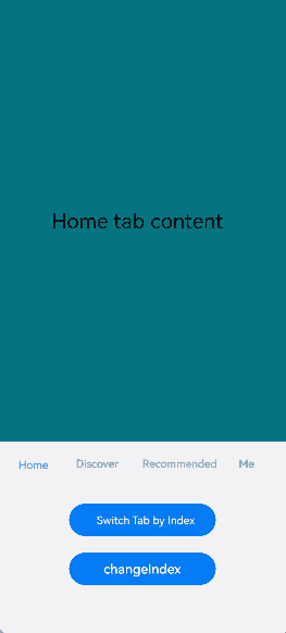
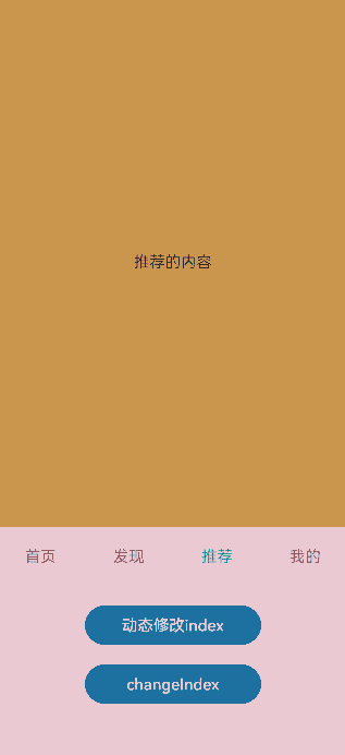
To enable switching between content pages and tabs without swiping, you can pass currentIndex to the index parameter of Tabs. By changing the value of currentIndex, you can navigate to the content page corresponding to a specific index. Alternatively, use TabsController, which is the controller for the Tabs component, to manage content page switches. By using the changeIndex API of TabsController, you can set your application to display the tab content corresponding to the specified index.
@State currentIndex: number = 2
@State currentAnimationMode: AnimationMode = AnimationMode.CONTENT_FIRST
private controller: TabsController = new TabsController()

Tabs({ barPosition: BarPosition.End, index: this.currentIndex, controller: this.controller }) {
  // ...
}
.height(600)
.animationMode(this.currentAnimationMode)
.onChange((index: number) => {
   this.currentIndex = index
})

Button('Dynamically Change AnimationMode').width('50%').margin({ top: 1 }).height(25)
  .onClick(()=>{
    if (this.currentAnimationMode === AnimationMode.CONTENT_FIRST) {
      this.currentAnimationMode = AnimationMode.ACTION_FIRST
    } else if (this.currentAnimationMode === AnimationMode.ACTION_FIRST) {
      this.currentAnimationMode = AnimationMode.NO_ANIMATION
    } else if (this.currentAnimationMode === AnimationMode.NO_ANIMATION) {
      this.currentAnimationMode = AnimationMode.CONTENT_FIRST_WITH_JUMP
    } else if (this.currentAnimationMode === AnimationMode.CONTENT_FIRST_WITH_JUMP) {
      this.currentAnimationMode = AnimationMode.ACTION_FIRST_WITH_JUMP
    } else if (this.currentAnimationMode === AnimationMode.ACTION_FIRST_WITH_JUMP) {
      this.currentAnimationMode = AnimationMode.CONTENT_FIRST
    }
})

Button('Dynamically Change Index').width('50%').margin({ top: 20 })
  .onClick(()=>{
    this.currentIndex = (this.currentIndex + 1) % 4
})

Button('Change Index via Controller').width('50%').margin({ top: 20 })
  .onClick(()=>{
    let index = (this.currentIndex + 1) % 4
    this.controller.changeIndex(index)
})
Figure 12 Switching to a specific tab page
You can use the onContentWillChange API of the Tabs component to customize the interception callback function. The interception callback function is called when a new page is about to be displayed. If the callback returns true, the tab can switch to the new page. If the callback returns false, the tab cannot switch to the new page and will remain on the current page.
Tabs({ barPosition: BarPosition.End, controller: this.controller, index: this.currentIndex }) {
  // ...
  }
  .onContentWillChange((currentIndex, comingIndex) => {
    if (comingIndex == 2) {
      return false
    }
    return true
  })
Figure 13 Customizing the page switching interception event
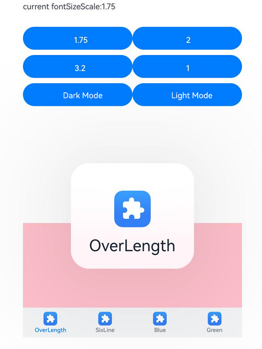
Supporting Aging-Friendly Design
In aging-friendly scenarios with large font sizes, the bottom tab bar offers a dialog box with large fonts for content display. When the component detects a large font setting, it constructs a long-press dialog box based on the configured text and icons. After the user long-presses the tab bar and then swipes in the dialog box to switch to the next tab, the dialog box updates with content of the new tab. Upon releasing, the dialog box closes and the UI switches to the corresponding tab page.
NOTE
The dialog box applies only to bottom tab bars, that is, tab bars in the style of BottomTabBarStyle.
Figure 14 Displaying an aging-friendly dialog box by long-pressing the bottom tab bar in an aging-friendly scenario
import { abilityManager, Configuration } from '@kit.AbilityKit';
import { BusinessError } from '@kit.BasicServicesKit';
import { promptAction, uiAppearance } from '@kit.ArkUI';

@Entry
@Component
struct Demo {
  @State fontColor: string = '#182431';
  @State selectedFontColor: string = '#007DFF';
  @State currentIndex: number = 0;
  @State currentFontSizeScale: string = '';
  @State showBuilderTab: boolean = false;
  @State fontSize: number = 15;
  private darkModeKey: string[] = Object.keys(uiAppearance.DarkMode).filter(
    key => typeof uiAppearance.DarkMode[key] === 'number')

  async setFontScale(scale: number): Promise<void> {
    let configInit: Configuration = {
      fontSizeScale: scale,
    };
    abilityManager.updateConfiguration(configInit, (err: BusinessError) => {
      if (err) {
        console.error(`updateConfiguration fail, err: ${JSON.stringify(err)}`);
        promptAction.showToast({ message: `scale:${scale}, err:${JSON.stringify(err)}` })
      } else {
        this.currentFontSizeScale = String(scale);
        if (scale > 1) {
          this.fontSize = 8;
        } else {
          this.fontSize = 15;
        }
        console.log('updateConfiguration success.');
        promptAction.showToast({ message: `scale:${scale}, updateConfiguration success.` })
      }
    });
  }

  darkMode(isDarkMode: boolean): void {
    let mode: uiAppearance.DarkMode = uiAppearance.DarkMode.ALWAYS_LIGHT;
    if (isDarkMode) {
      mode = uiAppearance.DarkMode.ALWAYS_DARK;
    }
    if (mode == uiAppearance.getDarkMode()) {
      console.info(`TitleDarkMode Set ${this.darkModeKey[mode]} successfully.`)
      return;
    }
    try {
      uiAppearance.setDarkMode(mode).then(() => {
        console.info(`TitleDarkMode Set ${this.darkModeKey[mode]} successfully.`)
      }).catch((error: Error) => {
        console.error(`TitleDarkMode Set ${this.darkModeKey[mode]} failed, ${error.message}`);
      });
    } catch (error) {
      let message = (error as BusinessError).message;
      console.error(`TitleDarkMode Set dark-mode failed, ${message}`);
    }
  }

  build() {
    Column() {
      Column() {
        Row() {
          Text(`current fontSizeScale:${this.currentFontSizeScale}`)
            .margin({ top: 5, bottom: 5 })
            .fontSize(this.fontSize)
        }

        Row() {
          Button('1.75')
            .margin({ top: 5, bottom: 5 })
            .fontSize(this.fontSize)
            .width('40%')
            .onClick(async () => {
              await this.setFontScale(1.75);
            })
          Button('2')
            .margin({ top: 5, bottom: 5 })
            .fontSize(this.fontSize)
            .width('40%')
            .onClick(async () => {
              await this.setFontScale(2);
            })
        }.margin({ top: 25 })

        Row() {
          Button('3.2')
            .margin({ top: 5, bottom: 5 })
            .fontSize(this.fontSize)
            .width('40%')
            .onClick(async () => {
              await this.setFontScale(3.2);
            })
          Button('1')
            .margin({ top: 5, bottom: 5 })
            .fontSize(this.fontSize)
            .width('40%')
            .onClick(async () => {
              await this.setFontScale(1);
            })
        }

        Row() {
          Button('Dark Mode')
            .margin({ top: 5, bottom: 5 })
            .fontSize(this.fontSize)
            .width('40%')
            .onClick(async () => {
              this.darkMode(true);
            })
          Button('Light Mode')
            .margin({ top: 5, bottom: 5 })
            .fontSize(this.fontSize)
            .width('40%')
            .onClick(async () => {
              this.darkMode(false);
            })
        }
      }.alignItems(HorizontalAlign.Start)

      Column() {
        Tabs({ barPosition: BarPosition.End }) {
          TabContent() {
            Column().width('100%').height('100%').backgroundColor(Color.Pink)
          }.tabBar(new BottomTabBarStyle($r('sys.media.ohos_app_icon'), 'OverLength'))
          TabContent() {
            Column().width('100%').height('100%').backgroundColor(Color.Yellow)
          }.tabBar(new BottomTabBarStyle($r('sys.media.ohos_app_icon'), 'SixLine'))
          TabContent() {
            Column().width('100%').height('100%').backgroundColor(Color.Blue)
          }.tabBar(new BottomTabBarStyle($r('sys.media.ohos_app_icon'), 'Blue'))
          TabContent() {
            Column().width('100%').height('100%').backgroundColor(Color.Green)
          }.tabBar(new BottomTabBarStyle($r('sys.media.ohos_app_icon'), 'Green'))
        }
        .vertical(false)
        .scrollable(true)
        .barMode(BarMode.Fixed)
        .onChange((index: number) => {
          console.info(index.toString())
        })
        .width('100%')
        .backgroundColor(0xF1F3F5)
      }.width('80%').height(200)
      .margin({ top: 200 })
    }.width('100%')
  }
}
你可能感兴趣的鸿蒙文章
harmony 鸿蒙Atomic Service Full Screen Launch Component (FullScreenLaunchComponent)
harmony 鸿蒙Arc Button (ArcButton)
harmony 鸿蒙Frame Animation (ohos.animator)
harmony 鸿蒙Implementing Property Animation
- 所属分类: 后端技术
- 本文标签:
热门推荐
-
2、 优质文章
-
3、 gt
-
7、 openharmony
-
9、 golang
-
10、 Vue中input框自动聚焦