harmony 鸿蒙AtomicServiceTabs
AtomicServiceTabs
AtomicServiceTabs is an advanced component designed to streamline the use of the Tabs component by limiting customization options. It restricts the display to a maximum of five tabs, with fixed styles, positions, and sizes for the tabs.
NOTE
This component is supported since API version 12. Updates will be marked with a superscript to indicate their earliest API version.
Modules to Import
import { AtomicServiceTabs, TabBarOptions, TabBarPosition, OnContentWillChangeCallback } from '@kit.ArkUI';
Child Components
Not supported
Attributes
The universal attributes are not supported.
AtomicServiceTabs
AtomicServiceTabs ({
   tabContents?: [ TabContentBuilder?,
                    TabContentBuilder?,
                  TabContentBuilder?,
                  TabContentBuilder?,
                  TabContentBuilder?
                ],
   tabBarOptionsArray: [ TabBarOptions,
                        TabBarOptions,
                        TabBarOptions?,
                        TabBarOptions?,
                        TabBarOptions?
                      ],
   tabBarPosition?: TabBarPosition,
   layoutMode?: LayoutMode,
   barBackgroundColor?: ResourceColor,
   index?: number,
   barOverlap?: boolean,
   controller?: TabsController,
   onChange?: Callback<number>,
   onTabBarClick?: Callback<number>,
   onContentWillChange?: OnContentWillChangeCallback,
})
Decorator: \@Component
Atomic service API: This API can be used in atomic services since API version 12.
System capability: SystemCapability.ArkUI.ArkUI.Full
Parameters
| Name | Type | Mandatory | Decorator | Description |
|---|---|---|---|---|
| tabContents | [TabContentBuilder?,TabContentBuilder?, TabContentBuilder?,TabContentBuilder?, TabContentBuilder?] | No | @BuilderParam | Array of content view containers. |
| tabBarOptionsArray | [TabBarOptions?,TabBarOptions?, TabBarOptions?,TabBarOptions?, TabBarOptions?] | Yes | @Prop | Array of tab bar container configurations. |
| tabBarPosition | TabBarPosition | No | @Prop | Position of the tab bar. |
| layoutMode16+ | LayoutMode | No | @Prop | Sets the layout mode of the images and texts on the bottom tab. |
| barBackgroundColor | ResourceColor | No | @Prop | Background color of the tab bar. |
| index | number | No | @Prop | Index of the currently displayed tab. |
| barOverlap | boolean | No | @Prop | Whether the tab bar is superimposed on the TabContent component after having its background blurred. |
| controller | TabsController | No | - | Tab controller, which is used to control switching of tabs. |
| onChange | Callback<number> | No | - | Callback invoked when a tab is switched. |
| onTabBarClick | Callback<number> | No | - | Callback invoked when a tab is clicked. |
| onContentWillChange | OnContentWillChangeCallback | No | - | Callback invoked when a new page is about to be displayed. |
TabContentBuilder
type TabContentBuilder = () => void
Atomic service API: This API can be used in atomic services since API version 12.
System capability: SystemCapability.ArkUI.ArkUI.Full
| Type | Description |
|---|---|
| () => void | Content view container. |
TabBarOptions
constructor
constructor(icon: ResourceStr|TabBarSymbol, text: ResourceStr, unselectedColor?: ResourceColor, selectedColor?: ResourceColor)
A constructor used to create an TabBarOptions instance.
Atomic service API: This API can be used in atomic services since API version 12.
System capability: SystemCapability.ArkUI.ArkUI.Full
Parameters
| Name | Type | Mandatory | Description |
|---|---|---|---|
| icon | ResourceStr |TabBarSymbol | Yes | Icon of the tab. |
| text | ResourceStr | Yes | Text of the tab. |
| unselectedColor | ResourceColor | No | Color of the tab when it is not selected. Default value: #99182431 |
| selectedColor | ResourceColor | No | Color of the tab when it is selected. Default value: #FF007DFF |
TabBarPosition
Atomic service API: This API can be used in atomic services since API version 12.
System capability: SystemCapability.ArkUI.ArkUI.Full
| Name | Value | Description |
|---|---|---|
| LEFT | 0 | The tab bar is on the left side of the screen. |
| BOTTOM | 1 | The tab bar is at the bottom of the screen. |
OnContentWillChangeCallback
type OnContentWillChangeCallback = (currentIndex: number, comingIndex: number) => boolean
Atomic service API: This API can be used in atomic services since API version 12.
System capability: SystemCapability.ArkUI.ArkUI.Full
| Name | Type | Mandatory | Description |
|---|---|---|---|
| currentIndex | number | Yes | Index of the current tab. |
| comingIndex | number | Yes | Index of the tab to be switched to. |
Example
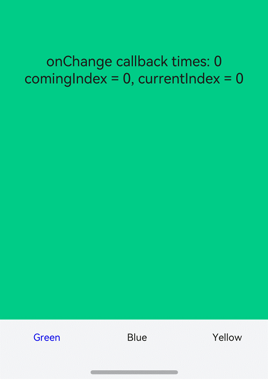
Example 1: Pure Text Style
// Index.ets
import { AtomicServiceTabs, TabBarOptions, TabBarPosition, OnContentWillChangeCallback } from '@kit.ArkUI';

@Entry
@Component
struct Index {
  @State message: string = 'Home';
  @State onClickNumber: number = 0;
  @State currentIndex: number = 0;
  @State comingIndex: number = 0;
  onContentWillChangeCallBack:  OnContentWillChangeCallback = (currentIndex: number, comingIndex: number): boolean => {
    this.currentIndex = currentIndex;
    this.comingIndex = comingIndex;
    console.log('OnContentWillChangeCallback')
     return true;
  }
  onTabClick: Callback<number> = (index:number)=>{
    this.onClickNumber ++;
    console.log('onTabClick');
  }
  @Builder
  tabContent1() {
    Column().width('100%').height('100%').alignItems(HorizontalAlign.Center).backgroundColor('#00CB87')
  }

  @Builder
  tabContent2() {
    Column().width('100%').height('100%').backgroundColor('#007DFF')
  }

  @Builder
  tabContent3() {
    Column().width('100%').height('100%').backgroundColor('#FFBF00')
  }

  build() {
    Stack() {
    AtomicServiceTabs({
      tabContents: [
        () => {
          this.tabContent1()
        },
        () => {
          this.tabContent2()
        },
        () => {
          this.tabContent3()
        }
      ],
      tabBarOptionsArray: [
        new TabBarOptions('', 'Green', Color.Black, Color.Green),
        new TabBarOptions('', 'Blue', Color.Black, Color.Blue),
        new TabBarOptions('', 'Yellow', Color.Black, Color.Yellow),
      ],
      tabBarPosition: TabBarPosition.BOTTOM,
      barBackgroundColor: $r('sys.color.ohos_id_color_bottom_tab_bg'),
      onTabBarClick:this.onTabClick,
      onContentWillChange: this.onContentWillChangeCallBack,
    })
    Column() {
      Text("onchange callback times:" + this.onClickNumber)
      Text("comingIndex = " + this.comingIndex + ", currentIndex = " + this.currentIndex)
    }.margin({top:500})
    }.height('100%')
  }
}
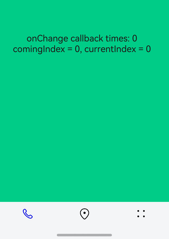
Example 2: Pure Icon Style
// Index.ets
import { AtomicServiceTabs, TabBarOptions, TabBarPosition, OnContentWillChangeCallback } from '@kit.ArkUI';

@Entry
@Component
struct Index {
  @State message: string = 'Home';
  @State onClickNumber: number = 0;
  @State currentIndex: number = 0;
  @State comingIndex: number = 0;
  onContentWillChangeCallBack:  OnContentWillChangeCallback = (currentIndex: number, comingIndex: number): boolean => {
    this.currentIndex = currentIndex;
    this.comingIndex = comingIndex;
    console.log('OnContentWillChangeCallback')
     return true;
  }
  onTabClick: Callback<number> = (index:number)=>{
    this.onClickNumber ++;
    console.log('onTabClick');
  }
  @Builder
  tabContent1() {
    Column().width('100%').height('100%').alignItems(HorizontalAlign.Center).backgroundColor('#00CB87')
  }

  @Builder
  tabContent2() {
    Column().width('100%').height('100%').backgroundColor('#007DFF')
  }

  @Builder
  tabContent3() {
    Column().width('100%').height('100%').backgroundColor('#FFBF00')
  }

  build() {
    Stack() {
    AtomicServiceTabs({
      tabContents: [
        () => {
          this.tabContent1()
        },
        () => {
          this.tabContent2()
        },
        () => {
          this.tabContent3()
        }
      ],
      tabBarOptionsArray: [
          new TabBarOptions($r('sys.media.ohos_ic_public_phone'), '', Color.Black, Color.Blue),
          new TabBarOptions($r('sys.media.ohos_ic_public_location'), '', Color.Black, Color.Blue),
          new TabBarOptions($r('sys.media.ohos_ic_public_more'), '', Color.Black, Color.Blue),
      ],
      tabBarPosition: TabBarPosition.BOTTOM,
      barBackgroundColor: $r('sys.color.ohos_id_color_bottom_tab_bg'),
      onTabBarClick:this.onTabClick,
      onContentWillChange: this.onContentWillChangeCallBack,
    })
    Column() {
      Text("onchange callback times:" + this.onClickNumber)
      Text("comingIndex = " + this.comingIndex + ", currentIndex = " + this.currentIndex)
    }.margin({top:500})
    }.height('100%')
  }
}
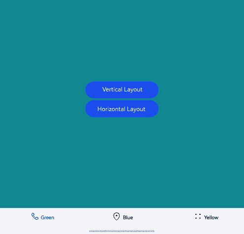
Example 3: Custom Layout with Text and Icons
// Index.ets
import { AtomicServiceTabs, TabBarOptions, TabBarPosition, OnContentWillChangeCallback } from '@kit.ArkUI';

@Entry
@Component
struct AtomicserviceTabs  {
  @State flag: boolean = false;
  @State message: string = 'Home';
  @State onClickNumber: number = 0;
  @State currentIndex: number = 0;
  @State comingIndex: number = 0;
  @State layoutMode: LayoutMode = LayoutMode.VERTICAL;
  onContentWillChangeCallBack: OnContentWillChangeCallback = (currentIndex: number, comingIndex: number): boolean => {
    this.currentIndex = currentIndex;
    this.comingIndex = comingIndex;
    console.log('OnContentWillChangeCallback')
    return true;
  }
  onTabClick: Callback<number> = (index: number) => {
    this.onClickNumber++;
    console.log('onTabClick');
  }
  onChange: Callback<number, void> = (Index: number) => {
    console.log('onChange');
    console.log('onChange2');
  }

  @Builder
  tabContent1() {
    Column().width('100%').height('100%').alignItems(HorizontalAlign.Center).backgroundColor('#00CB87')
  }

  @Builder
  tabContent2() {
    Column().width('100%').height('100%').backgroundColor(Color.Blue)
  }

  @Builder
  tabContent3() {
    Column().width('100%').height('100%').backgroundColor('#FFBF00')
  }

  build() {
    Stack() {
      AtomicServiceTabs({
        tabContents: [
          () => {
            this.tabContent1()
          },
          () => {
            this.tabContent2()
          },
          () => {
            this.tabContent3()
          },
        ],
        tabBarOptionsArray: [
        new TabBarOptions($r('sys.media.ohos_ic_public_phone'), 'Green', Color.Black, Color.Blue),
        new TabBarOptions($r('sys.media.ohos_ic_public_location'), 'Blue', Color.Black, Color.Blue),
        new TabBarOptions($r('sys.media.ohos_ic_public_more'), 'Yellow', Color.Black, Color.Blue),
        ],
        tabBarPosition: TabBarPosition.BOTTOM,
        barBackgroundColor: $r('sys.color.ohos_id_color_bottom_tab_bg'),
        onTabBarClick: this.onTabClick,
        onContentWillChange: this.onContentWillChangeCallBack,
        onChange: this.onChange,
        layoutMode: this.layoutMode,
      })

      Column() {
        Button("Vertical Layout")
          .width('30%')
          .height(50)
          .margin({ top: 5 })
          .onClick((event?: ClickEvent) => {
            this.layoutMode = LayoutMode.VERTICAL;
          })
        Button("Horizontal Layout")
          .width('30%')
          .height(50)
          .margin({ top: 5 })
          .onClick((event?: ClickEvent) => {
            this.layoutMode = LayoutMode.HORIZONTAL;
          })
      }.margin({ top: 10 })
    }.height('100%')
  }
}
你可能感兴趣的鸿蒙文章
- 所属分类: 后端技术
- 本文标签:
热门推荐
-
2、 优质文章
-
3、 gt
-
7、 openharmony
-
9、 golang
-
10、 Vue中input框自动聚焦