harmony 鸿蒙badge
badge
NOTE
This component is supported since API version 5. Updates will be marked with a superscript to indicate their earliest API version.
The <badge> component is used to mark new events that require user attention in your application.
Required Permissions
None
Child Components
This component supports only one child component.
NOTE
If multiple child components are used, only the first one takes effect by default.
Attributes
In addition to the universal attributes, the following attributes are supported.
| Name | Type | Default Value | Mandatory | Description |
|---|---|---|---|---|
| placement | string | rightTop | No | Position of a number or dot badge. Available values are as follows: - right: on the right border of the component. - rightTop: in the upper right corner of the component border. - left: on the left border of the component. |
| count | number | 0 | No | Number of notifications displayed via the badge. If the value is 0 (default value), the badge is not displayed. If the value is greater than 0, the badge is a number badge. When the count value is greater than the maxcount value, *maxcount*+ is displayed. The largest integer value supported for count is 2147483647. |
| visible | boolean | false | No | Whether to display the badge. The value true means that the badge shows up when a new notification is received. To use a number badge, also set the count attribute. |
| maxcount | number | 99 | No | Maximum number of notifications. When the number of new notifications exceeds the value of this attribute, *maxcount*+ is displayed, for example, 99+. The largest integer value supported for maxcount is 2147483647. |
| config | BadgeConfig | - | No | Configuration of the badge. |
| label6+ | string | - | No | Text of the new notification displayed via the badge. When this attribute is set, attributes count and maxcount do not take effect. |
Table 1 BadgeConfig
| Name | Type | Default Value | Mandatory | Description |
|---|---|---|---|---|
| badgeColor | <color> | #fa2a2d | No | Background color of the badge. |
| textColor | <color> | #ffffff | No | Text color of the number badge. |
| textSize | <length> | 10px | No | Text size of the number badge. |
| badgeSize | <length> | 6px | No | Default size of the dot badge. |
Styles
The universal styles are supported.
NOTE
The total size of child components must be smaller than or equal to that of the <badge> component. Otherwise, the child components cannot be displayed.
Events
The universal events are supported.
Methods
The universal methods are supported.
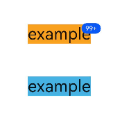
Example
<!-- xxx.hml -->
<div class="container">
  <badge class="badge" config="{{badgeconfig}}" visible="true" count="100" maxcount="99">
    <text class="text1">example</text>
  </badge>
  <badge class="badge" visible="true" count="0">
    <text class="text2">example</text>
  </badge>
</div>
/* xxx.css */
.container {
  flex-direction: column;
  width: 100%;
  align-items: center;
}
.badge {
  width: 50%;
  margin-top: 100px;
}
.text1 {
  background-color: #f9a01e;
  font-size: 50px;
}
.text2 {
  background-color: #46b1e3;
  font-size: 50px;
}
// xxx.js
export default {
  data:{
    badgeconfig:{
      badgeColor:"#0a59f7",
      textColor:"#ffffff",
    }
  }
}
你可能感兴趣的鸿蒙文章
harmony 鸿蒙JavaScript-compatible Web-like Development Paradigm
- 所属分类: 后端技术
- 本文标签:
热门推荐
-
2、 优质文章
-
3、 gt
-
7、 openharmony
-
9、 golang
-
10、 Vue中input框自动聚焦