harmony 鸿蒙div
div
NOTE
This component is supported since API version 4. Updates will be marked with a superscript to indicate their earliest API version.
The <div> component is a basic container that is used as the root node of the page structure or is used to group the content.
Required Permissions
None
Child Components
Supported
Attributes
The universal attributes are supported.
Styles
In addition to the universal styles, the following styles are supported.
| Name | Type | Default Value | Mandatory | Description |
|---|---|---|---|---|
| flex-direction | string | row | No | Main axis direction of the flex container, which defines how items are placed in the container. Available values are as follows: - column: Items are placed vertically from top to bottom. - row: Items are placed horizontally from left to right. |
| flex-wrap | string | nowrap | No | Whether items in the flex container are displayed in a single line or multiple lines. The value cannot be dynamically updated. Available values are as follows: - nowrap: Flex items are displayed in a single line. - wrap: Flex items are displayed in multiple lines. |
| justify-content | string | flex-start | No | How items are aligned along the main axis of the flex container. Available values are as follows: - flex-start: Items are packed toward the start edge of the container along the main axis. - flex-end: Items are packed toward the end edge of the container along the main axis. - center: Items are packed toward the center of the container along the main axis. - space-between: Items are positioned with space between the rows. - space-around: Items are positioned with space before, between, and after the rows. - space-evenly5+: Items are distributed within the container along the main axis, with even space between each two. |
| align-items | string | stretch |
No | How items are aligned along the cross axis in a flex container. Available values are as follows: - stretch: Items are stretched to the same height or width as the container along the cross axis. - flex-start: Items are packed toward the start edge of the cross axis. - flex-end: Items are packed toward the end edge of the cross axis. - center: Items are packed toward the center of the cross axis. - baseline: In a vertical layout, items are aligned to the start of the cross axis, which means that this value is equivalent of flex-start. In a horizontal layout, items are aligned with the text baseline if there is text involved, and aligned to the bottom otherwise. |
| align-content | string | flex-start | No | Multi-row alignment mode when there is extra space in the cross axis. Available values are as follows: - flex-start: All rows are packed toward the start edge of the cross axis. The start edge of the cross axis of the first row is aligned with the start edge of the cross axis of the container. All subsequent rows are aligned with the previous row. - flex-end: All rows are packed toward the end edge of the cross axis. The end of the cross axis of the last row is aligned with the end of the cross axis of the container. All subsequent rows are aligned with the previous row. - center: All rows are packed toward the center of the cross axis. Rows are close to each other and aligned with the center of the container. The spacing between the start edge of the container’s cross axis and the first row is equal to the spacing between the end edge of the container’s cross axis and the last row. - space-between: All rows are evenly distributed in the container. The spacing between two adjacent rows is the same. The start and end edges of the container’s cross axis are aligned with the edges of the first and last rows, respectively. - space-around: All rows are evenly distributed in the container. The spacing between two adjacent rows is the same. The spacing between the start edge of the container’s cross axis and the first row and that between the end edge and the last row are half of the spacing between two adjacent rows. |
| grid-template-[columns|rows] | string | 1 row, 1 column | No | Number of rows and columns in the current grid layout. If this attribute is not set, one row and one column are displayed by default. This attribute is valid only when display is set to grid. Below are some example values of grid-template-columns: - 50px 100px 60px: There are three columns. The first column is 50 px, the second column is 100 px, and the third column is 60 px. - 1fr 1fr 2fr: There are three columns, and the width allowed by the parent component is divided into four equal shares. The first column occupies one share, the second column occupies one share, and the third column occupies two shares. - 30% 20% 50%: There are three columns. The first column occupies 30% of the total width allowed by the parent component, the second column occupies 20%, and the third column occupies 50%. - repeat (2,100px): There are two columns. The first column is 100 px, and the second column is 100 px. - repeat(auto-fill,100px)5+: Each column is 100 px and repeats to fill the cross axis. The number of columns is calculated based on the column size and the cross axis size. - auto 1fr 1fr: There are three columns. The first column is adaptive to the width required by its child components. The remaining space is divided into two equal shares, one share occupied by each of the rest two columns. |
| grid-[columns|rows]-gap | <length> | 0 | No | Size of the gap between two consecutive rows or columns in a grid layout. You can also use grid-gap to set the same size of the gap between rows and columns. This attribute is valid only when display is set to grid. |
| grid-row-[start|end] | number | - | No | Start and end row numbers of the current item in the grid layout. This attribute is valid only when the item’s parent component is a <div> container whose display style is set to grid. |
| grid-column-[start|end] | number | - | No | Start and end column numbers of the current item in the grid layout. This attribute is valid only when the item’s parent component is a <div> container whose display style is set to grid. |
| grid-auto-flow5+ | string | - | No | How grid items are laid out automatically. Available values are as follows: - row: Elements are filled row by row. When there is no horizontal space in a row, a new row is added. - column: Elements are filled column by column. When there is no vertical space in a column, a new column is added. |
| overflow6+ | string | visible | No | Display mode when the content exceeds the container size. Available values are as follows: - visible: Displays the excess content outside the container. - hidden: Truncates the excess content. - scroll: Scrolls the content vertically, with a scrollbar provided. scroll works for elements whose size is fixed. By default, the scrolling direction is the same as the container direction. |
| align-items6+ | string | - | No | How items are aligned along the cross axis in a flex container. Available values are as follows: - stretch: Items are stretched to the same height or width as the flex container along the cross axis. - flex-start: Items are aligned to the start of the cross axis. - flex-end: Items are aligned to the end of the cross axis. - center: Items are aligned in the center of the cross axis. - baseline: In a vertical layout, items are aligned to the start of the cross axis, which means that this value is equivalent of flex-start. In a horizontal layout, items are aligned with the text baseline if there is text involved, and aligned to the bottom otherwise. |
| scrollbar-color6+ | <color> | - | No | Color of the scrollbar. |
| scrollbar-width6+ | <length> | - | No | Width of the scrollbar. |
| overscroll-effect6+ | string | - | No | How the scrollbar behaves when it reaches the edge of the scrolling area. Available values are as follows: - spring: Similar to the physical dynamic effect of a spring. When the scrollbar reaches the edge, it can continue to scroll for a distance based on the initial speed or a touch event. It rebounds after being released. - fade: Similar to the physical dynamic effect of fade. When the scrollbar reaches the edge, a wave shape fades. The fade changes according to the speed and scrolling distance. - none: No effect when the scrollbar reaches the edge. |
Events
In addition to the universal events, the following events are supported.
| Name | Parameter | Description |
|---|---|---|
| reachstart6+ | - | Triggered when the page scrolls to the beginning. This event is triggered only when flex-direction is row. |
| reachend6+ | - | Triggered when the page scrolls to the end. This event is triggered only when flex-direction is row. |
| reachtop6+ | - | Triggered when the page scrolls to the top. This event is triggered only when flex-direction is column. |
| reachbottom6+ | - | Triggered when the page scrolls to the bottom. This event is triggered only when flex-direction is column. |
Methods
In addition to the universal methods, the following methods are supported.
| Name | Parameter | Return Value | Description |
|---|---|---|---|
| getScrollOffset6+ | - | ScrollOffset | Obtains the scrolling offset of the element content. To use this method, overflow must be set to scroll. |
| scrollBy6+ | ScrollParam | - | Sets the scrolling offset of the element content. To use this method, overflow must be set to scroll. |
Table 1 ScrollOffset6+
| Name | Type | Description |
|---|---|---|
| x | number | Offset in the x-axis direction, in px. |
| y | number | Offset in the y-axis direction, in px. |
Table 2 ScrollParam6+
| Name | Type | Description |
|---|---|---|
| dx | number | Offset for scrolling in the horizontal direction, in px. |
| dy | number | Offset for scrolling in the vertical direction, in px. |
| smooth | boolean | Whether to perform smooth processing. |
Example
- Flex style
html
<!-- xxx.hml -->
<div class="container">
 <div class="flex-box">
   <div class="flex-item color-primary"></div>
   <div class="flex-item color-warning"></div>
   <div class="flex-item color-success"></div>
 </div>
</div>
   /* xxx.css */
   .container {
     flex-direction: column;
     justify-content: center;
     align-items: center;
     width: 454px;
     height: 454px;
   }
   .flex-box {
     justify-content: space-around;
     align-items: center;
     width: 400px;
     height: 140px;
     background-color: #ffffff;
   }
   .flex-item {
     width: 120px;
     height: 120px;
     border-radius: 16px;
   }
   .color-primary {
     background-color: #007dff;
   }
   .color-warning {
     background-color: #ff7500;
   }
   .color-success {
     background-color: #41ba41;
   }

- Flex wrap style
html
<!-- xxx.hml -->
<div class="container">
 <div class="flex-box">
   <div class="flex-item color-primary"></div>
   <div class="flex-item color-warning"></div>
   <div class="flex-item color-success"></div>
 </div>
</div>
   /* xxx.css */
   .container {
     flex-direction: column;
     justify-content: center;
     align-items: center;
     width: 454px;
     height: 454px;
   }
   .flex-box {
     justify-content: space-around;
     align-items: center;
     flex-wrap: wrap;
     width: 300px;
     height: 250px;
     background-color: #ffffff;
   }
   .flex-item {
     width: 120px;
     height: 120px;
     border-radius: 16px;
   }
   .color-primary {
     background-color: #007dff;
   }
   .color-warning {
     background-color: #ff7500;
   }
   .color-success {
     background-color: #41ba41;
   }

- Grid style
   <!-- xxx.hml -->
   <div class="common grid-parent">
     <div class="grid-child grid-left-top"></div>
     <div class="grid-child grid-left-bottom"></div>
     <div class="grid-child grid-right-top"></div>
     <div class="grid-child grid-right-bottom"></div>
   </div>
   /* xxx.css */
   .common {
     width: 400px;
     height: 400px;
     background-color: #ffffff;
     align-items: center;
     justify-content: center;
     margin: 24px;
   }
   .grid-parent {
     display: grid;
     grid-template-columns: 35% 35%;
     grid-columns-gap: 24px;
     grid-rows-gap: 24px;
     grid-template-rows: 35% 35%;
   }
   .grid-child {
     width: 100%;
     height: 100%;
     border-radius: 8px;
   }
   .grid-left-top {
     grid-row-start: 0;
     grid-column-start: 0;
     grid-row-end: 0;
     grid-column-end: 0;
     background-color: #3f56ea;
   }
   .grid-left-bottom {
     grid-row-start: 1;
     grid-column-start: 0;
     grid-row-end: 1;
     grid-column-end: 0;
     background-color: #00aaee;
   }
   .grid-right-top {
     grid-row-start: 0;
     grid-column-start: 1;
     grid-row-end: 0;
     grid-column-end: 1;
     background-color: #00bfc9;
   }
   .grid-right-bottom {
     grid-row-start: 1;
     grid-column-start: 1;
     grid-row-end: 1;
     grid-column-end: 1;
     background-color: #47cc47;
   }

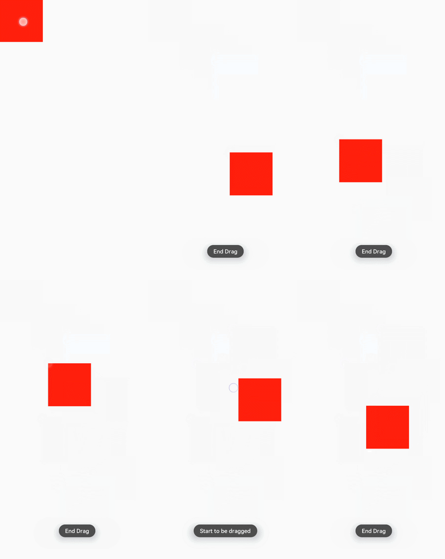
- Dragging7+
html
<!-- xxx.hml -->
<div class="container">
 <div class="content" ondragstart="dragstart" ondrag="drag" ondragend="dragend" style="position: absolute;left: {{left}};top: {{top}};">
 </div>
</div>
    /* xxx.css */
    .container {
    flex-direction: column;
    width: 100%;
    height: 100%;
    }
    .content {
    width: 200px;
    height: 200px;
    background-color: red;
    }
   // xxx.js
   import promptAction from '@ohos.promptAction';
   export default {
     data:{
       left:0,
       top:0,
     },
     dragstart(e){
       prompt.showToast({
         message: 'Start to be dragged'
       })
     },
     drag(e){
       this.left = e.globalX;
       this.top = e.globalY;
     },
     dragend(e){
       promptAction.showToast({
         message: 'End Drag'
       })
     }
   }

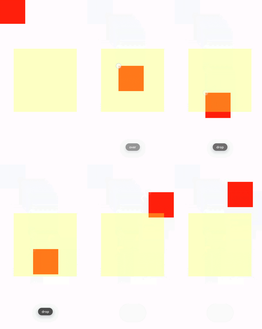
   <!-- xxx.hml -->
   <div class="container">
     <div class="content" ondrag="drag" style="position: absolute;left: {{left}};top: {{top}};"></div>
     <div style="width: 500px; height: 500px; background-color: yellow; position: fixed; left: 15%; top: 30%; opacity:0.3"
       ondragenter="dragenter" ondragover="dragover" ondragleave="dragleave" ondrop="drop">
     </div>
   </div>
   /* xxx.css */
   .container {
     flex-direction: column;
     width: 100%;
     position: relative;
     max-width: 100%;
   }
   .content{
     width: 200px;
     height: 200px;
     background-color: red;
     position: absolute;
   }
   // xxx.js
   import promptAction from '@ohos.promptAction';
   export default {
     data:{
       left:0,
       top:0,
     },
     drag(e){
       this.left = e.globalX;
       this.top = e.globalY;
     },
     dragenter(e){
       promptAction.showToast({
         message: 'enter'
       })
     },
     dragover(e){
       promptAction.showToast({
         message: 'over'
       })
     },
     dragleave(e){
       promptAction.showToast({
         message: 'leave'
       })
     },
     drop(e){
       promptAction.showToast({
         message: 'drop'
       })
     }
   }

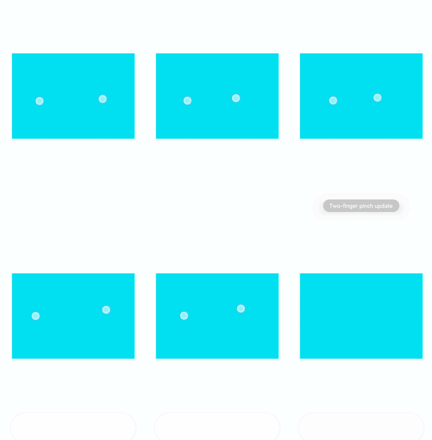
- Pinching7+
html
<!-- xxx.hml -->
<div class="container">
 <div class="content" onpinchstart="pinchstart" onpinchend="pinchend" onpinchupdate="pinchupdate"
   onpinchcancel="pinchcancel">
 </div>
</div>
   /* xxx.css */
   .container {
     flex-direction: column;
     justify-content: center;
     align-items: center;
     width: 454px;
     height: 454px;
   }
   .content {
     width: 400px;
     height: 400px;
     background-color: aqua;
     margin: 30px;
   }
   // xxx.js
   import promptAction from '@ohos.promptAction';
   export default {
     pinchstart(e){
       promptAction.showToast({
         message: 'pinchstart!!!'
       })
     },
     pinchupdate(e){
       promptAction.showToast({
         message: 'Two-finger pinch update'
       })
     },
     pinchend(e){
       promptAction.showToast({
         message: 'Finished with two fingers pinching'
       })
     },
     pinchcancel(e){
       promptAction.showToast({
         message: 'Finger pinching is interrupted'
       })
     }
   }

你可能感兴趣的鸿蒙文章
harmony 鸿蒙JavaScript-compatible Web-like Development Paradigm
0
赞
- 所属分类: 后端技术
- 本文标签: