harmony 鸿蒙Calendar Picker Dialog Box (CalendarPickerDialog)
Calendar Picker Dialog Box (CalendarPickerDialog)
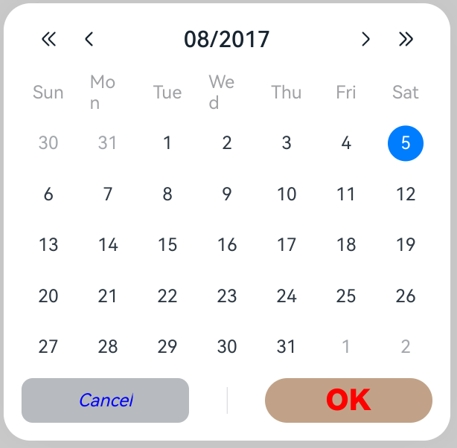
A calendar picker dialog box is a dialog box that allows users to select a date from a calendar picker.
NOTE
This component is supported since API version 10. Updates will be marked with a superscript to indicate their earliest API version.
The functionality of this module depends on UI context. This means that the APIs of this module cannot be used where the UI context is unclear. For details, see UIContext.
CalendarPickerDialog
show
static show(options?: CalendarDialogOptions)
Shows a calendar picker dialog box.
Atomic service API: This API can be used in atomic services since API version 11.
System capability: SystemCapability.ArkUI.ArkUI.Full
Parameters
| Name | Type | Mandatory | Description |
|---|---|---|---|
| options | CalendarDialogOptions | No | Parameters of the calendar picker dialog box. |
CalendarDialogOptions
Inherits from CalendarOptions.
System capability: SystemCapability.ArkUI.ArkUI.Full
| Name | Type | Mandatory | Description |
|---|---|---|---|
| onAccept | Callback<Date> | No | Triggered when the OK button in the dialog box is clicked. The selected date value is returned. Atomic service API: This API can be used in atomic services since API version 11. |
| onCancel | VoidCallback | No | Triggered when the Cancel button in the dialog box is clicked. Atomic service API: This API can be used in atomic services since API version 11. |
| onChange | Callback<Date> | No | Triggered when the selection in the picker changes the selected date. The selected date value is returned. Atomic service API: This API can be used in atomic services since API version 11. |
| backgroundColor11+ | ResourceColor | No | Backplane color of the dialog box. Default value: Color.Transparent NOTE When backgroundColor is set to a non-transparent color, backgroundBlurStyle must be set to BlurStyle.NONE; otherwise, the color display may not meet the expected effect. Atomic service API: This API can be used in atomic services since API version 12. |
| backgroundBlurStyle11+ | BlurStyle | No | Background blur style of the dialog box. Default value: BlurStyle.COMPONENT_ULTRA_THICK NOTE Setting this parameter to BlurStyle.NONE disables the background blur. When backgroundBlurStyle is set to a value other than NONE, do not set backgroundColor. If you do, the color display may not produce the expected visual effect. Atomic service API: This API can be used in atomic services since API version 12. |
| backgroundBlurStyleOptions18+ | BackgroundBlurStyleOptions | No | Options for customizing the background blur style. Atomic service API: This API can be used in atomic services since API version 18. |
| backgroundEffect18+ | BackgroundEffectOptions | No | Options for customizing the background effect. Atomic service API: This API can be used in atomic services since API version 18. |
| acceptButtonStyle12+ | PickerDialogButtonStyle | No | Style of the accept button. NOTE In the acceptButtonStyle and cancelButtonStyle configurations, only one primary field can be set to true at most. If both the primary fields are set to true, neither will take effect. Atomic service API: This API can be used in atomic services since API version 12. |
| cancelButtonStyle12+ | PickerDialogButtonStyle | No | Style of the cancel button. NOTE In the acceptButtonStyle and cancelButtonStyle configurations, only one primary field can be set to true at most. If both the primary fields are set to true, neither will take effect. Atomic service API: This API can be used in atomic services since API version 12. |
| onDidAppear12+ | VoidCallback | No | Event callback when the dialog box appears. NOTE 1. The normal timing sequence is as follows: onWillAppear > onDidAppear > (onAccept/onCancel/onChange) > onWillDisappear > onDidDisappear. 2. You can set the callback event for changing the dialog box display effect in onDidAppear. The settings take effect next time the dialog box appears. 3. If the user dismisses the dialog box immediately after it appears, onWillDisappear is invoked before onDidAppear. 4. If the dialog box is dismissed before its entrance animation is finished, this callback is not invoked. Atomic service API: This API can be used in atomic services since API version 12. |
| onDidDisappear12+ | VoidCallback | No | Event callback when the dialog box disappears. NOTE 1. The normal timing sequence is as follows: onWillAppear > onDidAppear > (onAccept/onCancel/onChange) > onWillDisappear > onDidDisappear. Atomic service API: This API can be used in atomic services since API version 12. |
| onWillAppear12+ | VoidCallback | No | Event callback when the dialog box is about to appear. NOTE 1. The normal timing sequence is as follows: onWillAppear > onDidAppear > (onAccept/onCancel/onChange) > onWillDisappear > onDidDisappear. 2. You can set the callback event for changing the dialog box display effect in onWillAppear. The settings take effect next time the dialog box appears. Atomic service API: This API can be used in atomic services since API version 12. |
| onWillDisappear12+ | VoidCallback | No | Event callback when the dialog box is about to disappear. NOTE 1. The normal timing sequence is as follows: onWillAppear > onDidAppear > (onAccept/onCancel/onChange) > onWillDisappear > onDidDisappear. 2. If the user closes the dialog box immediately after it appears, onWillDisappear is invoked before onDidAppear. Atomic service API: This API can be used in atomic services since API version 12. |
| shadow12+ | ShadowOptions |ShadowStyle | No | Shadow of the dialog box. Default value on 2-in-1 devices: ShadowStyle.OUTER_FLOATING_MD when the dialog box is focused and ShadowStyle.OUTER_FLOATING_SM otherwise Atomic service API: This API can be used in atomic services since API version 12. |
| enableHoverMode14+ | boolean | No | Whether to enable the hover mode. Default value: false, meaning not to enable the hover mode. Atomic service API: This API can be used in atomic services since API version 14. |
| hoverModeArea14+ | HoverModeAreaType | No | Display area of the dialog box in hover mode. Default value: HoverModeAreaType.BOTTOM_SCREEN Atomic service API: This API can be used in atomic services since API version 14. |
| markToday16+ | boolean | No | Whether to highlight the current system date. Default value: false The value true means to highlight the current system date, and false means the opposite. Atomic service API: This API can be used in atomic services since API version 16. |
NOTE
When the application window is resized, the width of the dialog box is continuously compressed. If the window width is reduced below a certain threshold, the content of the dialog box may not be fully visible. To ensure that the content of the CalendarPickerDialog component is fully displayed, the minimum window width required is 386 vp.
Example
Example 1: Setting the Background
This example demonstrates how to set the dialog box background using backgroundColor, backgroundBlurStyle, and shadow.
// xxx.ets
@Entry
@Component
struct CalendarPickerDialogExample {
private selectedDate: Date = new Date('2024-04-23')
build() {
Column() {
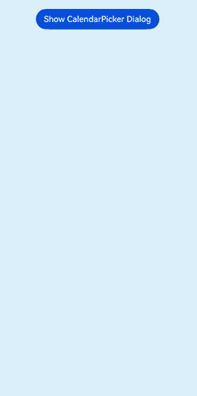
Button("Show CalendarPicker Dialog")
.margin(20)
.onClick(() => {
console.info("CalendarDialog.show")
CalendarPickerDialog.show({
selected: this.selectedDate,
backgroundColor: Color.White,
backgroundBlurStyle: BlurStyle.NONE,
shadow: ShadowStyle.OUTER_FLOATING_SM,
onAccept: (value) => {
this.selectedDate = value
console.info("calendar onAccept:" + JSON.stringify(value))
},
onCancel: () => {
console.info("calendar onCancel")
},
onChange: (value) => {
console.info("calendar onChange:" + JSON.stringify(value))
},
onDidAppear: () => {
console.info("calendar onDidAppear")
},
onDidDisappear: () => {
console.info("calendar onDidDisappear")
},
onWillAppear: () => {
console.info("calendar onWillAppear")
},
onWillDisappear: () => {
console.info("calendar onWillDisappear")
}
})
})
}.width('100%')
}
}
Example 2: Customizing the Button Style
This example demonstrates how to customize the button style using acceptButtonStyle and cancelButtonStyle.
// xxx.ets
@Entry
@Component
struct CalendarPickerDialogExample {
  private selectedDate: Date = new Date()

  build() {
    Column() {
      Button("Show CalendarPicker Dialog")
        .margin(20)
        .onClick(() => {
          console.info("CalendarDialog.show")
          CalendarPickerDialog.show({
            selected: this.selectedDate,
            acceptButtonStyle: {
              type: ButtonType.Normal,
              style: ButtonStyleMode.NORMAL,
              role: ButtonRole.NORMAL,
              fontColor: 'rgb(81, 81, 216)',
              fontSize: '26fp',
              fontWeight: FontWeight.Bolder,
              fontStyle: FontStyle.Normal,
              fontFamily: 'sans-serif',
              backgroundColor: '#A6ACAF',
              borderRadius: 20
            },
            cancelButtonStyle: {
              type: ButtonType.Normal,
              style: ButtonStyleMode.NORMAL,
              role: ButtonRole.NORMAL,
              fontColor: Color.Blue,
              fontSize: '16fp',
              fontWeight: FontWeight.Normal,
              fontStyle: FontStyle.Italic,
              fontFamily: 'sans-serif',
              backgroundColor: '#50182431',
              borderRadius: 10
            },
            onAccept: (value) => {
              this.selectedDate = value
              console.info("calendar onAccept:" + JSON.stringify(value))
            }
          })
        })
    }.width('100%')
  }
}
Example 3: Configuring a Dialog Box in the Hover State
This example demonstrates how to set the layout area of a dialog box in hover mode on a foldable device.
@Entry
@Component
struct CalendarPickerDialogExample {
  private selectedDate: Date = new Date('2024-04-23');

  build() {
    Column() {
      Button("Show CalendarPicker Dialog")
        .margin(20)
        .onClick(() => {
          console.info("CalendarDialog.show")
          CalendarPickerDialog.show({
            selected: this.selectedDate,
            onAccept: (value) => {
              console.info("calendar onAccept:" + JSON.stringify(value))
            },
            onCancel: () => {
              console.info("calendar onCancel")
            },
            onChange: (value) => {
              console.info("calendar onChange:" + JSON.stringify(value))
            },
            onDidAppear: () => {
              console.info("calendar onDidAppear")
            },
            onDidDisappear: () => {
              console.info("calendar onDidDisappear")
            },
            onWillAppear: () => {
              console.info("calendar onWillAppear")
            },
            onWillDisappear: () => {
              console.info("calendar onWillDisappear")
            },
            enableHoverMode: true,
            hoverModeArea: HoverModeAreaType.TOP_SCREEN,
          })
        })
    }.width('100%')
  }
}
Example 4: Setting the Background Style for the Selected Date
This example demonstrates how to customize the background style of the selected date using hintRadius.
// xxx.ets
@Entry
@Component
struct CalendarPickerDialogExample {
  private selectedDate: Date = new Date('2024-04-23')

  build() {
    Column() {
      Button("Show CalendarPicker Dialog")
        .margin(20)
        .onClick(() => {
          console.info("CalendarDialog.show")
          CalendarPickerDialog.show({
            selected: this.selectedDate,
            hintRadius: 1,
            onAccept: (value) => {
              this.selectedDate = value
              console.info("calendar onAccept:" + JSON.stringify(value))
            }
          })
        })
    }.width('100%')
  }
}
Example 5: Setting Start and End Dates
This example demonstrates how to set the start and end dates for the calendar picker dialog box using start and end.
// xxx.ets
@Entry
@Component
struct CalendarPickerDialogExample {
  private selectedDate: Date = new Date('2025-01-01')
  private startDate: Date = new Date('2024-01-10')
  private endDate: Date = new Date('2025-1-10')

  build() {
    Column() {
      Text('Calendar date picker').fontSize(30)
      Button("Show CalendarPicker Dialog")
        .margin(20)
        .onClick(() => {
          console.info("CalendarDialog.show")
          CalendarPickerDialog.show({
            start: this.startDate,
            end: this.endDate,
            selected: this.selectedDate,
          })
        })
    }.width('100%').margin({ top: 350 })
  }
}
Example 6: Highlighting the Current System Date and Disabling a Specific Date Range
This example shows how to highlight the current system date using markToday and disable a specific date range using disabledDateRange.
// xxx.ets
@Entry
@Component
struct CalendarPickerExample {
  private disabledDateRange: DateRange[] = [
    { start: new Date('2025-01-01'), end: new Date('2025-01-02') },
    { start: new Date('2025-01-09'), end: new Date('2025-01-10') },
    { start: new Date('2025-01-15'), end: new Date('2025-01-16') },
    { start: new Date('2025-01-19'), end: new Date('2025-01-19') },
    { start: new Date('2025-01-22'), end: new Date('2025-01-25') }
  ]

  build() {
    Column() {
      Button("Show CalendarPicker Dialog")
        .margin(20)
        .onClick(() => {
          console.info("CalendarDialog.show")
          CalendarPickerDialog.show({ markToday: true, disabledDateRange: this.disabledDateRange })
        })
    }.width('100%').margin({ top: 350 })
  }
}
你可能感兴趣的鸿蒙文章
- 所属分类: 后端技术
- 本文标签:
热门推荐
-
2、 优质文章
-
3、 gt
-
7、 openharmony
-
9、 golang
-
10、 Vue中input框自动聚焦