harmony 鸿蒙search
search
NOTE
This component is supported since API version 4. Updates will be marked with a superscript to indicate their earliest API version.
The <search> component provides an input area for users to search.
Child Components
Not supported
Attributes
In addition to the universal attributes, the following attributes are supported.
| Name | Type | Default Value | Mandatory | Description |
|---|---|---|---|---|
| icon | string | - | No | Search icon. By default, the system search icon is used. The supported icon format is SVG, JPG, and PNG. |
| hint | string | - | No | Hint text. |
| value | string | - | No | Text in the search box. |
| searchbutton5+ | string | - | No | Text on the search button at the end of the search box. |
| menuoptions5+ | Array<MenuOption> | - | No | Menu options displayed after users click the More button. |
Table 1 MenuOption5+
| Name | Type | Description |
|---|---|---|
| icon | string | Path of the icon for a menu option. |
| content | string | Text content of a menu option. |
Styles
In addition to the universal styles, the following styles are supported.
| Name | Type | Default Value | Mandatory | Description |
|---|---|---|---|---|
| color | <color> | #e6000000 | No | Font color of the search box. |
| font-size | <length> | 16px | No | Font size of the search box. |
| allow-scale | boolean | true | No | Whether the font size changes with the system’s font size settings. If the config-changes tag of fontSize is configured for abilities in the config.json file, the setting takes effect without application restart. |
| placeholder-color | <color> | #99000000 |
No | Color of the hint text. |
| font-weight | number |string | normal | No | Font weight. For details, see font-weight of the <text> component. |
| font-family | string | sans-serif | No | Font family, in which fonts are separated by commas (,). Each font is set using a font name or font family name. The first font in the family or the specified custom font is used for the text. |
| caret-color6+ | <color> | - | No | Color of the caret. |
Events
In addition to the universal events, the following events are supported.
| Name | Parameter | Description |
|---|---|---|
| change | { text:newText } | Triggered when the content entered in the text box changes. If you change the value attribute directly, this event will not be triggered. |
| submit | { text:submitText } | Triggered when users click the search icon or the search button5+, or tap the search button on a soft keyboard. |
| translate5+ | { value: selectedText } | Triggered when users click the translate button in the menu displayed after they select a text segment. The selected text content is returned. |
| share5+ | { value: selectedText } | Triggered when users click the share button in the menu displayed after they select a text segment. The selected text content is returned. |
| search5+ | { value: selectedText } | Triggered when users click the search button in the menu displayed after they select a text segment. The selected text content is returned. |
| optionselect5+ | { index:optionIndex, value: selectedText } | Triggered when users click a menu option in the menu displayed after they select a text segment. This event is valid only when the menuoptions attribute is set. The option index and selected text content are returned. |
Methods
The universal methods are supported.
Example
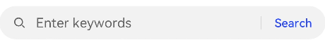
<!-- xxx.hml -->
<div class="container">
    <search hint="Enter keywords" searchbutton="Search" @search="search">
  </search>
</div>
/* xxx.css */
.container {
  display: flex;
  justify-content: center;
  align-items: center;
}
你可能感兴趣的鸿蒙文章
harmony 鸿蒙JavaScript-compatible Web-like Development Paradigm
0
赞
- 所属分类: 后端技术
- 本文标签:
热门推荐
-
2、 优质文章
-
3、 gt
-
7、 openharmony
-
9、 golang
-
10、 Vue中input框自动聚焦