harmony 鸿蒙piece
piece
NOTE
This component is supported since API version 5. Updates will be marked with a superscript to indicate their earliest API version.
The <piece> component provides an entrance piece that can contain images and text. It is usually used to display receivers, for example, email recipients or message recipients.
Child Components
Not supported
Attributes
In addition to the universal attributes, the following attributes are supported.
| Name | Type | Mandatory | Description |
|---|---|---|---|
| content | string | Yes | Text content of the operational piece. |
| closable | boolean | No | Whether to display the delete icon for the operational piece. When users click the delete icon, it triggers the close event. Default value: false |
| icon | string | No | URL of the delete icon for the operational piece. The value can be a local path. |
Styles
The universal styles are supported.
NOTE
By default, text and images are placed in the middle of the <piece> component.
Events
In addition to the universal events, the following events are supported.
| Name | Parameter | Description |
|---|---|---|
| close | - | Triggered when users click the delete icon of the operational piece. You can delete this component by using the if directive. |
Methods
The universal methods are supported.
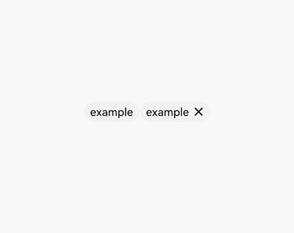
Example
<!-- xxx.hml-->
<div class="container" >
  <piece if="{{first}}" content="example"></piece>
  <piece if="{{second}}" content="example" closable="true" onclose="closeSecond"></piece>
</div>
/* xxx.css */
.container {
  width: 100%;
  height: 100%;
  align-items: center;
  justify-content: center;
}
// xxx.js
export default {
  data: {
    first: true,
    second: true
  },
  closeSecond(e) {
    this.second = false;
  }
}
你可能感兴趣的鸿蒙文章
harmony 鸿蒙JavaScript-compatible Web-like Development Paradigm
0
赞
- 所属分类: 后端技术
- 本文标签:
热门推荐
-
2、 优质文章
-
3、 gt
-
7、 openharmony
-
9、 golang
-
10、 Vue中input框自动聚焦