harmony 鸿蒙progress
progress
NOTE
This component is supported since API version 4. Updates will be marked with a superscript to indicate their earliest API version.
The <Progress> component is used to provide a progress bar that displays the progress of content loading or an operation.
Required Permissions
None
Child Components
Not supported
Attributes
In addition to the universal attributes, the following attributes are supported.
| Name | Type | Default Value | Mandatory | Description |
|---|---|---|---|---|
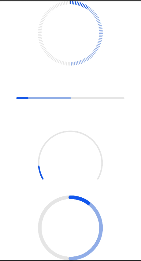
| type | string | horizontal | No | Type of the progress bar, which cannot be changed dynamically. Available values are as follows: - horizontal: linear progress bar. - circular: loading progress bar. - ring: ring progress bar. - scale-ring: ring progress bar with a scale. - arc: arc progress bar. - eclipse5+: eclipse progress bar. |
Different types of progress bars support different attributes.
When the type is horizontal, ring, or scale-ring, the following attributes are supported. |Name |Type |Default Value|Mandatory|Description | |—————-|——|—-|—-|—————-| |percent |number|0 |No |Current progress. The value ranges from 0 to 100.| |secondarypercent|number|0 |No |Secondary progress. The value ranges from 0 to 100.|
When the type is ring or scale-ring, the following attributes are supported. |Name |Type |Default Value|Mandatory|Description | |———|——-|—-|—-|————–| |clockwise|boolean|true|No |Whether the ring progress bar uses clockwise.|
When the type is arc or eclipse5+, the following attributes are supported. |Name |Type |Default Value|Mandatory|Description | |——-|——|—-|—-|—————-| |percent|number|0 |No |Current progress. The value ranges from 0 to 100.|
Styles
In addition to the universal styles, the following styles are supported.
Horizontal progress bar, of which type is horizontal
| Name | Type | Default Value | Mandatory | Description |
|---|---|---|---|---|
| color | <color> | #ff007dff | No | Color of the progress bar. |
| stroke-width | <length> | 4px | No | Stroke width of the progress bar. |
| background-color | <color> | - | No | Background color of the progress bar. |
| secondary-color | <color> | - | No | Color of the secondary progress bar. |
Circular progress bar, of which type is circular
| Name | Type | Default Value | Mandatory | Description |
|---|---|---|---|---|
| color | <color> | - | No | Color of the dot on the loading progress bar. |
Ring or scale-ring progress bar, of which ring is scale-ring
| Name | Type | Default Value | Mandatory | Description |
|---|---|---|---|---|
| color | <color> |<linear-gradient> | - | No | Color of the ring progress bar. The ring type supports the linear gradient color. The linear gradient color supports only two color attribute formats, for example, color = linear-gradient(#ff0000, #00ff00). |
| background-color | <color> | - | No | Background color of the ring progress bar. |
| secondary-color | <color> | - | No | Color of the secondary ring progress bar. |
| stroke-width | <length> | 10px | No | Width of the ring progress bar. |
| scale-width | <length> | - | No | Scale thickness of the ring progress bar with a scale. This style takes effect only when the type is scale-ring. |
| scale-number | number | 120 | No | Number of scales of the ring progress bar with a scale. This style takes effect only when the type is scale-ring. |
Arc progress bar, of which type is arc
| Name | Type | Default Value | Mandatory | Description |
|---|---|---|---|---|
| color | <color> | - | No | Color of the arc progress bar. |
| background-color | <color> | - | No | Background color of the arc progress bar. |
| stroke-width | <length> | 4px | No | Width of the arc progress bar, which is always within the radius area. The wider the progress bar is, the closer the progress bar is to the center of the circle. The progress bar is always within the radius. |
| start-angle | <deg> | 240 | No | Start angle of the arc progress bar, which starts from zero o’clock clockwise. The value ranges from 0 to 360 degrees. |
| total-angle | <deg> | 240 | No | Total length of the arc progress bar. The value ranges from –360 to 360. A negative number indicates anticlockwise. |
| center-x | <length> | Half of the width of the arc progress bar | No | Center of the arc progress bar (with the upper left corner of the component as the coordinate origin). This style must be used together with center-y and radius. |
| center-y | <length> | Half of the height of the arc progress bar | No | Center of the arc progress bar (with the upper left corner of the component as the coordinate origin). This style must be used together with center-x and radius. |
| radius | <length> | Half of the minimum width and height of the arc progress bar | No | Radius of the arc progress bar. This style must be used together with center-x and center-y. |
Eclipse progress bar, of which type is eclipse5+
| Name | Type | Default Value | Mandatory | Description |
|---|---|---|---|---|
| color | <color> | - | No | Color of the eclipse progress bar. |
| background-color | <color> | - | No | Background color of the eclipse progress bar. |
Events
The universal events are supported.
Methods
The universal methods are supported.
Example
<!--xxx.hml -->
<div class="container">
  <progress class="min-progress" type="scale-ring"  percent= "10" secondarypercent="50"></progress>
  <progress class="min-progress" type="horizontal" percent= "10" secondarypercent="50"></progress>
  <progress class="min-progress" type="arc" percent= "10"></progress>
  <progress class="min-progress" type="ring" percent= "10" secondarypercent="50"></progress>
</div>
/* xxx.css */
.container {
  flex-direction: column;
  height: 100%;
  width: 100%;
  align-items: center;
}
.min-progress {
  width: 300px;
  height: 300px;
}
你可能感兴趣的鸿蒙文章
harmony 鸿蒙JavaScript-compatible Web-like Development Paradigm
- 所属分类: 后端技术
- 本文标签:
热门推荐
-
2、 优质文章
-
3、 gt
-
7、 openharmony
-
9、 golang
-
10、 Vue中input框自动聚焦