harmony 鸿蒙Symbol Glyph (SymbolGlyph/SymbolSpan)
Symbol Glyph (SymbolGlyph/SymbolSpan)
SymbolGlyph is a component designed for icon glyphs, making it easy to use sophisticated icons, including multi-colored and animated icons. You can add symbol glyphs in text through the use of the SymbolSpan component, a child of the Text component. For details, see SymbolGlyph and SymbolSpan.
Creating a Symbol Glyph
You create a symbol glyph by referencing a resource through $r. Currently, only the preset symbol resources are supported.
  SymbolGlyph($r('sys.symbol.ohos_folder_badge_plus'))
    .fontSize(96)
    .renderingStrategy(SymbolRenderingStrategy.SINGLE)
    .fontColor([Color.Black, Color.Green, Color.White])

Adding to Text
To embed a symbol glyph within a text string, use SymbolSpan as a child of the Text component. You can nest multiple SymbolSpan components to display a series of symbol glyphs.
- Create a SymbolSpan component.
The SymbolSpan component works only when included in a Text component. It does not display any content when used alone.
  Text() {
    SymbolSpan($r('sys.symbol.ohos_trash'))
      .fontWeight(FontWeight.Normal)
      .fontSize(96)
  }

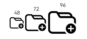
- Set the size of the SymbolSpan component through fontSize.
  Row() {
    Column() {
      Text("48")
      Text() {
        SymbolSpan($r('sys.symbol.ohos_folder_badge_plus'))
          .fontSize(48)
          .renderingStrategy(SymbolRenderingStrategy.SINGLE)
          .fontColor([Color.Black, Color.Green, Color.White])
      }
    }

    Column() {
      Text("72")
      Text() {
        SymbolSpan($r('sys.symbol.ohos_folder_badge_plus'))
          .fontSize(72)
          .renderingStrategy(SymbolRenderingStrategy.SINGLE)
          .fontColor([Color.Black, Color.Green, Color.White])
      }
    }

    Column() {
      Text("96")
      Text() {
        SymbolSpan($r('sys.symbol.ohos_folder_badge_plus'))
          .fontSize(96)
          .renderingStrategy(SymbolRenderingStrategy.SINGLE)
          .fontColor([Color.Black, Color.Green, Color.White])
      }
    }
  }
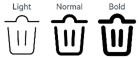
- Set the weight of the SymbolSpan component through fontWeight.
  Row() {
    Column() {
      Text("Light")
      Text() {
        SymbolSpan($r('sys.symbol.ohos_trash'))
          .fontWeight(FontWeight.Lighter)
          .fontSize(96)
      }
    }

    Column() {
      Text("Normal")
      Text() {
        SymbolSpan($r('sys.symbol.ohos_trash'))
          .fontWeight(FontWeight.Normal)
          .fontSize(96)
      }
    }

    Column() {
      Text("Bold")
      Text() {
        SymbolSpan($r('sys.symbol.ohos_trash'))
          .fontWeight(FontWeight.Bold)
          .fontSize(96)
      }
    }
  }
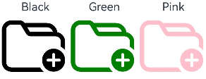
- Set the color of the SymbolSpan component through fontColor.
  Row() {
    Column() {
      Text("Black")
      Text() {
          SymbolSpan($r('sys.symbol.ohos_folder_badge_plus'))
            .fontSize(96)
            .fontColor([Color.Black])
      }
    }

    Column() {
      Text("Green")
      Text() {
        SymbolSpan($r('sys.symbol.ohos_folder_badge_plus'))
          .fontSize(96)
          .fontColor([Color.Green])
      }
    }

    Column() {
      Text("Pink")
      Text() {
        SymbolSpan($r('sys.symbol.ohos_folder_badge_plus'))
          .fontSize(96)
          .fontColor([Color.Pink])
      }
    }
  }
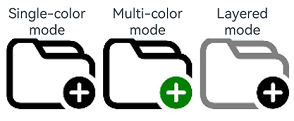
- Set the rendering strategy of the SymbolSpan component through renderingStrategy.
  Row() {
    Column() {
      Text("Single-color mode")
      Text() {
        SymbolSpan($r('sys.symbol.ohos_folder_badge_plus'))
          .fontSize(96)
          .renderingStrategy(SymbolRenderingStrategy.SINGLE)
          .fontColor([Color.Black, Color.Green, Color.White])
      }
    }

    Column() {
      Text("Multi-color mode")
      Text() {
        SymbolSpan($r('sys.symbol.ohos_folder_badge_plus'))
          .fontSize(96)
          .renderingStrategy(SymbolRenderingStrategy.MULTIPLE_COLOR)
          .fontColor([Color.Black, Color.Green, Color.White])
      }
    }

    Column() {
      Text("Layered mode")
      Text() {
        SymbolSpan($r('sys.symbol.ohos_folder_badge_plus'))
          .fontSize(96)
          .renderingStrategy(SymbolRenderingStrategy.MULTIPLE_OPACITY)
          .fontColor([Color.Black, Color.Green, Color.White])
      }
    }
  }
- Set the effect strategy of the SymbolSpan component through effectStrategy.
  Row() {
    Column() {
      Text("No effect")
      Text() {
        SymbolSpan($r('sys.symbol.ohos_wifi'))
          .fontSize(96)
          .effectStrategy(SymbolEffectStrategy.NONE)
      }
    }

    Column() {
      Text("Overall scale effect")
      Text() {
        SymbolSpan($r('sys.symbol.ohos_wifi'))
          .fontSize(96)
          .effectStrategy(SymbolEffectStrategy.SCALE)
      }
    }

    Column() {
      Text("Hierarchical effect")
      Text() {
        SymbolSpan($r('sys.symbol.ohos_wifi'))
          .fontSize(96)
          .effectStrategy(SymbolEffectStrategy.HIERARCHICAL)
      }
    }
  }
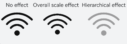
- SymbolSpan does not support universal events.
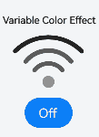
Customizing Symbol Glyph Animations
In addition to using the effectStrategy attribute, which triggers an animation once it is activated, you can control the animation playback and choose from a variety of effect strategies using the following two methods.
For details about how effectStrategy works with symbolEffect, see SymbolGlyph.symbolEffect.
- Use the symbolEffect attribute to set both the effect strategy and playback state of SymbolGlyph.
  @State isActive: boolean = true;
  Column() {
    Text("Variable Color Effect")
    SymbolGlyph($r('sys.symbol.ohos_wifi'))
      .fontSize(96)
      .symbolEffect(new HierarchicalSymbolEffect(EffectFillStyle.ITERATIVE), this.isActive)
    Button(this.isActive ? 'Off' : 'Play').onClick(() => {
      this.isActive = !this.isActive;
    })
  }
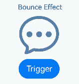
- Use the symbolEffect attribute to set both the effect strategy and the trigger for playback of SymbolGlyph.
  @State triggerValueReplace: number = 0;
  Column() {
    Text("Bounce Effect")
    SymbolGlyph($r('sys.symbol.ellipsis_message_1'))
      .fontSize(96)
      .fontColor([Color.Gray])
      .symbolEffect(new BounceSymbolEffect(EffectScope.WHOLE, EffectDirection.UP), this.triggerValueReplace)
    Button('Trigger').onClick(() => {
      this.triggerValueReplace = this.triggerValueReplace + 1;
    })
  }
Adding Events
You can add universal events, such as onClick and onTouch, to the SymbolGlyph component to handle user interactions.
@State wifiColor: ResourceColor = Color.Black;
SymbolGlyph($r('sys.symbol.ohos_wifi'))
  .fontSize(96)
  .fontColor([this.wifiColor])
  .onClick(() => {
    this.wifiColor = Color.Gray;
  })

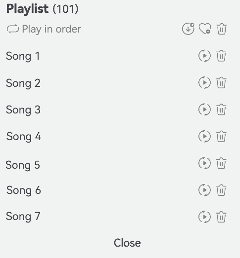
Example
This example shows how to implement a playlist with the use of symbolEffect, fontSize, and fontColor.
// xxx.ets
@Entry
@Component
struct Index {
  @State triggerValueReplace: number = 0;
  @State symbolSources: Resource[] =
    [$r('sys.symbol.repeat'), $r('sys.symbol.repeat_1'), $r('sys.symbol.arrow_left_arrow_right')];
  @State symbolSourcesIndex: number = 0;
  @State symbolText: string[] = ['Play in order', 'Loop song', 'Shuffle'];
  @State symbolTextIndex: number = 0;
  @State fontColorValue: ResourceColor = Color.Grey;
  @State fontColorValue1: ResourceColor = '#E8E8E8';

  build() {
    Column({ space: 10 }) {
      Row() {
        Text() {
          Span('Playlist')
            .fontSize(20)
            .fontWeight(FontWeight.Bolder)
          Span('(101)')
        }
      }

      Row() {
        Row({ space: 5 }) {
          SymbolGlyph(this.symbolSources[this.symbolSourcesIndex])
            .symbolEffect(new ReplaceSymbolEffect(EffectScope.WHOLE), this.triggerValueReplace)
            .fontSize(20)
            .fontColor([this.fontColorValue])
          Text(this.symbolText[this.symbolTextIndex])
            .fontColor(this.fontColorValue)
        }
        .onClick(() => {
          this.symbolTextIndex++;
          this.symbolSourcesIndex++;
          this.triggerValueReplace++;
          if (this.symbolSourcesIndex > (this.symbolSources.length - 1)) {
            this.symbolSourcesIndex = 0;
            this.triggerValueReplace = 0;
          }
          if (this.symbolTextIndex > (this.symbolText.length - 1)) {
            this.symbolTextIndex = 0;
          }
        })
        .width('75%')

        Row({ space: 5 }) {
          Text() {
            SymbolSpan($r('sys.symbol.arrow_down_circle_badge_vip_circle_filled'))
              .fontColor([this.fontColorValue])
              .fontSize(20)
          }

          Text() {
            SymbolSpan($r('sys.symbol.heart_badge_plus'))
              .fontColor([this.fontColorValue])
              .fontSize(20)
          }

          Text() {
            SymbolSpan($r('sys.symbol.ohos_trash'))
              .fontColor([this.fontColorValue])
              .fontSize(20)
          }
        }
        .width('25%')
      }

      Divider().width(5).color(this.fontColorValue1).width('98%')
      Row() {
        Row() {
          Text("Song 1")
        }.width('82%')

        Row({ space: 5 }) {
          SymbolGlyph($r('sys.symbol.play_arrow_triangle_2_circlepath'))
            .fontColor([this.fontColorValue])
            .fontSize(20)
          SymbolGlyph($r('sys.symbol.trash'))
            .fontColor([this.fontColorValue])
            .fontSize(20)
        }
      }

      Divider().width(5).color(this.fontColorValue1).width('98%')
      Row() {
        Row() {
          Text("Song 2")
        }.width('82%')

        Row({ space: 5 }) {
          SymbolGlyph($r('sys.symbol.play_arrow_triangle_2_circlepath'))
            .fontColor([this.fontColorValue])
            .fontSize(20)
          SymbolGlyph($r('sys.symbol.trash'))
            .fontColor([this.fontColorValue])
            .fontSize(20)
        }
      }

      Divider().width(5).color(this.fontColorValue1).width('98%')
      Row() {
        Row() {
          Text("Song 3")
        }.width('82%')

        Row({ space: 5 }) {
          SymbolGlyph($r('sys.symbol.play_arrow_triangle_2_circlepath'))
            .fontColor([this.fontColorValue])
            .fontSize(20)
          SymbolGlyph($r('sys.symbol.trash'))
            .fontColor([this.fontColorValue])
            .fontSize(20)
        }
      }

      Divider().width(5).color(this.fontColorValue1).width('98%')
      Row() {
        Row() {
          Text("Song 4")
        }.width('82%')

        Row({ space: 5 }) {
          SymbolGlyph($r('sys.symbol.play_arrow_triangle_2_circlepath'))
            .fontColor([this.fontColorValue])
            .fontSize(20)
          SymbolGlyph($r('sys.symbol.trash'))
            .fontColor([this.fontColorValue])
            .fontSize(20)
        }
      }

      Divider().width(5).color(this.fontColorValue1).width('98%')
      Row() {
        Row() {
          Text("Song 5")
        }.width('82%')

        Row({ space: 5 }) {
          SymbolGlyph($r('sys.symbol.play_arrow_triangle_2_circlepath'))
            .fontColor([this.fontColorValue])
            .fontSize(20)
          SymbolGlyph($r('sys.symbol.trash'))
            .fontColor([this.fontColorValue])
            .fontSize(20)
        }
      }

      Divider().width(5).color(this.fontColorValue1).width('98%')
      Row() {
        Row() {
          Text("Song 6")
        }.width('82%')

        Row({ space: 5 }) {
          SymbolGlyph($r('sys.symbol.play_arrow_triangle_2_circlepath'))
            .fontColor([this.fontColorValue])
            .fontSize(20)
          SymbolGlyph($r('sys.symbol.trash'))
            .fontColor([this.fontColorValue])
            .fontSize(20)
        }
      }

      Divider().width(5).color(this.fontColorValue1).width('98%')
      Row() {
        Row() {
          Text("Song 7")
        }.width('82%')

        Row({ space: 5 }) {
          SymbolGlyph($r('sys.symbol.play_arrow_triangle_2_circlepath'))
            .fontColor([this.fontColorValue])
            .fontSize(20)
          SymbolGlyph($r('sys.symbol.trash'))
            .fontColor([this.fontColorValue])
            .fontSize(20)
        }
      }

      Divider().width(5).color(this.fontColorValue1).width('98%')
      Column() {
        Text("Close")
      }
      .alignItems(HorizontalAlign.Center)
      .width('98%')
    }
    .alignItems(HorizontalAlign.Start)
    .width('100%')
    .height(400)
    .padding({
      left: 10,
      top: 10
    })
  }
}
你可能感兴趣的鸿蒙文章
harmony 鸿蒙Atomic Service Full Screen Launch Component (FullScreenLaunchComponent)
harmony 鸿蒙Arc Button (ArcButton)
harmony 鸿蒙Frame Animation (ohos.animator)
harmony 鸿蒙Implementing Property Animation
- 所属分类: 后端技术
- 本文标签:
热门推荐
-
2、 优质文章
-
3、 gt
-
7、 openharmony
-
9、 golang
-
10、 Vue中input框自动聚焦