harmony 鸿蒙Flex Layout (Flex)
Flex Layout (Flex)
Overview
The flex layout, implemented using the Flex container component, provides simple and powerful tools for flexibly distributing space and aligning items. The flex layout is widely used in scenarios such as the navigation bar distribution on the page header, page framework setup, and arrangement of multiple lines of data.
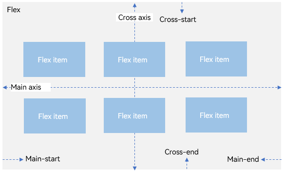
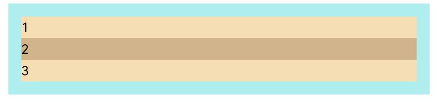
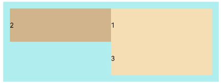
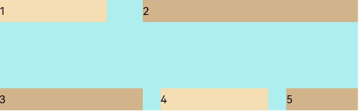
By default, the flex container has a main axis and a cross axis, and child elements are arranged along the main axis. The size of a child element along the main axis is referred to as its main axis size. Similarly, the size of a child element along the cross axis is referred to as its cross axis size.
Figure 1 Flex container whose main axis runs in the horizontal direction
Basic Concepts
Main axis: axis along which child elements are placed in the Flex component. Child elements are laid out along the main axis by default. The start point of the main axis is referred to as main-start, and the end point is referred to as main-end.
Cross axis: axis that runs perpendicular to the main axis. The start point of the cross axis is referred to as cross-start, and the end point is referred to as cross-end.
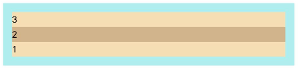
Layout Direction
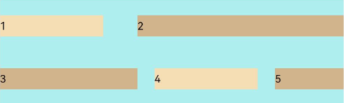
In the flex layout, the child elements can be arranged in any direction. You can set the direction parameter to define the direction of the main axis and thereby control the arrangement of child elements.
Figure 2 Flex layout direction
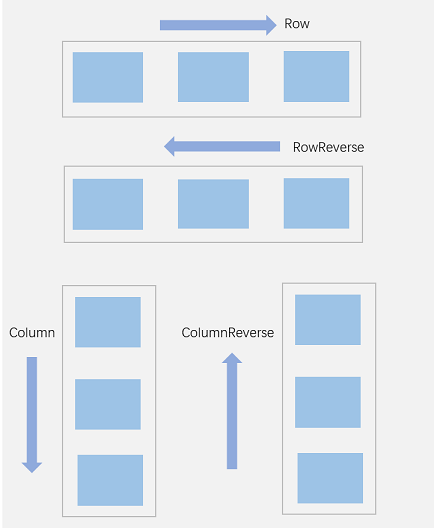
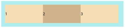
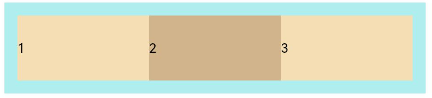
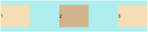
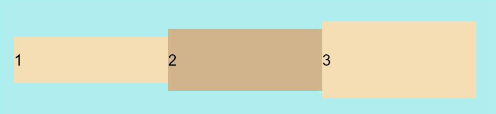
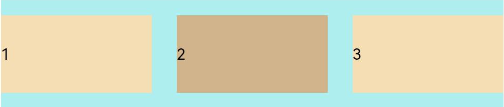
- FlexDirection.Row (default value): The main axis runs along the row horizontally, and the child elements are laid out from the start edge of the main axis.
  Flex({ direction: FlexDirection.Row }) {
    Text('1').width('33%').height(50).backgroundColor(0xF5DEB3)
    Text('2').width('33%').height(50).backgroundColor(0xD2B48C)
    Text('3').width('33%').height(50).backgroundColor(0xF5DEB3)
  }
  .height(70)
  .width('90%')
  .padding(10)
  .backgroundColor(0xAFEEEE)
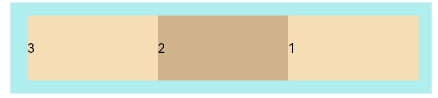
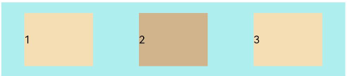
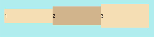
- FlexDirection.RowReverse: The main axis runs along the row horizontally, and the child elements are laid out from the end edge of the main axis, in a direction opposite to FlexDirection.Row.
  Flex({ direction: FlexDirection.RowReverse }) {
    Text('1').width('33%').height(50).backgroundColor(0xF5DEB3)
    Text('2').width('33%').height(50).backgroundColor(0xD2B48C)
    Text('3').width('33%').height(50).backgroundColor(0xF5DEB3)
  }
  .height(70)
  .width('90%')
  .padding(10)
  .backgroundColor(0xAFEEEE)
- FlexDirection.Column: The main axis runs along the column vertically, and the child elements are laid out from the start edge of the main axis.
  Flex({ direction: FlexDirection.Column }) {
    Text('1').width('100%').height(50).backgroundColor(0xF5DEB3)
    Text('2').width('100%').height(50).backgroundColor(0xD2B48C)
    Text('3').width('100%').height(50).backgroundColor(0xF5DEB3)
  }
  .height(70)
  .width('90%')
  .padding(10)
  .backgroundColor(0xAFEEEE)
- FlexDirection.ColumnReverse: The main axis runs along the column vertically, and the child elements are laid out from the end edge of the main axis, in a direction opposite to FlexDirection.Column.
  Flex({ direction: FlexDirection.ColumnReverse }) {
    Text('1').width('100%').height(50).backgroundColor(0xF5DEB3)
    Text('2').width('100%').height(50).backgroundColor(0xD2B48C)
    Text('3').width('100%').height(50).backgroundColor(0xF5DEB3)
  }
  .height(70)
  .width('90%')
  .padding(10)
  .backgroundColor(0xAFEEEE)
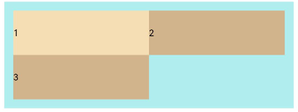
Wrapping in the Flex Layout
In the flex layout, child elements can be laid on a single line or on multiple lines. By default, child elements in the flex container are laid out on a single line (also called an axis). You can use the wrap attribute to set whether child elements can wrap onto multiple lines when the total main axis size of the child elements is greater than the main axis size of the container. When wrapped onto multiple lines, the child elements on the new line are aligned based on the cross axis direction.
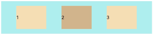
- FlexWrap.NoWrap (default value): Child elements are laid out on a single line. This may cause the child elements to shrink to fit the container when their total width is greater than the container width.
  Flex({ wrap: FlexWrap.NoWrap }) {
    Text('1').width('50%').height(50).backgroundColor(0xF5DEB3)
    Text('2').width('50%').height(50).backgroundColor(0xD2B48C)
    Text('3').width('50%').height(50).backgroundColor(0xF5DEB3)
  }
  .width('90%')
  .padding(10)
  .backgroundColor(0xAFEEEE)
- FlexWrap.Wrap: Child elements break into multiple lines and are aligned along the main axis.
  Flex({ wrap: FlexWrap.Wrap }) {
    Text('1').width('50%').height(50).backgroundColor(0xF5DEB3)
    Text('2').width('50%').height(50).backgroundColor(0xD2B48C)
    Text('3').width('50%').height(50).backgroundColor(0xD2B48C)
  }
  .width('90%')
  .padding(10)
  .backgroundColor(0xAFEEEE)
- FlexWrap.WrapReverse: Child elements break into multiple lines and are aligned in the reverse direction to the main axis.
  Flex({ wrap: FlexWrap.WrapReverse}) {
    Text('1').width('50%').height(50).backgroundColor(0xF5DEB3)
    Text('2').width('50%').height(50).backgroundColor(0xD2B48C)
    Text('3').width('50%').height(50).backgroundColor(0xF5DEB3)
  }
  .width('90%')
  .padding(10)
  .backgroundColor(0xAFEEEE)
Alignment on the Main Axis
Use the justifyContent parameter to set alignment of child elements on the main axis.
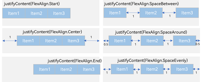
- FlexAlign.Start (default value): The child elements are aligned with each other toward the start edge of the container along the main axis.
  Flex({ justifyContent: FlexAlign.Start }) {
    Text('1').width('20%').height(50).backgroundColor(0xF5DEB3)
    Text('2').width('20%').height(50).backgroundColor(0xD2B48C)
    Text('3').width('20%').height(50).backgroundColor(0xF5DEB3)
  }
  .width('90%')
  .padding({ top: 10, bottom: 10 })
  .backgroundColor(0xAFEEEE)
- FlexAlign.Center: The child elements are aligned with each other toward the center of the container along the main axis.
  Flex({ justifyContent: FlexAlign.Center }) {
    Text('1').width('20%').height(50).backgroundColor(0xF5DEB3)
    Text('2').width('20%').height(50).backgroundColor(0xD2B48C)
    Text('3').width('20%').height(50).backgroundColor(0xF5DEB3)
  }
  .width('90%')
  .padding({ top: 10, bottom: 10 })
  .backgroundColor(0xAFEEEE)
- FlexAlign.End: The child elements are aligned with each other toward the end edge of the container along the main axis.
  Flex({ justifyContent: FlexAlign.End }) {
    Text('1').width('20%').height(50).backgroundColor(0xF5DEB3)
    Text('2').width('20%').height(50).backgroundColor(0xD2B48C)
    Text('3').width('20%').height(50).backgroundColor(0xF5DEB3)
  }
  .width('90%')
  .padding({ top: 10, bottom: 10 })
  .backgroundColor(0xAFEEEE)

- FlexAlign.SpaceBetween: The child elements are evenly distributed within the container along the main axis. The first and last child elements are aligned with the edges of the container.
  Flex({ justifyContent: FlexAlign.SpaceBetween }) {
    Text('1').width('20%').height(50).backgroundColor(0xF5DEB3)
    Text('2').width('20%').height(50).backgroundColor(0xD2B48C)
    Text('3').width('20%').height(50).backgroundColor(0xF5DEB3)
  }
  .width('90%')
  .padding({ top: 10, bottom: 10 })
  .backgroundColor(0xAFEEEE)
- FlexAlign.SpaceAround: The child elements are evenly distributed within the container along the main axis. The space between the first child element and main-start, and that between the last child element and main-end are both half of the space between two adjacent child elements.
  Flex({ justifyContent: FlexAlign.SpaceAround }) {
    Text('1').width('20%').height(50).backgroundColor(0xF5DEB3)
    Text('2').width('20%').height(50).backgroundColor(0xD2B48C)
    Text('3').width('20%').height(50).backgroundColor(0xF5DEB3)
  }
  .width('90%')
  .padding({ top: 10, bottom: 10 })
  .backgroundColor(0xAFEEEE)
- FlexAlign.SpaceEvenly: The child elements are evenly distributed within the container along the main axis. The space between the first child element and main-start, the space between the last child element and main-end, and the space between two adjacent child elements are the same.
  Flex({ justifyContent: FlexAlign.SpaceEvenly }) {
    Text('1').width('20%').height(50).backgroundColor(0xF5DEB3)
    Text('2').width('20%').height(50).backgroundColor(0xD2B48C)
    Text('3').width('20%').height(50).backgroundColor(0xF5DEB3)
  }
  .width('90%')
  .padding({ top: 10, bottom: 10 })
  .backgroundColor(0xAFEEEE)
Alignment on the Cross Axis
Alignment on the cross axis can be set for both the container and child elements, with that set for child elements having a higher priority.
Setting Alignment on the Cross Axis for the Container
Use the alignItems parameter of the Flex component to set alignment of child elements on the cross axis.
- ItemAlign.Auto: The child elements are automatically aligned in the flex container.
  Flex({ alignItems: ItemAlign.Auto }) {
    Text('1').width('33%').height(30).backgroundColor(0xF5DEB3)
    Text('2').width('33%').height(40).backgroundColor(0xD2B48C)
    Text('3').width('33%').height(50).backgroundColor(0xF5DEB3)
  }
  .size({ width: '90%', height: 80 })
  .padding(10)
  .backgroundColor(0xAFEEEE)
- ItemAlign.Start: The child elements are aligned with the start edge of the container along the cross axis.
  Flex({ alignItems: ItemAlign.Start }) {
    Text('1').width('33%').height(30).backgroundColor(0xF5DEB3)
    Text('2').width('33%').height(40).backgroundColor(0xD2B48C)
    Text('3').width('33%').height(50).backgroundColor(0xF5DEB3)
  }
  .size({ width: '90%', height: 80 })
  .padding(10)
  .backgroundColor(0xAFEEEE)

- ItemAlign.Start: The child elements are aligned with the center of the container along the cross axis.
  Flex({ alignItems: ItemAlign.Center }) {
    Text('1').width('33%').height(30).backgroundColor(0xF5DEB3)
    Text('2').width('33%').height(40).backgroundColor(0xD2B48C)
    Text('3').width('33%').height(50).backgroundColor(0xF5DEB3)
  }
  .size({ width: '90%', height: 80 })
  .padding(10)
  .backgroundColor(0xAFEEEE)
- ItemAlign.End: The child elements are aligned with the end edge of the container along the cross axis.
  Flex({ alignItems: ItemAlign.End }) {
    Text('1').width('33%').height(30).backgroundColor(0xF5DEB3)
    Text('2').width('33%').height(40).backgroundColor(0xD2B48C)
    Text('3').width('33%').height(50).backgroundColor(0xF5DEB3)
  }
  .size({ width: '90%', height: 80 })
  .padding(10)
  .backgroundColor(0xAFEEEE)
- ItemAlign.Stretch: The child elements are stretched along the cross axis. If no constraints are set, the child elements are stretched to fill the size of the container on the cross axis.
  Flex({ alignItems: ItemAlign.Stretch }) {
    Text('1').width('33%').backgroundColor(0xF5DEB3)
    Text('2').width('33%').backgroundColor(0xD2B48C)
    Text('3').width('33%').backgroundColor(0xF5DEB3)
  }
  .size({ width: '90%', height: 80 })
  .padding(10)
  .backgroundColor(0xAFEEEE)
- ItemAlign.Baseline: The child elements are aligned at the baseline of the cross axis.
  Flex({ alignItems: ItemAlign.Baseline }) {
    Text('1').width('33%').height(30).backgroundColor(0xF5DEB3)
    Text('2').width('33%').height(40).backgroundColor(0xD2B48C)
    Text('3').width('33%').height(50).backgroundColor(0xF5DEB3)
  }
  .size({ width: '90%', height: 80 })
  .padding(10)
  .backgroundColor(0xAFEEEE)
Setting Alignment on the Cross Axis for Child Elements
Use the alignSelf attribute of child elements to set their alignment in the container on the cross axis. The settings overwrite the default alignItems settings in the flex container. The sample code is as follows:
Flex({ direction: FlexDirection.Row, alignItems: ItemAlign.Center }) { // The child elements are aligned with the center of the container.
  Text('alignSelf Start').width('25%').height(80)
    .alignSelf(ItemAlign.Start)
    .backgroundColor(0xF5DEB3)
  Text('alignSelf Baseline')
    .alignSelf(ItemAlign.Baseline)
    .width('25%')
    .height(80)
    .backgroundColor(0xD2B48C)
  Text('alignSelf Baseline').width('25%').height(100)
    .backgroundColor(0xF5DEB3)
    .alignSelf(ItemAlign.Baseline)
  Text('no alignSelf').width('25%').height(100)
    .backgroundColor(0xD2B48C)
  Text('no alignSelf').width('25%').height(100)
    .backgroundColor(0xF5DEB3)

}.width('90%').height(220).backgroundColor(0xAFEEEE)
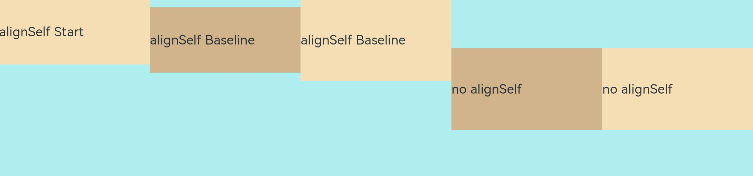
In the preceding example, the alignItems parameter of the Flex container and the alignSelf attribute of the child element are both set. In this case, the alignSelf settings take effect.
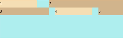
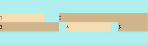
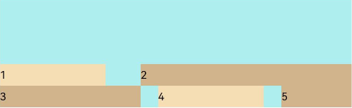
Content Alignment
Use the alignContent parameter to set how space is distributed between and around child elements along the cross axis. This parameter is effective only for a multi-line flex layout. Its available options are as follows:
- FlexAlign.Start: The child elements are aligned toward the start edge of the cross axis in the container.
  Flex({ justifyContent: FlexAlign.SpaceBetween, wrap: FlexWrap.Wrap, alignContent: FlexAlign.Start }) {
    Text('1').width('30%').height(20).backgroundColor(0xF5DEB3)
    Text('2').width('60%').height(20).backgroundColor(0xD2B48C)
    Text('3').width('40%').height(20).backgroundColor(0xD2B48C)
    Text('4').width('30%').height(20).backgroundColor(0xF5DEB3)
    Text('5').width('20%').height(20).backgroundColor(0xD2B48C)
  }
  .width('90%')
  .height(100)
  .backgroundColor(0xAFEEEE)
- FlexAlign.Center: The child elements are aligned toward the center of the cross axis in the container.
  Flex({ justifyContent: FlexAlign.SpaceBetween, wrap: FlexWrap.Wrap, alignContent: FlexAlign.Center }) {
    Text('1').width('30%').height(20).backgroundColor(0xF5DEB3)
    Text('2').width('60%').height(20).backgroundColor(0xD2B48C)
    Text('3').width('40%').height(20).backgroundColor(0xD2B48C)
    Text('4').width('30%').height(20).backgroundColor(0xF5DEB3)
    Text('5').width('20%').height(20).backgroundColor(0xD2B48C)
  }
  .width('90%')
  .height(100)
  .backgroundColor(0xAFEEEE)
- FlexAlign.End: The child elements are aligned toward the end edge of the cross axis in the container.
  Flex({ justifyContent: FlexAlign.SpaceBetween, wrap: FlexWrap.Wrap, alignContent: FlexAlign.End }) {
    Text('1').width('30%').height(20).backgroundColor(0xF5DEB3)
    Text('2').width('60%').height(20).backgroundColor(0xD2B48C)
    Text('3').width('40%').height(20).backgroundColor(0xD2B48C)
    Text('4').width('30%').height(20).backgroundColor(0xF5DEB3)
    Text('5').width('20%').height(20).backgroundColor(0xD2B48C)
  }
  .width('90%')
  .height(100)
  .backgroundColor(0xAFEEEE)
- FlexAlign.SpaceBetween: The child elements are evenly distributed within the container along the cross axis. The first and last child elements are aligned with the edges of the container.
  Flex({ justifyContent: FlexAlign.SpaceBetween, wrap: FlexWrap.Wrap, alignContent: FlexAlign.SpaceBetween }) {
    Text('1').width('30%').height(20).backgroundColor(0xF5DEB3)
    Text('2').width('60%').height(20).backgroundColor(0xD2B48C)
    Text('3').width('40%').height(20).backgroundColor(0xD2B48C)
    Text('4').width('30%').height(20).backgroundColor(0xF5DEB3)
    Text('5').width('20%').height(20).backgroundColor(0xD2B48C)
  }
  .width('90%')
  .height(100)
  .backgroundColor(0xAFEEEE)
- FlexAlign.SpaceAround: The child elements are evenly distributed within the container along the cross axis. The space between the first child element and cross-start, and that between the last child element and cross-end are both half of the space between two adjacent child elements.
  Flex({ justifyContent: FlexAlign.SpaceBetween, wrap: FlexWrap.Wrap, alignContent: FlexAlign.SpaceAround }) {
    Text('1').width('30%').height(20).backgroundColor(0xF5DEB3)
    Text('2').width('60%').height(20).backgroundColor(0xD2B48C)
    Text('3').width('40%').height(20).backgroundColor(0xD2B48C)
    Text('4').width('30%').height(20).backgroundColor(0xF5DEB3)
    Text('5').width('20%').height(20).backgroundColor(0xD2B48C)
  }
  .width('90%')
  .height(100)
  .backgroundColor(0xAFEEEE)
- FlexAlign.SpaceEvenly: The child elements are evenly distributed within the container along the cross axis. The space between the first child element and cross-start, the space between the last child element and cross-end, and the space between two adjacent child elements are the same.
  Flex({ justifyContent: FlexAlign.SpaceBetween, wrap: FlexWrap.Wrap, alignContent: FlexAlign.SpaceEvenly }) {
    Text('1').width('30%').height(20).backgroundColor(0xF5DEB3)
    Text('2').width('60%').height(20).backgroundColor(0xD2B48C)
    Text('3').width('40%').height(20).backgroundColor(0xD2B48C)
    Text('4').width('30%').height(20).backgroundColor(0xF5DEB3)
    Text('5').width('20%').height(20).backgroundColor(0xD2B48C)
  }
  .width('90%')
  .height(100)
  .backgroundColor(0xAFEEEE)

Adaptive Scaling
When the size of the flex container is not large enough, the following attributes of the child element can be used to achieve adaptive layout:
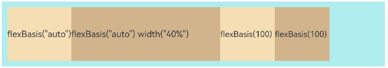
- flexBasis: base size of the child element in the container along the main axis. It sets the space occupied by the child element. If this attribute is not set, the space occupied by the child element is the result of width/height.
  Flex() {
    Text('flexBasis("auto")')
      .flexBasis('auto') // When width is not set and flexBasis is set to auto, the content is at its own width.
      .height(100)
      .backgroundColor(0xF5DEB3)
    Text('flexBasis("auto")'+' width("40%")')
      .width('40%')
      .flexBasis('auto') // When width is set and flexBasis is set to auto, the value of width is used.
      .height(100)
      .backgroundColor(0xD2B48C)

    Text('flexBasis(100)') // When width is not set and flexBasis is set to 100, the width is 100 vp.
      .flexBasis(100)
      .height(100)
      .backgroundColor(0xF5DEB3)

    Text('flexBasis(100)')
      .flexBasis(100)
      .width(200) // When both width and flexBasis are set, flexBasis takes precedence, and the width is 100 vp.
      .height(100)
      .backgroundColor(0xD2B48C)
  }.width('90%').height(120).padding(10).backgroundColor(0xAFEEEE)
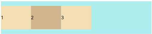
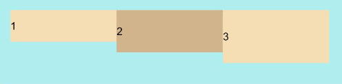
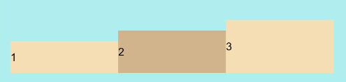
- flexGrow: percentage of the flex container’s remaining space that is allocated to the child element. In other words, it is the grow factor of the child element.
  Flex() {
    Text('flexGrow(2)')
      .flexGrow(2)
      .width(100)
      .height(100)
      .backgroundColor(0xF5DEB3)
    Text('flexGrow(3)')
      .flexGrow(3)
      .width(100)
      .height(100)
      .backgroundColor(0xD2B48C)

    Text('no flexGrow')
      .width(100)
      .height(100)
      .backgroundColor(0xF5DEB3)
  }.width(420).height(120).padding(10).backgroundColor(0xAFEEEE)
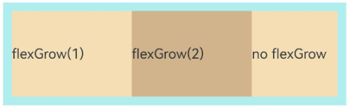
In the preceding figure, the width of the flex container is 420 vp, the original width of the three child elements is 100 vp each, and the left and right margins are 20 vp in total. The flex container’s remaining 100 vp space is allocated to the child elements based on their flexGrow settings. The third child element does not have flexGrow set and therefore does not participate in the allocation of remaining space.
After receiving their share of remaining space at the 2:3 ratio, the first and second child elements are at a width of 140 vp (100 vp + 100 vp x 2⁄5) and 160 vp (100 vp + 100 vp x 3⁄5), respectively.
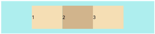
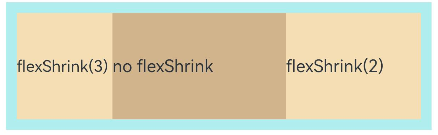
- flexShrink: shrink factor of the child element when the size of all child elements is larger than the flex container.
  Flex({ direction: FlexDirection.Row }) {
    Text('flexShrink(3)')
      .flexShrink(3)
      .width(200)
      .height(100)
      .backgroundColor(0xF5DEB3)

    Text('no flexShrink')
      .width(200)
      .height(100)
      .backgroundColor(0xD2B48C)

    Text('flexShrink(2)')
      .flexShrink(2)
      .width(200)
      .height(100)
      .backgroundColor(0xF5DEB3)
  }.width(400).height(120).padding(10).backgroundColor(0xAFEEEE)
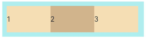
Example
In this example, child elements are arranged horizontally in the flex layout, aligned at both edges, evenly spaced, and centered in the vertical direction.
@Entry
@Component
struct FlexExample {
  build() {
    Column() {
      Column({ space: 5 }) {
        Flex({ direction: FlexDirection.Row, wrap: FlexWrap.NoWrap, justifyContent: FlexAlign.SpaceBetween, alignItems: ItemAlign.Center }) {
          Text('1').width('30%').height(50).backgroundColor(0xF5DEB3)
          Text('2').width('30%').height(50).backgroundColor(0xD2B48C)
          Text('3').width('30%').height(50).backgroundColor(0xF5DEB3)
        }
        .height(70)
        .width('90%')
        .backgroundColor(0xAFEEEE)
      }.width('100%').margin({ top: 5 })
    }.width('100%')
 }
}
你可能感兴趣的鸿蒙文章
harmony 鸿蒙Atomic Service Full Screen Launch Component (FullScreenLaunchComponent)
harmony 鸿蒙Arc Button (ArcButton)
harmony 鸿蒙Frame Animation (ohos.animator)
harmony 鸿蒙Implementing Property Animation
- 所属分类: 后端技术
- 本文标签:
热门推荐
-
2、 优质文章
-
3、 gt
-
7、 openharmony
-
9、 golang
-
10、 Vue中input框自动聚焦