harmony 鸿蒙Creating an Arc Carousel Component (ArcSwiper) (Recommended for Circular Screens)
Creating an Arc Carousel Component (ArcSwiper) (Recommended for Circular Screens)
ArcSwiper is an arc carousel component designed specifically for circular screens, allowing you to display content in an arc layout. For details, see ArcSwiper.
Before using the ArcSwiper component, you need to import the ArcSwiper module in your code:
import {
  ArcSwiper,
  ArcSwiperAttribute,
  ArcDotIndicator,
  ArcDirection,
  ArcSwiperController
} from '@kit.ArkUI'
Setting the Navigation Point Indicator Style
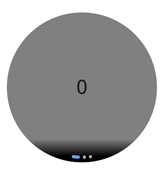
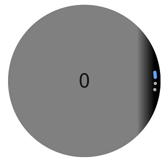
ArcSwiper provides a default arc-shaped navigation point style, with the navigation points displayed centered below the ArcSwiper. You can customize the style of the arc-shaped navigation points using the indicator attribute.
Using the indicator attribute, you can set the direction of the arc-shaped navigation points and customize the colors of the points and the selected point.
- Example of using the navigation point indicator in its default style:
  ArcSwiper() {
    Text('0')
      .width(233)
      .height(233)
      .backgroundColor(Color.Gray)
      .textAlign(TextAlign.Center)
      .fontSize(30)

    Text('1')
      .width(233)
      .height(233)
      .backgroundColor(Color.Green)
      .textAlign(TextAlign.Center)
      .fontSize(30)

    Text('2')
      .width(233)
      .height(233)
      .backgroundColor(Color.Pink)
      .textAlign(TextAlign.Center)
      .fontSize(30)
  }
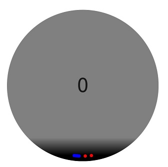
- Example of customizing the style of the navigation point indicator:
In this example, the navigation dots are positioned at the 6 o’clock direction of the ArcSwiper component, with the dot color set to red and the selected point color set to blue.
  ArcSwiper() {
    // ...
  }
  .indicator(
    new ArcDotIndicator()
      .arcDirection(ArcDirection.SIX_CLOCK_DIRECTION) // Set the dots at the 6 o'clock direction.
      .itemColor (Color.Red) // Set the dot color to red.
      .selectedItemColor (Color.Blue) // Set the selected dot color to blue.
  )
Controlling Page Switching Modes
The ArcSwiper component supports four page switching modes: swiping with fingers, touching navigation points, rotating the digital crown, and using a controller. The following examples demonstrate how to use a controller and the digital crown to switch between pages.
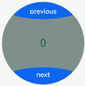
- Using a controller to switch between pages
  // Import the ArcButton and ArcSwiper modules.
  import {
    ArcButton,
    ArcButtonOptions,
    ArcButtonStatus,
    ArcButtonStyleMode,
    ArcButtonPosition,
    ArcSwiper,
    ArcSwiperAttribute,
    ArcDotIndicator,
    ArcDirection,
    ArcSwiperController
  } from '@kit.ArkUI';

  @Entry
  @Component
  struct SwiperCustomAnimationExample {
    private wearableSwiperController: ArcSwiperController = new ArcSwiperController()

    build() {
      Column() {
        Stack() {
          ArcSwiper(this.wearableSwiperController) {
            // ...
          }
          .vertical(true)
          .indicator(false)

          Column() {
            ArcButton({
              options: new ArcButtonOptions({
                label: 'previous',
                position: ArcButtonPosition.TOP_EDGE,
                styleMode: ArcButtonStyleMode.EMPHASIZED_LIGHT,
                onClick: () => {
                  this.wearableSwiperController.showPrevious(); // Switch to the previous page using the controller.
                }
              })
            })

            Blank()

            ArcButton({
              options: new ArcButtonOptions({
                label: 'next',
                position: ArcButtonPosition.BOTTOM_EDGE,
                styleMode: ArcButtonStyleMode.EMPHASIZED_LIGHT,
                onClick: () => {
                  this.wearableSwiperController.showNext(); // Switch to the next page using the controller.
                }
              })
            })
          }.width('100%').height('100%')
        }
      }
    }
  }
- Using the digital crown to switch between pages
When the ArcSwiper component is focused, it can respond to digital crown rotations. Users can scroll through the ArcSwiper component by rotating the crown to browse content.
  ArcSwiper() {
    // ...
  }
  .focusable(true)
  .focusOnTouch(true)
  .defaultFocus(true)
You can also adjust the sensitivity of the digital crown to events using the digitalCrownSensitivity attribute to adapt to different scales of data. For large datasets, you can increase the sensitivity; for smaller datasets, you can decrease it.
  ArcSwiper() {
    // ...
  }
  .digitalCrownSensitivity(CrownSensitivity.MEDIUM)
Setting the Swiping Direction
The ArcSwiper component supports both horizontal and vertical swiping, controlled primarily by the vertical attribute.
When vertical is set to true, swiping occurs in the vertical direction. When vertical is set to false, swiping occurs in the horizontal direction. The default value is false.
- Example of using horizontal swiping:
  ArcSwiper() {
    // ...
  }
  .indicator(true)
  .vertical(false)
- Example of using vertical swiping with dots at the 3 o’clock direction:
  ArcSwiper() {
    // ...
  }
  .indicator(new ArcDotIndicator()
      .arcDirection(ArcDirection.THREE_CLOCK_DIRECTION))
  .vertical(true)
Customizing the Transition Animation
Use the customContentTransition attribute to set a custom transition animation for ArcSwiper. Define the animation by adjusting opacity, scale, translation, and rendering layer for all pages within the viewport frame by frame in the callback.
import { Decimal } from '@kit.ArkTS'

@Entry
@Component
struct SwiperCustomAnimationExample {
  private MIN_SCALE: number = 0.1
  @State backgroundColors: Color[] = [Color.Green, Color.Blue, Color.Yellow, Color.Pink, Color.Gray, Color.Orange]
  @State opacityList: number[] = []
  @State scaleList: number[] = []

  aboutToAppear(): void {
    for (let i = 0; i < this.backgroundColors.length; i++) {
      this.opacityList.push(1.0)
      this.scaleList.push(1.0)
    }
  }

  build() {
    Column() {
      ArcSwiper() {
        ForEach(this.backgroundColors, (backgroundColor: Color, index: number) => {
          Text(index.toString())
            .width(233)
            .height(233)
            .fontSize(50)
            .textAlign(TextAlign.Center)
            .backgroundColor(backgroundColor)
            .opacity(this.opacityList[index])
            .scale({ x: this.scaleList[index], y: this.scaleList[index] })
        })
      }
      .customContentTransition({
        timeout: 1000,
        transition: (proxy: SwiperContentTransitionProxy) => {
          if (proxy.position <= -1||proxy.position >= 1) {
            // When a group of pages is completely scrolled out of the viewport, reset the attribute values.
            this.opacityList[proxy.index] = 1.0
            this.scaleList[proxy.index] = 1.0
          } else {
            let position: number = Decimal.abs(proxy.position).toNumber()
            this.opacityList[proxy.index] = 1 - position
            this.scaleList[proxy.index] =
              this.MIN_SCALE + (1 - this.MIN_SCALE) * (1 - position)
          }
        }
      })
    }.width('100%')
  }
}

Implementing Swipe-to-Return
The swipe gesture of the ArcSwiper component may conflict with the swipe-to-return functionality. To resolve this, you can use gesture judgment to determine whether ArcSwiper has scrolled to the beginning. This allows you to intercept the swipe gesture and enable the swipe-to-return functionality.
@Entry
@Component
struct SwiperCustomAnimationExample {
  @State backgroundColors: Color[] = [Color.Green, Color.Blue, Color.Yellow, Color.Pink, Color.Gray, Color.Orange]
  innerSelectedIndex: number = 0

  build() {
    Column() {
      ArcSwiper() {
        ForEach(this.backgroundColors, (backgroundColor: Color, index: number) => {
          Text(index.toString())
            .width(233)
            .height(233)
            .fontSize(50)
            .textAlign(TextAlign.Center)
            .backgroundColor(backgroundColor)
        })
      }
      .onAnimationStart((index: number, targetIndex: number) => {
        this.innerSelectedIndex = targetIndex
      })
      .onGestureRecognizerJudgeBegin((event: BaseGestureEvent, current: GestureRecognizer,
        others: Array<GestureRecognizer>): GestureJudgeResult => { // When the implementation is about to succeed, set the recognizer enabling state based on the current component state.
        if (current) {
          let target = current.getEventTargetInfo();
          if (target && current.isBuiltIn() && current.getType() == GestureControl.GestureType.PAN_GESTURE) {
            let swiperTaget = target as ScrollableTargetInfo
            if (swiperTaget instanceof ScrollableTargetInfo &&
              (swiperTaget.isBegin()||this.innerSelectedIndex === 0)) { // This condition checks whether ArcSwiper has scrolled to the beginning.
              let panEvent = event as PanGestureEvent;
              if (panEvent && panEvent.offsetX > 0 && (swiperTaget.isBegin()||this.innerSelectedIndex === 0)) {
                return GestureJudgeResult.REJECT;
              }
            }
          }
        }
        return GestureJudgeResult.CONTINUE;
      })
    }.width('100%')
  }
}
你可能感兴趣的鸿蒙文章
harmony 鸿蒙Atomic Service Full Screen Launch Component (FullScreenLaunchComponent)
harmony 鸿蒙Arc Button (ArcButton)
harmony 鸿蒙Frame Animation (ohos.animator)
harmony 鸿蒙Implementing Property Animation
- 所属分类: 后端技术
- 本文标签:
热门推荐
-
2、 优质文章
-
3、 gt
-
7、 openharmony
-
9、 golang
-
10、 Vue中input框自动聚焦