harmony 鸿蒙Creating an Arc List (ArcList) (Recommended for Circular Screens)
Creating an Arc List (ArcList) (Recommended for Circular Screens)
The ArcList component is a specialized list designed for devices with circular screens, capable of efficiently displaying information in a structured, scrollable format. For details, see ArcList.
You can linearly arrange child components, ArcListItem, vertically within the ArcList component. This allows each item in the ArcList to have its own view. To build a complex ArcList, you can use ForEach to iterate over a set of list items or combine any number of individual views with the ForEach structure. The ArcList component supports various rendering control methods, including conditional rendering, loop rendering, and lazy loading, to generate child components.
Creating an ArcList Component
To create an ArcList component, use the following:
ArcList() {
  ArcListItem() {
    // ...
  }
  ArcListItem() {
    // ...
  }
  // ...
}
NOTE
The child components of the ArcList must be ArcListItem. ArcListItem must be used in conjunction with ArcList.
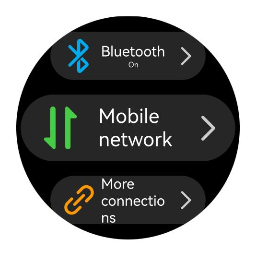
Displaying Data in the ArcList Component
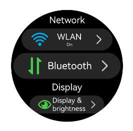
The ArcList component displays a collection of items vertically and provides scrolling functionality when items exceed the screen boundaries. This makes it ideal for displaying large datasets. In the simplest form of an ArcList, the list items, ArcListItem, are statically created within the ArcList.
// xxx.ets
import { ArcList, ArcListItem, ArcListAttribute, ArcListItemAttribute, LengthMetrics } from "@kit.ArkUI";

@Entry
@Component
struct ArcListExample {
  build() {
    ArcList({ initialIndex: 2 }) {
      ArcListItem() {
        Row() {
          Image($r("app.media.wlan")).width("99px").height("99px")
            .borderRadius("50px").margin({ left: 7 })
          Column() {
            Text("WLAN").fontSize("38px").fontColor("#FFFFFFFF")
            Text("On").fontSize("20px").fontColor("#FFFFFFFF")
          }.width("190px")

          Image($r("app.media.ic_settings_arrow")).width("92px").height("92px")
            .borderRadius("50px")
        }
      }
      .borderRadius("65px")
      .width("414px")
      .height("129px")
      .backgroundColor("#26FFFFFF")

      ArcListItem() {
        Row() {
          Image($r("app.media.blueTooth")).width("99px").height("99px")
            .borderRadius("50px").margin({ left: 7 })
          Column() {
            Text("Bluetooth").fontSize("38px").fontColor("#FFFFFFFF")
            Text("On").fontSize("20px").fontColor("#FFFFFFFF")
          }.width("190px")

          Image($r("app.media.ic_settings_arrow")).width("92px").height("92px")
            .borderRadius("50px")
        }
      }
      .borderRadius("65px")
      .width("414px")
      .height("129px")
      .backgroundColor("#26FFFFFF")

      ArcListItem() {
        Row() {
          Image($r("app.media.mobileData")).width("99px").height("99px")
            .borderRadius("50px").margin({ left: 7 })
          Column() {
            Text("Mobile network").fontSize("38px").fontColor("#FFFFFFFF")
          }.width("190px")

          Image($r("app.media.ic_settings_arrow")).width("92px").height("92px")
            .borderRadius("50px")
        }
      }
      .borderRadius("65px")
      .width("414px")
      .height("129px")
      .backgroundColor("#26FFFFFF")

      ArcListItem() {
        Row() {
          Image($r("app.media.ic_settings_more_connections")).width("99px").height("99px")
            .borderRadius("50px").margin({ left: 7 })
          Column() {
            Text("More connections").fontSize("38px").fontColor("#FFFFFFFF")
          }.width("190px")

          Image($r("app.media.ic_settings_arrow")).width("92px").height("92px")
            .borderRadius("50px")
        }
      }
      .borderRadius("65px")
      .width("414px")
      .height("129px")
      .backgroundColor("#26FFFFFF")

      ArcListItem() {
        Row() {
          Image($r("app.media.displayAndBrightness")).width("99px").height("99px")
            .borderRadius("50px").margin({ left: 7 })
          Column() {
            Text("Display & brightness").fontSize("38px").fontColor("#FFFFFFFF")
          }.width("190px")

          Image($r("app.media.ic_settings_arrow")).width("92px").height("92px")
            .borderRadius("50px")
        }
      }
      .borderRadius("65px")
      .width("414px")
      .height("129px")
      .backgroundColor("#26FFFFFF")
    }
    .width("466px")
    .height("466px")
    .space(LengthMetrics.px(10))
    .borderRadius("233px")
    .backgroundColor(Color.Black)
  }
}
Figure 1 Displaying data in the ArcList component
Iterating ArcList Content
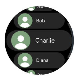
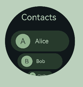
Typically, applications dynamically create lists from data collections. Using loop rendering, you can iterate over the data source to create corresponding components during each iteration, thereby reducing code complexity.
ArkTS provides loop rendering capabilities through ForEach. For example, in a simple contacts list, contact names and profile picture data are stored in a contacts array using a Contact class structure. By using ForEach with nested ArcListItem, you can replace multiple similar, flat-laid-out ArcListItem components, reducing redundant code and making your code more concise and efficient.
// xxx.ets
import { ArcList, ArcListAttribute, ArcListItemAttribute, ArcListItem, LengthMetrics } from '@kit.ArkUI';
import { util } from '@kit.ArkTS';

class Contact {
  key: string = util.generateRandomUUID(true);
  name: string;
  icon: Resource;

  constructor(name: string, icon: Resource) {
    this.name = name;
    this.icon = icon;
  }
}

@Entry
@Component
struct SimpleContacts {
  private contacts: Array<object> = [
    new Contact('Alice', $r("app.media.ic_contact")),
    new Contact('Bob', $r("app.media.ic_contact")),
    new Contact('Charlie', $r("app.media.ic_contact")),
    new Contact('Diana', $r("app.media.ic_contact")),
    new Contact('Eve', $r("app.media.ic_contact"))
  ]

  build() {
    ArcList({ initialIndex: 2 }) {
      ForEach(this.contacts, (item: Contact) => {
        ArcListItem() {
          Row() {
            Image(item.icon)
              .width(40)
              .height(40)
              .margin(10)
              .backgroundColor("#FF9CC998")
              .borderRadius(20)
            Text(item.name).fontSize("38px").fontColor("#FFFFFFFF")
          }
          .width('100%')
          .justifyContent(FlexAlign.Start)
        }
        .borderRadius("65px")
        .width("410px")
        .height('130px')
        .backgroundColor("#26FFFFFF")
      }, (item: Contact) => JSON.stringify(item))
    }
    .space(LengthMetrics.px(10))
    .width('466px')
    .height('466px')
    .borderRadius('233px')
    .backgroundColor(Color.Black)
  }
}
Figure 2 Iterating ArcList content
Customizing the ArcList Style
Setting a Custom Header
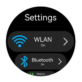
You can add a custom header to an ArcList using the header parameter.
- Construct the custom header component, customHeader.
   @Builder
   function customHeader() {
     Column() {
       Text("Settings")
         .fontColor("#FFFFFFFF")
         .fontSize('19fp')
     }
   }
- Wrap the custom header component. This step is required because the header parameter expects a ComponentContent type.
   context: UIContext = this.getUIContext();
   arcListHeader: ComponentContent<Object> = new ComponentContent(this.context, wrapBuilder(customHeader));
- Set the **arcListHeader **to the ArcList component using the header parameter.
   ArcList({header: this.arcListHeader}) {
     ArcListItem() {
       // ...
     }
     ArcListItem() {
       // ...
     }
     // ...
   }
Figure 3 Setting a custom header
Setting the List Item Spacing
When initializing the ArcList component, you can use the space attribute to add spacing between list items. For example, to add a vertical spacing of 30 px between list items:
ArcList() {
  // ...
}
.space(LengthMetrics.px(30))
Figure 4 Setting the list item spacing
Disabling Auto-Scaling for List Items
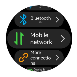
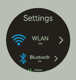
By default, items in an ArcList component automatically scale when they are near the top or bottom edges. However, in some cases, you might not want this scaling effect. To disable it, set the autoScale attribute of ArcListItem to false. For example, as shown in Figure 5, the Network and Display list items do not scale regardless of their position after thire autoScale attribute is disabled.
ArcListItem() {
  // ...
}
.autoScale(false)
Figure 5 Disabling auto-scaling for list items
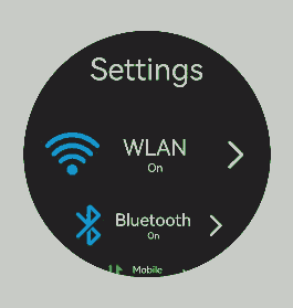
Adding a Built-in Scrollbar
When the height of the list items exceeds the screen height, the ArcList component can scroll vertically. To help users quickly navigate, a scrollbar can be provided to allow rapid scrolling through the list, as shown in Figure 6.
When using the ArcList component, you can control the display of the scrollbar using the scrollBar attribute. The value of scrollBar is of type BarState. When set to BarState.Auto, the scrollbar is displayed as needed. In this mode, the scrollbar appears when the user touches the scrollbar area, allowing for up and down dragging to quickly scroll through the content. The scrollbar also thickens during dragging for better visibility. If the user takes no action, the scrollbar automatically disappears after 2 seconds. You can customize the scrollbar style, using the scrollBarWidth attribute to set its width in the pressed state and the scrollBarColor attribute to set its color.
ArcList() {
  // ...
}
.scrollBar(BarState.Auto)
.scrollBarWidth(LengthMetrics.px(10))
.scrollBarColor(ColorMetrics.resourceColor(Color.White))
Figure 6 Built-in scrollbar of the ArcList component
Adding an External Scrollbar: ArcScrollBar
To add an external scrollbar to an ArcList, you can use the ArcScrollBar component. By binding both the ArcList and ArcScrollBar components to the same Scroller object, you can ensure they stay synchronized.
- Create a Scroller object named arcListScroller.
private arcListScroller: Scroller = new Scroller();
- Bind the arcListScroller object to the ArcList component using the scroller parameter.
   // Use arcListScroller to initialize the scroller parameter to bind it with the ArcList component.
   ArcList({ scroller: this.arcListScroller }) {
   // ...
   }
- Bind the arcListScroller object to the ArcScrollBar component using the scroller parameter.
   // Use arcListScroller to initialize the scroller parameter to bind it with the ArcScrollBar component.
   ArcScrollBar({ scroller: this.arcListScroller })
Figure 7 External scrollbar of the ArcList component
NOTE
The ArcScrollBar component can also be used with other scrollable components such as List, Grid, and Scroll.
Interacting with ArcAlphabetIndexer
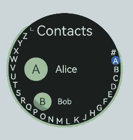
Applications often need to monitor changes in the scroll position of a list and respond accordingly, or quickly navigate to specific sections by adjusting the scroll position. For example, in a contacts list, as the list scrolls through different sections (for example, from “A” to “B”), the external index bar should update to reflect the current letter. When a user selects an index item (for example, “C”), the list should jump to the corresponding section. To achieve this functionality, you can use the ArcAlphabetIndexer component.
As shown in Figure 8, when the list scrolls from contacts starting with “A” to those starting with “B,” the external index bar should also update from the selected “A” state to the selected “B” state. This can be achieved by listening for the onScrollIndex event of the ArcList component. When an index item “C” is clicked, the list should jump to the contacts starting with “C.” This can be achieved by listening for the onSelect event of the ArcAlphabetIndexer component.
When the list scrolls, the selectedIndex value of the letter to highlight in the alphabet index bar is recalculated based on the firstIndex value of the item to which the list has scrolled. Since the ArcAlphabetIndexer component uses the selected attribute to set the selected item index, changes to selectedIndex will trigger the ArcAlphabetIndexer component to re-render and display the selected letter state.
When an index item is selected, the selected item index (index) is used to recalculate the corresponding position in the list. The list is then scrolled to that position using the scrollToIndex API of the bound scroll controller (arcListScroller). The ArcList component can be bound to a Scroller (scroll controller) object using the scroller parameter.
const alphabets = ['#', 'A', 'B', 'C', 'D', 'E', 'F', 'G', 'H', 'I', 'J', 'K',
  'L', 'M', 'N', 'O', 'P', 'Q', 'R', 'S', 'T', 'U', 'V', 'W', 'X', 'Y', 'Z'];
@Entry
@Component
struct ContactsArcList {
  // Index of the selected item in the index bar
  @State selectedIndex: number = 0;
  // Scroll controller bound to the list
  private arcListScroller: Scroller = new Scroller();

  build() {
    Stack({ alignContent: Alignment.End }) {
      ArcList({ scroller: this.arcListScroller }) {
        // ...
      }
      .onScrollIndex((firstIndex: number) => {
        // Recalculate the corresponding index bar position based on the index of the item to which the list has scrolled.
        this.selectedIndex = firstIndex + 1;
      })

      // ArcAlphabetIndexer component
      ArcAlphabetIndexer({ arrayValue: alphabets })
        .selected(this.selectedIndex)
        .onSelect((index: number) => {
          // Scroll the list to the corresponding position when an index item is selected.
          this.selectedIndex = index
          this.scrollerForList.scrollToIndex(this.selectedIndex - 1)
        })
    }
  }
}
Figure 8 Interaction between the ArcList and ArcAlphabetIndexer
Responding to Swipe on List Items
To enable swipe gestures on list items in the ArcList component, you can use the swipeAction attribute of ArcListItem. This attribute requires a SwipeActionOptions object with start and end parameters. Here, start defines the swipe action item displayed on the start edge of the list item when the item is swiped right, while end defines the swipe action item displayed on the end edge of the list item when the item is swiped left.
For example, in a contacts list, you can use the end parameter to show a delete button when an item is swiped left. When the delete button is clicked, you can remove the corresponding item from the data source.
Build the component that appears from the end edge when the list item is swiped left.
@Builder
itemEnd(item: Contact) {
 // Build the component that appears from the end edge when the list item is swiped left.
 Button({ type: ButtonType.Circle }) {
   Image($r('app.media.ic_public_delete_filled'))
     .width(20)
     .height(20)
 }
 .backgroundColor(Color.Black)
 .onClick(() => {
   animateTo({
     duration: 1000,
     curve: Curve.Smooth,
     iterations: 1,
     playMode: PlayMode.Normal,
   }, () => {
     // this.contacts is the data source. The indexOf API obtains the index of the item to be deleted.
     let index = this.contacts.indexOf(item)
     // Remove the specified data item from the data source.
     this.contacts.splice(index, 1)
   })
 })
}
Bind the swipeAction attribute to the ArcListItem that can be swiped left.
   // When constructing an ArcList component, use ForEach to render list items based on the data source this.contacts.
   ArcListItem() {
     // ...
   }
   .swipeAction({
     end: {
       // item is the data corresponding to this list item in the data source this.contacts.
       builder: () => { this.itemEnd(item) }
     }
   }) // Set the swipe action.
Figure 9 Swipe-to-delete feature
Handling Long Lists
While ForEach is suitable for short lists, using it for long lists with a large number of items can significantly slow down page loading, as it loads all items at once. Therefore, for better list performance, use LazyForEach instead to implement on-demand iterative data loading. For details about the implementation, see the example in LazyForEach: Lazy Data Loading.
When the list is rendered in lazy loading mode, to improve the list scrolling experience and minimize white blocks during list scrolling, you can use the cachedCount attribute of the ArcList component. This attribute sets the number of list items preloaded outside of the screen and is valid only in LazyForEach.
ArcList() {
  // ...
}.cachedCount(3)
NOTE
A greater cachedCount value may result in higher CPU and memory overhead of the UI. Adjust the value by taking into account both the comprehensive performance and user experience.
When a list uses data lazy loading, all list items except the list items in the display area and the cached list items are destroyed.
Responding to Digital Crown Rotations
On wearable devices, the ArcList component can respond to digital crown rotations when it is in focus. Users can scroll through the list items by rotating the crown. To make the ArcList the default focus on the page and enable it to respond to crown rotations, you can use the following focus control attributes:
ArcList() {
  // ...
}
// Enable focus for the ArcList component.
.focusable(true)
// Allow the ArcList component to gain focus on touch.
.focusOnTouch(true)
// Set the ArcList component as the default focus on the page.
.defaultFocus(true)
You can also adjust the sensitivity of the digital crown response using the digitalCrownSensitivity attribute. This allows you to fine-tune the responsiveness based on the amount of data in the list. For lists with more items, you might want to increase the sensitivity, while for lists with fewer items, you can decrease it.
ArcList() {
  // ...
}
.digitalCrownSensitivity(CrownSensitivity.MEDIUM)
你可能感兴趣的鸿蒙文章
harmony 鸿蒙Atomic Service Full Screen Launch Component (FullScreenLaunchComponent)
harmony 鸿蒙Arc Button (ArcButton)
harmony 鸿蒙Frame Animation (ohos.animator)
harmony 鸿蒙Implementing Property Animation
- 所属分类: 后端技术
- 本文标签:
热门推荐
-
2、 优质文章
-
3、 gt
-
7、 openharmony
-
9、 golang
-
10、 Vue中input框自动聚焦