harmony 鸿蒙Text Picker Dialog Box (TextPickerDialog)
Text Picker Dialog Box (TextPickerDialog)
A text picker dialog box is a dialog box that allows users to select text from the given range.
NOTE
This component is supported since API version 8. Updates will be marked with a superscript to indicate their earliest API version.
The functionality of this module depends on UI context. This means that the APIs of this module cannot be used where the UI context is unclear. For details, see UIContext.
Since API version 10, you can use the showTextPickerDialog API in UIContext, which ensures that the text picker dialog box is shown in the intended UI instance.
TextPickerDialog
show
static show(options?: TextPickerDialogOptions)
Shows a text picker in the given settings.
Atomic service API: This API can be used in atomic services since API version 11.
System capability: SystemCapability.ArkUI.ArkUI.Full
Parameters
| Name | Type | Mandatory | Description |
|---|---|---|---|
| options | TextPickerDialogOptions | No | Parameters of the text picker dialog box. |
TextPickerDialogOptions
Inherits from TextPickerOptions.
System capability: SystemCapability.ArkUI.ArkUI.Full
| Name | Type | Mandatory | Description |
|---|---|---|---|
| defaultPickerItemHeight | number |string | No | Height of the picker item. Default value: 56 vp (selected) and 36 vp (unselected). The set value applies to both selected and unselected items. Atomic service API: This API can be used in atomic services since API version 11. |
| disappearTextStyle10+ | PickerTextStyle | No | Font color, font size, and font weight of the top and bottom items. Default value: { color: ‘#ff182431’, font: { size: ‘14fp’, weight: FontWeight.Regular } } Atomic service API: This API can be used in atomic services since API version 11. |
| textStyle10+ | PickerTextStyle | No | Font color, font size, and font weight of all items except the top, bottom, and selected items. Default value: { color: ‘#ff182431’, font: { size: ‘16fp’, weight: FontWeight.Regular } } Atomic service API: This API can be used in atomic services since API version 11. |
| selectedTextStyle10+ | PickerTextStyle | No | Font color, font size, and font weight of the selected item. Default value: { color: ‘#ff007dff’, font: { size: ‘20vp’, weight: FontWeight.Medium } } Atomic service API: This API can be used in atomic services since API version 11. |
| acceptButtonStyle12+ | PickerDialogButtonStyle | No | Style of the accept button. NOTE In the acceptButtonStyle and cancelButtonStyle configurations, only one primary field can be set to true at most. If both the primary fields are set to true, neither will take effect. Atomic service API: This API can be used in atomic services since API version 12. |
| cancelButtonStyle12+ | PickerDialogButtonStyle | No | Style of the cancel button. NOTE In the acceptButtonStyle and cancelButtonStyle configurations, only one primary field can be set to true at most. If both the primary fields are set to true, neither will take effect. Atomic service API: This API can be used in atomic services since API version 12. |
| canLoop10+ | boolean | No | Whether to support scroll looping. The value true means to support scroll looping, and false means the opposite. Default value: true Atomic service API: This API can be used in atomic services since API version 11. |
| alignment10+ | DialogAlignment | No | Alignment mode of the dialog box in the vertical direction. Default value: DialogAlignment.Default Atomic service API: This API can be used in atomic services since API version 11. |
| offset10+ | Offset | No | Offset of the dialog box based on the alignment settings. Default value: { dx: 0 , dy: 0 } Atomic service API: This API can be used in atomic services since API version 11. |
| maskRect10+ | Rectangle | No | Mask area of the dialog box. Events outside the mask area are transparently transmitted, and events within the mask area are not. Default value: { x: 0, y: 0, width: ‘100%’, height: ‘100%’ } Atomic service API: This API can be used in atomic services since API version 11. |
| onAccept | (value: TextPickerResult) => void | No | Callback invoked when the OK button in the dialog box is clicked. Atomic service API: This API can be used in atomic services since API version 11. |
| onCancel | () => void | No | Callback invoked when the Cancel button in the dialog box is clicked. Atomic service API: This API can be used in atomic services since API version 11. |
| onChange | (value: TextPickerResult) => void | No | Callback invoked when the text picker in the dialog box snaps to the selected item. Atomic service API: This API can be used in atomic services since API version 11. |
| onScrollStop14+ | (value: TextPickerResult) => void | No | Callback invoked when the scrolling in the text picker of the dialog box stops. Atomic service API: This API can be used in atomic services since API version 14. |
| backgroundColor11+ | ResourceColor | No | Backplane color of the dialog box. Default value: Color.Transparent NOTE When backgroundColor is set to a non-transparent color, backgroundBlurStyle must be set to BlurStyle.NONE; otherwise, the color display may not meet the expected effect. Atomic service API: This API can be used in atomic services since API version 12. |
| backgroundBlurStyle11+ | BlurStyle | No | Background blur style of the dialog box. Default value: BlurStyle.COMPONENT_ULTRA_THICK NOTE Setting this parameter to BlurStyle.NONE disables the background blur. When backgroundBlurStyle is set to a value other than NONE, do not set backgroundColor. If you do, the color display may not produce the expected visual effect. Atomic service API: This API can be used in atomic services since API version 12. |
| backgroundBlurStyleOptions18+ | BackgroundBlurStyleOptions | No | Options for customizing the background blur style. Atomic service API: This API can be used in atomic services since API version 18. |
| backgroundEffect18+ | BackgroundEffectOptions | No | Options for customizing the background effect. Atomic service API: This API can be used in atomic services since API version 18. |
| onDidAppear12+ | () => void | No | Event callback when the dialog box appears. NOTE 1. The normal timing sequence is as follows: onWillAppear > onDidAppear > (onAccept/onCancel/onChange/onScrollStop) > onWillDisappear > onDidDisappear. 2. You can set the callback event for changing the dialog box display effect in onDidAppear. The settings take effect next time the dialog box appears. 3. If the user closes the dialog box immediately after it appears, onWillDisappear is invoked before onDidAppear. 4. If the dialog box is closed before its entrance animation is finished, this callback is not invoked. Atomic service API: This API can be used in atomic services since API version 12. |
| onDidDisappear12+ | () => void | No | Event callback when the dialog box disappears. NOTE 1. The normal timing sequence is as follows: onWillAppear > onDidAppear > (onAccept/onCancel/onChange/onScrollStop) > onWillDisappear > onDidDisappear. Atomic service API: This API can be used in atomic services since API version 12. |
| onWillAppear12+ | () => void | No | Event callback when the dialog box is about to appear. NOTE 1. The normal timing sequence is as follows: onWillAppear > onDidAppear > (onAccept/onCancel/onChange/onScrollStop) > onWillDisappear > onDidDisappear. 2. You can set the callback event for changing the dialog box display effect in onWillAppear. The settings take effect next time the dialog box appears. Atomic service API: This API can be used in atomic services since API version 12. |
| onWillDisappear12+ | () => void | No | Event callback when the dialog box is about to disappear. NOTE 1. The normal timing sequence is as follows: onWillAppear > onDidAppear > (onAccept/onCancel/onChange/onScrollStop) > onWillDisappear > onDidDisappear. 2. If the user closes the dialog box immediately after it appears, onWillDisappear is invoked before onDidAppear. Atomic service API: This API can be used in atomic services since API version 12. |
| shadow12+ | ShadowOptions |ShadowStyle | No | Shadow of the dialog box. Default value on 2-in-1 devices: ShadowStyle.OUTER_FLOATING_MD when the dialog box is focused and ShadowStyle.OUTER_FLOATING_SM otherwise Atomic service API: This API can be used in atomic services since API version 12. |
| enableHoverMode14+ | boolean | No | Whether to enable the hover mode. Default value: false, meaning not to enable the hover mode. Atomic service API: This API can be used in atomic services since API version 14. |
| hoverModeArea14+ | HoverModeAreaType | No | Display area of the dialog box in hover mode. Default value: HoverModeAreaType.BOTTOM_SCREEN Atomic service API: This API can be used in atomic services since API version 14. |
| disableTextStyleAnimation15+ | boolean | No | Sets whether to enable the text style change animation during the scrolling process. true: Disable the text style change animation. false: Enable the text style change animation. Default value: false |
| defaultTextStyle15+ | TextPickerTextStyle | No | Style of the text items when the text style change animation during the scrolling process is disabled. It is effective only when disableTextStyleAnimation is true. Default value: same as the default value of the Text component |
| onEnterSelectedArea16+ | Callback<TextPickerResult> | No | Represents the callback triggered during the scrolling of the text picker when an item enters the divider area. Compared to the onChange event, this event is triggered earlier, specifically when the scroll distance of the current column exceeds half the height of the selected item, which indicates that the item has entered the divider area. NOTE In scenarios where the picker contains linked columns, the use of this callback is not recommended. The reason is that it identifies nodes where items enter the divider area during scrolling. However, items that change in response to the scrolling do not themselves scroll. As a result, the callback’s return values will only reflect changes for the currently scrolling column, while other non-scrolling columns will remain unchanged. Atomic service API: This API can be used in atomic services since API version 16. |
| enableHapticFeedback16+ | boolean | No | Whether to enable haptic feedback. true (default): Haptic feedback is enabled. false: Haptic feedback is disabled. Atomic service API: This API can be used in atomic services since API version 16. NOTE To enable haptic feedback, you must declare the ohos.permission.VIBRATE permission under requestPermissions in the module.json5 file of the project. “requestPermissions”: [{“name”: “ohos.permission.VIBRATE”}] |
TextPickerResult
Atomic service API: This API can be used in atomic services since API version 11.
System capability: SystemCapability.ArkUI.ArkUI.Full
| Name | Type | Read Only | Optional | Description |
|---|---|---|---|---|
| value | string |string []10+ | No | No | Text of the selected item. NOTE When the picker contains text only or both text and imagery, value indicates the text value of the selected item. (For a multi-column picker, value is of the array type.) For an image list, value is empty. The value cannot contain the following escape character: \ |
| index | number |number []10+ | No | No | Index of the selected item in the range. (For a multi-column picker, index is of the array type.) |
Example
NOTE
For clarity in UI execution context, you are advised to use the showTextPickerDialog API in UIContext.
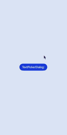
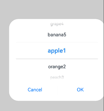
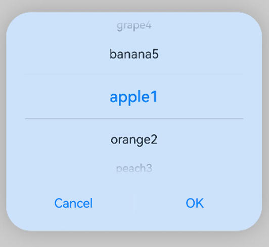
Example 1: Displaying a Text Picker Dialog Box
This example demonstrates how to display a text picker dialog box when a button is touched.
// xxx.ets
@Entry
@Component
struct TextPickerDialogExample {
  private select: number|number[] = 0
  private fruits: string[] = ['apple1', 'orange2', 'peach3', 'grape4', 'banana5']
  @State v: string = '';

  build() {
    Row() {
      Column() {
        Button("TextPickerDialog:" + this.v)
          .margin(20)
          .onClick(() => {
            TextPickerDialog.show({
              // You are advised to use this.getUIContext().showTextPickerDialog().
              range: this.fruits,
              selected: this.select,
              value: this.v,
              defaultPickerItemHeight: 40,
              onAccept: (value: TextPickerResult) => {
                // Set select to the index of the item selected when the OK button is touched. In this way, when the text picker dialog box is displayed again, the selected item is the one last confirmed.
                this.select = value.index
                console.log(this.select + '')
                // After OK is clicked, the selected item is displayed on the page.
                this.v = value.value as string
                console.info("TextPickerDialog:onAccept()" + JSON.stringify(value))
              },
              onCancel: () => {
                console.info("TextPickerDialog:onCancel()")
              },
              onChange: (value: TextPickerResult) => {
                console.info("TextPickerDialog:onChange()" + JSON.stringify(value))
              },
              onScrollStop: (value: TextPickerResult) => {
                console.info("TextPickerDialog:onScrollStop()" + JSON.stringify(value))
              },
              onDidAppear: () => {
                console.info("TextPickerDialog:onDidAppear()")
              },
              onDidDisappear: () => {
                console.info("TextPickerDialog:onDidDisappear()")
              },
              onWillAppear: () => {
                console.info("TextPickerDialog:onWillAppear()")
              },
              onWillDisappear: () => {
                console.info("TextPickerDialog:onWillDisappear()")
              }
            })
          })
      }.width('100%')
    }.height('100%')
  }
}
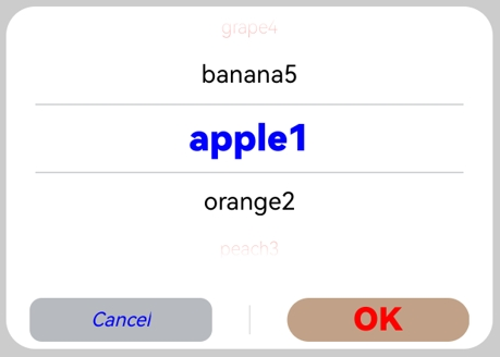
Example 2: Customizing the Style
In this example, disappearTextStyle, textStyle, selectedTextStyle, acceptButtonStyle, and cancelButtonStyle are configured to customize the text and button style.
// xxx.ets
@Entry
@Component
struct TextPickerDialogExample {
  private select: number|number[] = 0
  private fruits: string[] = ['apple1', 'orange2', 'peach3', 'grape4', 'banana5']
  @State v: string = '';

  build() {
    Row() {
      Column() {
        Button("TextPickerDialog:" + this.v)
          .margin(20)
          .onClick(() => {
            TextPickerDialog.show({
              // You are advised to use this.getUIContext().showTextPickerDialog().
              range: this.fruits,
              selected: this.select,
              disappearTextStyle: { color: '#297bec', font: { size: 15, weight: FontWeight.Lighter } },
              textStyle: { color: Color.Black, font: { size: 20, weight: FontWeight.Normal } },
              selectedTextStyle: { color: Color.Blue, font: { size: 30, weight: FontWeight.Bolder } },
              acceptButtonStyle: {
                type: ButtonType.Normal,
                style: ButtonStyleMode.NORMAL,
                role: ButtonRole.NORMAL,
                fontColor: 'rgb(81, 81, 216)',
                fontSize: '26fp',
                fontWeight: FontWeight.Bolder,
                fontStyle: FontStyle.Normal,
                fontFamily: 'sans-serif',
                backgroundColor: '#A6ACAF',
                borderRadius: 20
              },
              cancelButtonStyle: {
                type: ButtonType.Normal,
                style: ButtonStyleMode.NORMAL,
                role: ButtonRole.NORMAL,
                fontColor: Color.Blue,
                fontSize: '16fp',
                fontWeight: FontWeight.Normal,
                fontStyle: FontStyle.Italic,
                fontFamily: 'sans-serif',
                backgroundColor: '#50182431',
                borderRadius: 10
              },
              onAccept: (value: TextPickerResult) => {
                // Set select to the index of the item selected when the OK button is touched. In this way, when the text picker dialog box is displayed again, the selected item is the one last confirmed.
                this.select = value.index
                console.log(this.select + '')
                // After OK is clicked, the selected item is displayed on the page.
                this.v = value.value as string
                console.info("TextPickerDialog:onAccept()" + JSON.stringify(value))
              },
              onCancel: () => {
                console.info("TextPickerDialog:onCancel()")
              },
              onChange: (value: TextPickerResult) => {
                console.info("TextPickerDialog:onChange()" + JSON.stringify(value))
              },
              onScrollStop: (value: TextPickerResult) => {
                console.info("TextPickerDialog:onScrollStop()" + JSON.stringify(value))
              },
              onDidAppear: () => {
                console.info("TextPickerDialog:onDidAppear()")
              },
              onDidDisappear: () => {
                console.info("TextPickerDialog:onDidDisappear()")
              },
              onWillAppear: () => {
                console.info("TextPickerDialog:onWillAppear()")
              },
              onWillDisappear: () => {
                console.info("TextPickerDialog:onWillDisappear()")
              }
            })
          })
      }.width('100%')
    }.height('100%')
  }
}
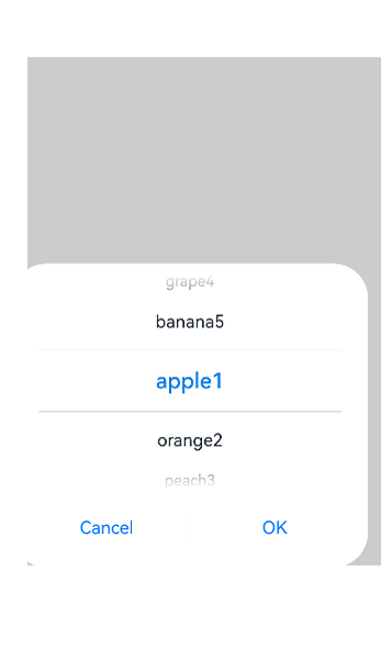
Example 3: Configuring a Dialog Box in the Hover State
This example demonstrates how to set the layout area of a dialog box in hover mode on a foldable device.
@Entry
@Component
struct TextPickerDialogExample {
  private select: number|number[] = 0;
  private fruits: string[] = ['apple1', 'orange2', 'peach3', 'grape4', 'banana5'];
  @State v: string = '';

  build() {
    Row() {
      Column() {
        Button("TextPickerDialog:" + this.v)
          .margin(20)
          .onClick(() => {
            TextPickerDialog.show({ // You are advised to use this.getUIContext().showTextPickerDialog().
              range: this.fruits,
              selected: this.select,
              disappearTextStyle: { color: Color.Red, font: { size: 15, weight: FontWeight.Lighter }},
              textStyle: { color: Color.Black, font: { size: 20, weight: FontWeight.Normal }},
              selectedTextStyle: { color: Color.Blue, font: { size: 30, weight: FontWeight.Bolder }},
              onAccept: (value: TextPickerResult) => {
                // Set select to the index of the item selected when the OK button is touched. In this way, when the text picker dialog box is displayed again, the selected item is the one last confirmed.
                this.select = value.index;
                console.log(this.select + '');
                // After OK is clicked, the selected item is displayed on the page.
                this.v = value.value as string;
                console.info("TextPickerDialog:onAccept()" + JSON.stringify(value));
              },
              onCancel: () => {
                console.info("TextPickerDialog:onCancel()");
              },
              onChange: (value: TextPickerResult) => {
                console.info("TextPickerDialog:onChange()" + JSON.stringify(value));
              },
              onScrollStop: (value: TextPickerResult) => {
                console.info("TextPickerDialog:onScrollStop()" + JSON.stringify(value));
              },
              onDidAppear: () => {
                console.info("TextPickerDialog:onDidAppear()");
              },
              onDidDisappear: () => {
                console.info("TextPickerDialog:onDidDisappear()");
              },
              onWillAppear: () => {
                console.info("TextPickerDialog:onWillAppear()");
              },
              onWillDisappear: () => {
                console.info("TextPickerDialog:onWillDisappear()");
              },
              enableHoverMode: true,
              hoverModeArea: HoverModeAreaType.TOP_SCREEN
            })
          })
      }.width('100%')
    }.height('100%')
  }
}

Example 4: Setting the Dialog Box Position
This example demonstrates how to set the position of a dialog box using alignment and offset.
// xxx.ets
@Entry
@Component
struct TextPickerDialogExample {
  private select: number|number[] = 0
  private fruits: string[] = ['apple1', 'orange2', 'peach3', 'grape4', 'banana5']
  @State v: string = '';

  build() {
    Row() {
      Column() {
        Button("TextPickerDialog:" + this.v)
          .margin(20)
          .onClick(() => {
            TextPickerDialog.show({
              range: this.fruits,
              selected: this.select,
              alignment: DialogAlignment.Center,
              offset: { dx: 20, dy: 0 },
              onAccept: (value: TextPickerResult) => {
                // Set select to the index of the item selected when the OK button is touched. In this way, when the text picker dialog box is displayed again, the selected item is the one last confirmed.
                this.select = value.index
                console.log(this.select + '')
                // After OK is clicked, the selected item is displayed on the page.
                this.v = value.value as string
                console.info("TextPickerDialog:onAccept()" + JSON.stringify(value))
              }
            })
          })
      }.width('100%')
    }.height('100%')
  }
}
Example 5: Setting the Mask Area
This example demonstrates how to set the mask area using maskRect.
// xxx.ets
@Entry
@Component
struct TextPickerDialogExample {
  private select: number|number[] = 0
  private fruits: string[] = ['apple1', 'orange2', 'peach3', 'grape4', 'banana5']
  @State v: string = '';

  build() {
    Row() {
      Column() {
        Button("TextPickerDialog:" + this.v)
          .margin(20)
          .onClick(() => {
            TextPickerDialog.show({
              range: this.fruits,
              selected: this.select,
              maskRect: {
                x: 30,
                y: 60,
                width: '100%',
                height: '60%'
              },
              onAccept: (value: TextPickerResult) => {
                // Set select to the index of the item selected when the OK button is touched. In this way, when the text picker dialog box is displayed again, the selected item is the one last confirmed.
                this.select = value.index
                console.log(this.select + '')
                // After OK is clicked, the selected item is displayed on the page.
                this.v = value.value as string
                console.info("TextPickerDialog:onAccept()" + JSON.stringify(value))
              }
            })
          })
      }.width('100%')
    }.height('100%')
  }
}
Example 6: Setting the Background
This example demonstrates how to set the dialog box background using backgroundColor, backgroundBlurStyle, and shadow.
// xxx.ets
@Entry
@Component
struct TextPickerDialogExample {
  private select: number|number[] = 0
  private fruits: string[] = ['apple1', 'orange2', 'peach3', 'grape4', 'banana5']
  @State v: string = '';

  build() {
    Row() {
      Column() {
        Button("TextPickerDialog:" + this.v)
          .margin(20)
          .onClick(() => {
            TextPickerDialog.show({
              range: this.fruits,
              selected: this.select,
              backgroundColor: 'rgb(204, 226, 251)',
              backgroundBlurStyle: BlurStyle.NONE,
              shadow: ShadowStyle.OUTER_FLOATING_SM,
              onAccept: (value: TextPickerResult) => {
                // Set select to the index of the item selected when the OK button is touched. In this way, when the text picker dialog box is displayed again, the selected item is the one last confirmed.
                this.select = value.index
                console.log(this.select + '')
                // After OK is clicked, the selected item is displayed on the page.
                this.v = value.value as string
                console.info("TextPickerDialog:onAccept()" + JSON.stringify(value))
              }
            })
          })
      }.width('100%')
    }.height('100%')
  }
}
Example 7: Setting Loopable Scrolling
This example demonstrates how to set whether scrolling is loopable using canLoop.
// xxx.ets
@Entry
@Component
struct TextPickerDialogExample {
  private select: number|number[] = 0
  private fruits: string[] = ['apple1', 'orange2', 'peach3', 'grape4', 'banana5']
  @State v: string = '';

  build() {
    Row() {
      Column() {
        Button("TextPickerDialog:" + this.v)
          .margin(20)
          .onClick(() => {
            TextPickerDialog.show({
              range: this.fruits,
              selected: this.select,
              value: this.v,
              canLoop: false,
              onAccept: (value: TextPickerResult) => {
                // Set select to the index of the item selected when the OK button is touched. In this way, when the text picker dialog box is displayed again, the selected item is the one last confirmed.
                this.select = value.index
                console.log(this.select + '')
                // After OK is clicked, the selected item is displayed on the page.
                this.v = value.value as string
                console.info("TextPickerDialog:onAccept()" + JSON.stringify(value))
              }
            })
          })
      }.width('100%')
    }.height('100%')
  }
}
你可能感兴趣的鸿蒙文章
- 所属分类: 后端技术
- 本文标签:
热门推荐
-
2、 优质文章
-
3、 gt
-
7、 openharmony
-
9、 golang
-
10、 Vue中input框自动聚焦