harmony 鸿蒙Creating a List (List)
Creating a List (List)
Overview
A list is a container that displays a collection of items. If the list items go beyond the screen, the list can scroll to reveal the content off the screen. The list is applicable for presenting similar data types or data type sets, such as images and text. Some common lists seen in applications are the contacts list, playlist, and shopping list.
You can use lists to easily and efficiently display structured, scrollable information. Specifically, you can provide a single view of rows or columns by arranging the ListItemGroup or ListItem child components linearly in a vertical or horizontal direction in the List component, or use ForEach to iterate over a group of rows or columns, or mix any number of single views and ForEach structures to build a list. The List component supports the generation of child components in various rendering modes, including conditional rendering, rendering of repeated content, and lazy data loading.
Layout and Constraints
A list automatically arranges child components in the direction it scrolls. Adding or removing child components from the list will trigger re-arrangement of the child components.
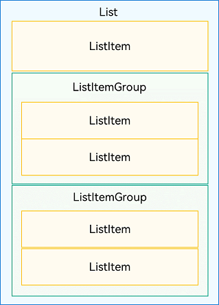
As shown in the following figure, in a vertical list, ListItemGroup or ListItem components are automatically arranged vertically.
ListItemGroup is used to display list data by group. Its child component is also ListItem. ListItem represents a list item, which can contain a single child component.
Figure 1 Relationships between List, ListItemGroup, and ListItem
NOTE
A List component can contain only ListItemGroup or ListItem as its child components. ListItemGroup and ListItem must be used together with List.
Layout
Apart from the aforementioned features, the list is also able to adapt to the number of elements in the cross axis direction.
When used in vertical layout, the list can contain one or more scrollable columns, as shown below.
Figure 2 Vertical scrolling list (left: one column; right: multiple columns)
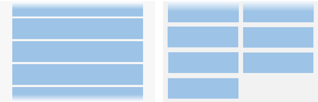
When used in horizontal layout, the list can contain one or more scrollable rows, as shown below.
Figure 3 Horizontal scrolling list (left: one column; right: multiple columns)
While Grid and WaterFlow can also create single-column and multi-column layouts, there are scenarios where the List is the more suitable choice. Specifically, if your layout design requires columns of equal width and items do not need to span rows or columns, opt for the List.
Constraints
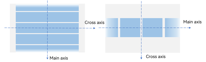
The main axis direction of a list refers to the direction in which the child component columns are laid out and in which the list scrolls. An axis perpendicular to the main axis is referred to as a cross axis, and the direction of the cross axis is perpendicular to a direction of the main axis.
As shown below, the main axis of a vertical list is in the vertical direction, and the cross axis is in the horizontal direction. The main axis of a horizontal list is in the horizontal direction, and the cross axis is in the vertical direction.
Figure 4 Main axis and cross axis of the list
If a size is set for the main axis or cross axis of the List component, it is used as the size of the component in the corresponding direction.
If no size is set for the main axis of the List component, the size of the List component in the main axis direction automatically adapts to the total size of its child components, as long as the total size of the child components in the main axis direction does not exceed the size of the parent component of List.
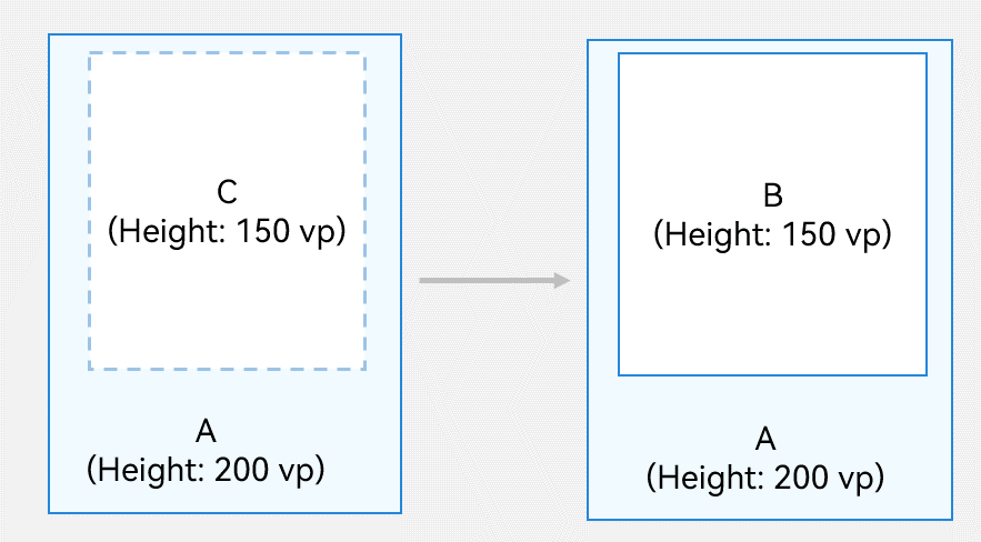
In the example shown below, no height is set for vertical list B, and the height of its parent component A is 200 vp. If the total height of all child components C is 150 vp, the height of list B is 150 vp.
Figure 5 Main axis height constraint example 1 (A: parent component of List; B: List component; C: all child components of List)
If the total size of the child components in the main axis direction is greater than the size of the parent component of List, the size of the List component in the main axis direction automatically adapts to the size of its parent component.
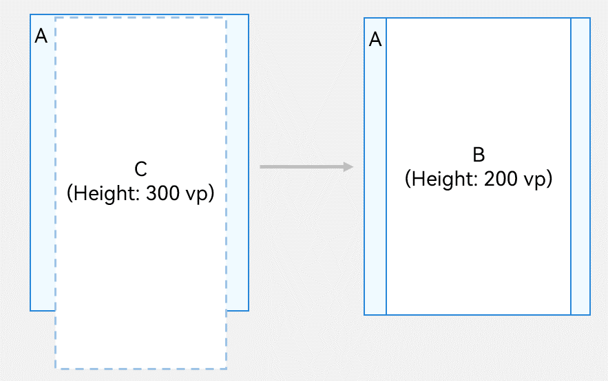
In the example shown below, still no height is set for vertical list B, and the height of its parent component A is 200 vp. If the total height of all child components C is 300 vp, the height of list B is 200 vp.
Figure 6 Main axis height constraint example 2 (A: parent component of List; B: List component; C: all child components of List)
If no size is set for the cross axis of the List component, the size of the List component in the cross axis direction automatically adapts to the size of its parent component.
Developing the Layout
Setting the Main Axis Direction
By default, the main axis of the List component runs in the vertical direction. This means that you can create a vertical scrolling list without the need to manually set the list direction.
To create a horizontal scrolling list, set the listDirection attribute to Axis.Horizontal. The default value of listDirection is Axis.Vertical.
List() {
  // ...
}
.listDirection(Axis.Horizontal)
Setting the Cross Axis Layout
The cross axis layout of the List component can be set using the lanes and alignListItem attributes. The lanes attribute controls the number of list items along the cross axis, and the alignListItem attribute controls the alignment mode of child components along the cross axis.
The lanes attribute of the List component is useful in building a list that auto-adapts the numbers of rows or columns on devices of different sizes. Its value type is number or LengthConstrain. If you are building a two-column vertical list shown on the right in Figure 2, set the lanes attribute to 2. The default value of lanes is 1.
List() {
  // ...
}
.lanes(2)
If set to a value of the LengthConstrain type, the lanes attribute determines the number of rows or columns based on the LengthConstrain settings and the size of the List component.
@Entry
@Component
struct EgLanes {
  @State egLanes: LengthConstrain = { minLength: 200, maxLength: 300 }
  build() {
    List() {
      // ...
    }
    .lanes(this.egLanes)
  }
}
For example, if the lanes attribute is set to { minLength: 200, maxLength: 300 } for a vertical list, then:
When the list width is 300 vp, the list contains one column, because minLength is 200 vp.
When the list width changes to 400 vp, which is twice that of the minLength value, the list is automatically adapted to two-column.
With regard to a vertical list, when the alignListItem attribute is set to ListItemAlign.Center, list items are center-aligned horizontally; when the alignListItem attribute is at its default value ListItemAlign.Start, list items are aligned toward the start edge of the cross axis in the list.
List() {
  // ...
}
.alignListItem(ListItemAlign.Center)
Displaying Data in the List
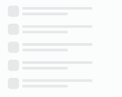
The list displays a collection of items horizontally or vertically and can scroll to reveal content off the screen. In the simplest case, a List component is statically made up of ListItem components.
Figure 7 Example of a city list
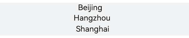
@Entry
@Component
struct CityList {
  build() {
    List() {
      ListItem() {
        Text('Beijing').fontSize(24)
      }

      ListItem() {
        Text('Hangzhou').fontSize(24)
      }

      ListItem() {
        Text('Shanghai').fontSize(24)
      }
    }
    .backgroundColor('#FFF1F3F5')
    .alignListItem(ListItemAlign.Center)
  }
}
Each ListItem component can contain only one root child component. Therefore, it does not allow for child components in tile mode. If tile mode is required, encapsulate the child components into a container or create a custom component.
Figure 8 Example of a contacts list
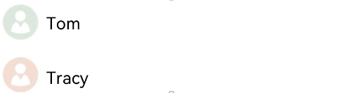
As shown above, as a list item, each contact has a profile picture and a name. To present it, you can encapsulate Image and Text components into a Row container.
List() {
  ListItem() {
    Row() {
      Image($r('app.media.iconE'))
        .width(40)
        .height(40)
        .margin(10)

      Text('Tom')
        .fontSize(20)
    }
  }

  ListItem() {
    Row() {
      Image($r('app.media.iconF'))
        .width(40)
        .height(40)
        .margin(10)

      Text('Tracy')
        .fontSize(20)
    }
  }
}
Iterating List Content
Compared with a static list, a dynamic list is more common in applications. You can use ForEach to obtain data from the data source and create components for each data item.
For example, when creating a contacts list, you can store the contact name and profile picture data in a Contact class structure to the contacts array, and nest ListItems in ForEach, thereby reducing repeated code needed for tiling similar list items.
import { util } from '@kit.ArkTS'

class Contact {
  key: string = util.generateRandomUUID(true);
  name: string;
  icon: Resource;

  constructor(name: string, icon: Resource) {
    this.name = name;
    this.icon = icon;
  }
}

@Entry
@Component
struct SimpleContacts {
  private contacts: Array<object> = [
    new Contact('Tom', $r("app.media.iconA")),
    new Contact('Tracy', $r("app.media.iconB")),
  ]

  build() {
    List() {
      ForEach(this.contacts, (item: Contact) => {
        ListItem() {
          Row() {
            Image(item.icon)
              .width(40)
              .height(40)
              .margin(10)
            Text(item.name).fontSize(20)
          }
          .width('100%')
          .justifyContent(FlexAlign.Start)
        }
      }, (item: Contact) => JSON.stringify(item))
    }
    .width('100%')
  }
}
In the List component, ForEach can be used to render ListItemGroup items as well as ListItem items. For details, see Adding Grouping Support.
Customizing the List Style
Setting the Spacing
When initializing a list, you can use the space parameter to add spacing between list items. In the following example, a 10vp spacing is added between list items along the main axis:
List({ space: 10 }) {
  // ...
}
Adding Dividers
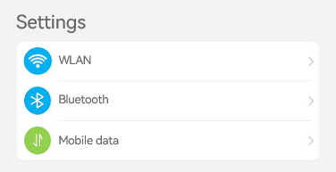
A divider separates UI items to make them easier to identify. In the following figure, a divider is added between the setting items. Note that since the icons are easy to identify in their own right, the divers do not extend below the icons.
Figure 9 Using dividers between the setting items
To add dividers between list items, you can use the divider attribute together with the following style attributes:
strokeWidth and color: stroke width and color of the diver, respectively.
startMargin and endMargin: distance between the divider and the start edge and end edge of the list, respectively.
class DividerTmp {
  strokeWidth: Length = 1
  startMargin: Length = 60
  endMargin: Length = 10
  color: ResourceColor = '#ffe9f0f0'

  constructor(strokeWidth: Length, startMargin: Length, endMargin: Length, color: ResourceColor) {
    this.strokeWidth = strokeWidth
    this.startMargin = startMargin
    this.endMargin = endMargin
    this.color = color
  }
}
@Entry
@Component
struct EgDivider {
  @State egDivider: DividerTmp = new DividerTmp(1, 60, 10, '#ffe9f0f0')
  build() {
    List() {
      // ...
    }
    .divider(this.egDivider)
  }
}
This example draws a divider with a stroke thickness of 1 vp from a position 60 vp away from the start edge of the list to a position 10 vp away from the end edge of the list. The effect is shown in Figure 9.
NOTE
The stroke width of the divider causes some space between list items. If the content spacing set for the list is smaller than the stroke width of the divider, the latter is used instead.
When a list contains multiple columns, the startMargin and endMargin attributes of the divider apply to each column.
The divider is drawn between list items. No divider is drawn above the first list item and below the last list item.
Adding a Scrollbar
When the total height (width) of list items exceeds the screen height (width), the list can scroll vertically (horizontally). The scrollbar of a list enables users to quickly navigate the list content, as shown below.
Figure 10 Scrollbar of a list
When using the List component, you can use the scrollBar attribute to control the display of the list scrollbar. The value type of scrollBar is BarState. When the value is BarState.Auto, the scrollbar is displayed as required: It is displayed when the scrollbar area is touched and becomes thicker when being dragged; it automatically disappears after 2 seconds of inactivity.
The default value of the scrollBar attribute is BarState.Off in API version 9 and earlier versions and BarState.Auto since API version 10.
List() {
  // ...
}
.scrollBar(BarState.Auto)
Adding Grouping Support
By allowing data to be displayed in groups in the list, you make the list easier to scan and navigate. Grouping is common in real-world applications. For example, the contacts list below use grouping.
Figure 11 Contacts list with grouping
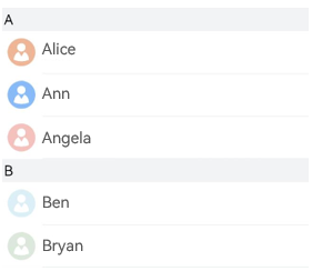
You can use ListItemGroup to group items in the List component to build a two-dimensional list.
A List component allows one or more ListItemGroup child components. By default, the width of ListItemGroup is equal to that of List. When initializing ListItemGroup, you can use the header parameter to set its header.
@Entry
@Component
struct ContactsList {

  @Builder itemHead(text: string) {
    // Header of the list group, corresponding to the group A and B locations.
    Text(text)
      .fontSize(20)
      .backgroundColor('#fff1f3f5')
      .width('100%')
      .padding(5)
  }

  build() {
    List() {
      ListItemGroup({ header: this.itemHead('A') }) {
        // Render the repeated list items of group A.
      }

      ListItemGroup({ header: this.itemHead('B') }) {
        // Render the repeated list items of group B.
      }
    }
  }
}
If the structures of multiple ListItemGroup components are similar, you can combine the data of these components into an array and use ForEach to render them cyclically. For example, in the contacts list, the contacts data of each group (for details, see Iterating List Content) and the title data of the corresponding group are combined and defined as the contactsGroups array. Then, with rendering of contactsGroups in ForEach, a contact list with multiple groups is implemented. For details, see the example in Adding a Sticky Header.
Adding a Sticky Header
The sticky header is a common pattern for keeping the header in the same place on the screen while the user scrolls down the list. As shown in the following figure, when you scroll through group A in the contacts list, the header of group B is always below group A. When you start scrolling through group B, the header of group B is fixed at the top of the screen. After group B has been scrolled to the bottom, the header of group B is replaced by the header of next group.
Sticky headers not only signify the representation and usage of data in the respective groups, but also help users navigate through a large amount of information, thereby avoiding unnecessary scrolling between the top of the area where the header is located and the area of interest.
Figure 12 Sticky header
You can set a sticky header or footer for a ListItemGroup component by setting the sticky attribute of its parent List component.
Setting the sticky attribute to StickyStyle.Header implements a sticky header. To implement a sticky footer, use the footer parameter to initialize the footer of ListItemGroup and set the sticky attribute to StickyStyle.Footer.
import { util } from '@kit.ArkTS'
class Contact {
  key: string = util.generateRandomUUID(true);
  name: string;
  icon: Resource;

  constructor(name: string, icon: Resource) {
    this.name = name;
    this.icon = icon;
  }
}
class ContactsGroup {
  title: string = ''
  contacts: Array<object>|null = null
  key: string = ""
}
export let contactsGroups: object[] = [
  {
    title: 'A',
    contacts: [
      new Contact('Alice', $r('app.media.iconA')),
      new Contact('Ann', $r('app.media.iconB')),
      new Contact('Angela', $r('app.media.iconC')),
    ],
    key: util.generateRandomUUID(true)
  } as ContactsGroup,
  {
    title: 'B',
    contacts: [
      new Contact('Ben', $r('app.media.iconD')),
      new Contact('Bryan', $r('app.media.iconE')),
    ],
    key: util.generateRandomUUID(true)
  } as ContactsGroup,
  // ...
]
@Entry
@Component
struct ContactsList {
  // Define the contactsGroups array.
  @Builder itemHead(text: string) {
    // Header of the list group, corresponding to the group A and B locations.
    Text(text)
      .fontSize(20)
      .backgroundColor('#fff1f3f5')
      .width('100%')
      .padding(5)
  }
  build() {
    List() {
      // Render the ListItemGroup components cyclically. contactsGroups is the data set of contacts and titles of multiple groups.
      ForEach(contactsGroups, (itemGroup: ContactsGroup) => {
        ListItemGroup({ header: this.itemHead(itemGroup.title) }) {
          // Render ListItem components cyclically.
          if (itemGroup.contacts) {
            ForEach(itemGroup.contacts, (item: Contact) => {
              ListItem() {
                // ...
              }
            }, (item: Contact) => JSON.stringify(item))
          }
        }
      }, (itemGroup: ContactsGroup) => JSON.stringify(itemGroup))
    }.sticky(StickyStyle.Header)  // Set a sticky header.
  }
}
Controlling the Scrolling Position
In some cases you may want to control the scrolling position of a list. For example, when there are a huge number of items in the news page list, you may want to allow users to quickly jump to the top or bottom of the list after they have scrolled to a certain point. Below is an example.
Figure 13 Returning to the top of the list
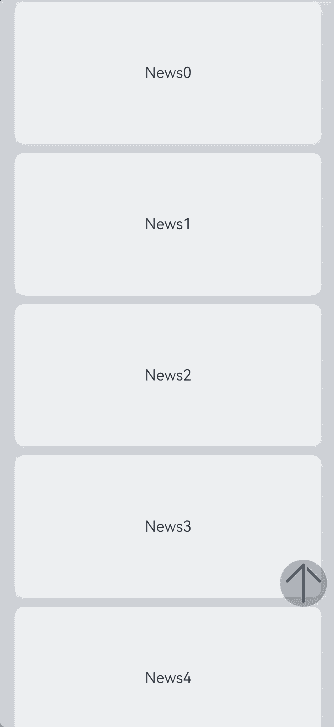
When the List component is initialized, you can use the scroller parameter to bind a Scroller object to control the scrolling of the list. In this example of a news page list, the scrollToIndex API of the Scroller object is used to scroll the list to the list item with the specified index. This allows the user to return to the top of the list by clicking a specific button.
To start with, create a Scroller object listScroller.
private listScroller: Scroller = new Scroller();
Then, use listScroller to initialize the scroller parameter to bind it with the List component. Set scrollToIndex to 0, meaning to return to the top of the list.
Stack({ alignContent: Alignment.Bottom }) {
  // Use listScroller to initialize the scroller parameter to bind it with the List component.
  List({ space: 20, scroller: this.listScroller }) {
    // ...
  }

  Button() {
    // ...
  }
  .onClick(() => {
    // Specify where e to jump when the specific button is clicked, which is the top of the list in this example.
    this.listScroller.scrollToIndex(0)
  })
}
Responding to the Scrolling Position
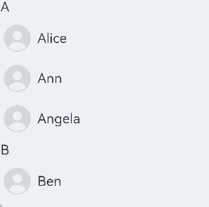
Many applications need to listen for the scrolling position change of the list and respond. For example, with regard to a contacts list, if scrolling spans more than one group, the alphabetical index bar at one side of the list also needs to be updated to highlight the letter corresponding to the current group.
Another common example is a scrolling list working with a multi-level index bar, as in the case of a product category page in a shopping application.
Figure 14 Alphabetical index bar’s response to contacts list scrolling
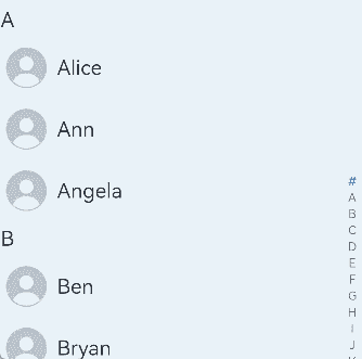
As shown above, when the contacts list scrolls from group A to B, the alphabetical index bar on the right also changes from A to B. This scenario can be implemented by listening for the onScrollIndex event of the List component. The alphabet index bar is implemented using the AlphabetIndexer component.
When the list scrolls, the selectedIndex value of the letter to highlight in the alphabet index bar is recalculated based on the firstIndex value of the item to which the list has scrolled. In the AlphabetIndexer component, the index of the highlighted item is set through the selected attribute. When the value of selectedIndex changes, the AlphabetIndexer component is re-rendered to highlight the corresponding letter.
const alphabets = ['#', 'A', 'B', 'C', 'D', 'E', 'F', 'G', 'H', 'I', 'J', 'K',
  'L', 'M', 'N', 'O', 'P', 'Q', 'R', 'S', 'T', 'U', 'V', 'W', 'X', 'Y', 'Z'];
@Entry
@Component
struct ContactsList {
  @State selectedIndex: number = 0;
  private listScroller: Scroller = new Scroller();

  build() {
    Stack({ alignContent: Alignment.End }) {
      List({ scroller: this.listScroller }) {}
      .onScrollIndex((firstIndex: number) => {
        // Recalculate the value of this.selectedIndex in the alphabetical index bar based on the index of the item to which the list has scrolled.
      })

      // AlphabetIndexer component
      AlphabetIndexer({ arrayValue: alphabets, selected: 0 })
        .selected(this.selectedIndex)
    }
  }
}
NOTE
During index calculation, each ListItemGroup component is taken as a whole and assigned an index, and the indexes of the list items within are not included in the calculation.
Responding to Swipe on List Items
Swipe menus are common in many applications. For example, a messaging application generally provides a swipe-to-delete feature for its message list. This feature allows users to delete a message by swiping left on it and touching the delete button, as shown in the following figure. For details about how to add a badge to the profile picture of a list item, see Adding a Badge to a List Item.
Figure 15 Swipe-to-delete feature
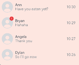
Swiping left or right on a list item can be implemented through the swipeAction attribute. In initialization of the swipeAction attribute, the SwipeActionOptions parameter is mandatory, wherein the start parameter indicates the component that appears from the start edge when the list item is swiped right, and the end parameter indicates the component that appears from the end edge when the list item is swiped left.
In the example of the message list, the end parameter is set to a custom delete button. In initialization of the end attribute, the index of the sliding list item is passed to the delete button. When the user touches the delete button, the data corresponding to the list item is deleted based on the index.
Build the component that appears from the end edge when the list item is swiped left.
@Builder itemEnd(index: number) {
  // Build the component that appears from the end edge when the list item is swiped left.
  Button({ type: ButtonType.Circle }) {
    Image($r('app.media.ic_public_delete_filled'))
      .width(20)
      .height(20)
  }
  .onClick(() => {
    // this.messages is the list data source, which can be constructed as required. A specified data item can be deleted from the data source upon click.
    this.messages.splice(index, 1);
  })
}
Binds the swipeAction attribute to a list item that can be swiped left.
// When constructing a list, use ForEach to render list items based on the data source this.messages.
ListItem() {
  // ...
}
.swipeAction({
  end: {
    // index is the index of the list item.
    builder: () => { this.itemEnd(index) },
  }
}) // Set the swipe action.
Adding a Badge to a List Item
A badge is an intuitive, unobtrusive visual indicator to draw attention and convey a specific message. For example, a badge can be displayed in the upper right corner of the contact’s profile picture to indicate that there is a new message from that contact, as shown in the following figure.
Figure 16 Adding a badge to a list item
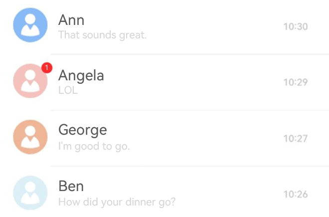
To add a badge, use the Badge component in ListItem. The Badge component is a container that can be attached to another component for tagging.
In this example, when implementing the Image component for presenting the profile picture of a list item, add it to Badge as a child component.
In the Badge component, the count and position parameters are used to set the number of notifications and the position to display the badge, respectively. You can also use the style parameter to spruce up the badge.
ListItem() {
  Badge({
    count: 1,
    position: BadgePosition.RightTop,
    style: { badgeSize: 16, badgeColor: '#FA2A2D' }
  }) {
    // The Image component implements the contact profile picture.
    // ...
  }
}
Implementing Pull-Down-to-Refresh and Pull-Up-to-Load
The pull-down-to-refresh and pull-up-to-load features are widely used in mobile applications, such as news applications. In effect, the implementation of these two features follows the same process: (1) As response to a touch event, a refresh or load view is displayed at the top or bottom of the page; (2) when the refresh or load is complete, the refresh or load view is hidden.
The following describes the implementation of the pull-and-refresh feature:
Listen for the finger press event and record the value of the initial position.
Listen for the finger movement event, and record and calculate the difference between the value of the current position and the initial value. If the difference is greater than 0, the finger moves downward. Set the maximum value for the movement.
Listen for the finger lift event. If the movement reaches the maximum value, trigger data loading and display the refresh view. After the loading is complete, hide the view.
NOTE
To implement the pull-down-to-refresh feature, you are advised to use the Refresh component.
Editing a List
The list editing mode is frequently used in various scenarios, such as to-do list management, file management, and note management. In editing mode, adding and deleting list items are the most basic functions. The core is to add and delete data in the data set corresponding to the list items.
The following uses to-do list management as an example to describe how to quickly add and delete list items.
Adding a List Item
As shown below, when a user touches Add, a page is displayed for the user to set options for the new list item. After the user touches OK, the corresponding item is added to the list.
Figure 17 Adding a to-do task
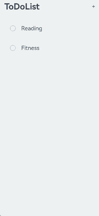
The process of implementing the addition feature is as follows:
- Define the list item data structure. In this example, a to-do data structure is defined.
   //ToDo.ets
   import { util } from '@kit.ArkTS'

   export class ToDo {
     key: string = util.generateRandomUUID(true);
     name: string;

     constructor(name: string) {
       this.name = name;
     }
   }
- Build the overall list layout and list items.
   //ToDoListItem.ets
   import { ToDo } from './ToDo';
   @Component
   export struct ToDoListItem {
     @Link isEditMode: boolean
     @Link selectedItems: ToDo[]
     private toDoItem: ToDo = new ToDo("");

     build() {
      Flex({ justifyContent: FlexAlign.SpaceBetween, alignItems: ItemAlign.Center }) {
        // ...
      }
      .width('100%')
      .height(80)
      // .padding(): Set this parameter based on the use case.
      .borderRadius(24)
      // .linearGradient(): Set this parameter based on the use case.
      .gesture(
        GestureGroup(GestureMode.Exclusive,
        LongPressGesture()
          .onAction(() => {
            // ...
          })
        )
      )
     }
   }
- Initialize the to-do list data and available items, and build the list layout and list items.
   //ToDoList.ets
   import { ToDo } from './ToDo';
   import { ToDoListItem } from './ToDoListItem';

   @Entry
   @Component
   struct ToDoList {
     @State toDoData: ToDo[] = []
     @Watch('onEditModeChange') @State isEditMode: boolean = false
     @State selectedItems: ToDo[] = []
    private availableThings: string[] = ['Reading', 'Fitness', 'Travel','Music','Movie', 'Singing']

     onEditModeChange() {
       if (!this.isEditMode) {
         this.selectedItems = []
       }
    }

     build() {
       Column() {
         Row() {
           if (this.isEditMode) {
             Text('X')
               .fontSize(20)
               .onClick(() => {
                 this.isEditMode = false;
               })
               .margin({ left: 20, right: 20 })
           } else {
             Text('To-Do')
               .fontSize(36)
               .margin({ left: 40 })
             Blank()
             Text('+') // Provide an entry for adding a list item, that is, add a click event for the add button.
               .onClick(() => {
                 this.getUIContext().showTextPickerDialog({
                   range: this.availableThings,
                   onAccept: (value: TextPickerResult) => {
                     let arr = Array.isArray(value.index) ? value.index : [value.index];
                     for (let i = 0; i < arr.length; i++) {
                       this.toDoData.push(new ToDo(this.availableThings[arr[i]])); // Add to-do list items (available items).
                     }
                   },
                 })
               })
           }
           List({ space: 10 }) {
             ForEach(this.toDoData, (toDoItem: ToDo) => {
               ListItem() {
                 // Place each item of toDoData into the list item in the form of model.
                 ToDoListItem({
                   isEditMode: this.isEditMode,
                   toDoItem: toDoItem,
                   selectedItems: this.selectedItems })
               }
             }, (toDoItem: ToDo) => toDoItem.key.toString())
           }
         }
       }
     }
   }
Deleting a List Item
As shown below, when the user long presses a list item to enter the deletion mode, a page is displayed for the user to delete the list item. After the user selects the list item and touches the delete button, the list item is deleted.
Figure 18 Deleting a to-do task

The process of implementing the deletion feature is as follows:
Generally, the deletion feature is available only after the list enters the editing mode. Therefore, the entry to the editing mode needs to be provided. In this example, by listening for the long press event of a list item, the list enters the editing mode when the user long presses a list item.
// Structure reference
export class ToDo {
  key: string = util.generateRandomUUID(true);
  name: string;
  toDoData: ToDo[] = [];


  constructor(name: string) {
    this.name = name;
  }
}
// Implementation reference Flex({ justifyContent: FlexAlign.SpaceBetween, alignItems: ItemAlign.Center }) { // ... } .gesture( GestureGroup(GestureMode.Exclusive, LongPressGesture() .onAction(() => { if (!this.isEditMode) { this.isEditMode = true; // Enter the editing mode. } }) ) )Respond to the user’s selection and record the list items to be deleted. In this to-do list example, the list items are selected or unselected according to the user’s selection.
// Structure reference
import { util } from '@kit.ArkTS'
export class ToDo {
 key: string = util.generateRandomUUID(true);
 name: string;
 toDoData: ToDo[] = [];


 constructor(name: string) {
   this.name = name;
 }
}
// Implementation reference if (this.isEditMode) { Checkbox() .onChange((isSelected) => { if (isSelected) { When this.selectedItems.push(toDoList.toDoItem) // this.selectedItems is selected, the selected list items are recorded. You can construct the list items based on the site requirements. } else { let index = this.selectedItems.indexOf(toDoList.toDoItem) if (index !== -1) { this.selectedItems.splice(index, 1) // When an item is deselected, it is deleted from the selectedItems array. } } }) }Respond to the user’s clicking the delete button and delete the corresponding items from the list.
// Structure reference
import { util } from '@kit.ArkTS'
export class ToDo {
  key: string = util.generateRandomUUID(true);
  name: string;
  toDoData: ToDo[] = [];


  constructor(name: string) {
    this.name = name;
  }
}
// Implementation reference Button('Delete') .onClick(() => { // this.toDoData is the to-do list item, which can be constructed based on service requirements. After an item is clicked, the corresponding data is removed. let leftData = this.toDoData.filter((item) => { return !this.selectedItems.find((selectedItem) => selectedItem == item); }) this.toDoData = leftData; this.isEditMode = false; })
Handling a Long List
ForEach is applicable to short lists. With regard to a long list with a large number of list items, using ForEach will greatly slow down page loading, as it loads all list items at once. Therefore, for better list performance, use LazyForEach instead to implement on-demand iterative data loading.
For details about the implementation, see the example in LazyForEach: Lazy Data Loading.
When the list is rendered in lazy loading mode, to improve the list scrolling experience and minimize white blocks during list scrolling, you can use the cachedCount parameter of the List component. This parameter sets the number of list items preloaded outside of the screen and is valid only in LazyForEach.
List() {
  // ...
}.cachedCount(3)
The following uses a vertical list as an example:
If lazy loading is used for list items and the list contains only one column, the number of the list items to cache before and after the currently displayed one equals the value of cachedCount. If the list contains multiple columns, the number of the list items to cache is the value of cachedCount multiplied by the number of columns.
If lazy loading is used for list item groups, the number of the list item groups to cache before and after the currently displayed one equals the value of cachedCount, regardless of the number of columns.
NOTE
A greater cachedCount value may result in higher CPU and memory overhead of the UI. Adjust the value by taking into account both the comprehensive performance and user experience.
When a list uses data lazy loading, all list items except the list items in the display area and the cached list items are destroyed.
Collapsing and Expanding
The collapsing and expanding of list items are widely used, often applied in scenarios such as displaying information lists and filling out forms.
Figure 19 Collapsing and expanding of list items
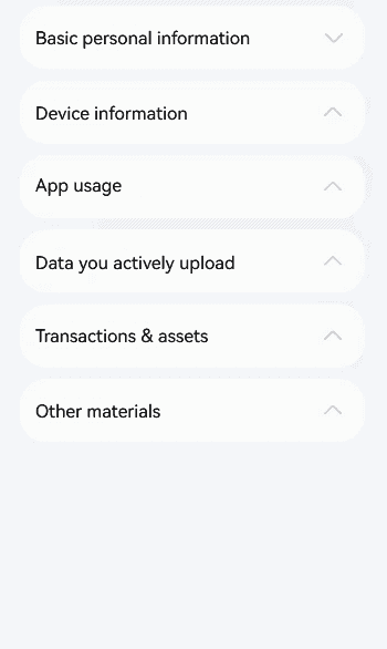
The process of implementing the collapsing and expanding effect of list items is as follows:
Define the list item data structure.
interface ItemInfo {
  index: number,
  name: string,
  label: ResourceStr,
  type?: string,
}


interface ItemGroupInfo extends ItemInfo {
  children: ItemInfo[]
}
Construct a list structure.
@State routes: ItemGroupInfo[] = [
  {
    index: 0,
    name: 'basicInfo',
    label: 'Basic personal information',
    children: [
      {
        index: 0,
        name: 'Nickname',
        label: 'xxxx',
        type: 'Text'
      },
      {
        index: 1,
        name: 'Profile picture',
        label: $r('sys.media.ohos_user_auth_icon_face'),
        type: 'Image'
      },
      {
        index: 2,
        name: 'Age',
        label: 'xxxx',
        type: 'Text'
      },
      {
        index: 3,
        name: 'Birthday',
        label: 'xxxxxxxxx',
        type: 'Text'
      },
      {
        index: 4,
        name: 'Gender',
        label: 'xxxxxxxx',
        type: 'Text'
      },
    ]
  },
  {
    index: 1,
    name: 'equipInfo',
    label: 'Device information',
    children: []
  },
  {
    index: 2,
    name: 'appInfo',
    label: 'App usage',
    children: []
  },
  {
    index: 3,
    name: 'uploadInfo',
    label: 'Data you actively upload',
    children: []
  },
  {
    index: 4,
    name: 'tradeInfo',
    label: 'Transactions & assets',
    children: []
  },
  {
    index: 5,
    name: 'otherInfo',
    label: 'Other materials',
    children: []
  },
];
@State expandedItems: boolean[] = Array(this.routes.length).fill(false);
@State selection: string|null = null;
build() {
  Column() {
    // ...


    List({ space: 10 }) {
      ForEach(this.routes, (itemGroup: ItemGroupInfo) => {
        ListItemGroup({
          header: this.ListItemGroupHeader(itemGroup),
          style: ListItemGroupStyle.CARD,
        }) {
          if (this.expandedItems[itemGroup.index] && itemGroup.children) {
            ForEach(itemGroup.children, (item: ItemInfo) => {
              ListItem({ style: ListItemStyle.CARD }) {
                Row() {
                  Text(item.name)
                  Blank()
                  if (item.type === 'Image') {
                    Image(item.label)
                      .height(20)
                      .width(20)
                  } else {
                    Text(item.label)
                  }
                  Image($r('sys.media.ohos_ic_public_arrow_right'))
                    .fillColor($r('sys.color.ohos_id_color_fourth'))
                    .height(30)
                    .width(30)
                }
                .width("100%")
              }
              .width("100%")
              .animation({ curve: curves.interpolatingSpring(0, 1, 528, 39) })
            })
          }
        }.clip(true)
      })
    }
    .width("100%")
  }
  .width('100%')
  .height('100%')
  .justifyContent(FlexAlign.Start)
  .backgroundColor($r('sys.color.ohos_id_color_sub_background'))
}
Control whether each list item is expanded by changing the state of ListItem, and achieve the animation effects during the expanding and collapsing process through animation and animateTo.
@Builder
ListItemGroupHeader(itemGroup: ItemGroupInfo) {
  Row() {
    Text(itemGroup.label)
    Blank()
    Image($r('sys.media.ohos_ic_public_arrow_down'))
      .fillColor($r('sys.color.ohos_id_color_fourth'))
      .height(30)
      .width(30)
      .rotate({ angle: !!itemGroup.children.length ? (this.expandedItems[itemGroup.index] ? 180 : 0) : 180 })
      .animation({ curve: curves.interpolatingSpring(0, 1, 228, 22) })
  }
  .width("100%")
  .padding(10)
  .animation({ curve: curves.interpolatingSpring(0, 1, 528, 39) })
  .onClick(() => {
    if (itemGroup.children.length) {
      this.getUIContext()?.animateTo({ curve: curves.interpolatingSpring(0, 1, 528, 39) }, () => {
        this.expandedItems[itemGroup.index] = !this.expandedItems[itemGroup.index]
      })
    }
  })
}
你可能感兴趣的鸿蒙文章
harmony 鸿蒙Atomic Service Full Screen Launch Component (FullScreenLaunchComponent)
harmony 鸿蒙Arc Button (ArcButton)
harmony 鸿蒙Frame Animation (ohos.animator)
harmony 鸿蒙Implementing Property Animation
- 所属分类: 后端技术
- 本文标签:
热门推荐
-
2、 优质文章
-
3、 gt
-
7、 openharmony
-
9、 golang
-
10、 Vue中input框自动聚焦