harmony 鸿蒙Drag Event
Drag Event
The drag event represents a drag and drop interaction for transfer of data using a mouse device or gesture. Users can drag data from one and drop it into another to trigger a response. During this process, the drag source provides the data, while the drop target is responsible for receiving and handling the data. With drag and drop, users can easily move, copy, or delete data.
Basic Concepts
- Drag operation: an operation that begins when a user selects a draggable component, continues when the user drags the component on the screen, and ends when the user releases the component on a droppable component.
- Drag preview (background): a visual representation of the data being dragged. You can set it by using CustomerBuilder or DragItemInfo of onDragStart, or by using the universal attribute dragPreview.
- Drag data: data being dragged, encapsulated using the UDMF API UnifiedData to ensure data consistency and security.
- Drag source: component that initiates the drag operation and provides data, typically with characteristics for responding to dragging.
- Drop target: component that can receive and process drag data, and is able to perform corresponding actions based on the data being dropped.
- Drag point: point of contact between the mouse device or finger and the screen. It is used to determine whether data enters a drop target. The determination is based on whether the contact point is within the bounds of the component.
Drag Process
The drag process can be gesture-based or mouse-based. The following describes these two types work.
Gesture-based Drag Process
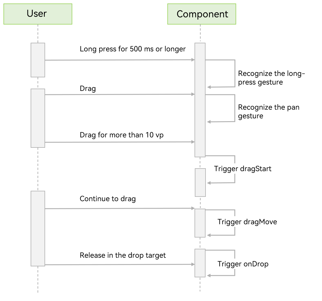
If a drag operation is initiated by a gesture, ArkUI checks whether the current component is draggable. For draggable components (Search, TextInput, TextArea, RichEditor, Text, Image, FormComponent, Hyperlink), ArkUI checks whether their draggable attribute is set to true (this attribute is true by default if layered parameters are used); for other components, ArkUI checks whether the onDragStart callback is set. If the attribute or callback is set as required, ArkUI starts dragging once the user has long pressed the component for 500 ms or longer, and displays a drag preview once the user has long pressed the component for 800 ms. When the drag operation is used together with a menu controlled by the isShow attribute for visibility, avoid delaying the display of the menu by 800 ms after the user’s action. Otherwise, unexpected behavior may occur.
Below you can see the drag process initiated by a gesture (finger or stylus).
Mouse-based Drag Process
When a mouse device is used as the pointer, ArkUI starts dragging once the draggable component has been moved with the left mouse button by more than 1 vp.
A drag and drop can occur in a single application, or start in one application and end in another. The following callback events are provided for you to detect the dragging status and intervene in the default dragging behavior of the system.
| Callback Event | Description |
|---|---|
| onDragStart | Triggered when a draggable component is dragged. You can use this callback to detect the initiation of dragging behavior. You can also set the drag data and drag preview in this callback. To avoid extra performance overhead, it is recommended that the drag preview be returned in the form of a pixel map, instead of using customBuilder. |
| onDragEnter | Triggered when the drag point enters the bounds of the component. This callback is called only when the component listens for the onDrop event. |
| onDragMove | Triggered when the drag point moves in the bounds of the component. This callback is called only when the component listens for the onDrop event. During the movement, the setResult API in DragEvent can be used to affect the system appearance in some scenarios. 1. Set DragResult.DROP_ENABLED. 2. Set DragResult.DROP_DISABLED. |
| onDragLeave | Triggered when the drag point leaves the bounds of the component. This callback is called only when the component listens for the onDrop event. By default, the onDragLeave callback is not called in the following cases: 1. An item in a parent component is dragged to one of its child components. 2. The layout of the drop target component overlaps that of the drag source component. Since API version 12, the setDragEventStrictReportingEnabled API in UIContext can be used to trigger the onDragLeave event in a strict fashion. |
| onDrop | Triggered when the dragged item is dropped on the component. The drag result must be set in this callback through the setResult API in DragEvent. Otherwise, the getResult API in the onDragEnd method of the drag source only returns the default result DragResult.DRAG_FAILED. This callback is where you can intervene in the default drop processing behavior. The system preferentially executes the onDrop callback and processes the drag data based on the setResult API in the callback function. 1. If DragResult.DRAG_SUCCESSFUL is set, you need to process the data on your own; the system does not process the data. 2. If DragResult.DRAG_FAILED is set, the system does not process the data. 3. If DragResult.DRAG_CANCELED is set, the system does not process the data. 4. Setting DragResult.DROP_ENABLED or DragResult.DROP_DISABLED will be ignored, producing the same effect as DragResult.DRAG_FAILED. |
| onDragEnd | Triggered when dragging of the component ends. |
| onPreDrag | Triggered when the component enters a state prior to a drop and drop operation. You can use this callback to listen for the value of PreDragStatus to prepare corresponding data. 1. ACTION_DETECTING_STATUS: A drag gesture is being detected. Triggered when the component is long pressed for 50 ms. 2. READY_TO_TRIGGER_DRAG_ACTION: The component is ready to be dragged. Triggered when the component is long pressed for 500 ms. 3. PREVIEW_LIFT_STARTED: A lift animation is started. Triggered when the component is long pressed for 800 ms. 4. PREVIEW_LIFT_FINISHED: A lift animation is finished. Triggered at the completion of the lift animation. 5. PREVIEW_LANDING_STARTED: A drop animation is started. Triggered when the drop animation starts. 6. PREVIEW_LANDING_FINISHED: A drop animation is finished. Triggered when the drop animation ends. 7. ACTION_CANCELED_BEFORE_DRAG: A drop animation is terminated. Triggered when the finger is lifted off the screen after the component enters the READY_TO_TRIGGER_DRAG_ACTION state. |
DragEvent provides getters to obtain information about the drag operation. The table below lists whether the getters can return valid data in the corresponding drag callbacks. |Callback Event|onDragStart|onDragEnter|onDragMove|onDragLeave|onDrop|onDragEnd| |-|-|-|-|-|-|-| |getData |—|—|—|—|Supported|—| |getSummary |—|Supported|Supported|Supported|Supported|—| |getResult |—|—|—|—|—|Supported| |getPreviewRect|—|—|—|—|Supported|—| |getVelocity/X/Y|—|Supported|Supported|Supported|Supported|—| |getWindowX/Y |Supported|Supported|Supported|Supported|Supported|—| |getDisplayX/Y |Supported|Supported|Supported|Supported|Supported|—| |getX/Y |Supported|Supported|Supported|Supported|Supported|—| |behavior |—|—|—|—|—|Supported|
DragEvent also provides setters to transfer information to the system, which may affect how the system handles UI or data. The table below lists the stages in the callbacks where the setters should be executed for the information to be accepted and processed by the system. |Callback Event|onDragStart|onDragEnter|onDragMove|onDragLeave|onDrop| |-|-|-|-|-|-| |useCustomDropAnimation|—|—|—|—|Supported| |setData |Supported|—|—|—|—| |setResult |Supported; can be used to prevent dragging initiation by setting failed or cancel|Supported; not passed as the final result to onDragEnd|Supported; not passed as the final result to onDragEnd|Supported; not passed as the final result to onDragEnd|Supported; passed as the final result to onDragEnd| |behavior |—|Supported|Supported|Supported|Supported|
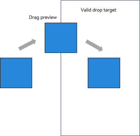
Drag Preview
The drag preview is an image displayed during the drag and drop operation. It is a visual representation of the drag data, not the component itself. You can set it to any supported image that you want to display to users. The customBuilder or pixelMap object returned by the onDragStart callback can be used to set the drag preview displayed during dragging and moving, with a snapshot of the component being used as the default drag preview during a lift animation. The customBuilder or pixelMap object set by the dragPreview attribute can be used to set the drag preview during a lift animation and dragging. If no custom drag preview is set, the system uses a snapshot of the component by default.
You can set the opacity, rounded corners, shadow, and blur for the drag preview. For details, see Drag and Drop Control.
Constraints:
- For a container component, if the internal content exceeds the bounds of the component due to position, offset, or other settings, the component snapshot does not capture the excess content. To show the excess content, you can expand the container scope or customize the container.
- Regardless of whether you use a custom builder or rely on the default snapshot mechanism, the snapshot process does not support transformation APIs, including scale and rotate.
General Drag and Drop Adaptation
The following uses the Image component as an example to describe the basic procedure for drag and drop development and the precautions to be taken during development.
- Make the component draggable.
Set the draggable attribute to true and set the onDragStart callback function. In the callback function, you can use UDMF to set the drag data and return the custom drag preview.
```ts
import { unifiedDataChannel, uniformTypeDescriptor } from '@kit.ArkData';

Image($r('app.media.app_icon'))
    .width(100)
    .height(100)
    .draggable(true)
    .onDragStart((event) => {
        let data: unifiedDataChannel.Image = new unifiedDataChannel.Image();
        data.imageUri = 'common/pic/img.png';
        let unifiedData = new unifiedDataChannel.UnifiedData(data);
        event.setData(unifiedData);

        let dragItemInfo: DragItemInfo = {
        pixelMap: this.pixmap,
        extraInfo: "this is extraInfo",
        };
        // The custom drag preview is returned in onDragStart.
        return dragItemInfo;
    })
```
The gesture-based drag operation is initiated by a long press gesture bound at the underlying layer. If a long press gesture is also bound to the dragged component, gesture conflict will occur, resulting in dragging to fail. To address this issue, you can use parallel gestures.
```ts
.parallelGesture(LongPressGesture().onAction(() => {
   promptAction.showToast({ duration: 100, message: 'Long press gesture trigger' });
}))
```
- Customize the drag preview.
Prepare a pixel map for the custom drag preview within the callback triggered by onPreDrag after a long press of 50 ms.
```ts
.onPreDrag((status: PreDragStatus) => {
    if (preDragStatus == PreDragStatus.ACTION_DETECTING_STATUS) {
        this.getComponentSnapshot();
    }
})
```
To generate a pixel map, you can use the componentSnapshot.createFromBuilder API.
  ```ts
  @Builder
  pixelMapBuilder() {
      Column() {
        Image($r('app.media.startIcon'))
          .width(120)
          .height(120)
          .backgroundColor(Color.Yellow)
      }
    }
    private getComponentSnapshot(): void {
    this.getUIContext().getComponentSnapshot().createFromBuilder(()=>{this.pixelMapBuilder()},
    (error: Error, pixmap: image.PixelMap) => {
        if(error){
          console.log("error: " + JSON.stringify(error))
          return;
        }
        this.pixmap = pixmap;
    })
  }
  ```
To make sure the onDragLeave event is triggered as expected, use the setDragEventStrictReportingEnabled API.
import { UIAbility } from '@kit.AbilityKit';
import { window, UIContext } from '@kit.ArkUI';


export default class EntryAbility extends UIAbility {
  onWindowStageCreate(windowStage: window.WindowStage): void {
    windowStage.loadContent('pages/Index', (err, data) => {
      if (err.code) {
        return;
      }
      windowStage.getMainWindow((err, data) => {
        if (err.code) {
          return;
        }
        let windowClass: window.Window = data;
        let uiContext: UIContext = windowClass.getUIContext();
        uiContext.getDragController().setDragEventStrictReportingEnabled(true);
      });
    });
  }
}
Set the badge displayed during dragging.
You can set allowDrop to define the allowed data types for dropping, which affects the badge display. The COPY badge is displayed when the drag data matches the allowed data types, the FORBIDDEN badge is displayed when it does not, and the MOVE badge is displayed if allowDrop is not set. The following example allows only data of HYPERLINK and PLAIN_TEXT types defined in UnifiedData.
```ts
.allowDrop([uniformTypeDescriptor.UniformDataType.HYPERLINK, uniformTypeDescriptor.UniformDataType.PLAIN_TEXT])
```
If the onDrop callback is implemented, you can control the badge display by setting DragResult to DROP_ENABLED in onDragMove and setting DragBehavior to COPY or MOVE. The following code forces the badge to display MOVE during a drag operation:
```ts
.onDragMove((event) => {
    event.setResult(DragResult.DROP_ENABLED);
    event.dragBehavior = DragBehavior.MOVE;
})
```
- Receive drag data.
Set the onDrop callback to handle the drag data and determine the drag result.
```ts
.onDrop((dragEvent?: DragEvent) => {
    // Obtain the drag data.
    this.getDataFromUdmf((dragEvent as DragEvent), (event: DragEvent) => {
    let records: Array<unifiedDataChannel.UnifiedRecord> = event.getData().getRecords();
    let rect: Rectangle = event.getPreviewRect();
    this.imageWidth = Number(rect.width);
    this.imageHeight = Number(rect.height);
    this.targetImage = (records[0] as unifiedDataChannel.Image).imageUri;
    this.imgState = Visibility.None;
    // Explicitly set the result to successful, and then pass this value to onDragEnd of the drag source.
    event.setResult(DragResult.DRAG_SUCCESSFUL);
})
```
Data transfer is managed by UDMF, which may experience latency when dealing with large data volumes. Therefore, you are advised to implement a retry mechanism with a 1500 ms delay after the initial data acquisition fails.
```ts
getDataFromUdmfRetry(event: DragEvent, callback: (data: DragEvent) => void) {
   try {
     let data: UnifiedData = event.getData();
     if (!data) {
       return false;
     }
     let records: Array<unifiedDataChannel.UnifiedRecord> = data.getRecords();
     if (!records||records.length <= 0) {
       return false;
     }
     callback(event);
     return true;
   } catch (e) {
     console.log("getData failed, code: " + (e as BusinessError).code + ", message: " + (e as BusinessError).message);
     return false;
   }
}

getDataFromUdmf(event: DragEvent, callback: (data: DragEvent) => void) {
  if (this.getDataFromUdmfRetry(event, callback)) {
    return;
  }
  setTimeout(() => {
    this.getDataFromUdmfRetry(event, callback);
  }, 1500);
}
```
The drag initiator can detect the result of the drag operation by setting the onDragEnd callback.
import { promptAction } from '@kit.ArkUI';


.onDragEnd((event) => {
    // The result value obtained from onDragEnd is set in onDrop of the drop target.
  if (event.getResult() === DragResult.DRAG_SUCCESSFUL) {
    promptAction.showToast({ duration: 100, message: 'Drag Success' });
  } else if (event.getResult() === DragResult.DRAG_FAILED) {
    promptAction.showToast({ duration: 100, message: 'Drag failed' });
  }
})
Sample Code
import { unifiedDataChannel, uniformTypeDescriptor } from '@kit.ArkData';
import { promptAction } from '@kit.ArkUI';
import { BusinessError } from '@kit.BasicServicesKit';
import { image } from '@kit.ImageKit';

@Entry
@Component
struct Index {
  @State targetImage: string = '';
  @State imageWidth: number = 100;
  @State imageHeight: number = 100;
  @State imgState: Visibility = Visibility.Visible;
  @State pixmap: image.PixelMap|undefined = undefined

  @Builder
  pixelMapBuilder() {
    Column() {
      Image($r('app.media.startIcon'))
        .width(120)
        .height(120)
        .backgroundColor(Color.Yellow)
    }
  }

  getDataFromUdmfRetry(event: DragEvent, callback: (data: DragEvent) => void) {
    try {
      let data: UnifiedData = event.getData();
      if (!data) {
        return false;
      }
      let records: Array<unifiedDataChannel.UnifiedRecord> = data.getRecords();
      if (!records||records.length <= 0) {
        return false;
      }
      callback(event);
      return true;
    } catch (e) {
      console.log("getData failed, code: " + (e as BusinessError).code + ", message: " + (e as BusinessError).message);
      return false;
    }
  }
  // Obtain UDMF data with a retry mechanism of 1500 ms if the initial attempt fails.
  getDataFromUdmf(event: DragEvent, callback: (data: DragEvent) => void) {
    if (this.getDataFromUdmfRetry(event, callback)) {
      return;
    }
    setTimeout(() => {
      this.getDataFromUdmfRetry(event, callback);
    }, 1500);
  }
  // Use the createFromBuilder API of componentSnapshot to capture a snapshot of a custom builder.
  private getComponentSnapshot(): void {
    this.getUIContext().getComponentSnapshot().createFromBuilder(()=>{this.pixelMapBuilder()},
      (error: Error, pixmap: image.PixelMap) => {
        if(error){
          console.log("error: " + JSON.stringify(error))
          return;
        }
        this.pixmap = pixmap;
      })
  }
  // Prepare a custom screenshot pixel map after a 50 ms long press is detected.
  private PreDragChange(preDragStatus: PreDragStatus): void {
    if (preDragStatus == PreDragStatus.ACTION_DETECTING_STATUS) {
      this.getComponentSnapshot();
    }
  }

  build() {
    Row() {
      Column() {
        Text('start Drag')
          .fontSize(18)
          .width('100%')
          .height(40)
          .margin(10)
          .backgroundColor('#008888')
        Row() {
          Image($r('app.media.app_icon'))
            .width(100)
            .height(100)
            .draggable(true)
            .margin({ left: 15 })
            .visibility(this.imgState)
            // Bind a parallel gesture to trigger a custom long press gesture.
            .parallelGesture(LongPressGesture().onAction(() => {
              promptAction.showToast({ duration: 100, message: 'Long press gesture trigger' });
            }))
            .onDragStart((event) => {
              let data: unifiedDataChannel.Image = new unifiedDataChannel.Image();
              data.imageUri = 'common/pic/img.png';
              let unifiedData = new unifiedDataChannel.UnifiedData(data);
              event.setData(unifiedData);

              let dragItemInfo: DragItemInfo = {
                pixelMap: this.pixmap,
                extraInfo: "this is extraInfo",
              };
              return dragItemInfo;
            })
              // Prepare a custom drag preview in advance.
            .onPreDrag((status: PreDragStatus) => {
              this.PreDragChange(status);
            })
            .onDragEnd((event) => {
              // The result value obtained from onDragEnd is set in onDrop of the drop target.
              if (event.getResult() === DragResult.DRAG_SUCCESSFUL) {
                promptAction.showToast({ duration: 100, message: 'Drag Success' });
              } else if (event.getResult() === DragResult.DRAG_FAILED) {
                promptAction.showToast({ duration: 100, message: 'Drag failed' });
              }
            })
        }

        Text('Drag Target Area')
          .fontSize(20)
          .width('100%')
          .height(40)
          .margin(10)
          .backgroundColor('#008888')
        Row() {
          Image(this.targetImage)
            .width(this.imageWidth)
            .height(this.imageHeight)
            .draggable(true)
            .margin({ left: 15 })
            .border({ color: Color.Black, width: 1 })
            // Set the drag behavior to MOVE, which means no badge is displayed.
            .onDragMove((event) => {
              event.setResult(DragResult.DROP_ENABLED)
              event.dragBehavior = DragBehavior.MOVE
            })
            .allowDrop([uniformTypeDescriptor.UniformDataType.IMAGE])
            .onDrop((dragEvent?: DragEvent) => {
              // Obtain the drag data.
              this.getDataFromUdmf((dragEvent as DragEvent), (event: DragEvent) => {
                let records: Array<unifiedDataChannel.UnifiedRecord> = event.getData().getRecords();
                let rect: Rectangle = event.getPreviewRect();
                this.imageWidth = Number(rect.width);
                this.imageHeight = Number(rect.height);
                this.targetImage = (records[0] as unifiedDataChannel.Image).imageUri;
                this.imgState = Visibility.None;
                // Explicitly set the result to successful, and then pass this value to onDragEnd of the drag source.
                event.setResult(DragResult.DRAG_SUCCESSFUL);
              })
            })
        }
      }
      .width('100%')
      .height('100%')
    }
    .height('100%')
  }
}
Multi-Select Drag and Drop Adaptation
Since API version 12, the GridItem and ListItem components, which are child components of Grid and List, respectively, support multi-select drag and drop, which can be initiated through the onDragStart API.
The following uses Grid as an example to describe the basic procedure for multi-select drag and drop development and key considerations during development.
- Enable multi-select drag and drop.
Create GridItem child components and bind the onDragStart callback to them. In addition, set the GridItem components to be selectable.
```ts
Grid() {
  ForEach(this.numbers, (idx: number) => {
    GridItem() {
      Column()
        .backgroundColor(this.colors[idx % 9])
        .width(50)
        .height(50)
        .opacity(1.0)
        .id('grid'+idx)
    }
    .onDragStart(()=>{})
    .selectable(true)
  }, (idx: string) => idx)
}
```
Multi-select drag and drop is disabled by default. To enable it, set isMultiSelectionEnabled to true in the DragInteractionOptions parameter of the dragPreviewOptions API. DragInteractionOptions also has the defaultAnimationBeforeLifting parameter, which, when set to true, applies a default scaling down animation as the lift animation for the component.
```ts
.dragPreviewOptions({isMultiSelectionEnabled:true,defaultAnimationBeforeLifting:true})
```
To maintain the selected state, set the selected attribute of the GridItem components to true. For example, you can use onClick to set a specific component to the selected state.
```ts
.selected(this.isSelectedGrid[idx])
.onClick(()=>{
    this.isSelectedGrid[idx] = !this.isSelectedGrid[idx]
})
```
- Optimize the multi-select drag and drop performance.
In multi-select drag and drop scenarios, there is a clustering animation effect when multiple items are selected. This effect captures a snapshot of the selected components currently displayed on the screen, which can incur high performance costs if there are too many selected components. To save on performance, multi-select drag and drop allows for the use of a snapshot from dragPreview as the basis for the clustering animation.
```ts
.dragPreview({
    pixelMap:this.pixmap
})
```
To obtain a snapshot of a component, you can call the get API of componentSnapshot when the component is selected. The following shows how to use the component ID to obtain the snapshot.
```ts
@State previewData: DragItemInfo[] = []
@State isSelectedGrid: boolean[] = []
.onClick(()=>{
    this.isSelectedGrid[idx] = !this.isSelectedGrid[idx]
    if (this.isSelectedGrid[idx]) {
        let gridItemName = 'grid' + idx
        this.getUIContext().getComponentSnapshot().get(gridItemName, (error: Error, pixmap: image.PixelMap)=>{
            this.pixmap = pixmap
            this.previewData[idx] = {
                pixelMap:this.pixmap
            }
        })
    }
})
```
Set the multi-select display effects.
Use stateStyles to set display effects for selected and unselected states for easy distinction.
@Styles
normalStyles(): void{
  .opacity(1.0)
}


@Styles
selectStyles(): void{
  .opacity(0.4)
}


.stateStyles({
  normal : this.normalStyles,
  selected: this.selectStyles
})
Adapt the number badge.
Configure the number badge for multi-select drag and drop using the numberBadge parameter in dragPreviewOptions, adjusting it based on the number of selected items.
@State numberBadge: number = 0;


.onClick(()=>{
    this.isSelectedGrid[idx] = !this.isSelectedGrid[idx]
    if (this.isSelectedGrid[idx]) {
      this.numberBadge++;
    } else {
      this.numberBadge--;
  }
})
// Set the numberBadge parameter in dragPreviewOptions for the number badge in multi-select scenarios.
.dragPreviewOptions({numberBadge: this.numberBadge})
Sample Code
import { image } from '@kit.ImageKit';

@Entry
@Component
struct GridEts {
  @State pixmap: image.PixelMap|undefined = undefined
  @State numbers: number[] = []
  @State isSelectedGrid: boolean[] = []
  @State previewData: DragItemInfo[] = []
  @State colors: Color[] = [Color.Red, Color.Blue, Color.Brown, Color.Gray, Color.Green, Color.Grey, Color.Orange,Color.Pink ,Color.Yellow]
  @State numberBadge: number = 0;

  @Styles
  normalStyles(): void{
    .opacity(1.0)
  }

  @Styles
  selectStyles(): void{
    .opacity(0.4)
  }

  onPageShow(): void {
    let i: number = 0
    for(i=0;i<100;i++){
      this.numbers.push(i)
      this.isSelectedGrid.push(false)
      this.previewData.push({})
    }
  }

  @Builder
  RandomBuilder(idx: number) {
    Column()
      .backgroundColor(this.colors[idx % 9])
      .width(50)
      .height(50)
      .opacity(1.0)
  }

  build() {
    Column({ space: 5 }) {
      Grid() {
        ForEach(this.numbers, (idx: number) => {
          GridItem() {
            Column()
              .backgroundColor(this.colors[idx % 9])
              .width(50)
              .height(50)
              .opacity(1.0)
              .id('grid'+idx)
          }
          .dragPreview(this.previewData[idx])
          .selectable(true)
          .selected(this.isSelectedGrid[idx])
          // Set the multi-select display effects.
          .stateStyles({
            normal : this.normalStyles,
            selected: this.selectStyles
          })
          .onClick(()=>{
            this.isSelectedGrid[idx] = !this.isSelectedGrid[idx]
            if (this.isSelectedGrid[idx]) {
              this.numberBadge++;
              let gridItemName = 'grid' + idx
              // Call the get API in componentSnapshot to obtain the component snapshot pixel map on selection.
              this.getUIContext().getComponentSnapshot().get(gridItemName, (error: Error, pixmap: image.PixelMap)=>{
                this.pixmap = pixmap
                this.previewData[idx] = {
                  pixelMap:this.pixmap
                }
              })
            } else {
              this.numberBadge--;
            }
          })
          // Enable multiselect and set the number badge.
          .dragPreviewOptions({numberBadge: this.numberBadge},{isMultiSelectionEnabled:true,defaultAnimationBeforeLifting:true})
          .onDragStart(()=>{
          })
        }, (idx: string) => idx)
      }
      .columnsTemplate('1fr 1fr 1fr 1fr 1fr')
      .columnsGap(5)
      .rowsGap(10)
      .backgroundColor(0xFAEEE0)
    }.width('100%').margin({ top: 5 })
  }
}
你可能感兴趣的鸿蒙文章
harmony 鸿蒙Atomic Service Full Screen Launch Component (FullScreenLaunchComponent)
harmony 鸿蒙Arc Button (ArcButton)
harmony 鸿蒙Frame Animation (ohos.animator)
harmony 鸿蒙Implementing Property Animation
- 所属分类: 后端技术
- 本文标签:
热门推荐
-
2、 优质文章
-
3、 gt
-
7、 openharmony
-
9、 golang
-
10、 Vue中input框自动聚焦