harmony 鸿蒙Drag and Drop Control
Drag and Drop Control
The drag and drop control attributes set whether a component can respond to drag events.
NOTE
The APIs of this module are supported since API version 10. Updates will be marked with a superscript to indicate their earliest API version.
The ArkUI framework provides default drag and drop capabilities for the following components, allowing them to serve as the drag source (from which data can be dragged) or drop target (to which data can be dropped). You can also define drag responses by implementing common drag events.
The following component supports drag actions by default: Search, TextInput, TextArea, RichEditor, Text, Image, FormComponent, Hyperlink. You can control the default drag behavior by setting the draggable attribute.
The following component supports drop actions by default: Search, TextInput, TextArea, RichEditor. You can disable the default drag behavior by setting the allowDrop attribute to null.
To enable drag and drop for other components, you need to set the draggable attribute to true and implement data transmission in APIs such as onDragStart.
NOTE
When using the Text component, set copyOption to CopyOptions.InApp or CopyOptions.LocalDevice.
allowDrop
allowDrop(value: Array<UniformDataType>|null)
Sets the type of data that can be dropped to the component.
Atomic service API: This API can be used in atomic services since API version 11.
System capability: SystemCapability.ArkUI.ArkUI.Full
Parameters
| Name | Type | Mandatory | Description |
|---|---|---|---|
| value | Array<UniformDataType> |null12+ | Yes | Type of data that can be dropped to the component. Since API version 12, this parameter can be set to null to make the component reject all data types. Default value: empty |
draggable
draggable(value: boolean)
Sets whether the component is draggable.
Atomic service API: This API can be used in atomic services since API version 11.
System capability: SystemCapability.ArkUI.ArkUI.Full
Parameters
| Name | Type | Mandatory | Description |
|---|---|---|---|
| value | boolean | Yes | Whether the component is draggable. true: The component is draggable. false: The component is not draggable. Default value: false |
dragPreview11+
dragPreview(value: CustomBuilder|DragItemInfo|string)
Sets the preview displayed when the component is dragged.
Atomic service API: This API can be used in atomic services since API version 12.
System capability: SystemCapability.ArkUI.ArkUI.Full
Parameters
| Name | Type | Mandatory | Description |
|---|---|---|---|
| value | CustomBuilder |DragItemInfo |string12+ | Yes | Preview displayed when the component is dragged. This attribute has effect for onDragStart only. If the component supports drag and drop and a preview is specified through bindContextMenu, that specified preview is displayed when the component is dragged. The priority of the background image returned in onDragStart is lower than that of the preview set in dragPreview. This means that, once set, the latter will be used in place of the former. Because CustomBuilder can be used only after offline rendering, it may increase performance overhead and latency. In light of this, you are advised to use PixelMap in DragItemInfo to set the preview. When an ID of the string type is passed in, the snapshot of the component assigned the ID is used as the preview image. If the component assigned the ID cannot be found or its Visibility attribute is set to none or hidden, a snapshot of the current component is used as the preview image. Currently, snapshots do not support visual effects, such as brightness, shadow, blur, and rotation. Default value: empty |
dragPreview15+
dragPreview(preview: CustomBuilder|DragItemInfo|string, config?: PreviewConfiguration):T
Sets the preview displayed when the component is dragged. It is used only for setting or disabling the lifting effect.
Atomic service API: This API can be used in atomic services since API version 15.
System capability: SystemCapability.ArkUI.ArkUI.Full
Parameters
| Name | Type | Mandatory | Description |
|---|---|---|---|
| preview | CustomBuilder |DragItemInfo |string | Yes | Preview displayed when the component is dragged. This attribute has effect for onDragStart only. If the component supports drag and drop and a preview is specified through bindContextMenu, that specified preview is displayed when the component is dragged. The priority of the background image returned in onDragStart is lower than that of the preview set in dragPreview. This means that, once set, the latter will be used in place of the former. Because CustomBuilder can be used only after offline rendering, it may increase performance overhead and latency. In light of this, you are advised to use PixelMap in DragItemInfo to set the preview. When an ID of the string type is passed in, the snapshot of the component assigned the ID is used as the preview image. If the component assigned the ID cannot be found or its Visibility attribute is set to none or hidden, a snapshot of the current component is used as the preview image. Currently, snapshots do not support visual effects, such as brightness, shadow, blur, and rotation. Default value: empty |
| config | PreviewConfiguration | Yes | Additional settings for the drag preview. This parameter is effective only for previews set using dragPreview. Default value: empty |
dragPreviewOptions11+
dragPreviewOptions(value: DragPreviewOptions, options?: DragInteractionOptions)
Sets the processing mode of the drag preview and the display of the number badge during dragging. The onItemDragStart dragging mode is not supported.
Atomic service API: This API can be used in atomic services since API version 12.
System capability: SystemCapability.ArkUI.ArkUI.Full
Parameters
| Name | Type | Mandatory | Description |
|---|---|---|---|
| value | DragPreviewOptions11+ | Yes | Processing mode of the drag preview and the display of the number badge during dragging. Default value: empty |
| options12+ | DragInteractionOptions12+ | No | Interaction mode of the drag preview. Default value: empty |
DragPreviewOptions11+
Atomic service API: This API can be used in atomic services since API version 12.
| Name | Type | Mandatory | Description |
|---|---|---|---|
| mode | DragPreviewMode | Array<DragPreviewMode>12+ | No | How the background image is processed when the component is dragged. Default value: DragPreviewMode.AUTO If DragPreviewMode.AUTO is along with other enum values, the setting takes precedence with DragPreviewMode.AUTO, and other enum values do not take effect. |
| numberBadge12+ | boolean | number | No | Whether to display the number badge or the number displayed on the badge. For a number badge, the value range is [0, 231-1]. Values outside this range will be processed as the default state. If the value specified is a floating-point number, only the integer part is displayed. NOTE When multiple items are dragged, use this API to set the number of items dragged. Default value: true |
| modifier12+ | ImageModifier | No | Style modifier to apply to the drag preview. You can use the attributes and styles supported by the image component to configure the drag preview style (see example 6). Currently, opacity, shadow, background blur, and rounded corners are supported. This parameter does not work for text dragging, which only supports the default effect. 1. Opacity Use the opacity attribute to set the opacity. The value ranges from 0 to 1. If the value is set to 0 or left unspecified, it reverts to the default value 0.95. Setting it to 1 or an invalid value makes the object completely opaque. 2. Shadow Use the shadow attribute to set the shadow. 3. Background blur Use the backgroundEffect or backgroundBlurStyle attribute to set the background blur. If both are used, backgroundEffect takes precedence. 4. Rounded corner Use the border or borderRadius attribute to set rounded corners. If you set rounded corners in both mode and modifier, the settings in modifier prevail. Default value: empty. The attribute cannot be modified. |
| sizeChangeEffect18+ | DraggingSizeChangeEffect18+ | No | Transition effect for switching between the long-press preview and the drag preview. Default value: DraggingSizeChangeEffect.DEFAULT |
DragPreviewMode11+
| Name | Value | Description |
|---|---|---|
| AUTO | 1 | Enables the system to automatically change the position of the dragged point based on the scenario and apply scaling transformations to the drag preview based on set rules. Atomic service API: This API can be used in atomic services since API version 12. |
| DISABLE_SCALE | 2 | Disables the system’s scaling behavior for the drag preview. Atomic service API: This API can be used in atomic services since API version 12. |
| ENABLE_DEFAULT_SHADOW12+ | 3 | Enables the default shadow effect for non-text components. Atomic service API: This API can be used in atomic services since API version 12. |
| ENABLE_DEFAULT_RADIUS12+ | 4 | Enables a unified rounded corner effect for non-text components, with the default value of 12 vp. If the custom rounded corner value set by the application is greater than the default value or the value set by modifier, the custom value is used. Atomic service API: This API can be used in atomic services since API version 12. |
| ENABLE_DRAG_ITEM_GRAY_EFFECT18+ | 5 | Enables the gray (transparency) effect for the original drag item, which does not apply to text content dragging. When the user starts dragging, the original item displays a gray effect. When released, the original item returns to its original appearance. After enabling the default gray effect, avoid manually modifying the opacity after dragging starts. Otherwise, the gray effect will be overridden, and the original opacity will not be correctly restored when dragging ends. Atomic service API: This API can be used in atomic services since API version 18. |
| ENABLE_MULTI_TILE_EFFECT18+ | 6 | Enables the effect where multiple selected objects do not cluster when dragged with the mouse. This parameter takes effect only when** isMultiSelectionEnabled** is true and effective under multi-selection conditions. The non-clustering effect has a higher priority than dragPreview. This setting does not support secondary dragging, rounded corners, or scaling. Atomic service API: This API can be used in atomic services since API version 18. |
| ENABLE_TOUCH_POINT_CALCULATION_BASED_ON_FINAL_PREVIEW18+ | 7 | Whether to enable the calculation of touch point positions based on the initial size of the drag preview. This option has no effect when DragPreviewMode.ENABLE_MULTI_TILE_EFFECT is set. Atomic service API: This API can be used in atomic services since API version 18. |
DraggingSizeChangeEffect18+
Enumerates the transition effects for switching between the long-press preview (set through bindContextMenu) and the drag preview when both are configured on a component.
Atomic service API: This API can be used in atomic services since API version 18.
System capability: SystemCapability.ArkUI.ArkUI.Full
| Name | Value | Description |
|---|---|---|
| DEFAULT | 0 | Directly switches from the long-press preview to the final drag preview at its full size when dragging begins. |
| SIZE_TRANSITION | 1 | Switches from the long-press preview to the drag preview directly, but transitions the size from the long-press preview size to the final drag preview size. This is used when the long-press preview and drag preview are the same. |
| SIZE_CONTENT_TRANSITION | 2 | Gradually transitions from the long-press preview to the final drag preview, including changes in content opacity and size. This is used when the long-press preview and drag preview have significant differences. |
DragInteractionOptions12+
| Name | Type | Mandatory | Description |
|---|---|---|---|
| isMultiSelectionEnabled | boolean | No | Whether to enable multiselect for the drag preview. true: Enable multiselect for the drag preview. false: Disable multiselect for the drag preview. This parameter takes effect only for the grid items and list items in the Grid and List containers. When multiselect is enabled for an item, the child components of the item cannot be dragged. The precendence levels of drag previews for multiselect, from high to low, are as follows: preview specified through a string value in dragPreview, preview specified through PixelMap in dragPreview, and component snapshot. The Builder format in dragPreview is not supported. The context menu bound to the component through bindContextMenu cannot contain the isShown parameter. Default value: false Atomic service API: This API can be used in atomic services since API version 12. |
| defaultAnimationBeforeLifting | boolean | No | Whether to enable the default pressed state animation (compressing in size) of the component before a lift animation starts. true: Enable the default pressed state animation. false: Disable the default pressed state animation. Default value: false Atomic service API: This API can be used in atomic services since API version 12. |
| isLiftingDisabled15+ | boolean | No | Whether to disable the lifting effect during dragging. true: Disable the lifting effect during dragging. false: Enable the lifting effect during dragging. With the value true, only the custom menu preview (set using bindContextMenu), also known as the long-press preview, is displayed if both the long-press preview and drag preview are configured. Default value: false Atomic service API: This API can be used in atomic services since API version 15. |
| enableEdgeAutoScroll18+ | boolean | No | Whether to trigger automatic scrolling for dragging to the edge of a scrollable component. true: Trigger automatic scrolling. false: Do not trigger automatic scrolling. Default value: true Atomic service API: This API can be used in atomic services since API version 18. |
| enableHapticFeedback18+ | boolean | No | Whether to enable haptic feedback during dragging. true: Enable haptic feedback during dragging. false: Disable haptic feedback during dragging. This parameter takes effect only in preview scenarios with a mask (using bindContextMenu). NOTE The settings take effect only when the application has the ohos.permission.VIBRATE permission and the user has enabled haptic feedback. Default value: false Atomic service API: This API can be used in atomic services since API version 18. |
Example
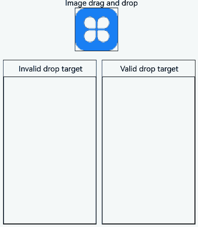
Example 1: Allowing Drag and Drop
This example demonstrates how to configure whether a component can be dragged and dropped into by setting allowDrop and draggable.
// xxx.ets
import { unifiedDataChannel, uniformTypeDescriptor } from '@kit.ArkData';

@Entry
@Component
struct ImageExample {
  @State uri: string = ""
  @State AblockArr: string[] = []
  @State BblockArr: string[] = []
  @State AVisible: Visibility = Visibility.Visible
  @State dragSuccess :Boolean = false

  build() {
    Column() {
      Text('Image drag and drop')
        .fontSize('30dp')
      Flex({ direction: FlexDirection.Row, alignItems: ItemAlign.Center, justifyContent: FlexAlign.SpaceAround }) {
        Image($r('app.media.icon'))
          .width(100)
          .height(100)
          .border({ width: 1 })
          .visibility(this.AVisible)
          .draggable(true)
          .onDragEnd((event: DragEvent) => {
            let ret = event.getResult();
            if(ret == 0) {
              console.log("enter ret == 0")
              this.AVisible = Visibility.Hidden;
            } else {
              console.log("enter ret != 0")
              this.AVisible = Visibility.Visible;
            }
          })
      }
      .margin({ bottom: 20 })
      Row() {
        Column(){
          Text('Invalid drop target')
            .fontSize('15dp')
            .height('10%')
          List(){
            ForEach(this.AblockArr, (item:string, index) => {
              ListItem() {
                Image(item)
                  .width(100)
                  .height(100)
                  .border({width: 1})
              }
              .margin({ left: 30 , top : 30})
            }, (item:string) => item)
          }
          .height('90%')
          .width('100%')
          .allowDrop([uniformTypeDescriptor.UniformDataType.TEXT])
          .onDrop((event?: DragEvent, extraParams?: string) => {
            this.uri = JSON.parse(extraParams as string).extraInfo;
            this.AblockArr.splice(JSON.parse(extraParams as string).insertIndex, 0, this.uri);
            console.log("ondrop not udmf data");
          })
          .border({width: 1})
        }
        .height("50%")
        .width("45%")
        .border({ width: 1 })
        .margin({ left: 12 })
        Column(){
          Text('Valid drop target')
            .fontSize('15dp')
            .height('10%')
          List(){
            ForEach(this.BblockArr, (item:string, index) => {
              ListItem() {
                Image(item)
                  .width(100)
                  .height(100)
                  .border({width: 1})
              }
              .margin({ left: 30 , top : 30})
            }, (item:string) => item)
          }
          .border({width: 1})
          .height('90%')
          .width('100%')
          .allowDrop([uniformTypeDescriptor.UniformDataType.IMAGE])
          .onDrop((event?: DragEvent, extraParams?: string) => {
            console.log("enter onDrop")
            let dragData:UnifiedData = (event as DragEvent).getData() as UnifiedData;
            if(dragData != undefined) {
              let arr:Array<unifiedDataChannel.UnifiedRecord> = dragData.getRecords();
              if(arr.length > 0) {
                let image = arr[0] as unifiedDataChannel.Image;
                this.uri = image.imageUri;
                this.BblockArr.splice(JSON.parse(extraParams as string).insertIndex, 0, this.uri);
              } else {
                console.log(`dragData arr is null`)
              }
            } else {
              console.log(`dragData  is undefined`)
            }
            console.log("ondrop udmf data");
            this.dragSuccess = true
          })
        }
        .height("50%")
        .width("45%")
        .border({ width: 1 })
        .margin({ left: 12 })
      }
    }.width('100%')
  }
}
Example 2: Setting the Drag Preview
This example demonstrates how to configure the preview displayed during the drag process using dragPreview.
// xxx.ets
@Entry
@Component
struct DragPreviewDemo{
  @Builder dragPreviewBuilder() {
    Column() {
      Text("dragPreview")
        .width(150)
        .height(50)
        .fontSize(20)
        .borderRadius(10)
        .textAlign(TextAlign.Center)
        .fontColor(Color.Black)
        .backgroundColor(Color.Pink)
    }
  }

  @Builder MenuBuilder() {
    Flex({ direction: FlexDirection.Column, justifyContent: FlexAlign.Center, alignItems: ItemAlign.Center }) {
      Text("menu item 1")
        .fontSize(15)
        .width(100)
        .height(40)
        .textAlign(TextAlign.Center)
        .fontColor(Color.Black)
        .backgroundColor(Color.Pink)
      Divider()
        .height(5)
      Text("menu item 2")
        .fontSize(15)
        .width(100)
        .height(40)
        .textAlign(TextAlign.Center)
        .fontColor(Color.Black)
        .backgroundColor(Color.Pink)
    }
    .width(100)
  }

  build() {
    Row() {
      Column() {
        Image('/resource/image.jpeg')
          .width("30%")
          .draggable(true)
          .bindContextMenu(this.MenuBuilder, ResponseType.LongPress)
          .onDragStart(() => {
            console.log("Image onDragStart")
          })
          .dragPreview(this.dragPreviewBuilder)
      }
      .width("100%")
    }
    .height("100%")
  }
}

Example 3: Setting the Drag Preview Style
This example demonstrates how to set default shadows, unified rounded corners, and gray effects by configuring dragPreviewOptions with ENABLE_DEFAULT_SHADOW, ENABLE_DEFAULT_RADIUS, and ENABLE_DRAG_ITEM_GRAY_EFFECT.
// xxx.ets
@Entry
@Component
struct dragPreviewOptionsDemo{
  build() {
    Row() {
      Column() {
        Image('/resource/image.jpeg')
          .margin({ top: 10 })
          .width("30%")
          .draggable(true)
          .dragPreviewOptions({ mode: DragPreviewMode.AUTO })
        Image('/resource/image.jpeg')
          .margin({ top: 10 })
          .width("30%")
          .border({ radius: { topLeft: 1, topRight: 2, bottomLeft: 4, bottomRight: 8 } })
          .draggable(true)
          .onDragStart(() => {
            console.log("Image onDragStart")
          })
          .dragPreviewOptions({ mode: [ DragPreviewMode.ENABLE_DEFAULT_SHADOW, DragPreviewMode.ENABLE_DEFAULT_RADIUS, DragPreviewMode.ENABLE_DRAG_ITEM_GRAY_EFFECT ] })
      }
      .width("100%")
      .height("100%")
    }
  }
}

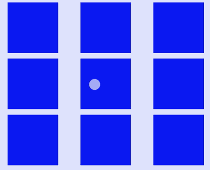
Example 4: Enabling Multiselect for Dragging
This example demonstrates how to enable multiselect for dragging in a Grid component by configuring isMultiSelectionEnabled.
@Entry
@Component
struct Example {
  @State numbers: number[] = [0, 1, 2, 3, 4 , 5, 6, 7, 8]
  build() {
    Column({ space: 5}) {
      Grid() {
        ForEach(this.numbers, (item: number) => {
          GridItem() {
            Column()
              .backgroundColor(Color.Blue)
              .width('100%')
              .height('100%')
          }
          .width(90)
          .height(90)
          .selectable(true)
          .selected(true)
          .dragPreviewOptions({}, {isMultiSelectionEnabled:true})
          .onDragStart(()=>{

          })
    }, (item: string) => item)
      }
      .columnsTemplate('1fr 1fr 1fr')
      .rowsTemplate('1fr 1fr 1fr')
      .height(300)
    }
    .width('100%')
  }
}
Example 5: Enabling the Default Pressed State Animation
This example demonstrates how to enable the default pressed state animation for a Grid component by configuring defaultAnimationBeforeLifting.
@Entry
@Component
struct Example {
  @State numbers: number[] = [0, 1, 2, 3, 4 , 5, 6, 7, 8]
  build() {
    Column({ space: 5}) {
      Grid() {
        ForEach(this.numbers, (item: number) => {
          GridItem() {
            Column()
              .backgroundColor(Color.Blue)
              .width('100%')
              .height('100%')
          }
          .width(90)
          .height(90)
          .selectable(true)
          .selected(true)
          .dragPreviewOptions({}, {isMultiSelectionEnabled:true, defaultAnimationBeforeLifting:true})
          .onDragStart(()=>{

          })
    }, (item: string) => item)
      }
      .columnsTemplate('1fr 1fr 1fr')
      .rowsTemplate('1fr 1fr 1fr')
      .height(300)
    }
    .width('100%')
  }
}

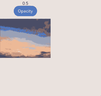
Example 6: Customizing the Preview Style
This example demonstrates how to customize the preview style for an Image component by configuring ImageModifier.
// xxx.ets
import { ImageModifier } from '@kit.ArkUI'

@Entry
@Component
struct dragPreviewOptionsDemo{
  @State myModifier: ImageAttribute = new ImageModifier().opacity(0.5)
  @State vis: boolean = true
  @State changeValue: string = ''
  @State submitValue: string = ''
  @State positionInfo: CaretOffset = { index: 0, x: 0, y: 0 }
  controller: SearchController = new SearchController()
  @State OpacityIndex: number = 0
  @State OpacityList:(number|undefined|null)[]=[
    0.3,0.5,0.7,1,-50,0,10,undefined,null
  ]
  build() {
    Row() {
      Column() {
        Text(this.OpacityList[this.OpacityIndex] + "")
        Button("Opacity")
          .onClick(()=> {
            this.OpacityIndex++
            if(this.OpacityIndex > this.OpacityList.length - 1){
              this.OpacityIndex = 0
            }
          })
        Image($r('app.media.image'))
          .margin({ top: 10 })
          .width("100%")
          .draggable(true)
          .dragPreviewOptions({modifier: this.myModifier.opacity(this.OpacityList[this.OpacityIndex]) as ImageModifier})
      }
      .width("50%")
      .height("50%")
    }
  }
}
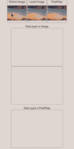
Example 7: Configuring Image Dragging Settings
This example shows the settings for different types of images (online image resources, local image resources, and PixelMap) during drag operations. The ohos.permission.INTERNET permission is required for using online images. For details about how to apply for a permission, see Declaring Permissions.
// xxx.ets
import { uniformTypeDescriptor, unifiedDataChannel } from '@kit.ArkData';
import { image } from '@kit.ImageKit';
import { request } from '@kit.BasicServicesKit';
import { common } from '@kit.AbilityKit';
import { fileIo } from '@kit.CoreFileKit';
import { buffer } from '@kit.ArkTS';
import { BusinessError } from '@kit.BasicServicesKit';

@Entry
@Component
struct ImageDrag {
  @State targetImage1: string|PixelMap|null = null;
  @State targetImage2: string|PixelMap|null = null;
  @State targetImage3: string|PixelMap|null = null;
  context: Context|undefined = this.getUIContext().getHostContext();
  filesDir = this.context?.filesDir;

  public async createPixelMap(pixelMap: unifiedDataChannel.SystemDefinedPixelMap): Promise<image.PixelMap|null> {
    let mWidth: number = (pixelMap.details?.width ?? -1) as number;
    let mHeight: number = (pixelMap.details?.width ?? -1) as number;
    let mPixelFormat: image.PixelMapFormat =
      (pixelMap.details?.['pixel-format'] ?? image.PixelMapFormat.UNKNOWN) as image.PixelMapFormat;
    let mItemPixelMapData: Uint8Array = pixelMap.rawData;
    const opts: image.InitializationOptions = {
      editable: false, pixelFormat: mPixelFormat, size: {
        height: mHeight,
        width: mWidth
      }
    };
    const buffer: ArrayBuffer = mItemPixelMapData.buffer.slice(mItemPixelMapData.byteOffset,
      mItemPixelMapData.byteLength + mItemPixelMapData.byteOffset);
    try {
      let pixelMap: image.PixelMap = await image.createPixelMap(buffer, opts);
      return pixelMap;
    } catch (err) {
      console.error('dragtest--> getPixelMap', err);
      return null;
    }
  }

  build() {
    Column() {
      Flex({ direction: FlexDirection.Row, justifyContent: FlexAlign.Center }) {
        // Drag an online image.
        Column() {
          Text('Online Image').fontSize(14)
          Image('https://www.example.com/xxx.png') // Enter a specific online image URL.
            .objectFit(ImageFit.Contain).draggable(true)
            .onDragStart(() => {})
            .width(100).height(100)
        }
        .border({ width: 2, color: Color.Gray, radius: 5, style: BorderStyle.Dotted })
        .alignItems(HorizontalAlign.Center).justifyContent(FlexAlign.Center)

        // Drag a local image.
        Column() {
          Text('Local Image').fontSize(14)
          Image($r('app.media.example'))
            .objectFit(ImageFit.Contain).draggable(true)
            .onDragStart(() => {})
            .width(100).height(100)
        }
        .border({ width: 2, color: Color.Gray, radius: 5, style: BorderStyle.Dotted })
        .alignItems(HorizontalAlign.Center).justifyContent(FlexAlign.Center)

        // Drag a PixelMap object.
        Column() {
          Text('PixelMap').fontSize(14)
          Image(this.context?.resourceManager.getDrawableDescriptor($r('app.media.example').id).getPixelMap())
            .objectFit(ImageFit.Contain).draggable(true)
            .onDragStart(() => {})
            .width(100).height(100)
        }
        .border({ width: 2, color: Color.Gray, radius: 5, style: BorderStyle.Dotted })
        .alignItems(HorizontalAlign.Center).justifyContent(FlexAlign.Center)
      }

      // Set the drop data type to Image.
      Text('Data type is Image').fontSize(14).margin({ top: 10 })
      Column() {
        Image(this.targetImage1)
          .objectFit(ImageFit.Contain)
          .width('70%').height('70%')
          .allowDrop([uniformTypeDescriptor.UniformDataType.IMAGE])
          .onDrop((event: DragEvent, extraParams: string) => {
            // Obtain the image through extraParams.
            let arr: Record<string, object> = JSON.parse(extraParams) as Record<string, object>;
            let uri = arr['extraInfo'];
            if (typeof uri == 'string') {
              this.targetImage1 = uri;

              try {
                request.downloadFile(this.context, {
                  url: uri,
                  filePath: this.filesDir + '/example.png'
                }).then((downloadTask: request.DownloadTask) => {
                  let file = fileIo.openSync(this.filesDir + '/example.png', fileIo.OpenMode.READ_WRITE);
                  let arrayBuffer = new ArrayBuffer(1024);
                  let readLen = fileIo.readSync(file.fd, arrayBuffer);
                  let buf = buffer.from(arrayBuffer, 0, readLen);
                  console.info(`The content of file: ${buf.toString()}`);
                  fileIo.closeSync(file);
                })
              } catch (error) {}
            }
          })
      }
      .width('70%').height('25%')
      .border({ width: 2, color: Color.Gray, radius: 5, style: BorderStyle.Dotted })
      .alignItems(HorizontalAlign.Center).justifyContent(FlexAlign.Center)

      Column() {
        Image(this.targetImage2)
          .objectFit(ImageFit.Contain)
          .width('70%').height('70%')
          .allowDrop([uniformTypeDescriptor.UniformDataType.IMAGE])
          .onDrop((event: DragEvent, extraParams: string) => {
            // Obtain the image through uniformTypeDescriptor.
            let data: UnifiedData = event.getData();
            let records: Array<unifiedDataChannel.UnifiedRecord> = data.getRecords();
            if (records[0].getType() ===uniformTypeDescriptor.UniformDataType.IMAGE) {
              let image: unifiedDataChannel.Image = records[0] as unifiedDataChannel.Image;
              this.targetImage2 = image.imageUri;
            }
          })
      }
      .width('70%').height('25%')
      .border({ width: 2, color: Color.Gray, radius: 5, style: BorderStyle.Dotted })
      .alignItems(HorizontalAlign.Center).justifyContent(FlexAlign.Center)

      // Set the drop data type to PixelMap.
      Text('Data type is PixelMap').fontSize(14).margin({ top: 10 })
      Column() {
        Image(this.targetImage3)
          .objectFit(ImageFit.Contain)
          .width('70%').height('70%')
          .allowDrop([uniformTypeDescriptor.UniformDataType.OPENHARMONY_PIXEL_MAP])
          .onDrop(async (event: DragEvent, extraParams: string) => {
            // Obtain the image through uniformTypeDescriptor.
            let data: UnifiedData = event.getData();
            let records: Array<unifiedDataChannel.UnifiedRecord> = data.getRecords();
            if (records[0].getType() ===uniformTypeDescriptor.UniformDataType.OPENHARMONY_PIXEL_MAP) {
              let record: unifiedDataChannel.SystemDefinedPixelMap = records[0] as unifiedDataChannel.SystemDefinedPixelMap;
              this.targetImage3 = await this.createPixelMap(record);

              // Save data to local storage.
              const imagePackerApi = image.createImagePacker();
              let packOpts : image.PackingOption = { format: "image/jpeg", quality:98 };
              const path : string = this.context?.cacheDir + "/pixel_map.jpg";
              let file = fileIo.openSync(path, fileIo.OpenMode.CREATE|fileIo.OpenMode.READ_WRITE);
              imagePackerApi.packToFile(this.targetImage3, file.fd, packOpts).then(() => {
                // Pack the image into the file.
              }).catch((error : BusinessError) => {
                console.error('Failed to pack the image. And the error is: ' + error);
              })
            }
          })
      }
      .width('70%').height('25%')
      .border({ width: 2, color: Color.Gray, radius: 5, style: BorderStyle.Dotted })
      .alignItems(HorizontalAlign.Center).justifyContent(FlexAlign.Center)

    }.width('100%').height('100%')
  }
}
Example 8: Enabling Haptic Feedback for Dragging
This example demonstrates how to enable haptic feedback for image dragging by setting enableHapticFeedback.
// xxx.ets
@Entry
@Component
struct DragPreviewDemo{
  @Builder MenuBuilder() {
    Flex({ direction: FlexDirection.Column, justifyContent: FlexAlign.Center, alignItems: ItemAlign.Center }) {
      Text("menu item 1")
        .fontSize(15)
        .width(100)
        .height(40)
        .textAlign(TextAlign.Center)
        .fontColor(Color.Black)
        .backgroundColor(Color.Pink)
      Divider()
        .height(5)
      Text("menu item 2")
        .fontSize(15)
        .width(100)
        .height(40)
        .textAlign(TextAlign.Center)
        .fontColor(Color.Black)
        .backgroundColor(Color.Pink)
    }
    .width(100)
  }

  build() {
    Row() {
      Column() {
        Image($r('app.media.app_icon'))
          .width("30%")
          .draggable(true)
          .dragPreviewOptions({}, {isMultiSelectionEnabled:true, defaultAnimationBeforeLifting:true, enableHapticFeedback: true})
          .bindContextMenu(this.MenuBuilder, ResponseType.LongPress)
          .onDragStart(() => {
            console.log("Image onDragStart")
          })
      }
      .width("100%")
    }
    .height("100%")
  }
}
Example 9: Customizing the Drag Preview
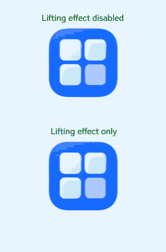
This example demonstrates how to customize the drag preview using onlyForLifting for lifting effects and isLiftingDisabled to disable the lifting effect.
// xxx.ets
@Entry
@Component
struct LiftingExampleDemo {
  @Builder
  dragPreviewBuilder() {
    Column() {
      Text("dragPreview builder")
        .width(150)
        .height(50)
        .fontSize(20)
        .borderRadius(10)
        .textAlign(TextAlign.Center)
        .fontColor(Color.Black)
        .backgroundColor(Color.Green)
    }
  }
  @Builder
  MenuBuilder() {
    Flex({ direction: FlexDirection.Column, justifyContent: FlexAlign.Center, alignItems: ItemAlign.Center }) {
      Text("menu 1")
        .fontSize(25)
        .width(200)
        .height(60)
        .textAlign(TextAlign.Center)
        .fontColor(Color.Black)
        .backgroundColor(Color.Green)
      Divider()
        .height(5)
      Text("menu 2")
        .fontSize(25)
        .width(200)
        .height(60)
        .textAlign(TextAlign.Center)
        .fontColor(Color.Black)
        .backgroundColor(Color.Green)
    }
    .width(100)
  }
  build() {
    Column() {
      Column() {
        Text("Lifting effect disabled")
          .fontSize(30)
          .height(30)
          .backgroundColor('#FFFFFF')
          .margin({ top: 30 })
        Image($r('app.media.startIcon'))
          .width("40%")
          .draggable(true)
          .margin({ top: 15 })
          .bindContextMenu(this.MenuBuilder, ResponseType.LongPress)
          .onDragStart(() => {
          })
          .dragPreviewOptions({}, {
            isLiftingDisabled: true
          })
          .dragPreview(this.dragPreviewBuilder, {
            onlyForLifting: true,
            delayCreating: true
          })
      }.width("%")
      Column() {
        Text("Lifting effect only")
          .fontSize(30)
          .height(30)
          .backgroundColor('#FFFFFF')
          .margin({ top: 80 })
        Image($r('app.media.startIcon'))
          .width("40%")
          .draggable(true)
          .margin({ top: 15 })
          .onDragStart(() => {
          })
          .dragPreviewOptions({}, {
            isLiftingDisabled: false
          })
          .dragPreview(this.dragPreviewBuilder, {
            onlyForLifting: true,
            delayCreating: true
          })
      }.width("100%")
    }.height("100%")
  }
}
Custom preview for the lifting effect only
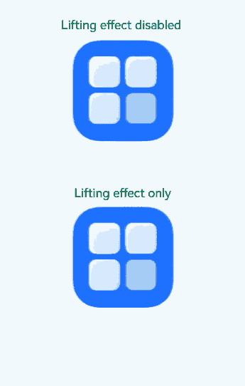
Custom preview with the lifting effect disabled
你可能感兴趣的鸿蒙文章
- 所属分类: 后端技术
- 本文标签:
热门推荐
-
2、 优质文章
-
3、 gt
-
7、 openharmony
-
9、 golang
-
10、 Vue中input框自动聚焦